Service Quality Heatmap Template
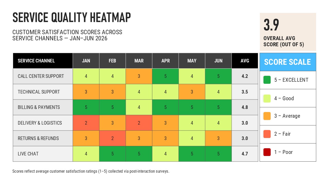
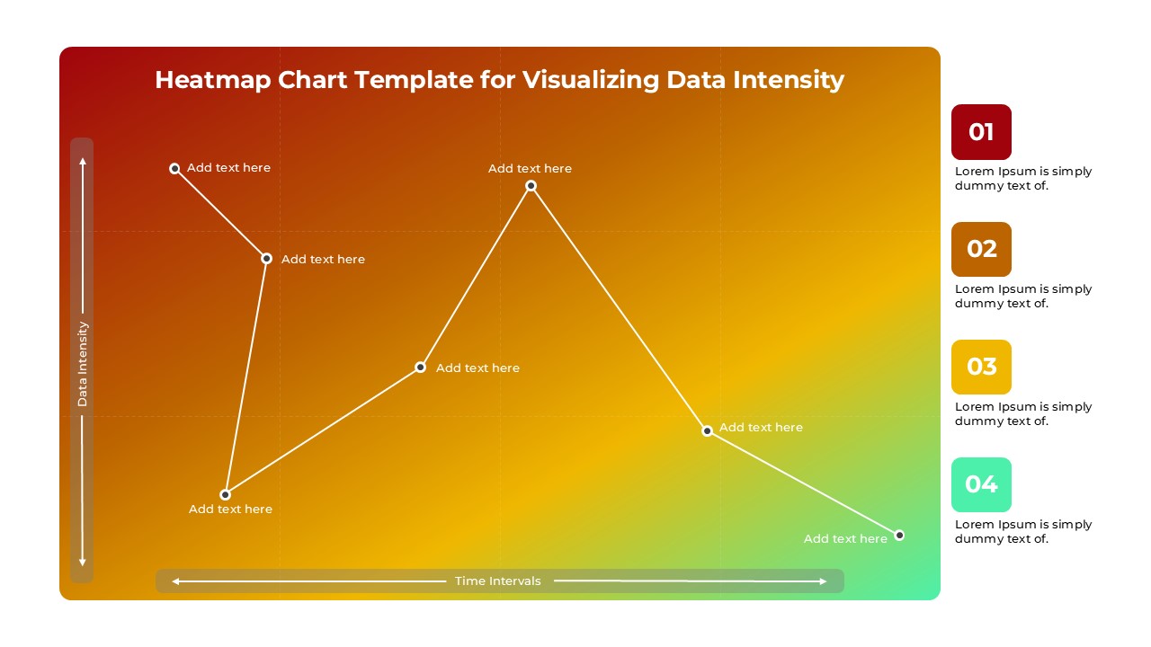
Visualize customer satisfaction trends and service performance with this Service Quality Heatmap PowerPoint and Google Slides Template. Designed for professionals who need to monitor service quality across multiple channels, this template transforms performance metrics into an easy-to-understand color-coded heatmap, helping teams identify strengths, weaknesses, and improvement opportunities at a glance.
The layout features a structured matrix that compares service channels against monthly performance scores, making it ideal for tracking customer satisfaction, support effectiveness, operational efficiency, and service consistency over time. A built-in color scale highlights performance levels, allowing audiences to quickly recognize high-performing areas and those requiring immediate attention. An overall average score section further summarizes organizational performance, making executive reporting more impactful and data-driven.
This template is particularly valuable for customer experience managers, service operations teams, quality assurance professionals, call center managers, business analysts, and consultants who regularly present service performance reports. Whether reviewing customer feedback, evaluating support channels, or presenting quarterly operational updates, the heatmap format ensures complex datasets remain clear, engaging, and actionable.
Fully editable in both Microsoft PowerPoint and Google Slides, every element of the template—including colors, labels, text, tables, and scoring values—can be customized to match your organization’s branding and reporting requirements. You can easily adapt the layout to display weekly, monthly, quarterly, or yearly performance metrics across departments, locations, products, or business units.
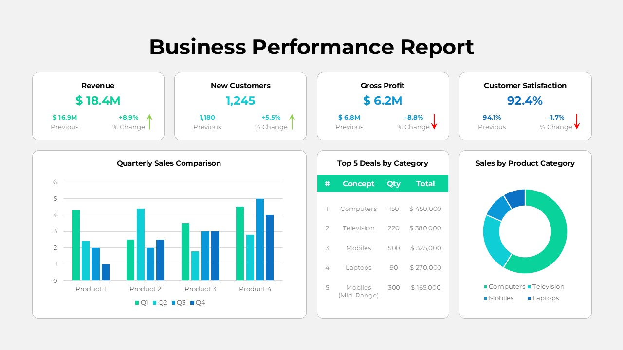
Beyond customer service reporting, the template is versatile enough for operational dashboards, KPI reviews, employee performance evaluations, project health assessments, compliance monitoring, and business performance tracking. Its professional design makes it suitable for executive presentations, stakeholder meetings, management reports, and strategic planning sessions.
See more

Aspect Ratio
16:9Item ID
SKT04762


Features of this template
Other User Cases of the Template
Customer satisfaction analysis, Call center performance dashboard, Technical support KPI reporting, Employee performance evaluation, Department performance comparison, Sales performance heatmap, Project status tracking, Risk assessment matrix, Operational KPI dashboard, Quality assurance reporting, Vendor performance evaluation, Branch performance analysis, Healthcare service quality monitoring, IT service management reporting, Supply chain performance review, Compliance tracking, Customer experience reporting, Business performance dashboard, Monthly management reporting, Executive performance review.
FAQs
You May Also Like These Presentation Templates


- Free
- Free
- Free

- Free