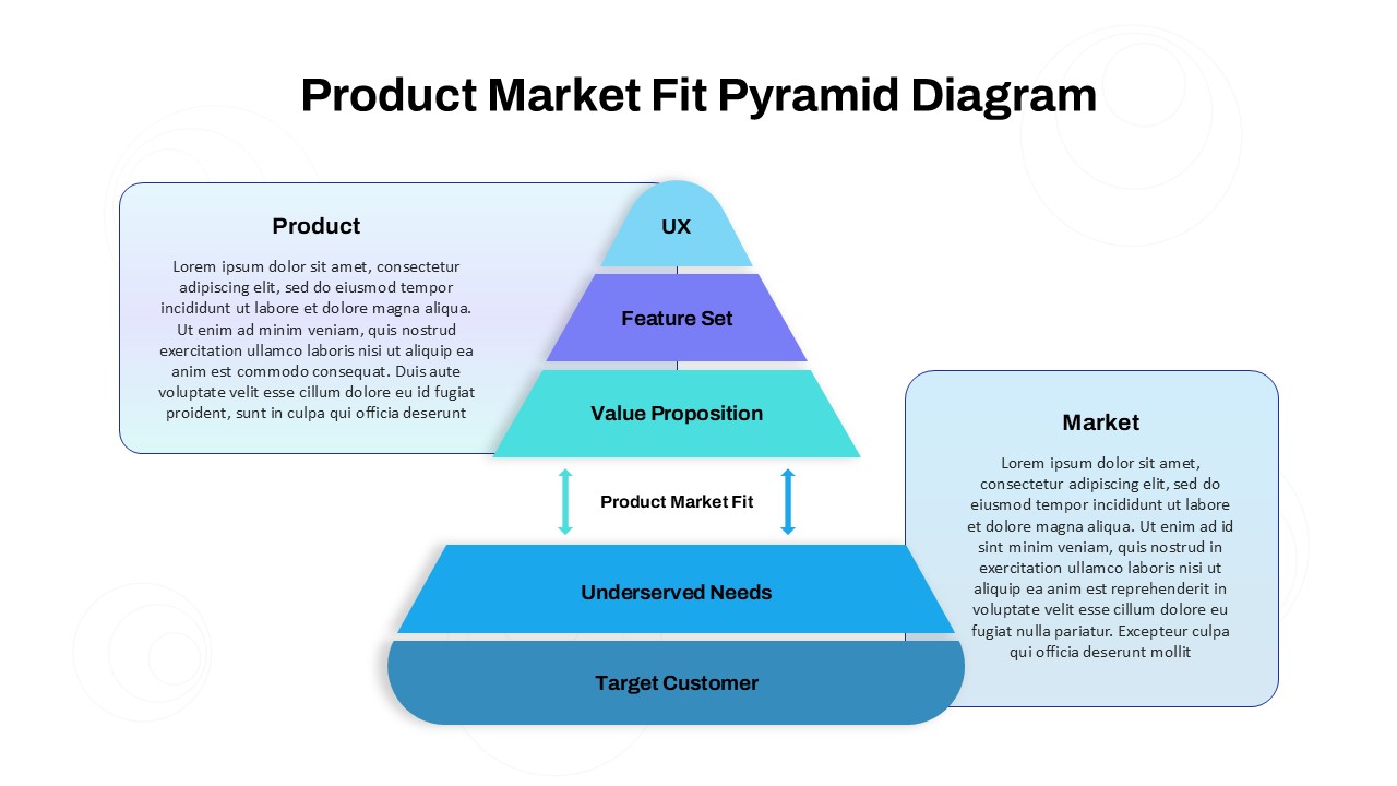
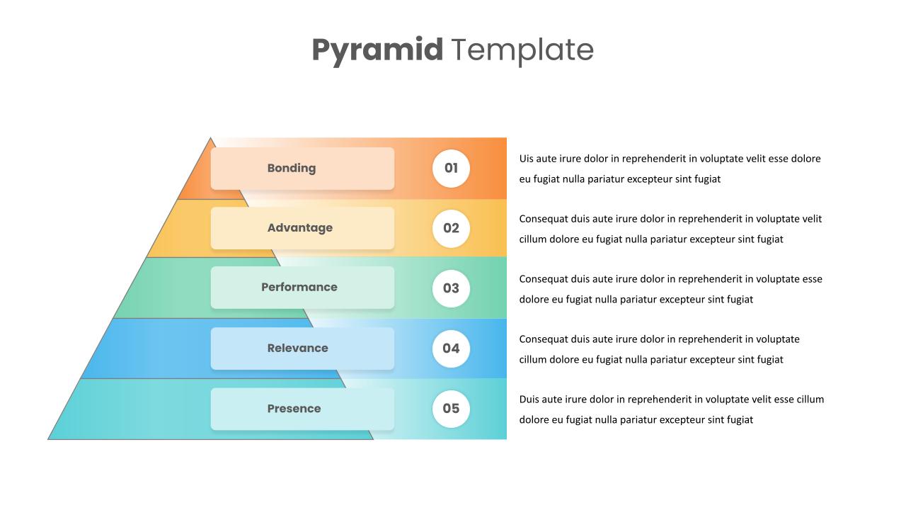
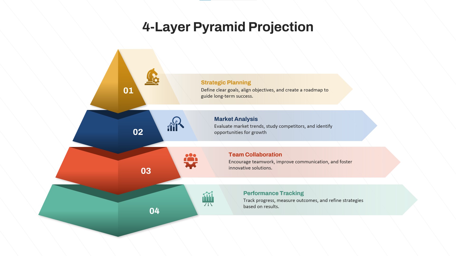
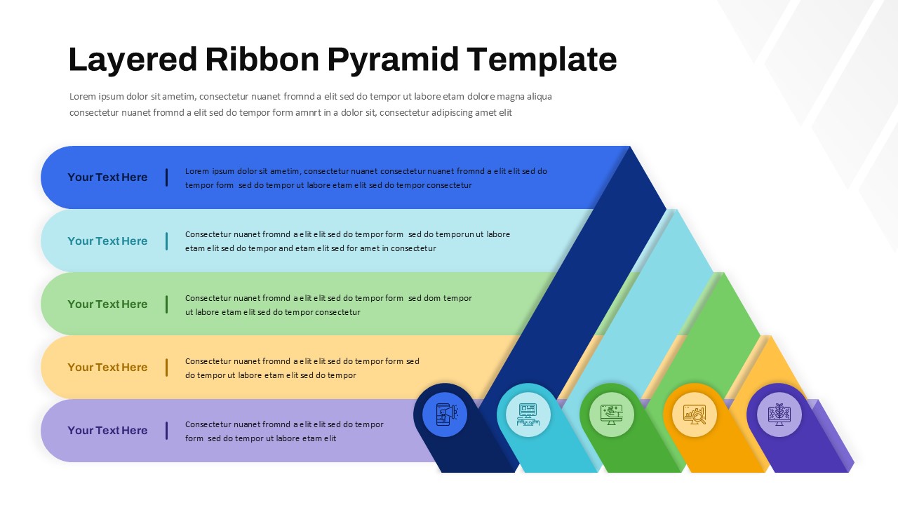
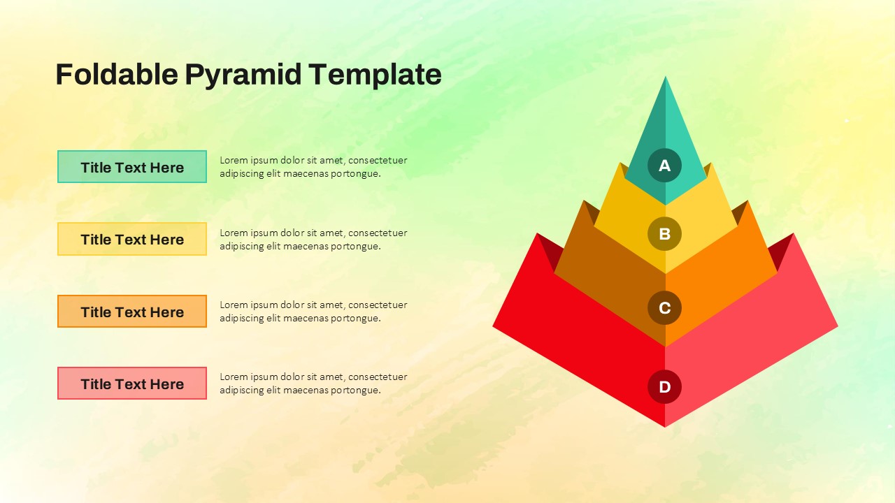
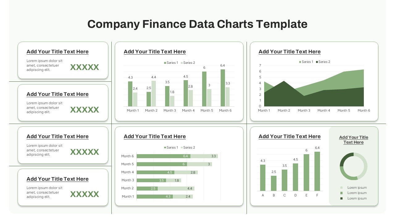
MVP Feature Pyramid Diagram for PowerPoint & Google Slides
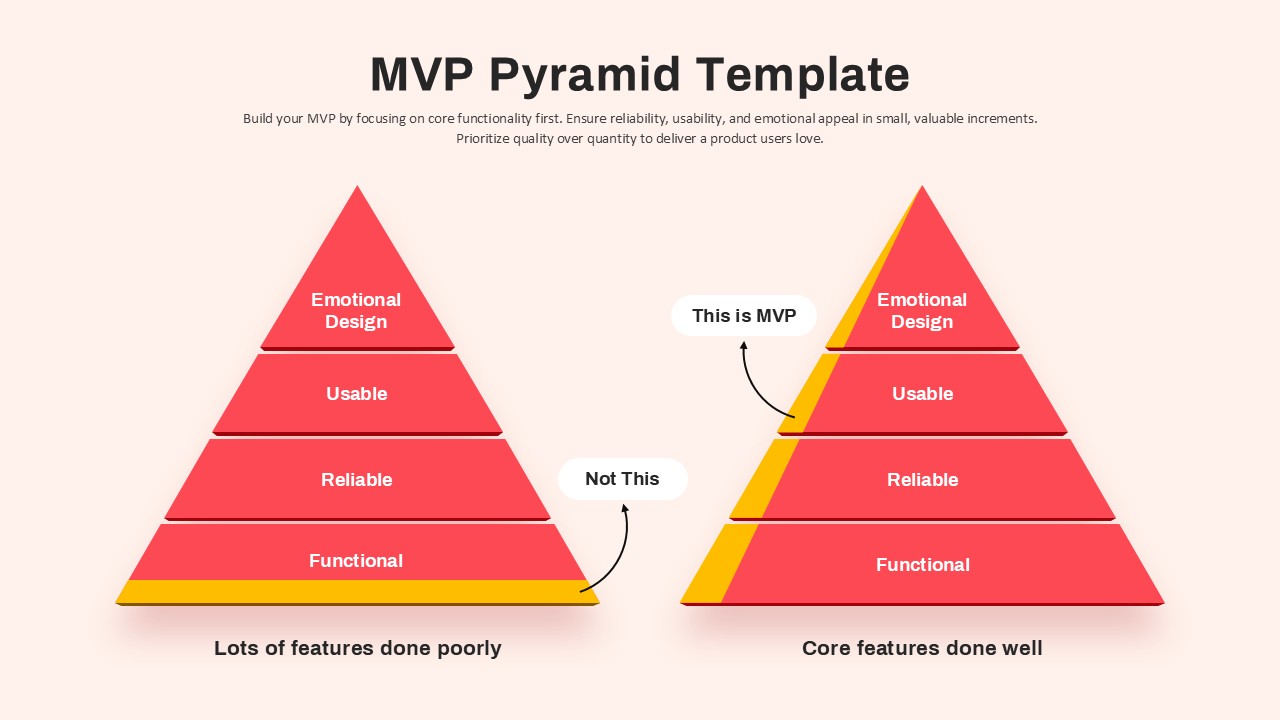
This MVP Pyramid slide visualizes the essential difference between building a minimally viable product with depth versus one with broad but shallow feature sets. Two contrasting pyramids illustrate the concept side-by-side: the left pyramid, labeled “Not This,” shows all layers (Functional, Reliable, Usable, Emotional Design) done poorly—resulting in a weak MVP. In contrast, the right pyramid—“This is MVP”—demonstrates a focused approach where core features are implemented thoroughly before expanding scope.
Each layer of the pyramid is color-coded in red with subtle 3D shading, making the structure visually striking and easy to interpret. A yellow border at the base symbolizes foundational strength, while callout labels reinforce key takeaways. Accompanied by a concise headline and subtext, the diagram effectively communicates why quality-focused MVPs outperform feature-heavy prototypes.
This visual is perfect for product management presentations, agile development kickoffs, or startup pitch decks. Fully editable in PowerPoint and Google Slides, users can customize colors, labels, or annotations to align with their specific project focus or audience.
See more

Aspect Ratio
16:9Item ID
SKT04109
Features of this template
Other Uses
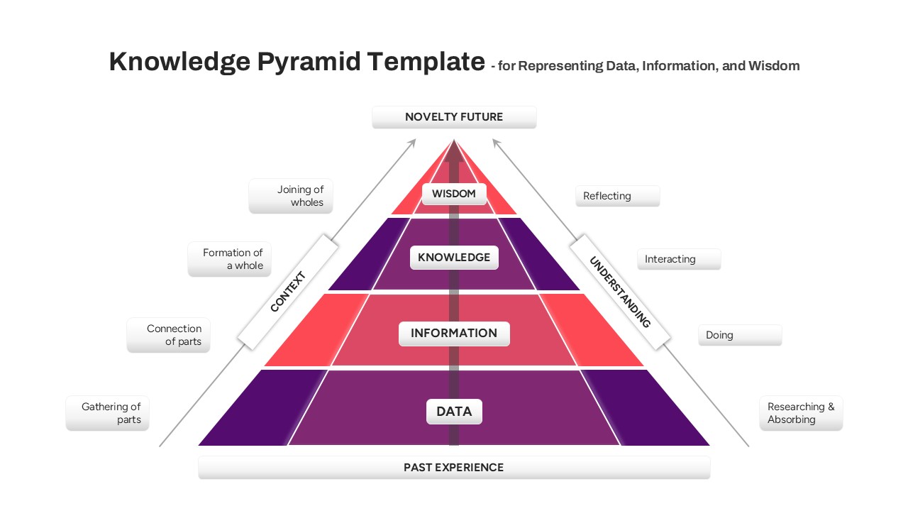
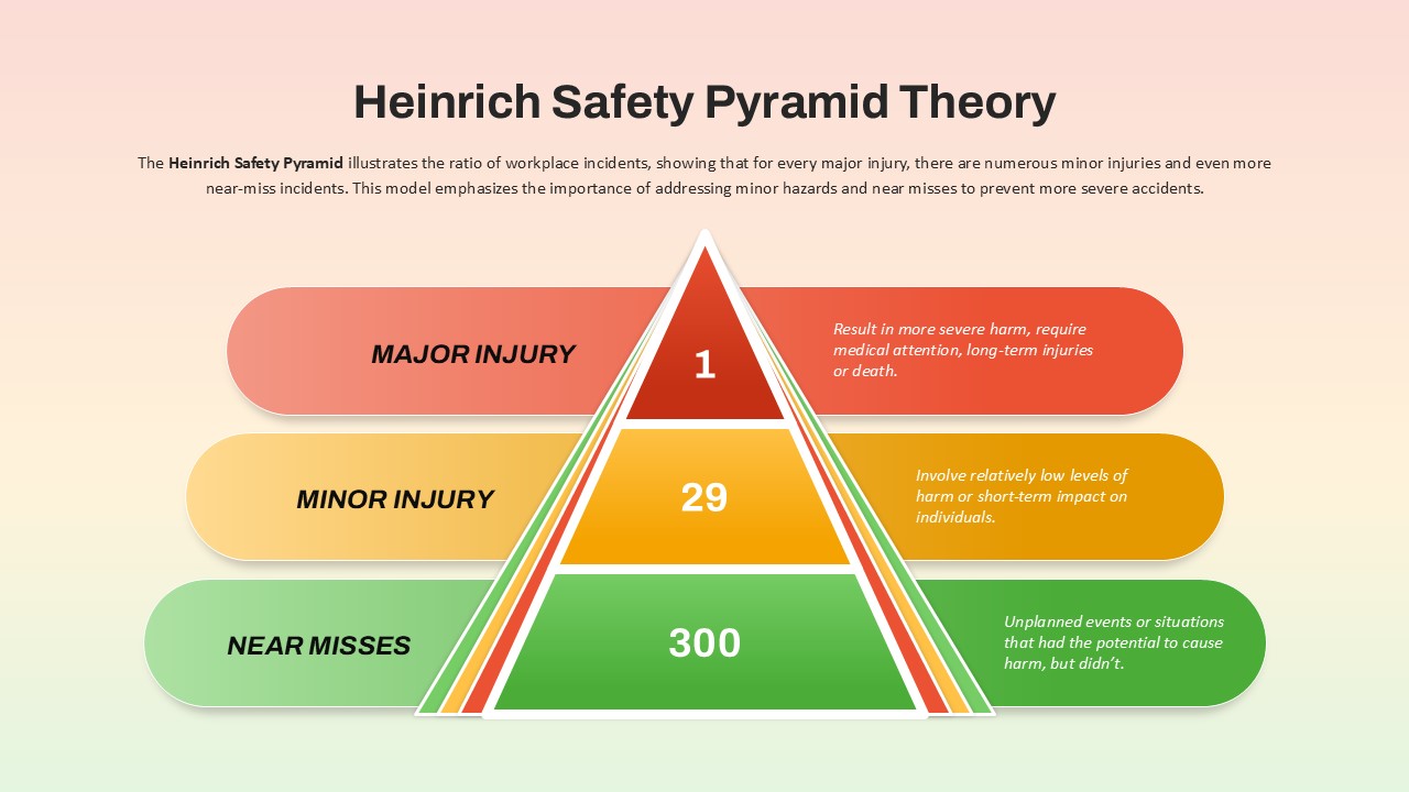
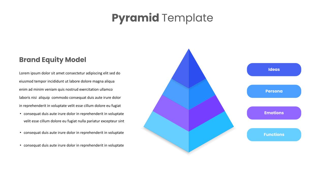
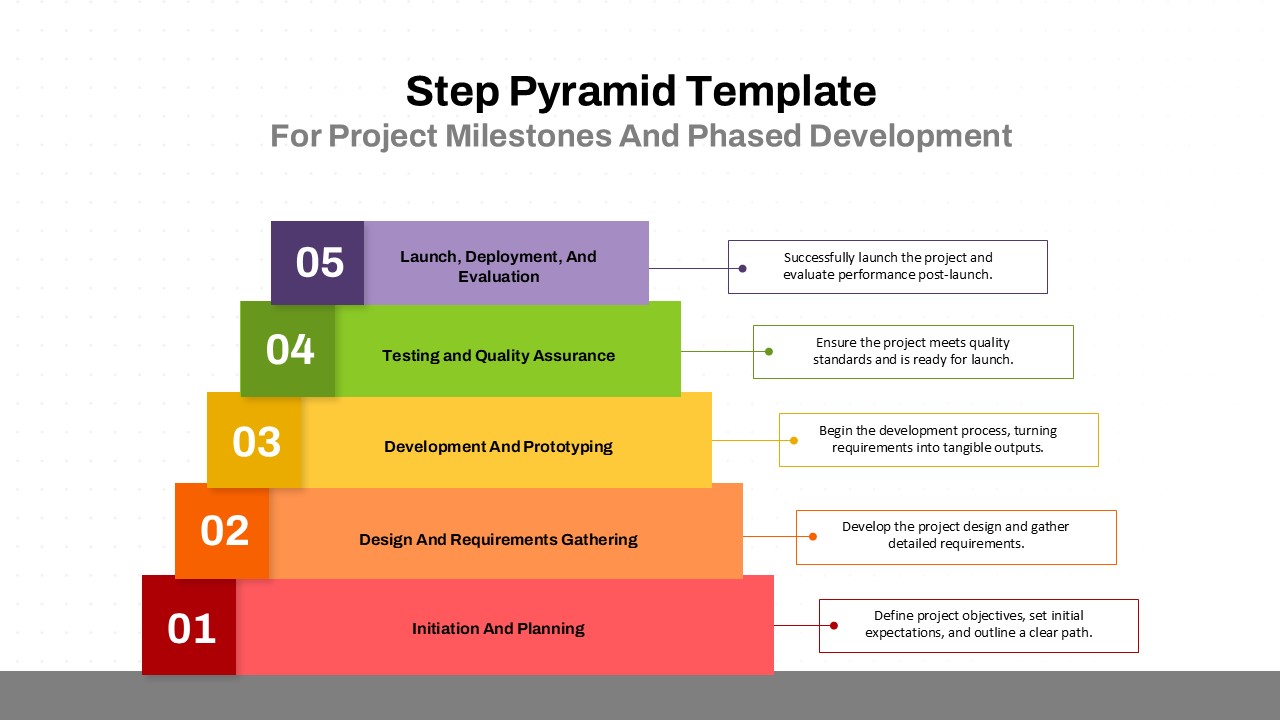
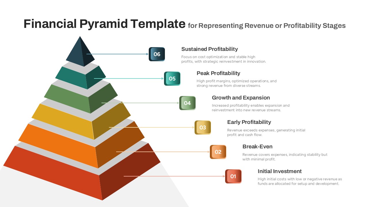
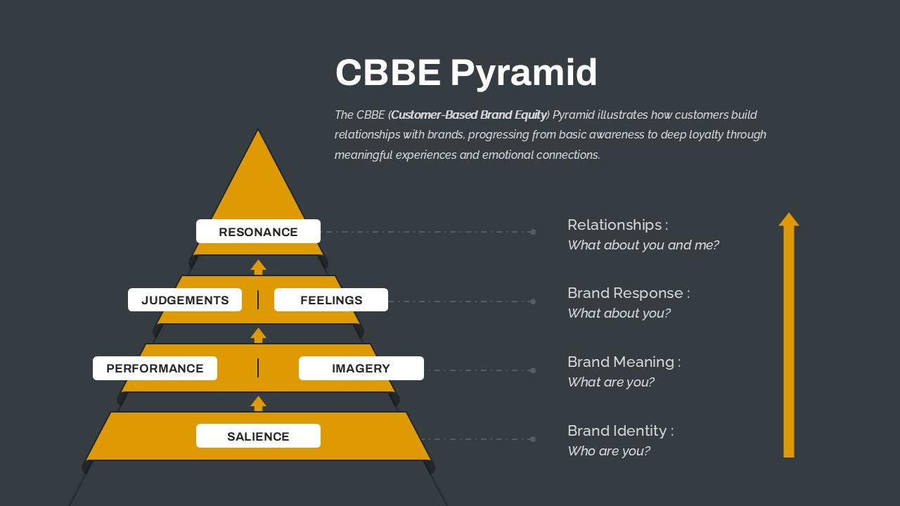
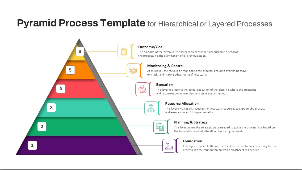
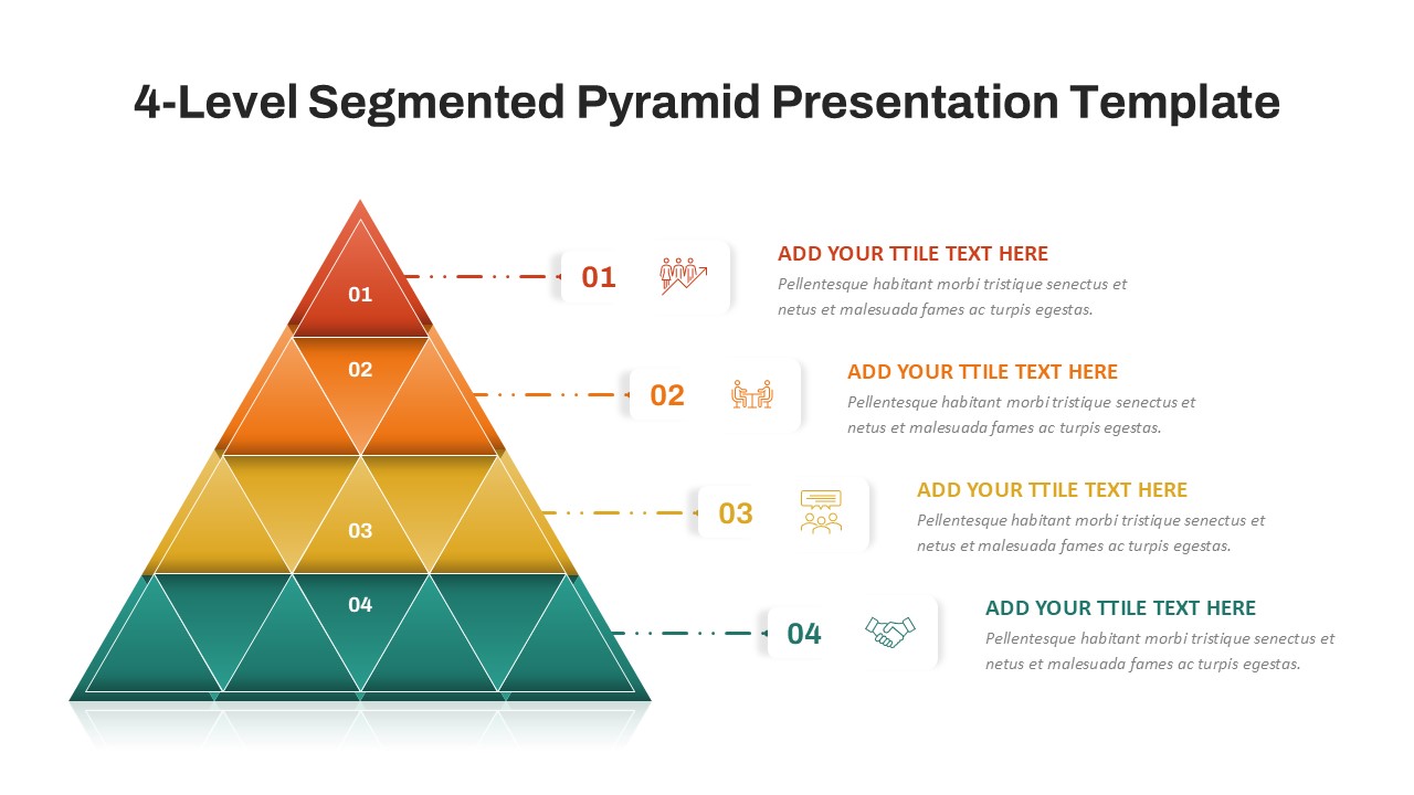
Repurpose this diagram for prioritization workshops, feature-scope planning, or software release roadmaps. Use the pyramid model to compare other tiered strategies—such as user experience layers, service quality levels, or training frameworks.
FAQs
You May Also Like These Presentation Templates


- Free
- Free
- Free
- Free
- Free
- Free
- Free
- Free