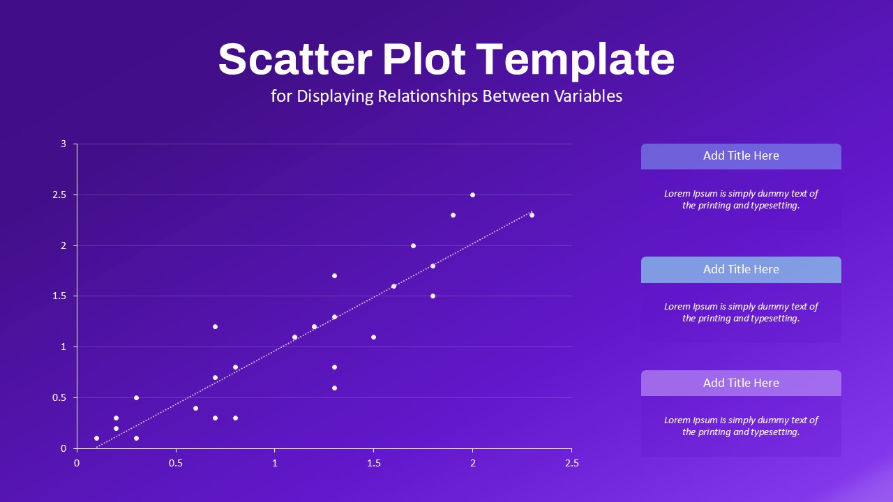
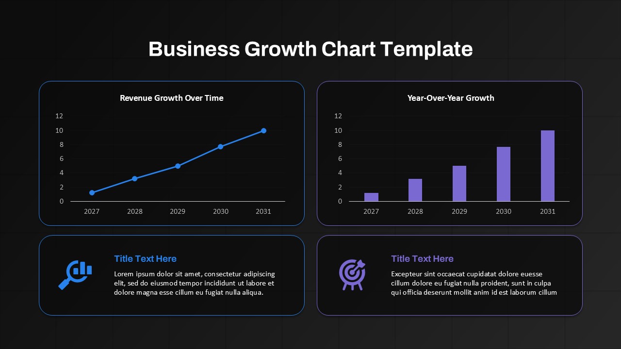
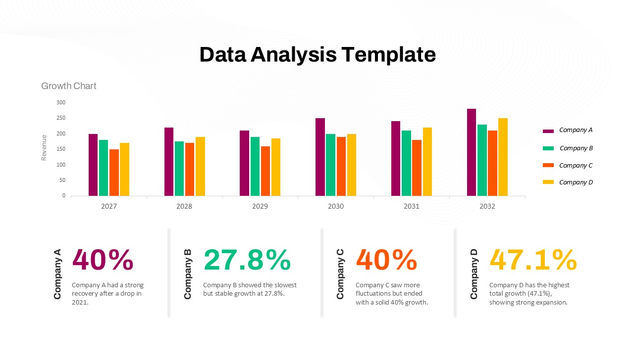
Dark Gradient Radar Chart for PowerPoint & Google Slides
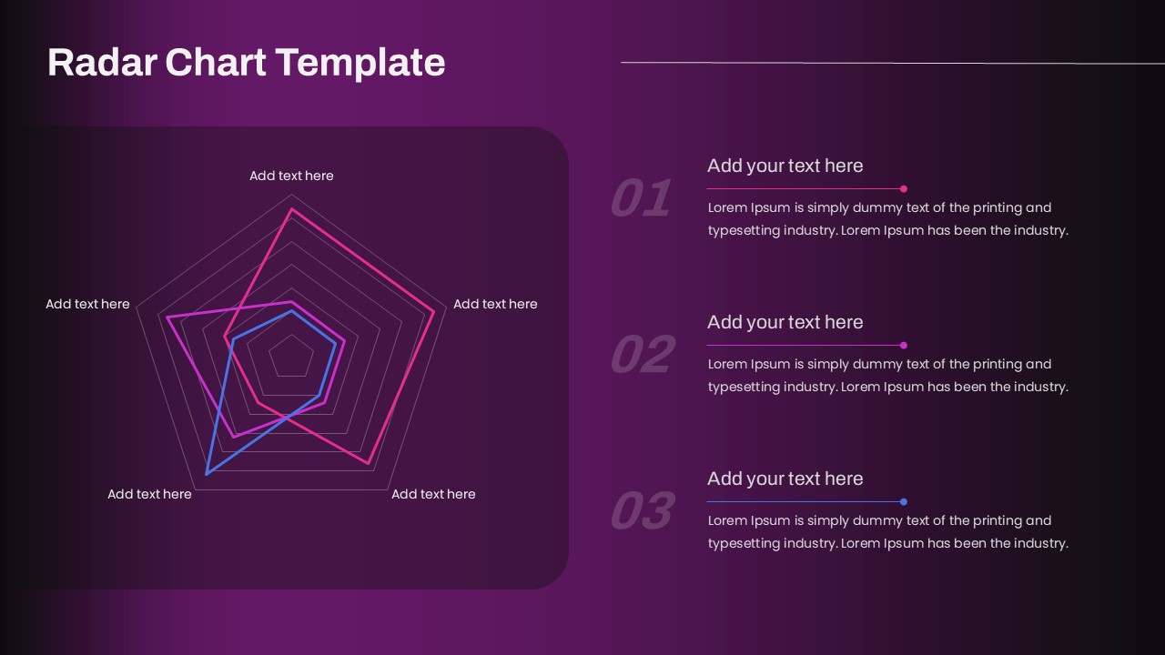
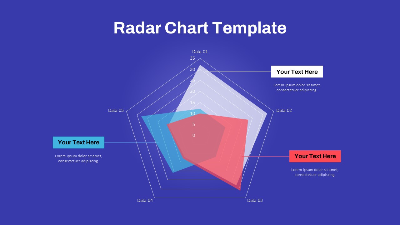
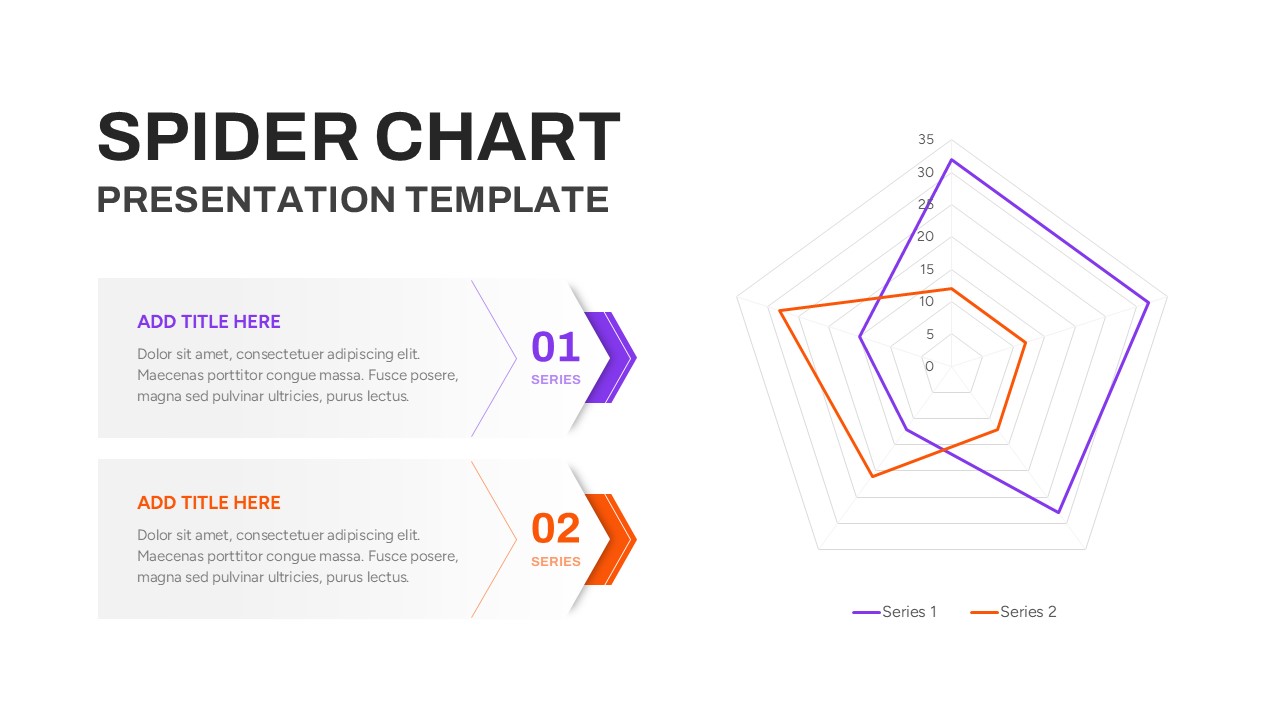
This Radar Chart slide provides a sleek, data-centric visualization ideal for comparing multiple variables across a consistent set of metrics. Featuring a dark gradient background with neon-accented radar lines in pink, purple, and blue, the chart allows for intuitive multivariate analysis across five customizable axes. The left side of the slide houses the radar plot, while the right panel offers three numbered text blocks for contextual explanation or data interpretation.
Designed for clarity and visual impact, this template is perfect for benchmarking, performance evaluations, skill assessments, or product comparisons. Each data series is color-coded and easily distinguishable, allowing presenters to highlight variances and trends effectively. The layout supports deep customization—users can edit axis labels, adjust data points, or modify colors to reflect branding or audience needs.
Fully compatible with PowerPoint and Google Slides, this asset is optimized for modern presentations requiring high-contrast visuals. Whether in executive reviews, academic reporting, or product development meetings, this radar chart communicates complex data with sharp design and minimal effort.
See more

Aspect Ratio
16:9Item ID
SKT04199
Features of this template
Other Uses
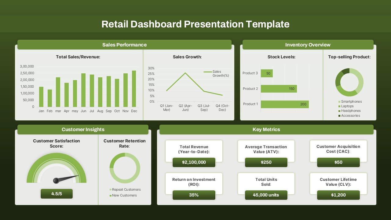
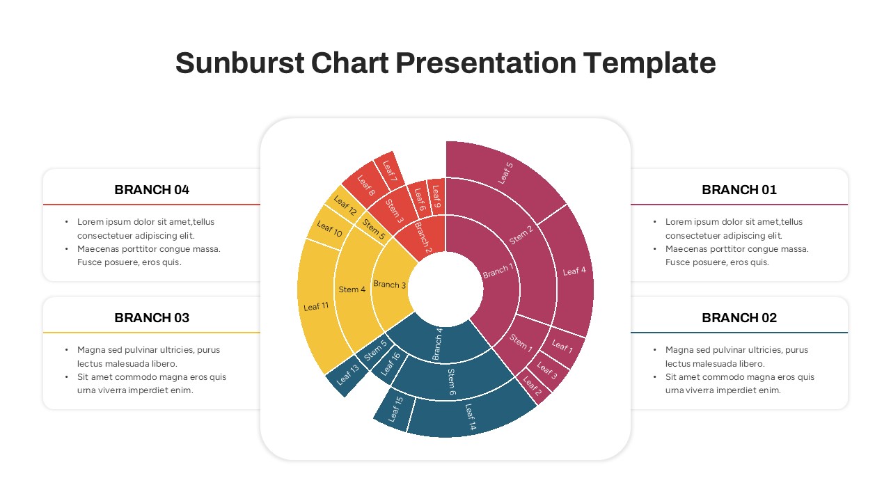
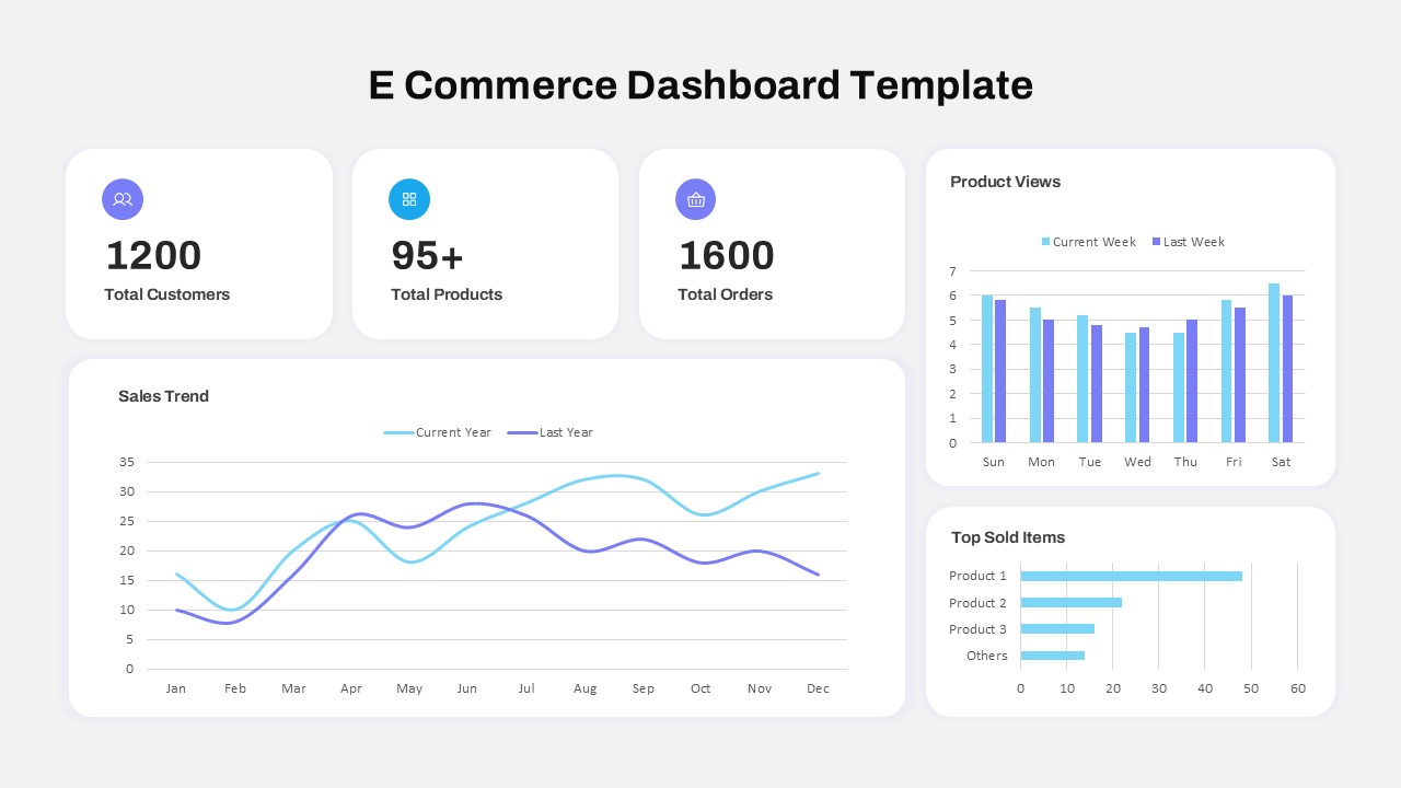
This slide can be adapted for risk assessments, marketing performance comparisons, strategic capability mapping, or team competency visualization. It's also useful in workshops or pitch decks where quick, visual cross-variable insights are essential.
FAQs
You May Also Like These Presentation Templates


- Free
- Free


- Free
- Free
- Free
- Free

- Free
- Free
- Free
- Free