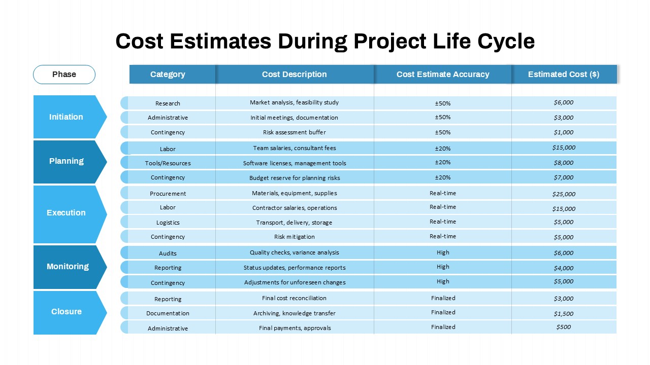
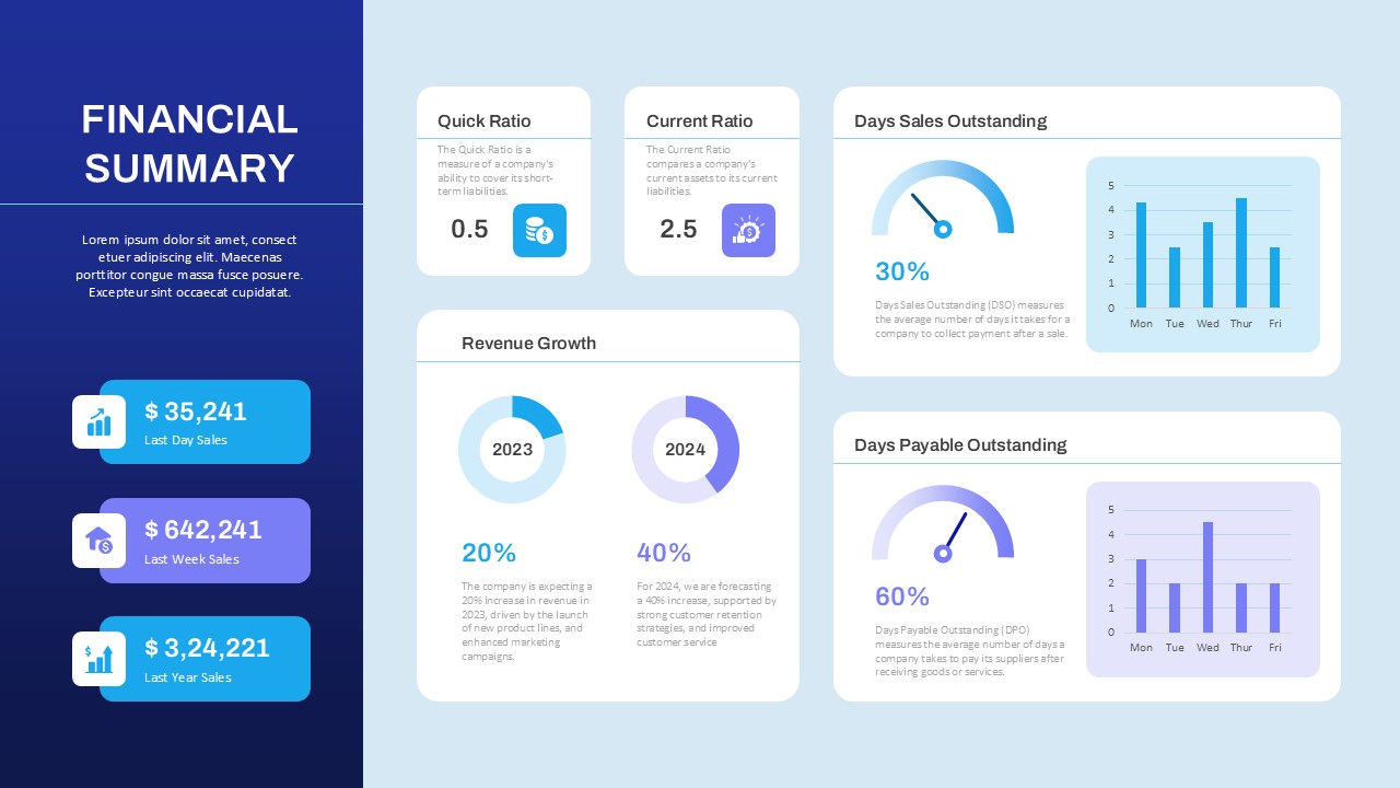
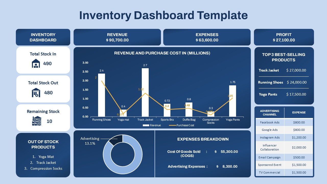
3D Budget Allocation Pie Chart Slide for PowerPoint & Google Slides
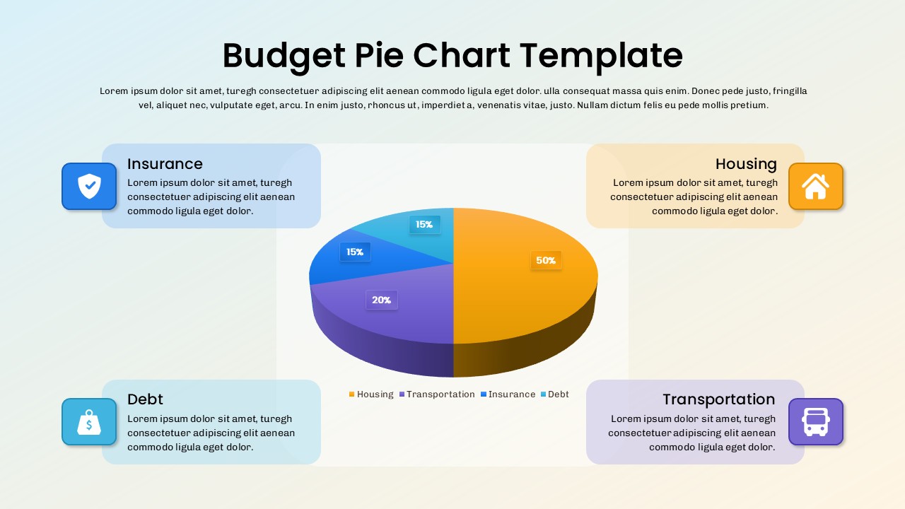
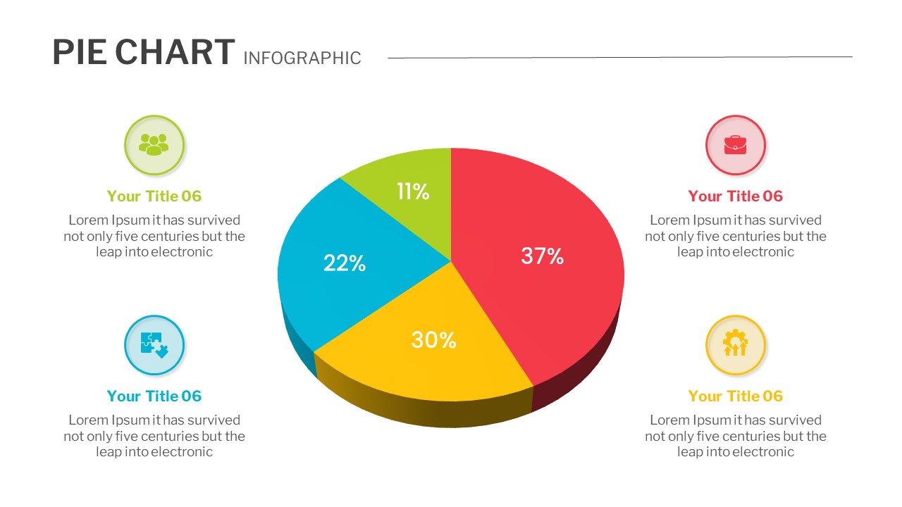
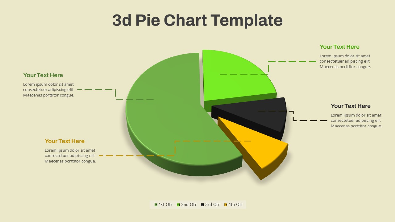
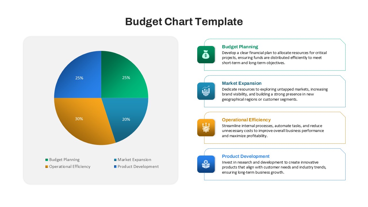
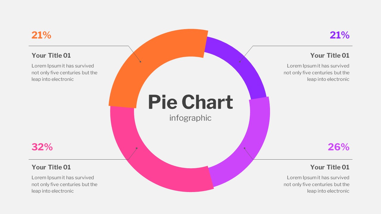
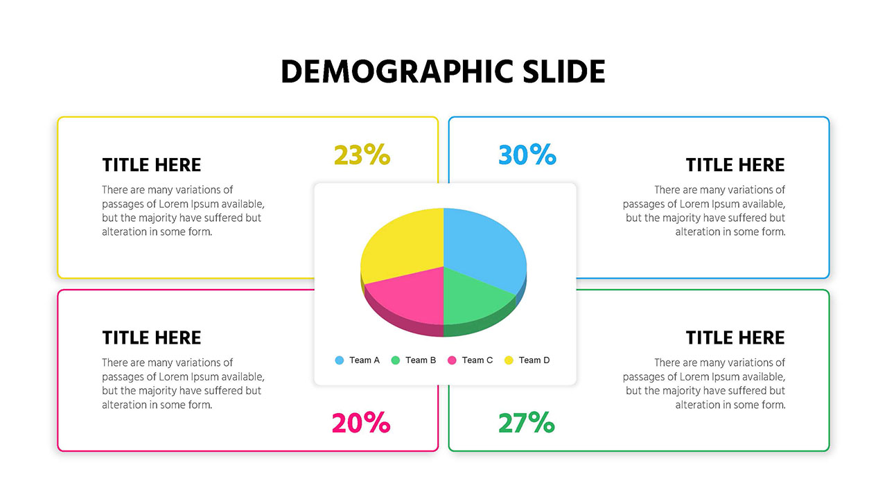
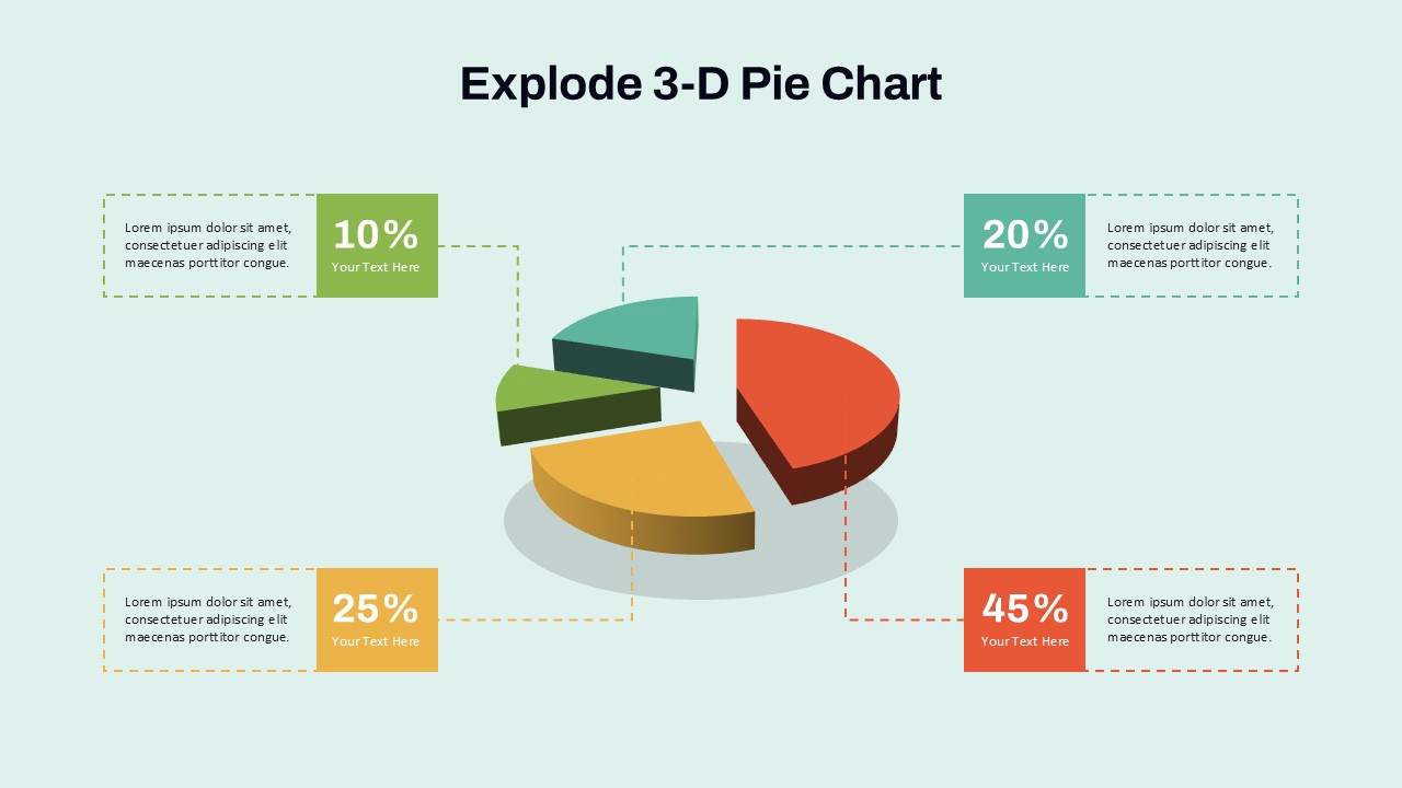
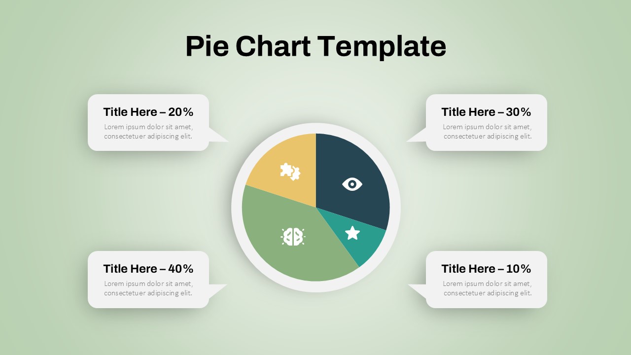
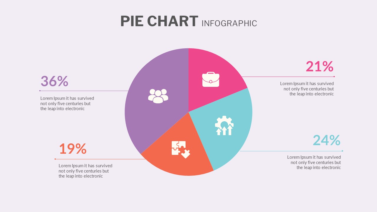
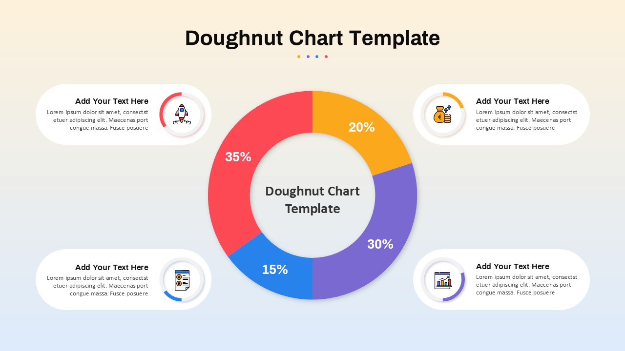
This 3D Budget Pie Chart slide provides a vibrant and visually intuitive breakdown of financial allocations across key spending categories. At the center, a 3D pie chart highlights the percentage distribution of a sample budget: Housing (50%), Transportation (20%), Insurance (15%), and Debt (15%). Each segment is clearly color-coded—orange for housing, purple for transportation, blue for insurance, and light blue for debt—ensuring instant recognition and comparison.
Supporting the chart, each category is paired with an icon-anchored text box that offers additional context, making the design ideal for financial reports, budget presentations, or educational content. The layout balances data visualization and explanatory content without clutter, set against a smooth gradient background that adds depth without distraction.
Optimized for both PowerPoint and Google Slides, this template is fully editable. Users can easily adjust category labels, values, or colors to reflect specific financial scenarios. Its professional yet friendly design ensures credibility while maintaining viewer engagement, making it a versatile asset for a variety of audiences.
See more

Aspect Ratio
16:9Item ID
SKT04154
Features of this template
Other Uses
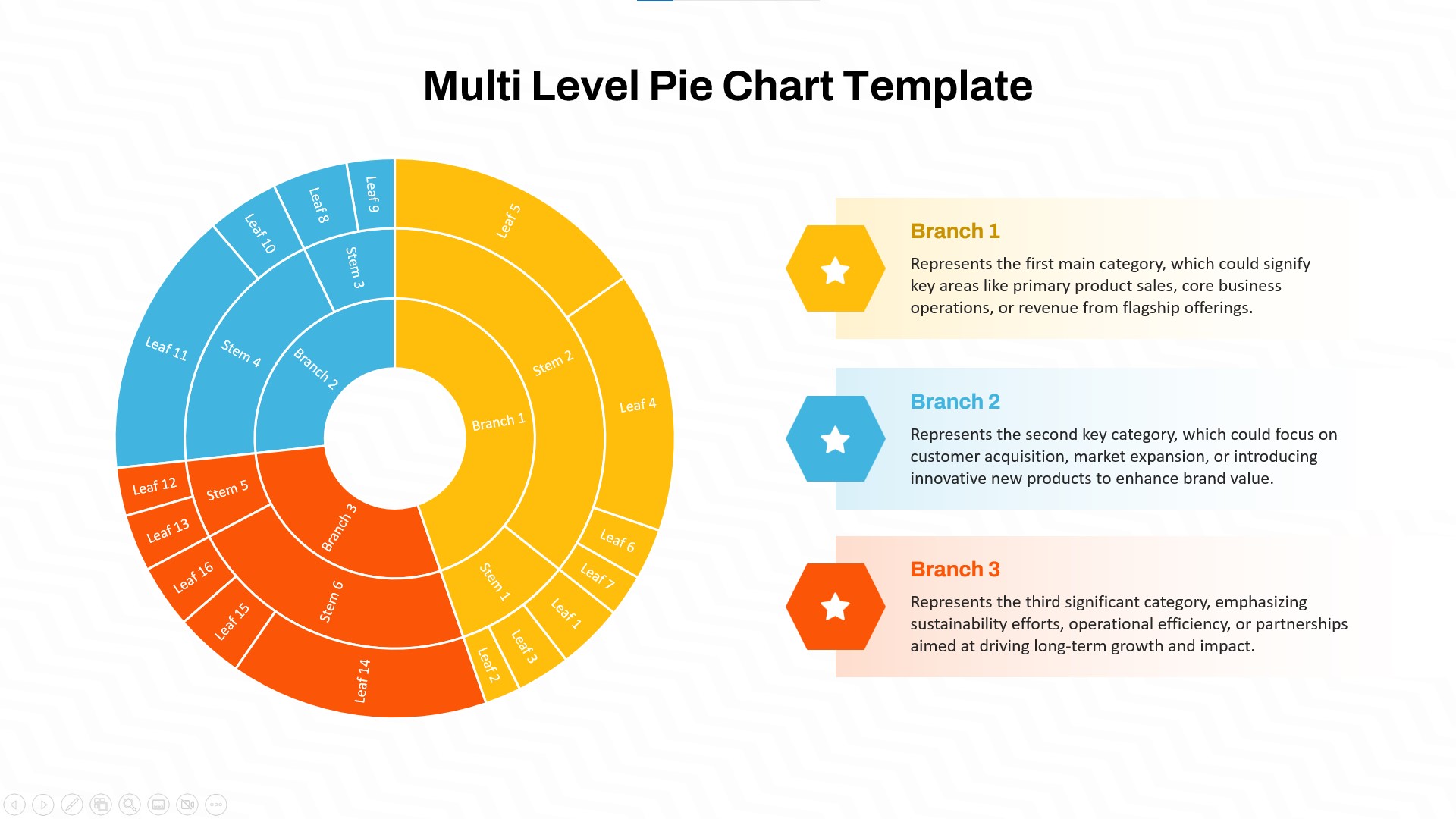
Beyond budgeting, the slide can be repurposed to show sales distribution, marketing spend, departmental resource allocation, or any scenario requiring percentage-based visual comparisons. Suitable for workshops, dashboards, planning meetings, and student presentations.
FAQs
You May Also Like These Presentation Templates

- Free


- Free
- Free
- Free
- Free

- Free