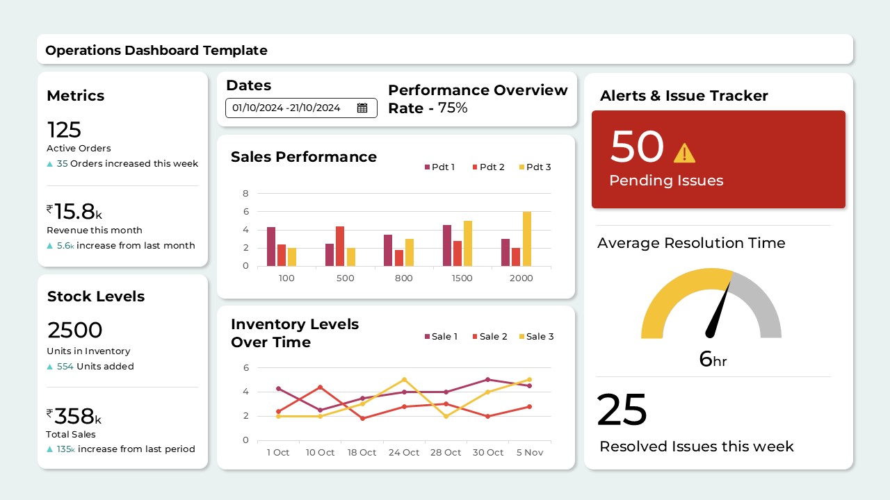
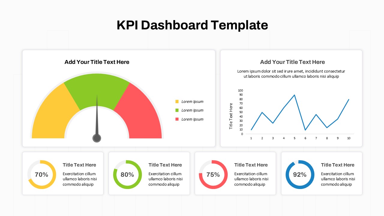
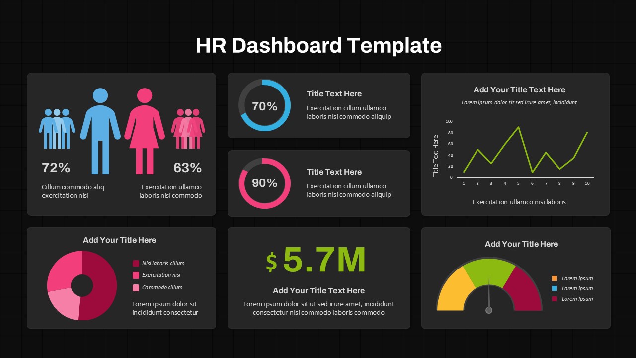
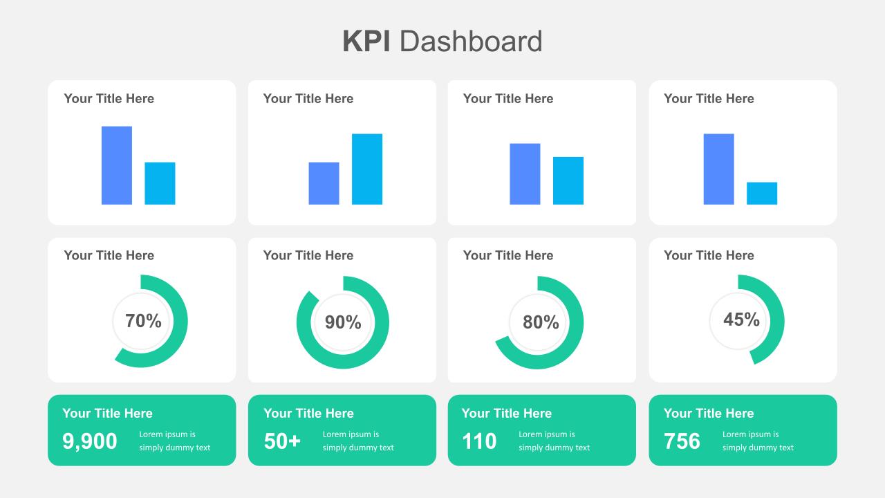
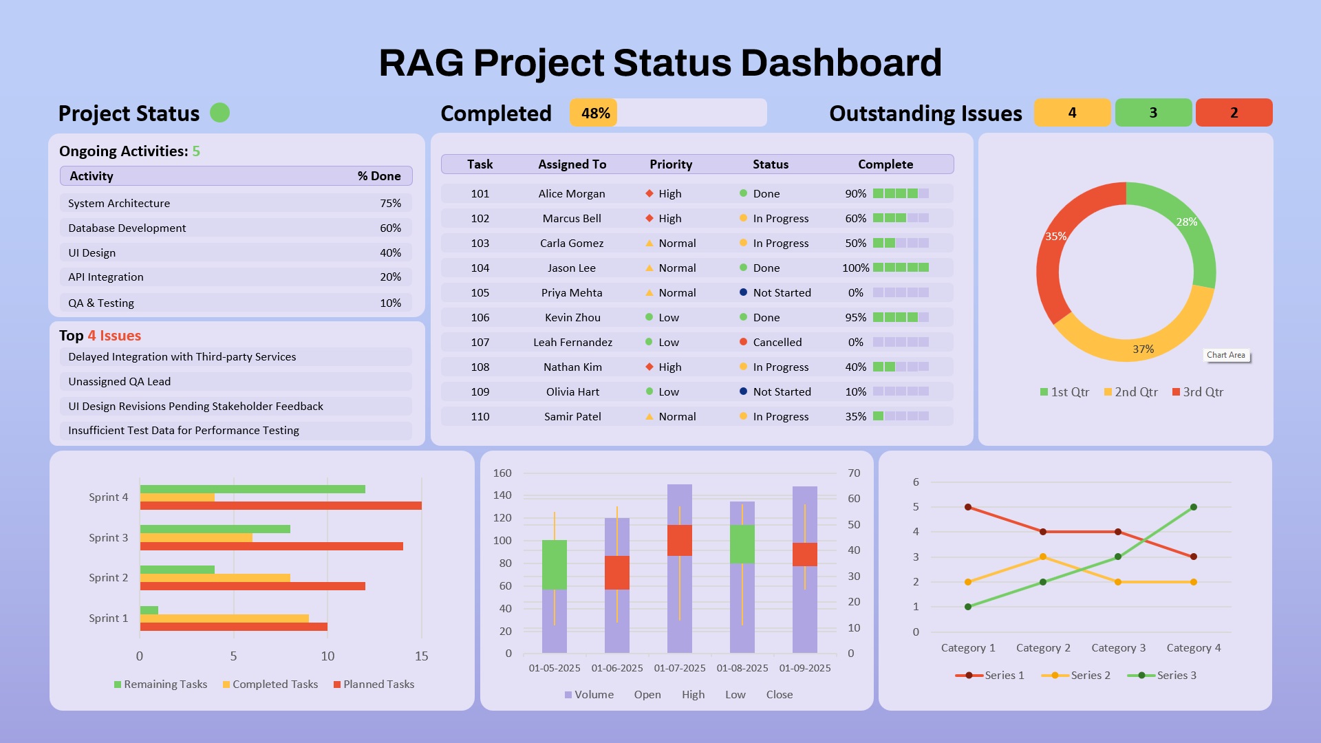
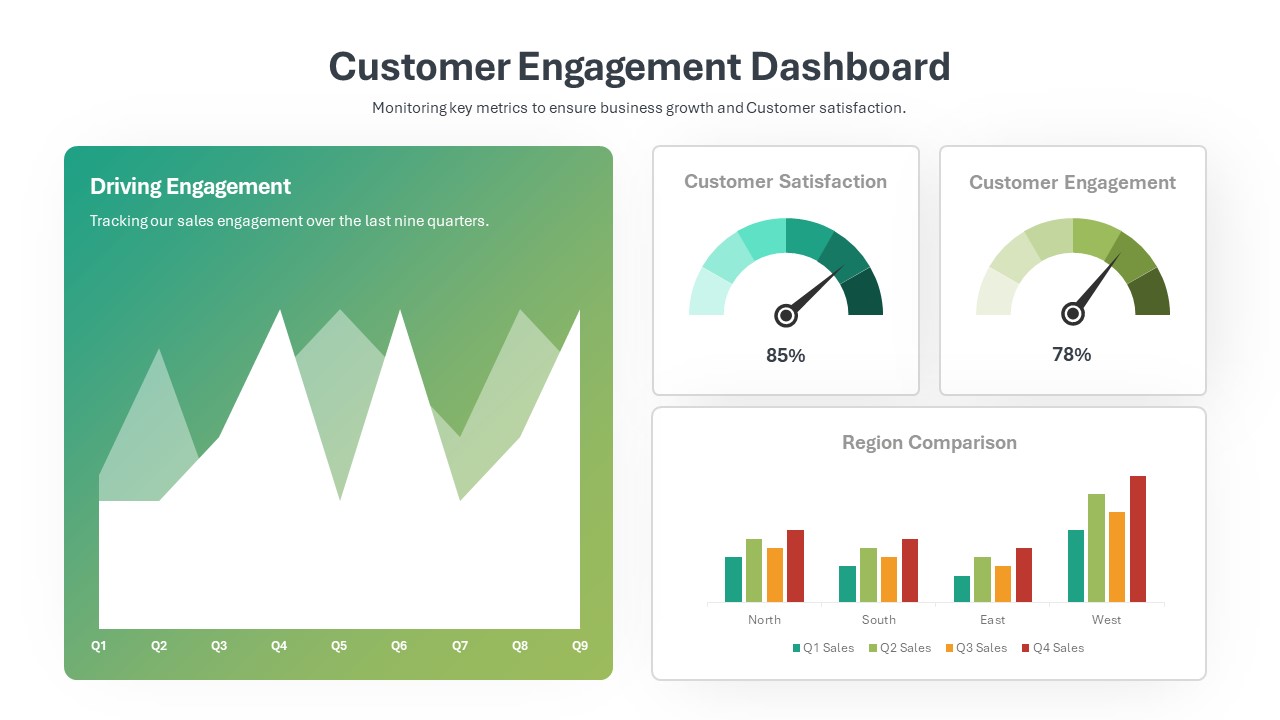
Safety KPI Dashboard Template for PowerPoint & Google Slides
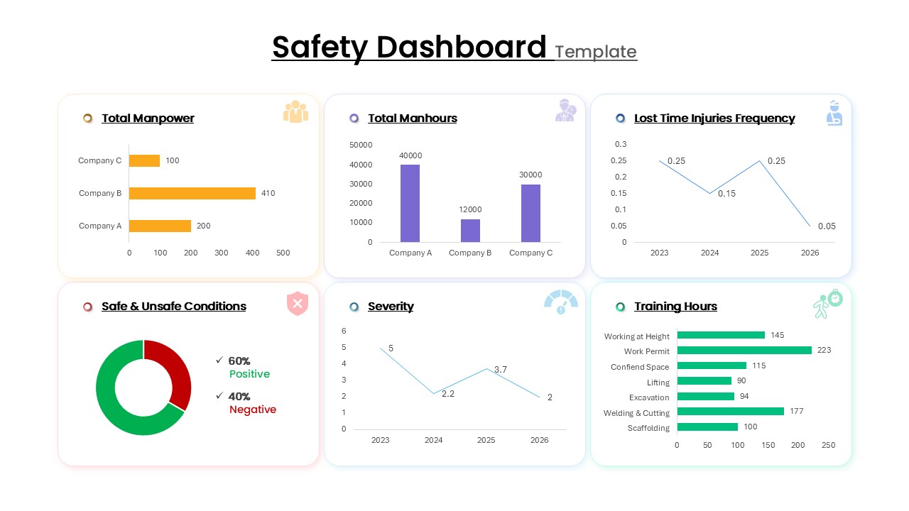
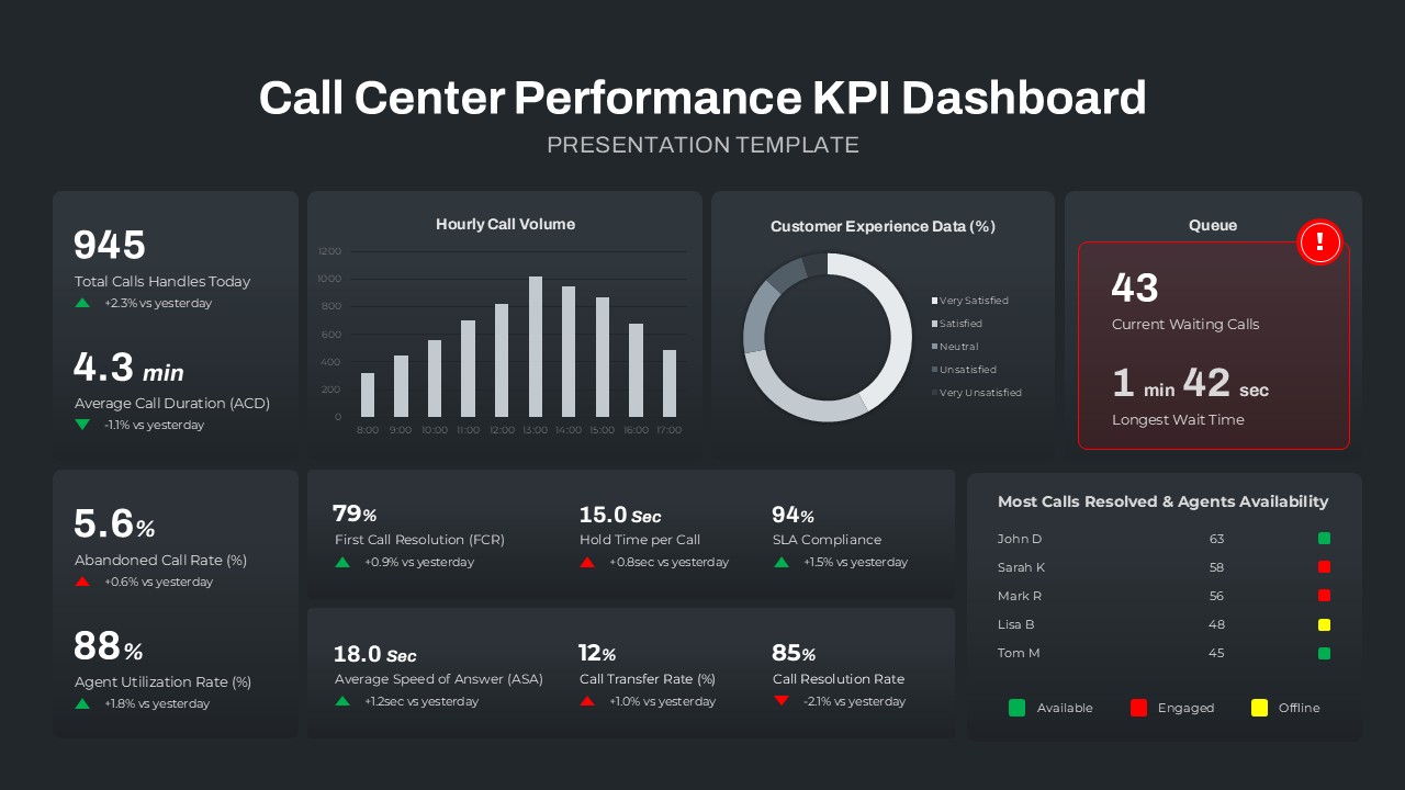
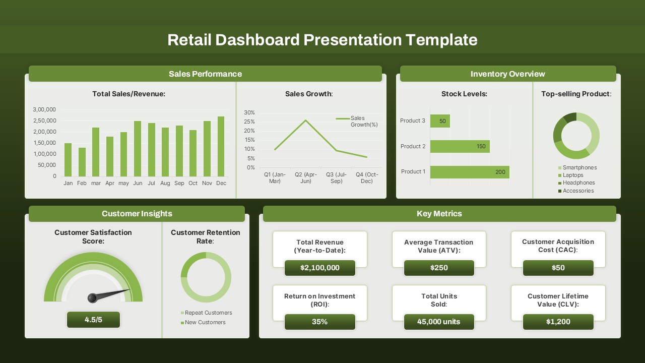
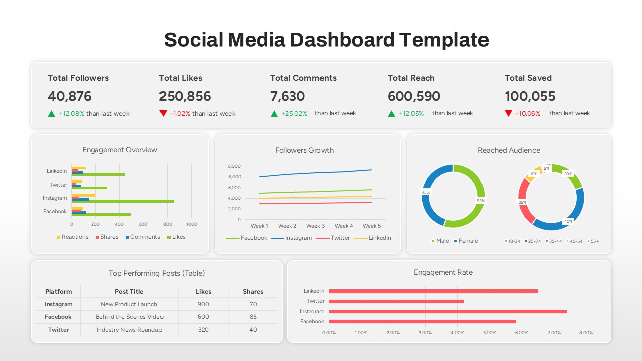
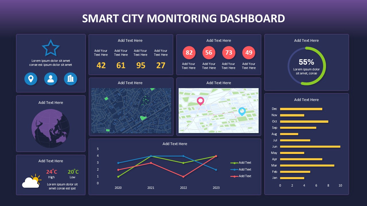
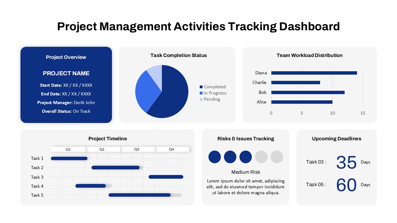
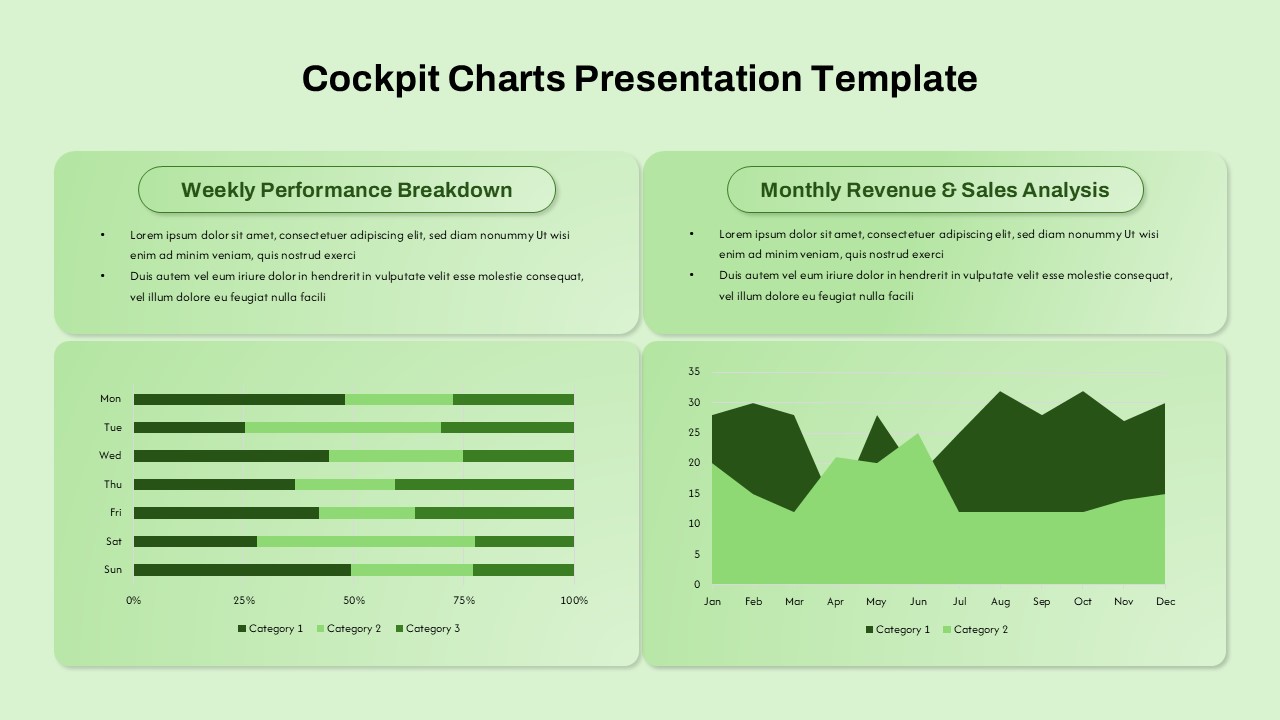
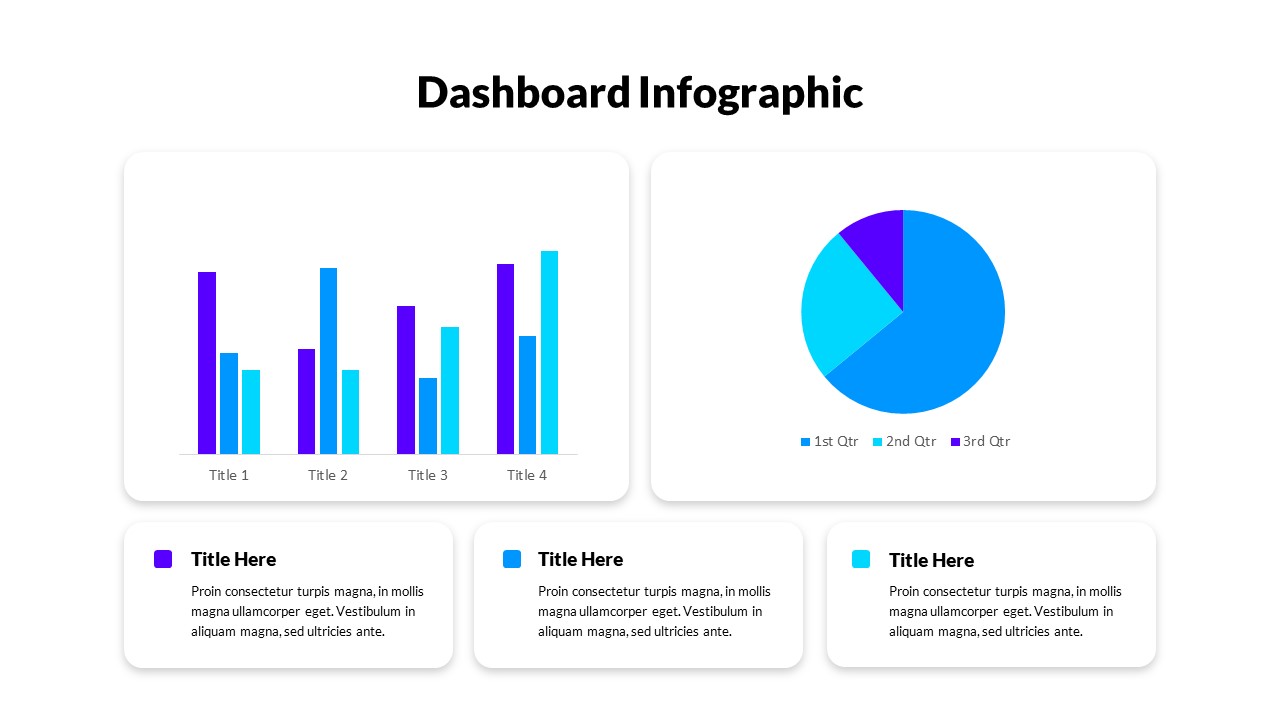
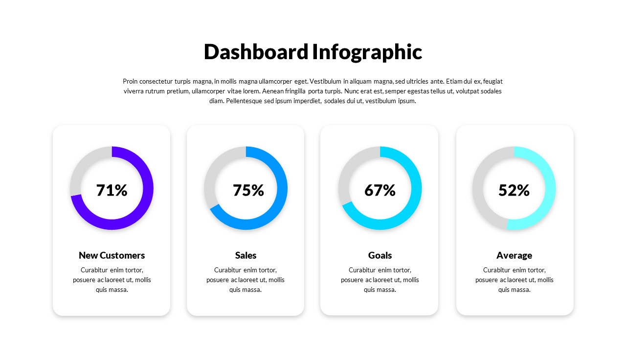
Present safety performance metrics with clarity using this comprehensive Safety KPI Dashboard Template. This multi-panel layout consolidates critical safety indicators such as Total Manpower, Total Manhours, Lost Time Injuries Frequency, Safe & Unsafe Conditions, Severity, and Training Hours—all in one cohesive view. Each metric is visually distinguished using bar charts, line graphs, and donut charts, enabling users to easily assess trends, identify gaps, and monitor compliance.
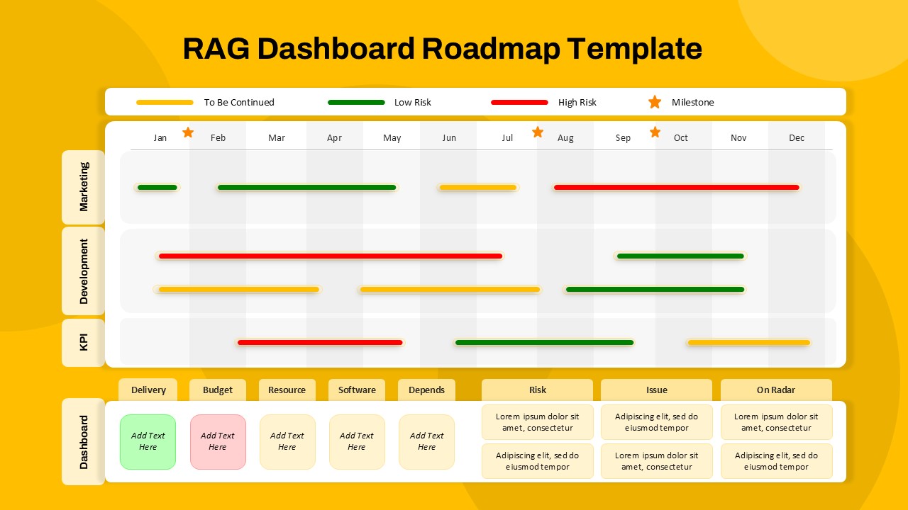
The slide adopts a modular card-based design, where each widget is clearly labeled and icon-enhanced for intuitive navigation. The pastel color scheme with highlights of green, red, yellow, and purple ensures visual contrast without overwhelming the viewer. Perfectly aligned for performance reviews, safety audits, and management briefings, this dashboard facilitates real-time reporting and decision-making.
Optimized for both PowerPoint and Google Slides, the template offers full editability—allowing users to update figures, swap charts, and adjust labels to reflect current data. It’s a valuable tool for EHS teams, safety officers, and operations managers aiming to reinforce workplace safety culture and track compliance benchmarks over time.
See more

Aspect Ratio
16:9Item ID
SKT04112
Features of this template
Other Uses
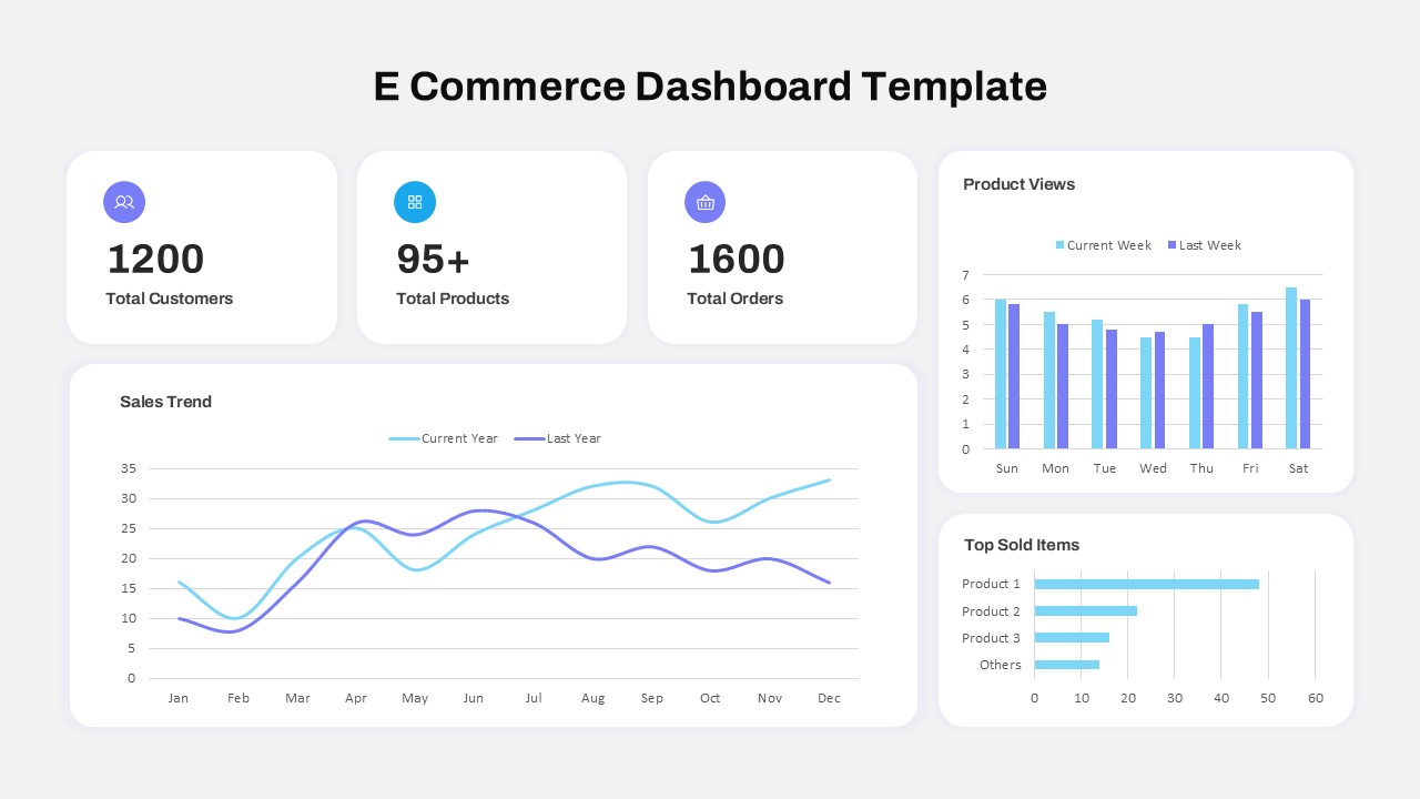
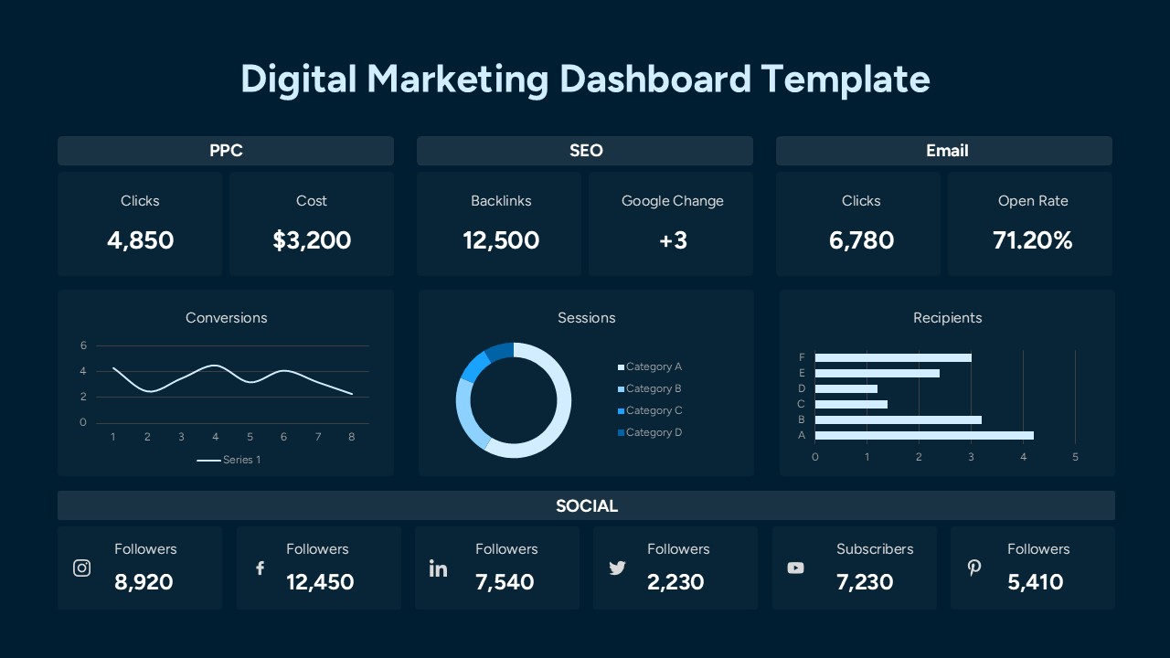
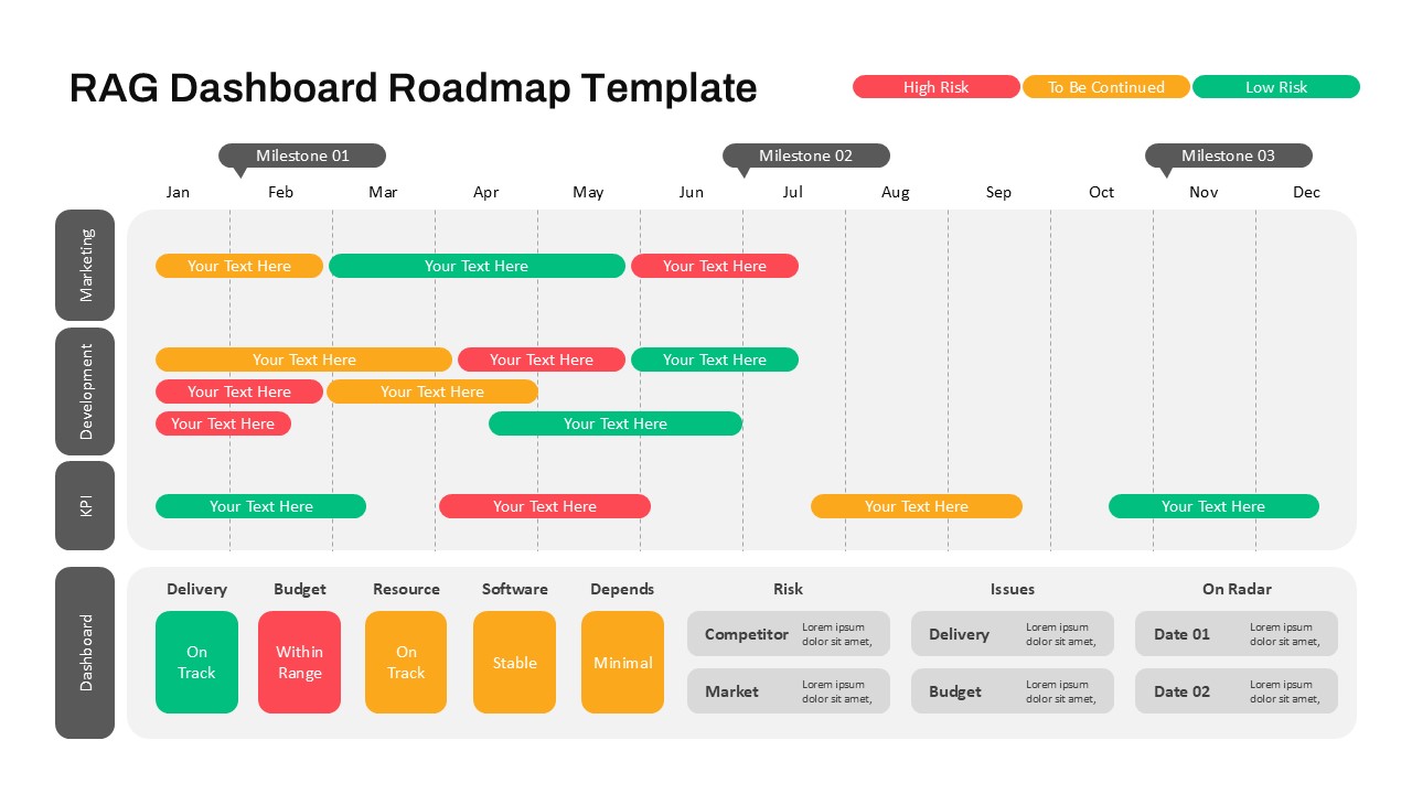
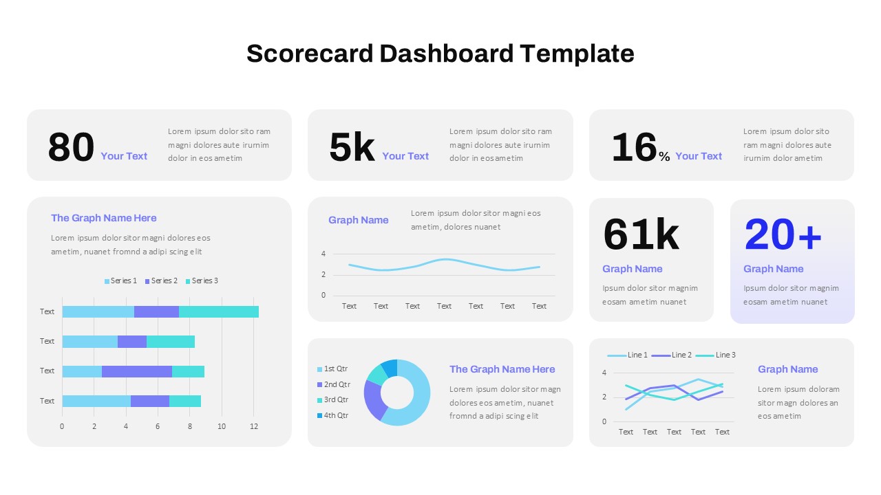
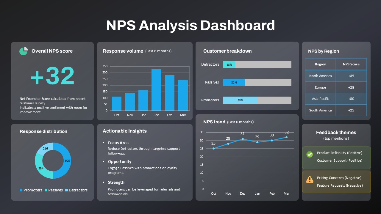
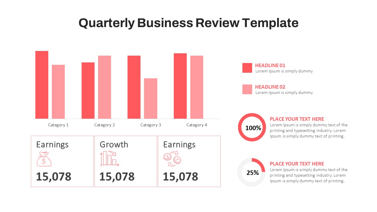
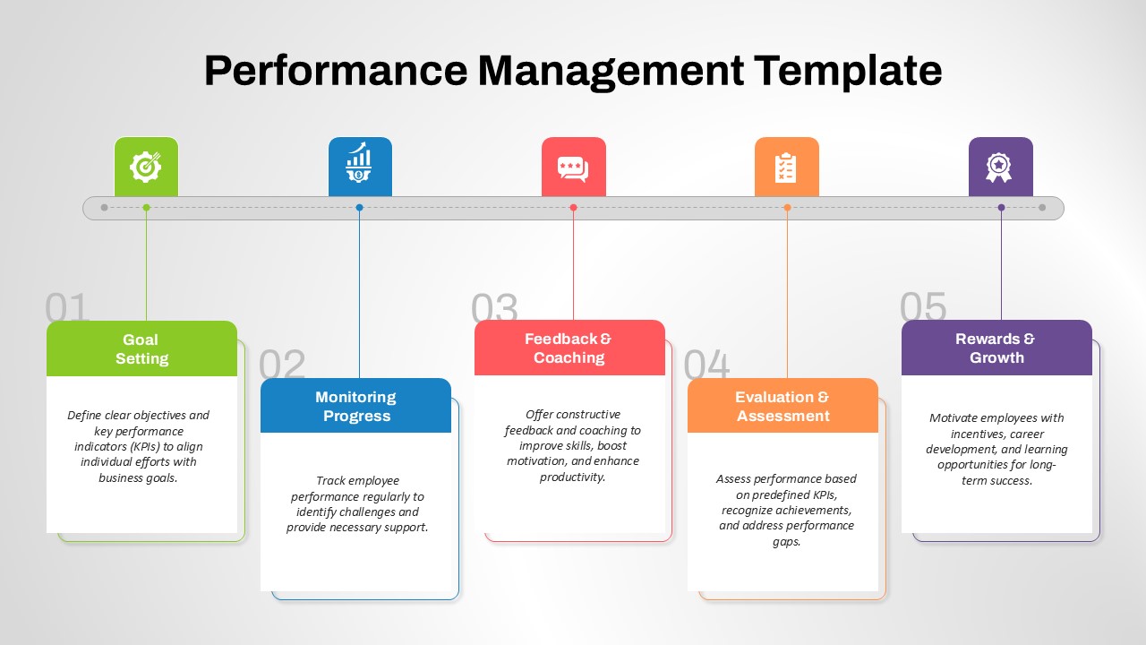
Besides safety KPIs, this dashboard structure can be adapted for employee engagement metrics, HR analytics, or operational performance overviews. Replace chart labels to track project milestones, resource allocation, or quality control data across departments.
FAQs
You May Also Like These Presentation Templates

- Free
- Free
- Free


- Free
- Free
- Free