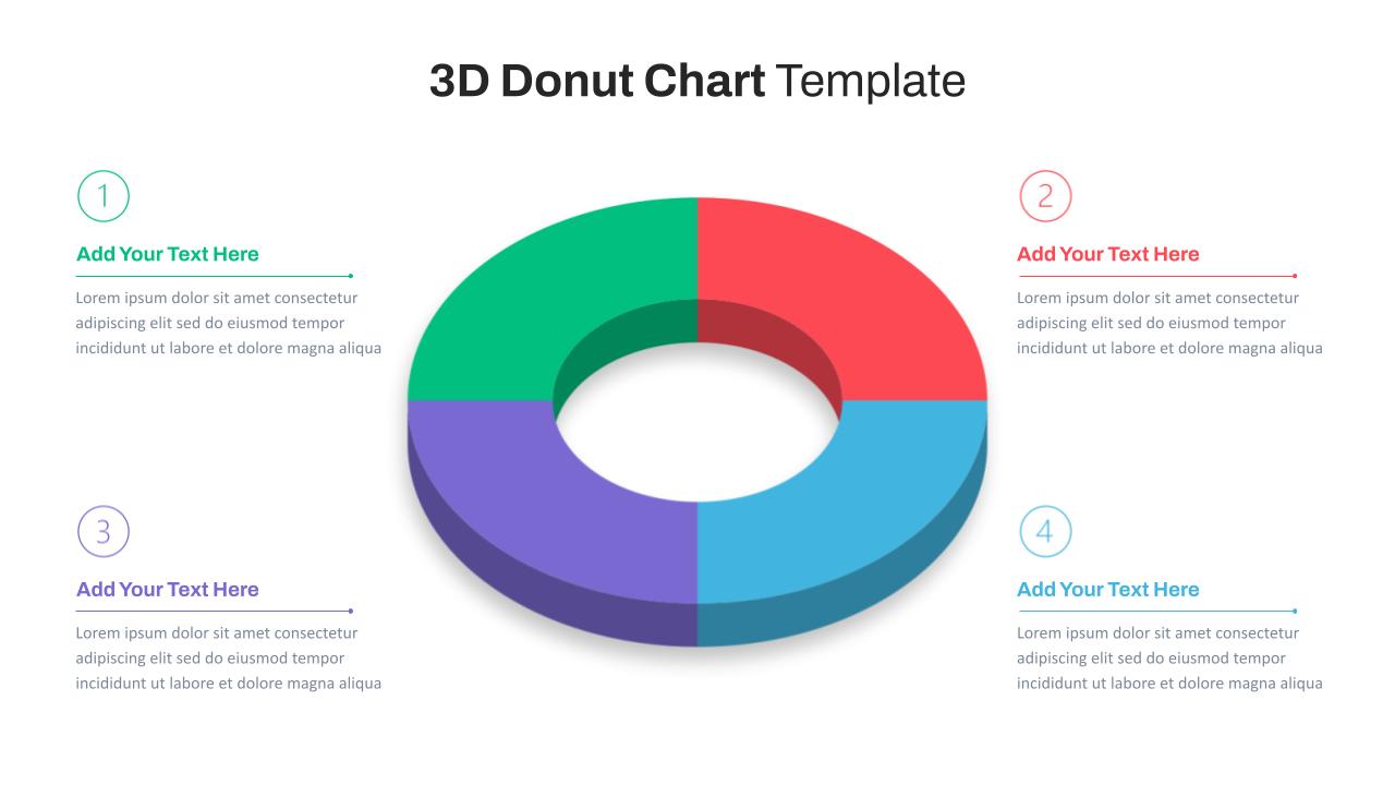
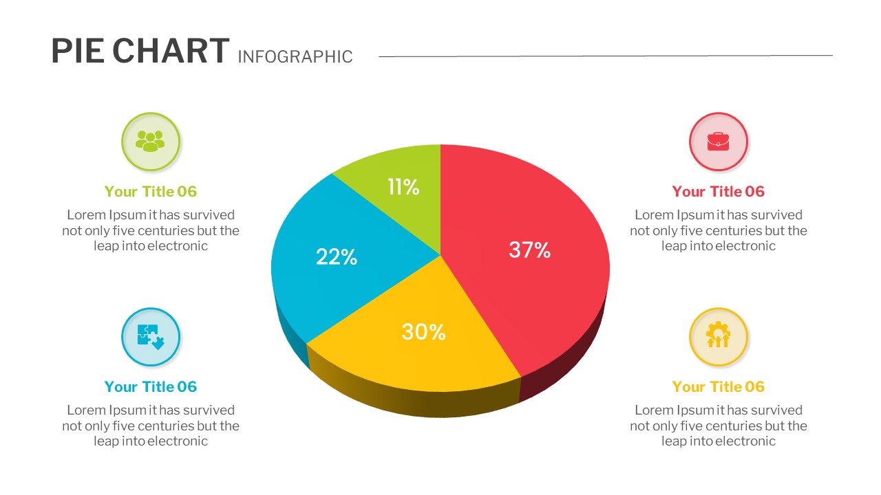
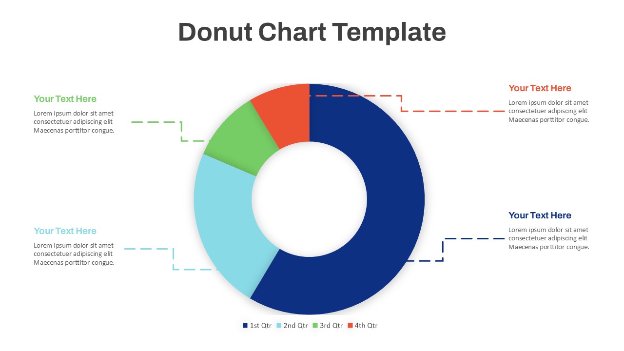
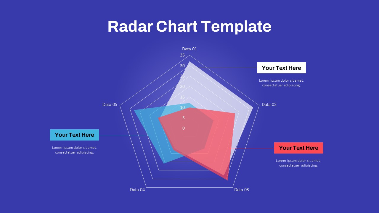
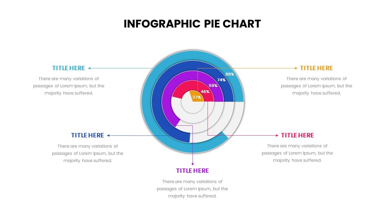
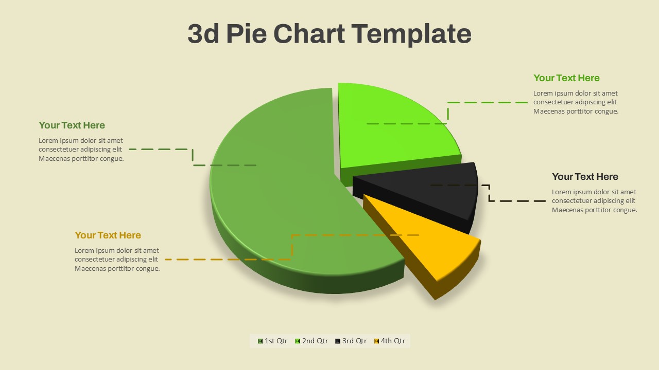
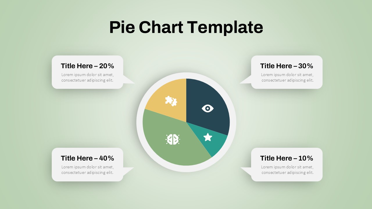
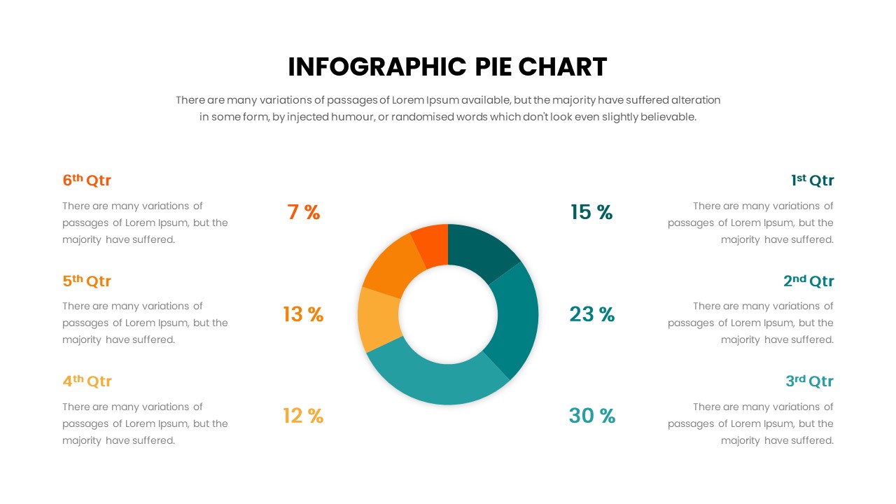
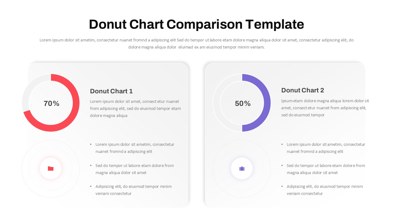
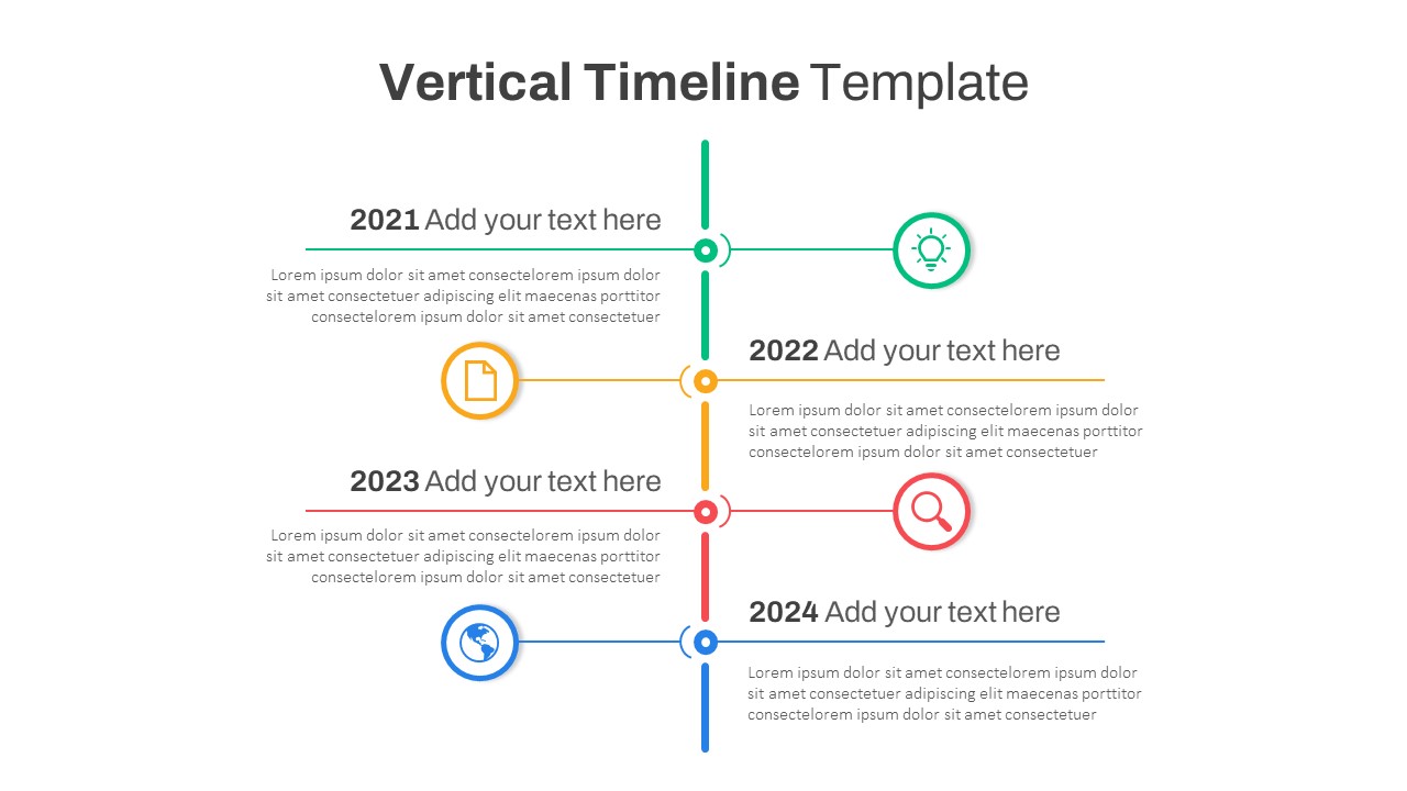
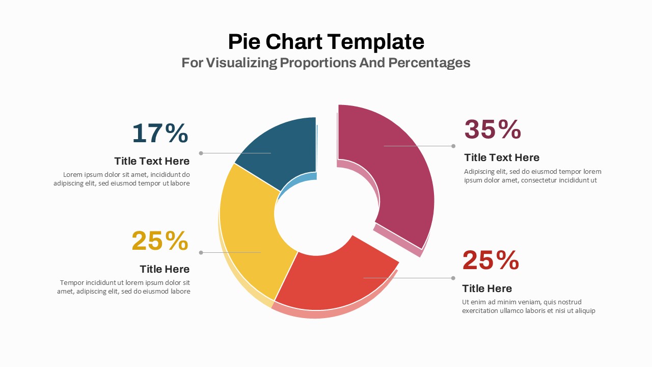
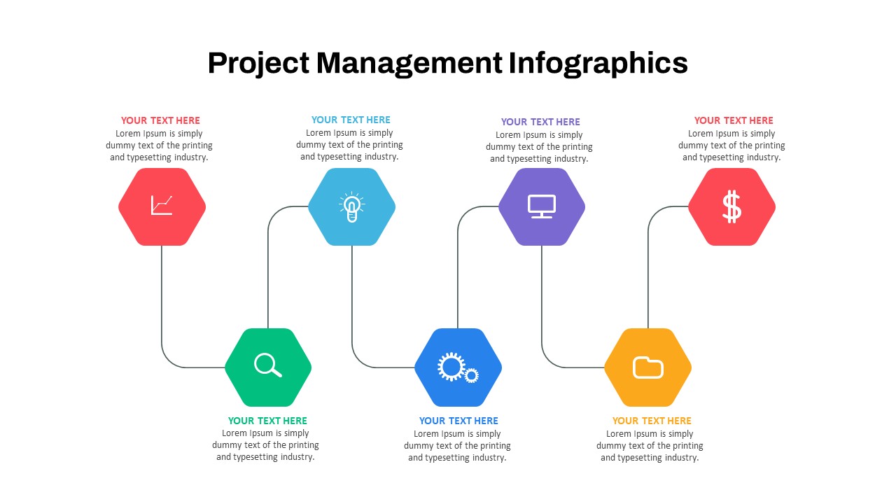
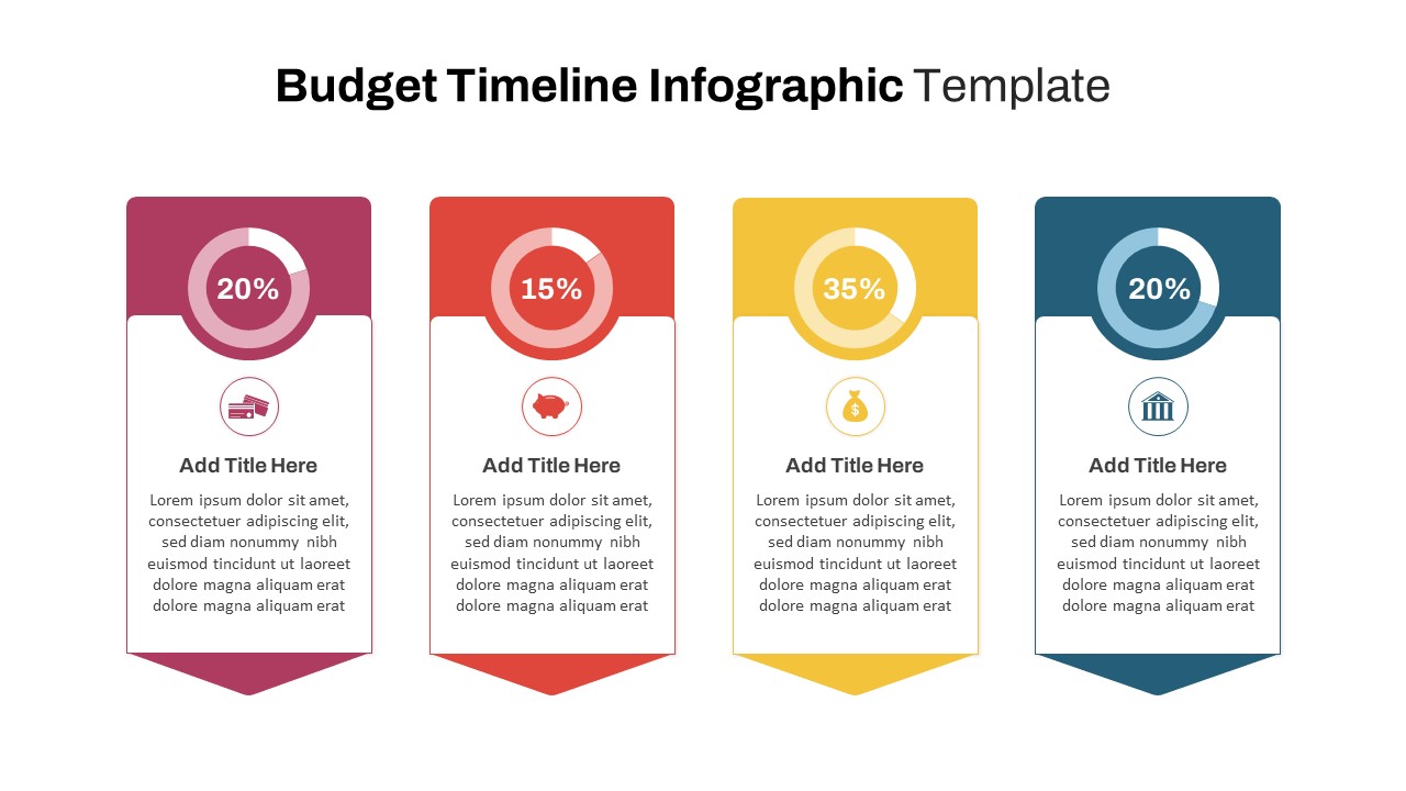
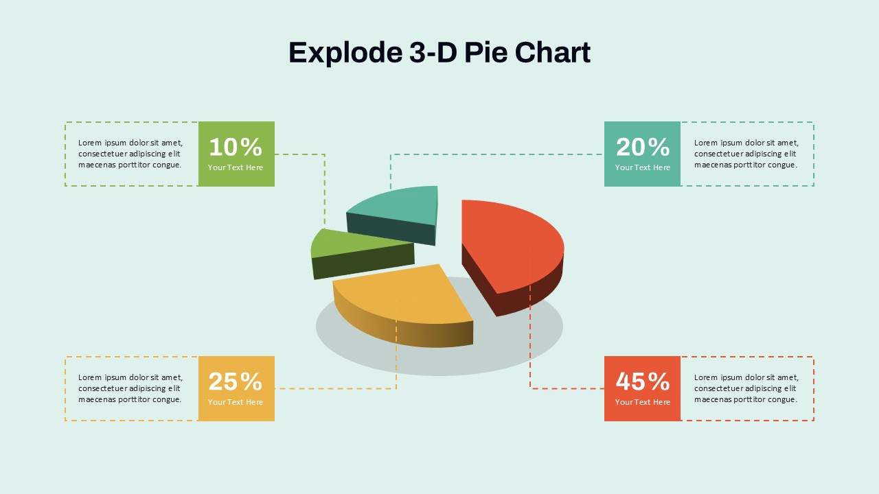
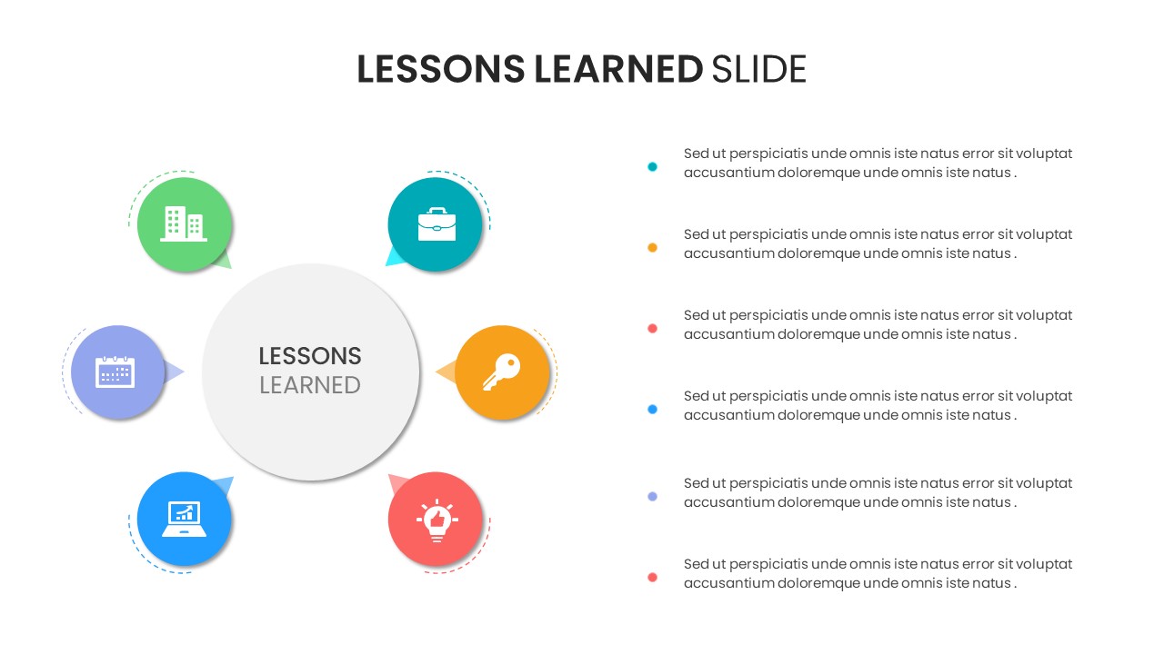
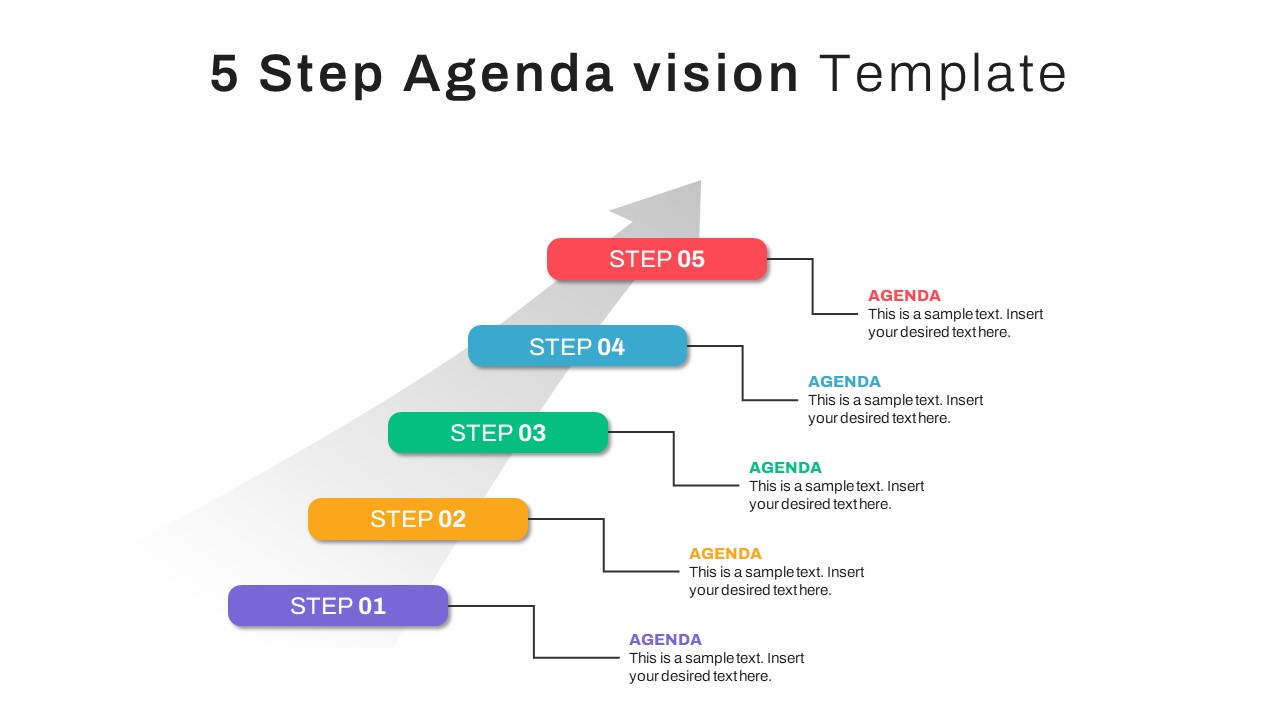
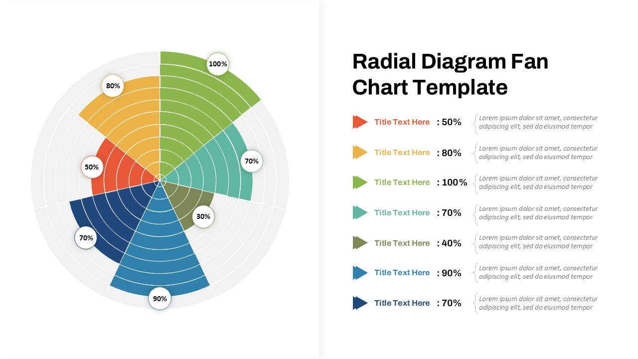
Colorful Doughnut Chart with Icons for PowerPoint & Google Slides
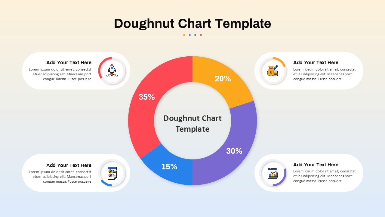
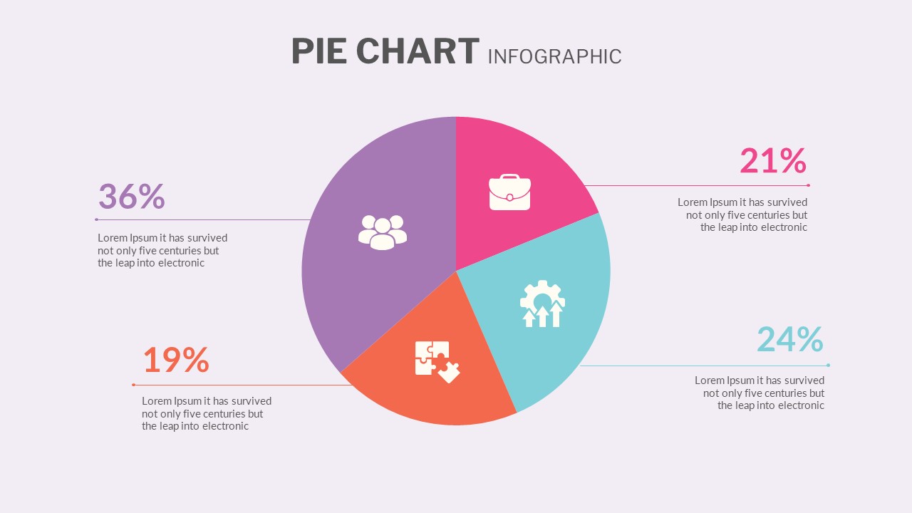
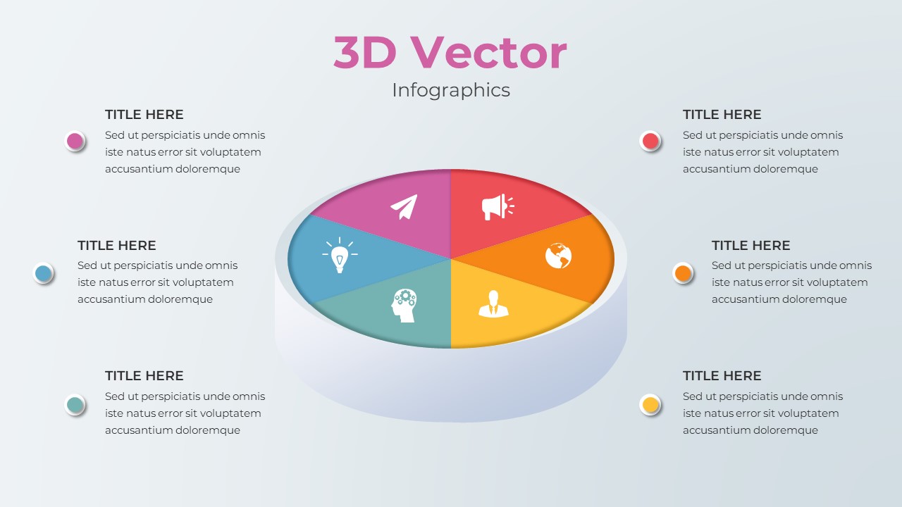
This vibrant doughnut chart slide offers a visually engaging way to present segmented data with four distinct categories: 35%, 30%, 20%, and 15%. Each segment is color-coded—red, purple, yellow, and blue—for instant differentiation, and is paired with matching circular icons and text boxes placed strategically around the chart. This layout draws the viewer’s eye naturally from the center outward, promoting clarity and intuitive data storytelling.
At the center of the doughnut, a placeholder title reinforces the chart’s purpose, while each quadrant connects to a rounded rectangular text field with an icon, headline, and description area. The use of playful iconography—such as a rocket, coin purse, and analytics—adds personality and reinforces category relevance without overwhelming the design. A subtle gradient background supports legibility and enhances contrast without distraction.
Ideal for business reports, marketing plans, or financial breakdowns, this fully editable template works seamlessly in both PowerPoint and Google Slides. Users can quickly adjust values, colors, icons, or text to match their data and brand aesthetics. It’s perfect for showcasing proportional comparisons, budget allocations, or project distributions.
See more

Aspect Ratio
16:9Item ID
SKT04107
Features of this template
Other Uses
Beyond percentage displays, this doughnut chart can support KPI tracking, customer segmentation, campaign effectiveness, or departmental resource sharing. Replace percentages with qualitative data to illustrate workflow cycles, priorities, or strategic focus areas.
FAQs
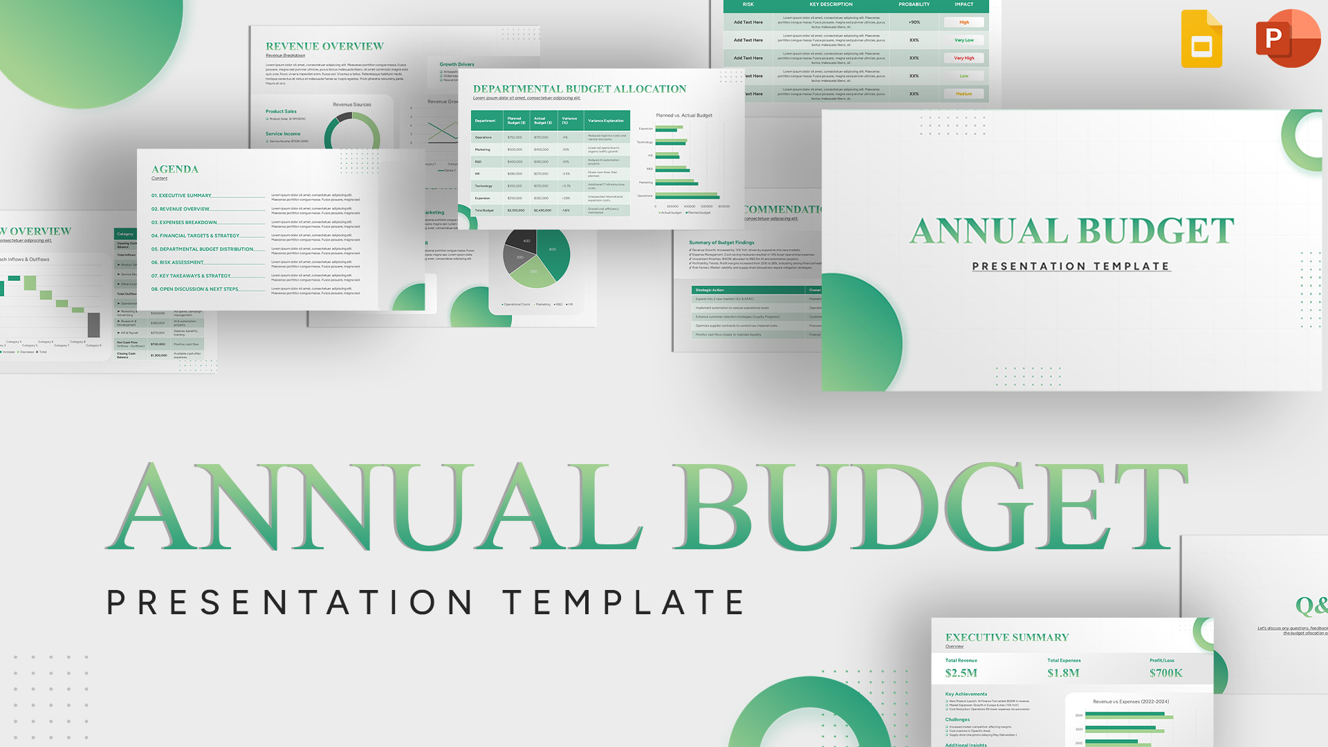
You May Also Like These Presentation Templates


- Free
- Free


- Free
- Free
- Free
- Free
- Free
- Free
- Free
- Free
- Free