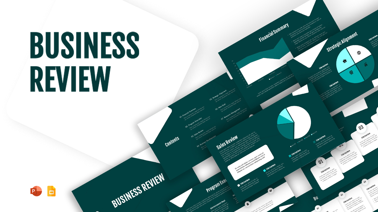
Global Sales Bar Chart Template for PowerPoint & Google Slides
Present regional performance with clarity using this Global Sales Bar Chart Template, designed for both PowerPoint and Google Slides. This template offers a professional and visually appealing way to showcase sales comparisons across multiple regions and timeframes, making it perfect for business reviews, financial reports, and market analysis.
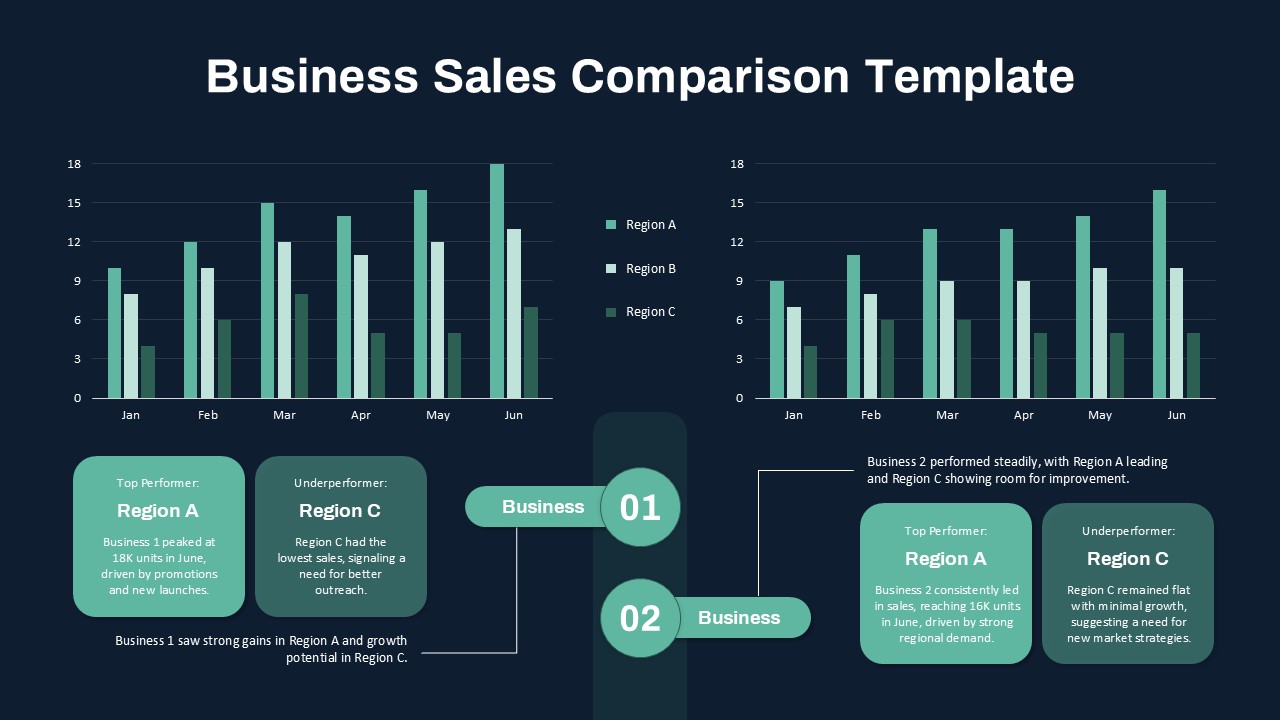
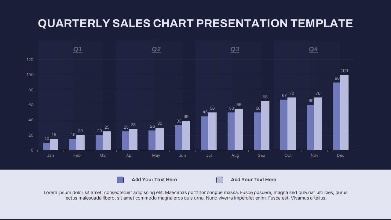
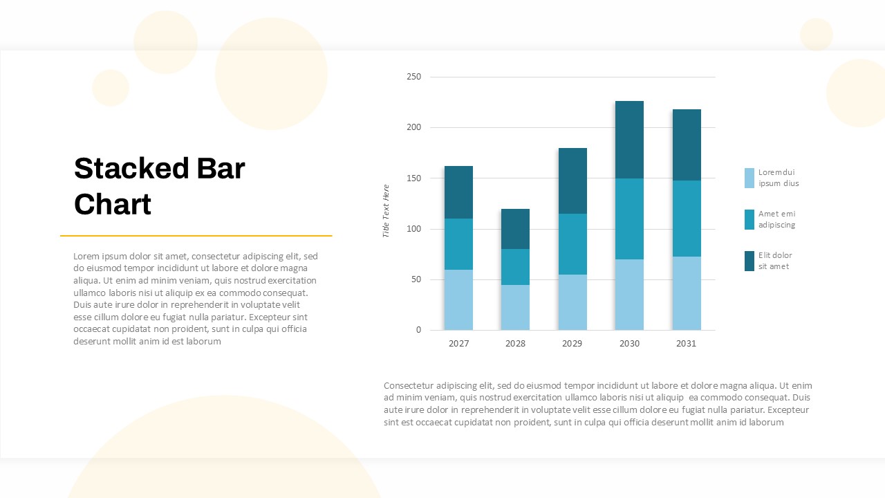
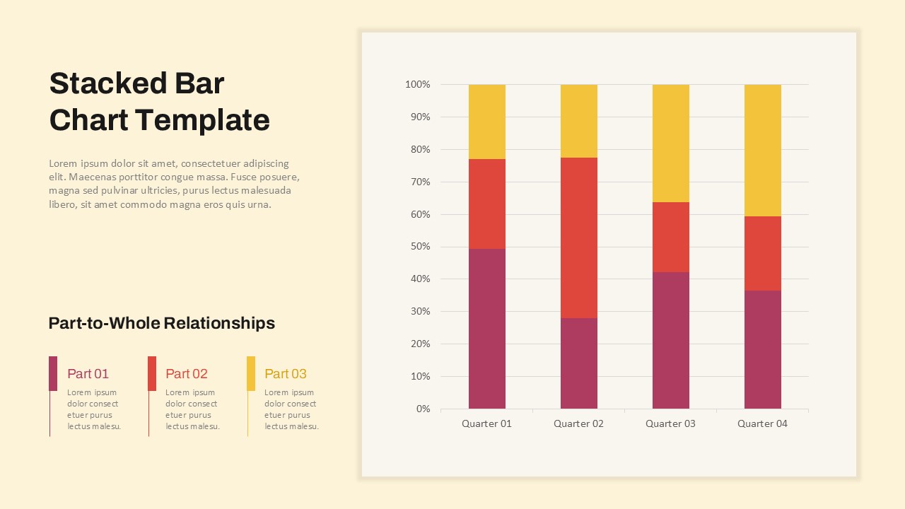
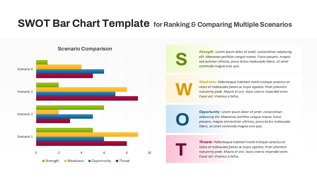
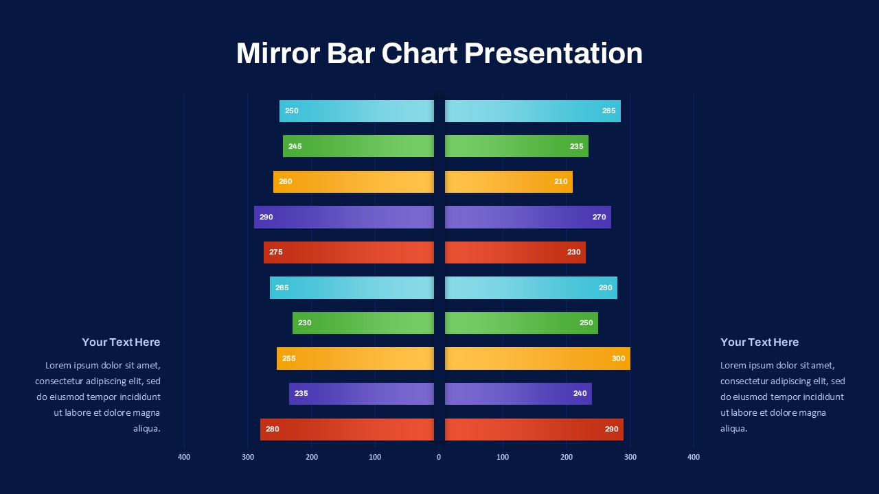
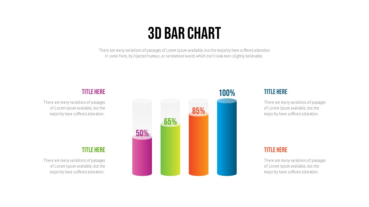
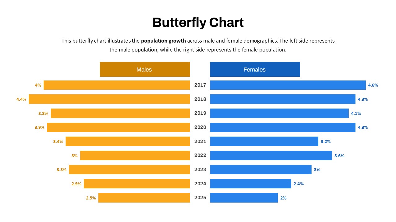
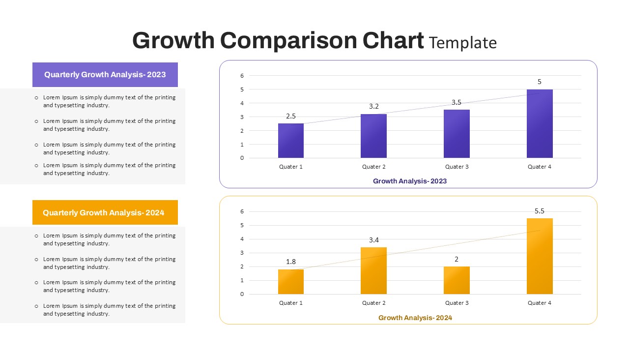
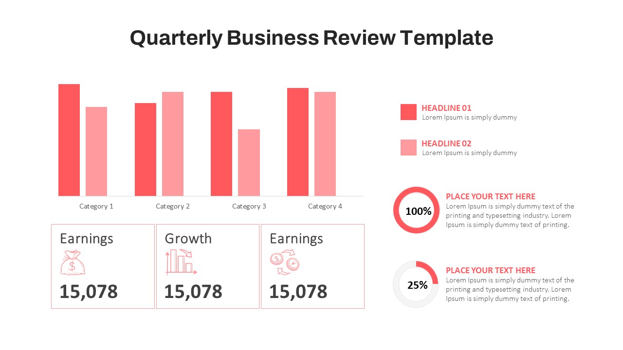
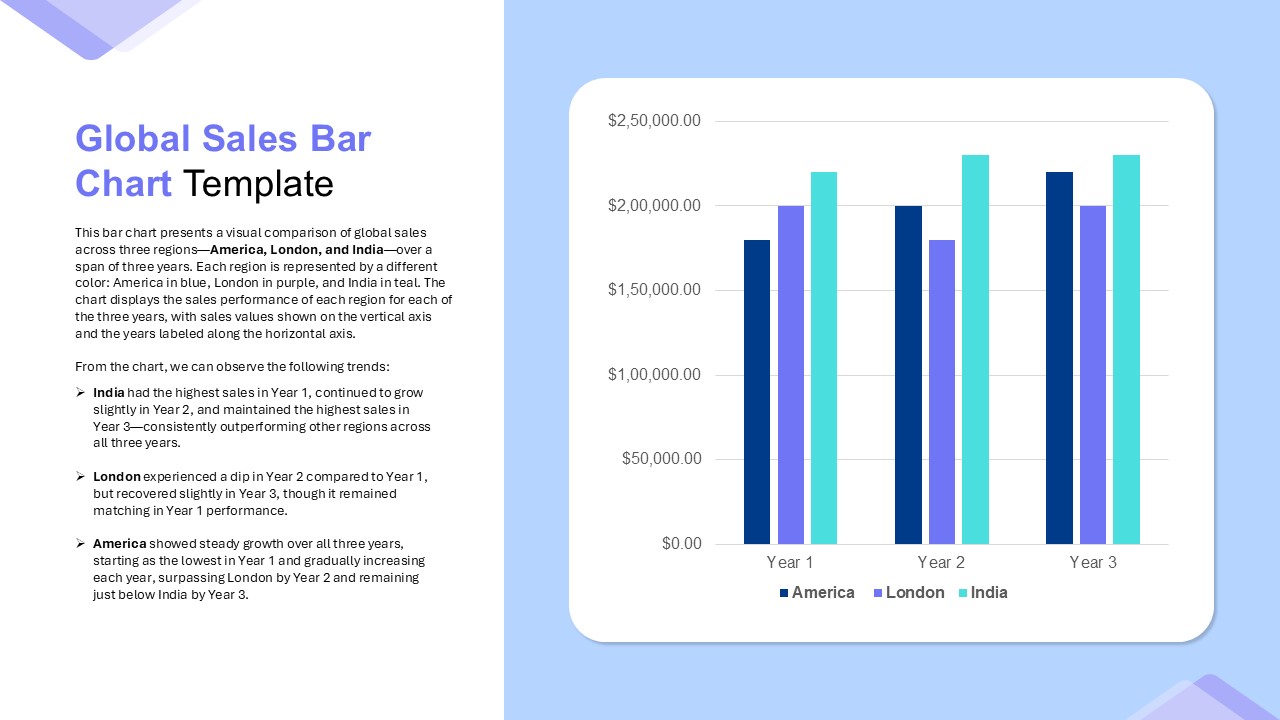
The featured bar chart compares global sales across three regions—America, London, and India—over a span of three years. Each region is color-coded for quick recognition (America in blue, London in purple, and India in teal), allowing audiences to easily identify trends. Alongside the chart, explanatory text highlights key insights, such as India’s consistent leadership in sales performance, America’s steady growth across all years, and London’s dip in Year 2 followed by recovery in Year 3.
This template helps professionals transform raw data into meaningful stories that drive decision-making. The clean design balances data visualization with explanatory notes, ensuring that audiences not only see the numbers but also understand the implications. It is fully editable, enabling users to replace data, adjust colors, and tailor content for any industry or business case.
Ideal for executive meetings, sales reviews, investor updates, and business development strategies, this Global Sales Bar Chart Template makes presenting regional and yearly performance simple, engaging, and impactful.
See more

Aspect Ratio
16:9Item ID
SKT04255
Features of this template
Other User Cases of the Template:
Quarterly sales reports, regional market analysis, investor presentations, financial performance reviews, business growth tracking, corporate strategy updates, revenue forecasting, global business comparisons.
FAQs
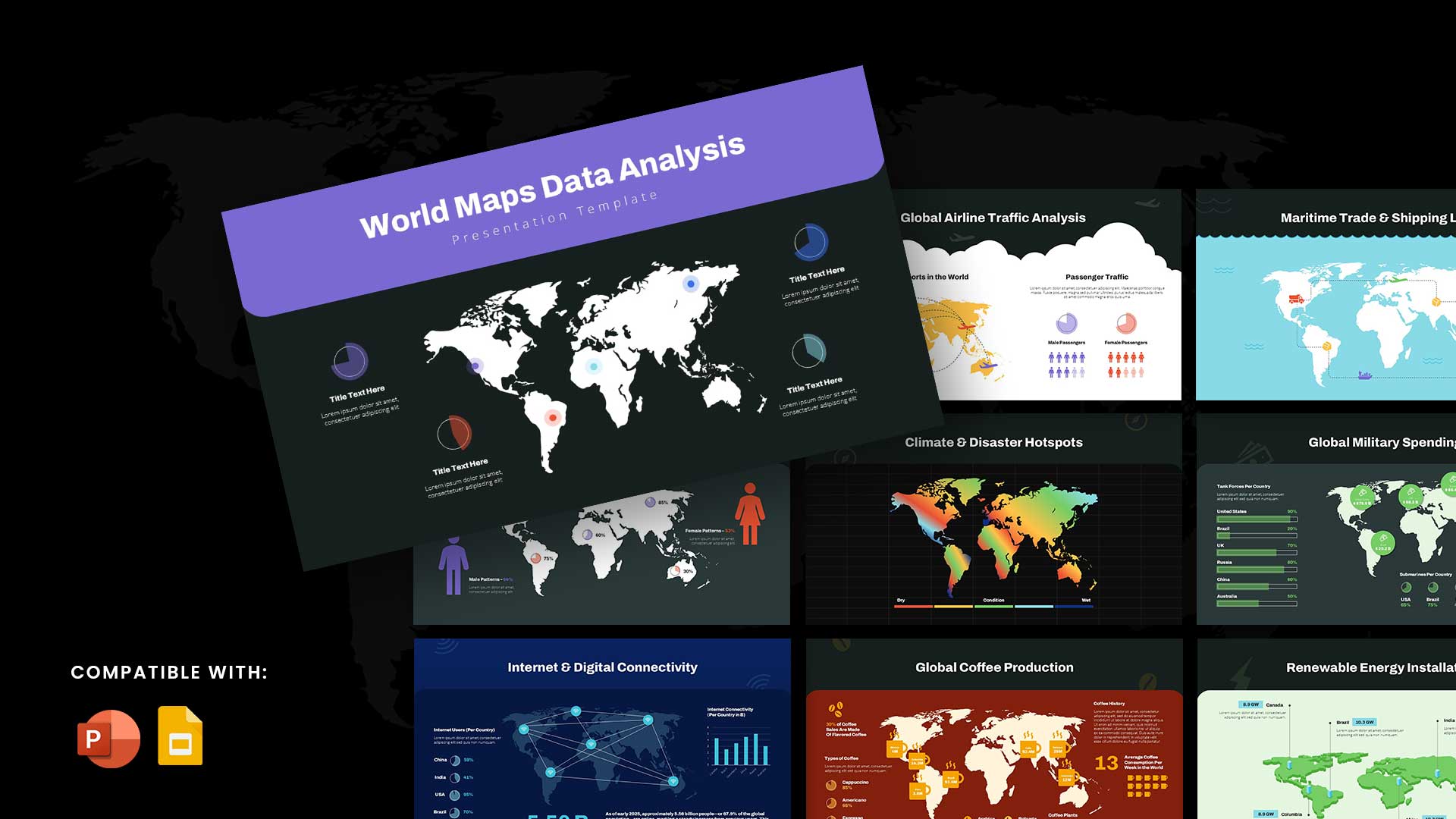
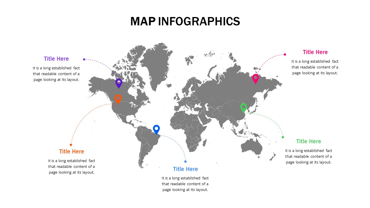
You May Also Like These Presentation Templates


- Free

- Free
- Free
- Free
- Free

- Free
- Free