Company Finance Data Charts PowerPoint & Google Slides Template
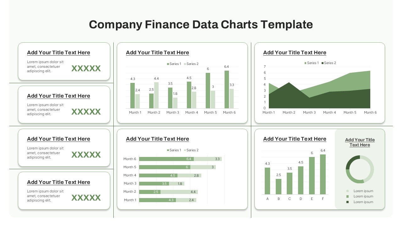
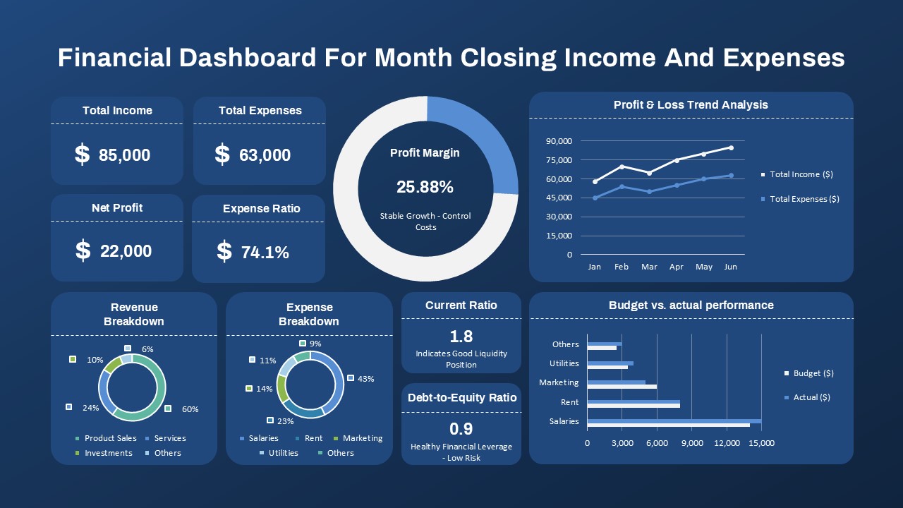
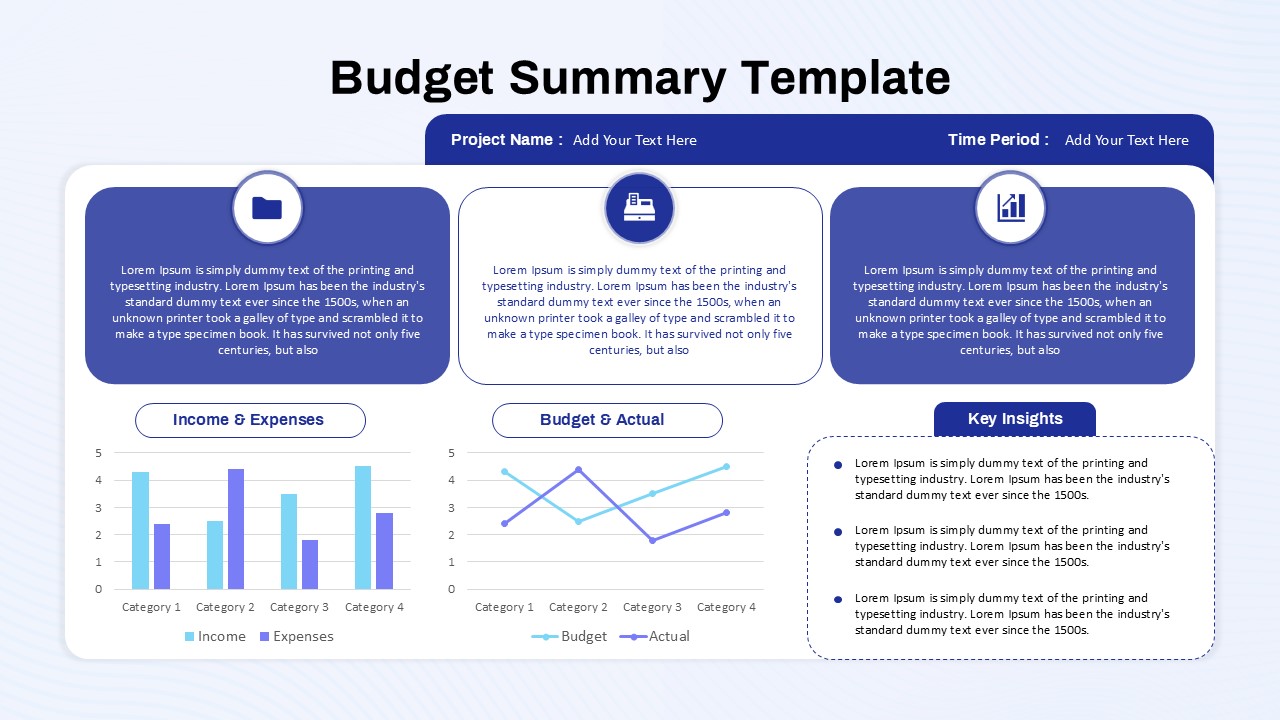
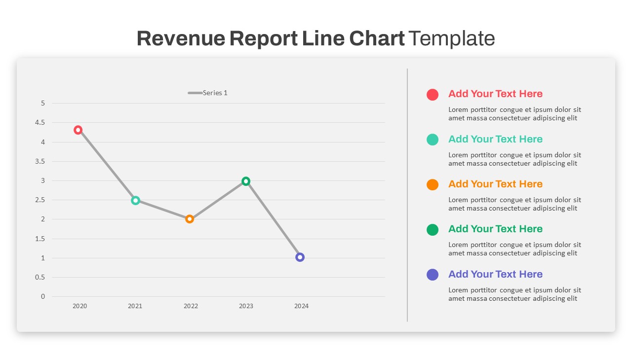
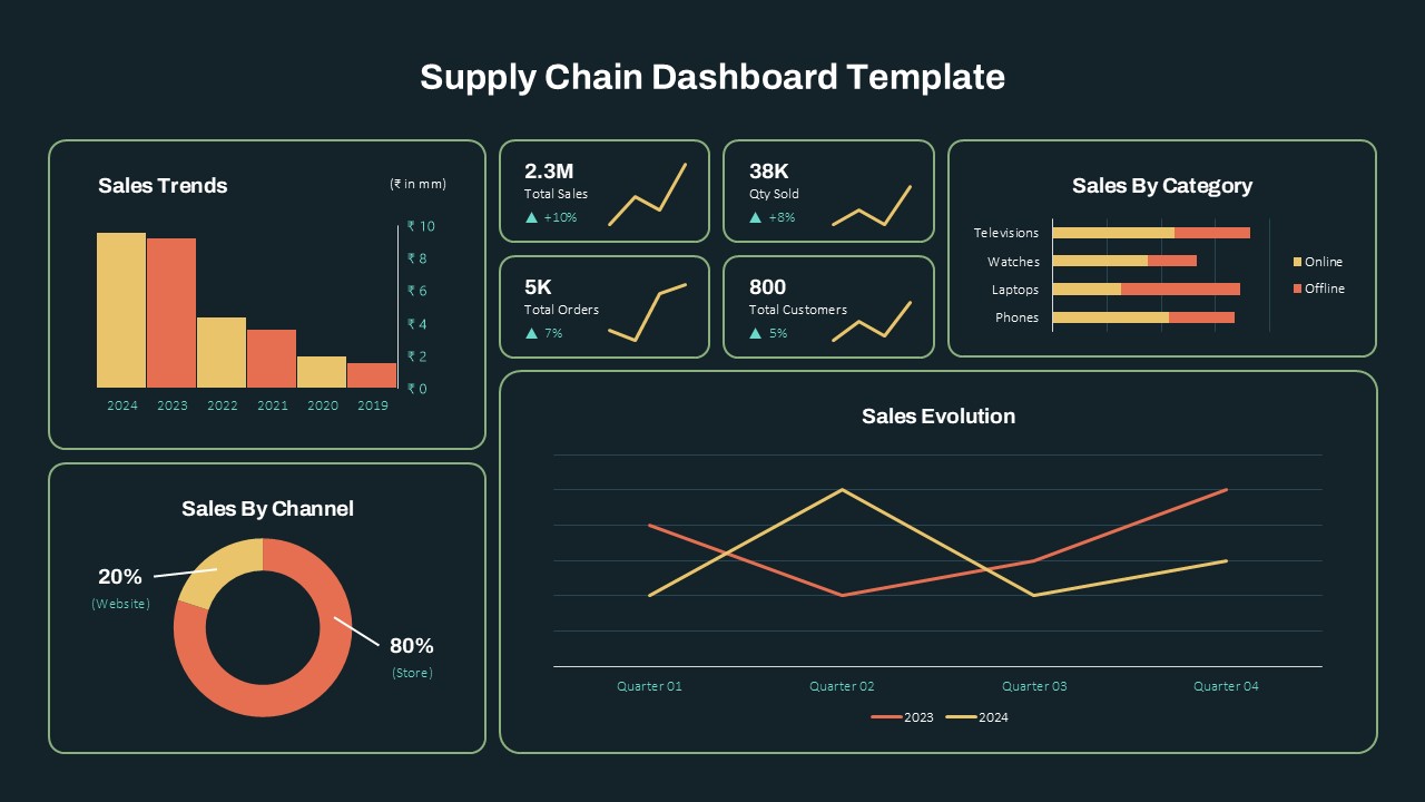
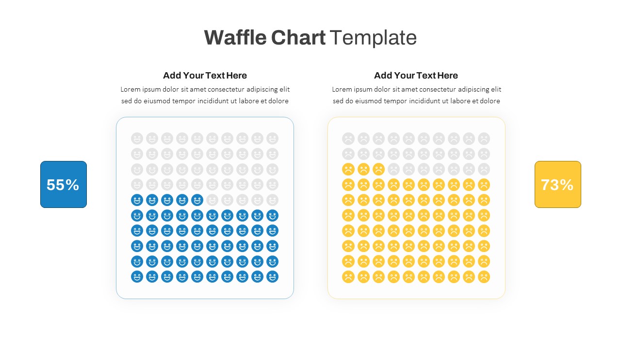
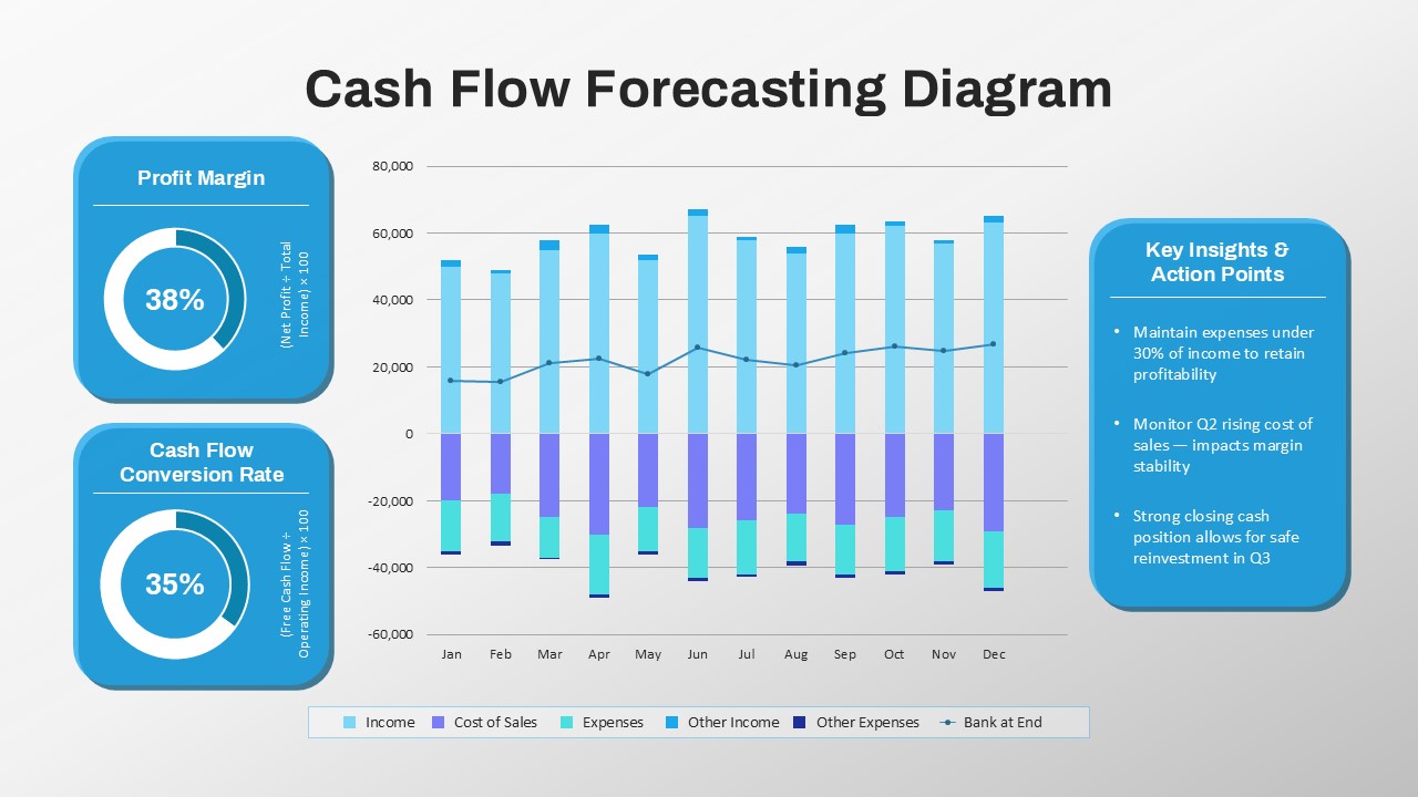
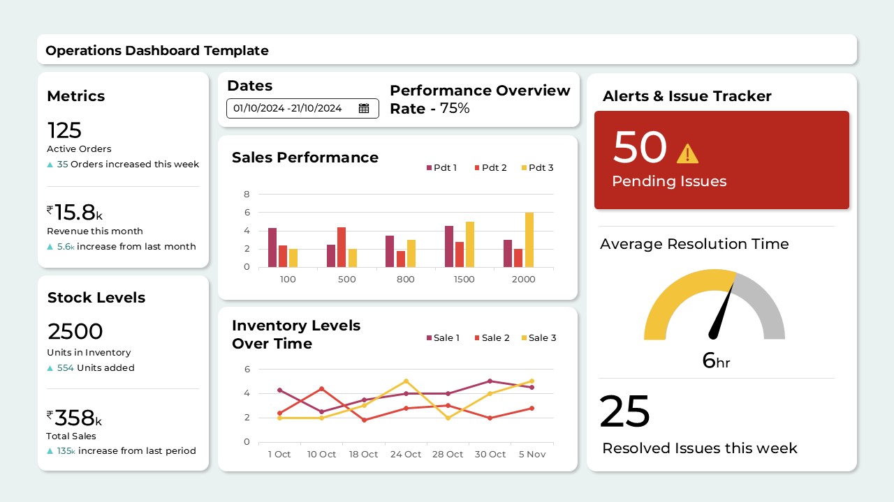
The company financial data charts template offers a comprehensive and visually consistent layout for presenting financial data and performance metrics with clarity and professionalism. This multi-chart dashboard format is ideal for showcasing monthly trends, comparative insights, and financial summaries in board meetings, investor presentations, or business reviews.
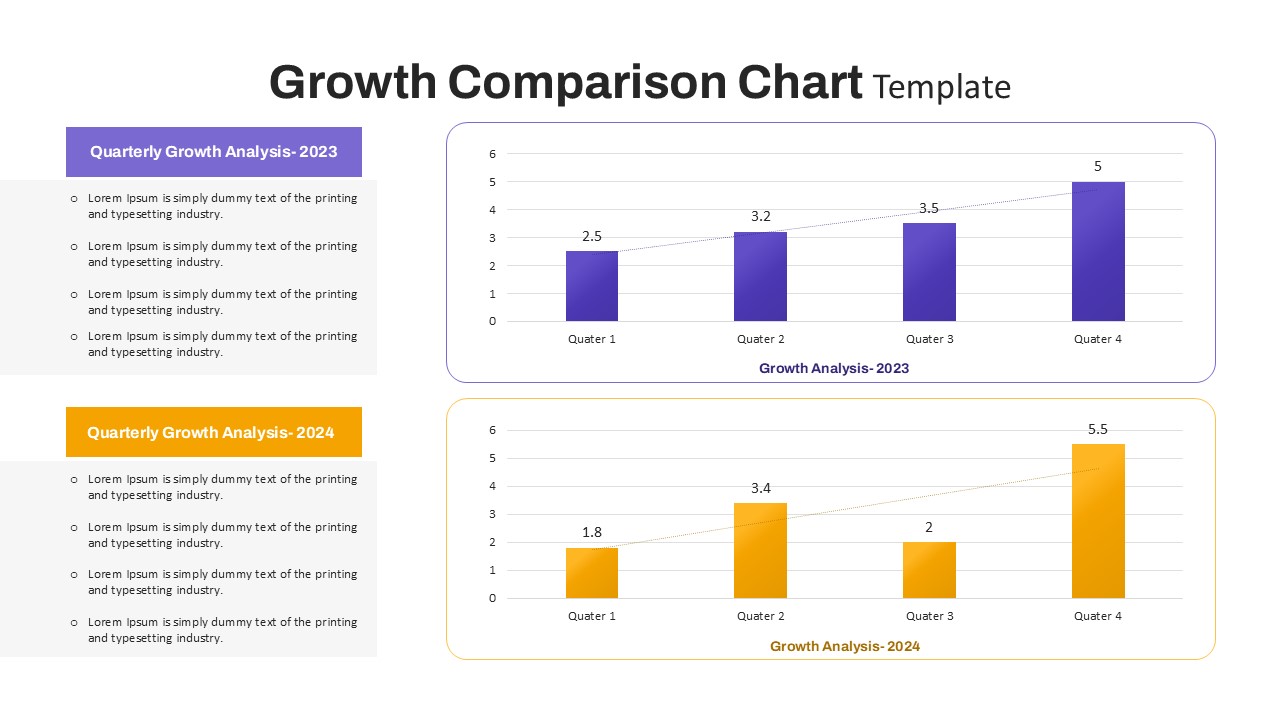
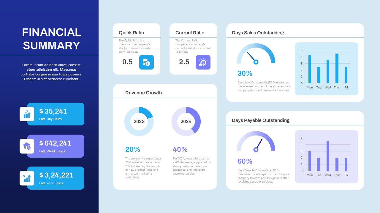
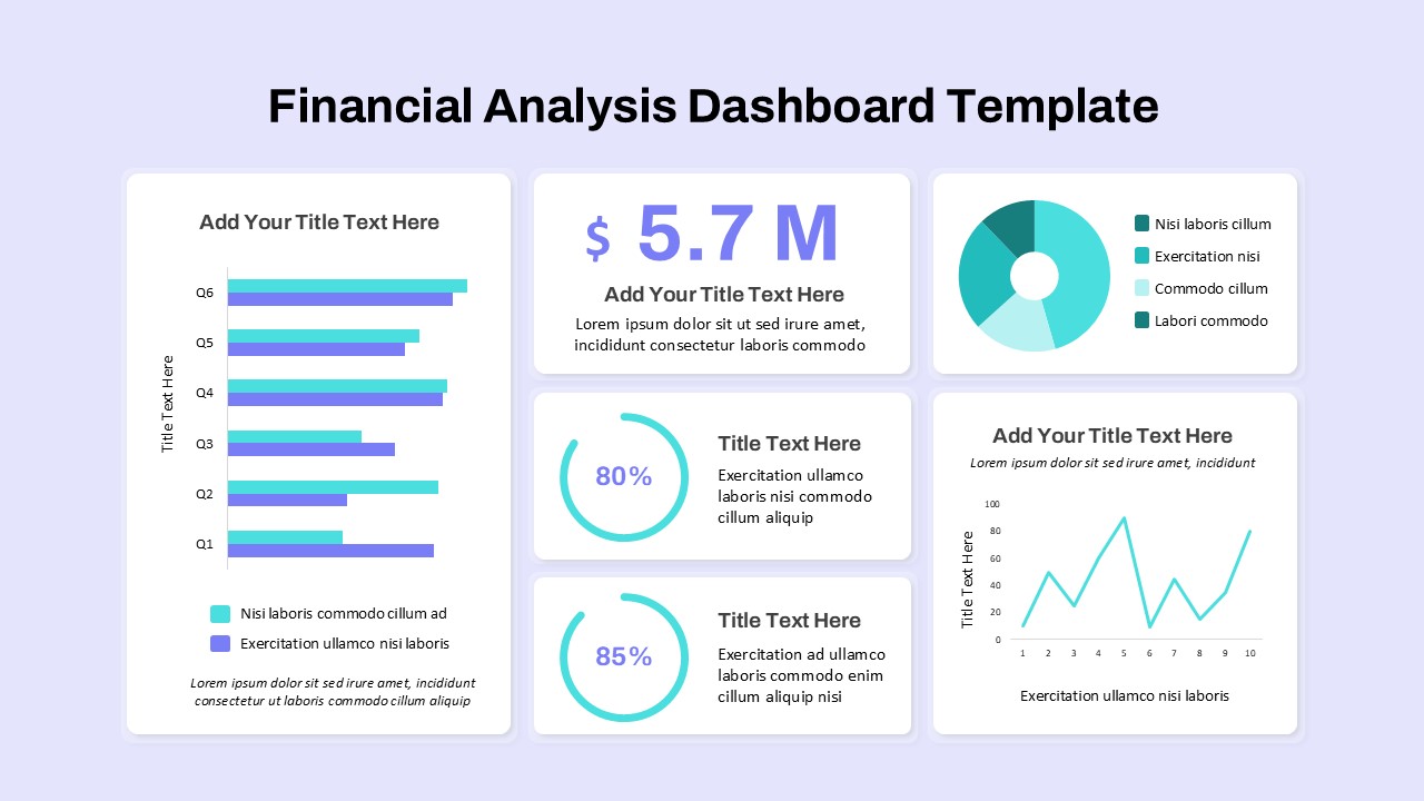
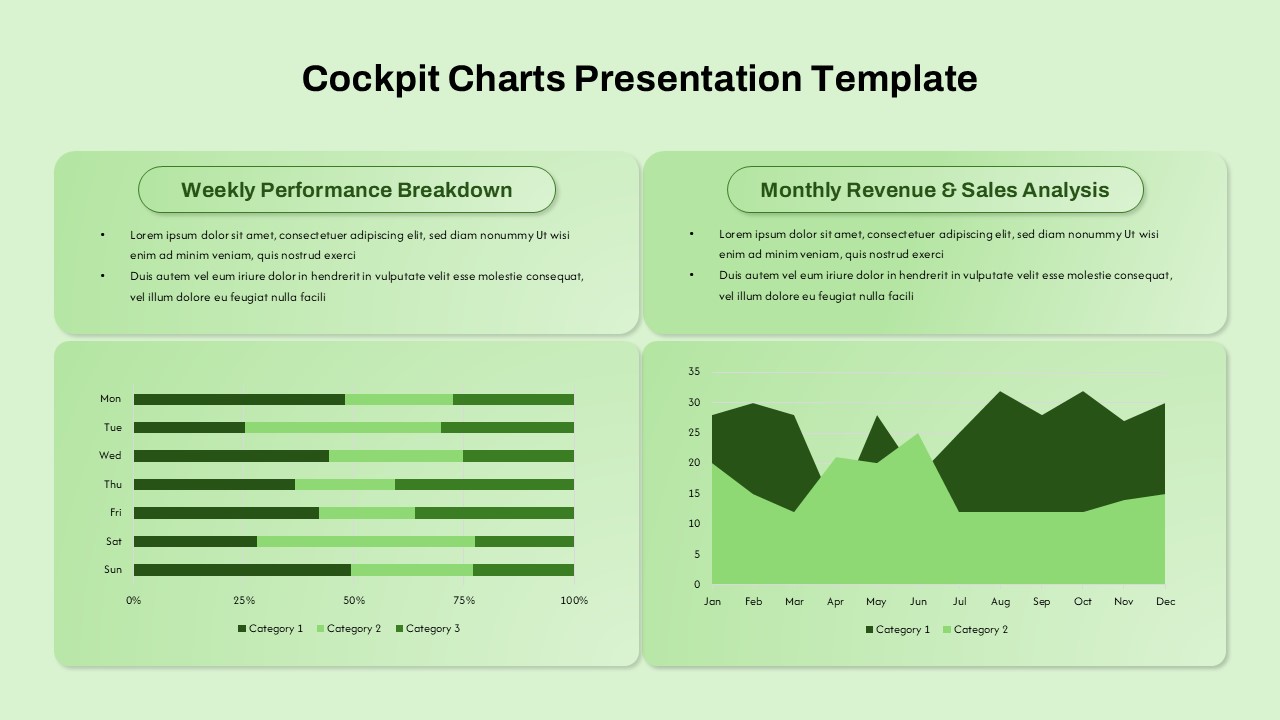
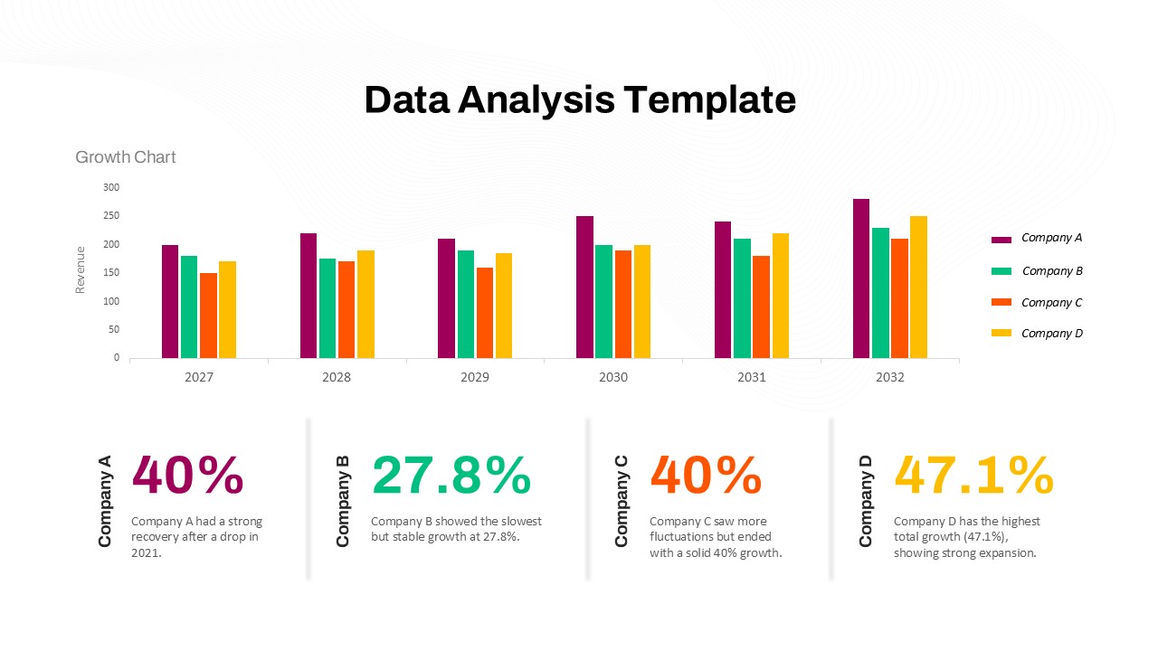
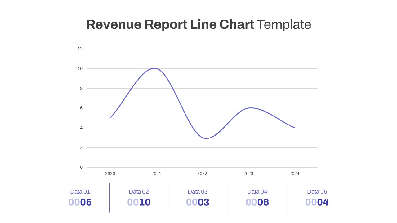
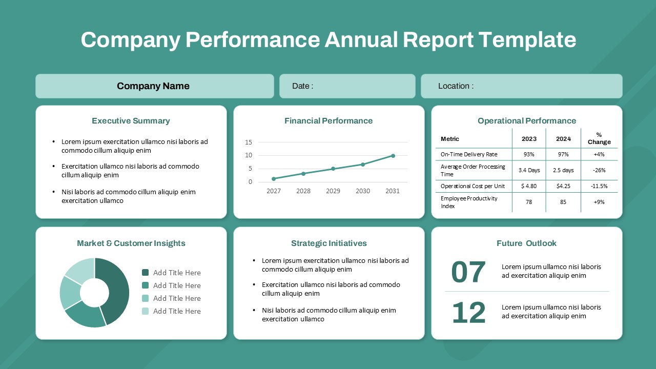
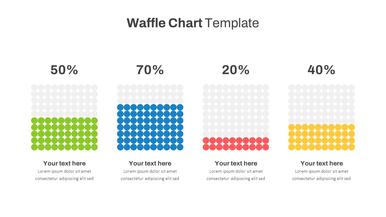
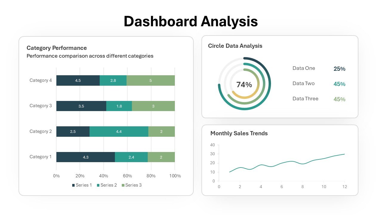
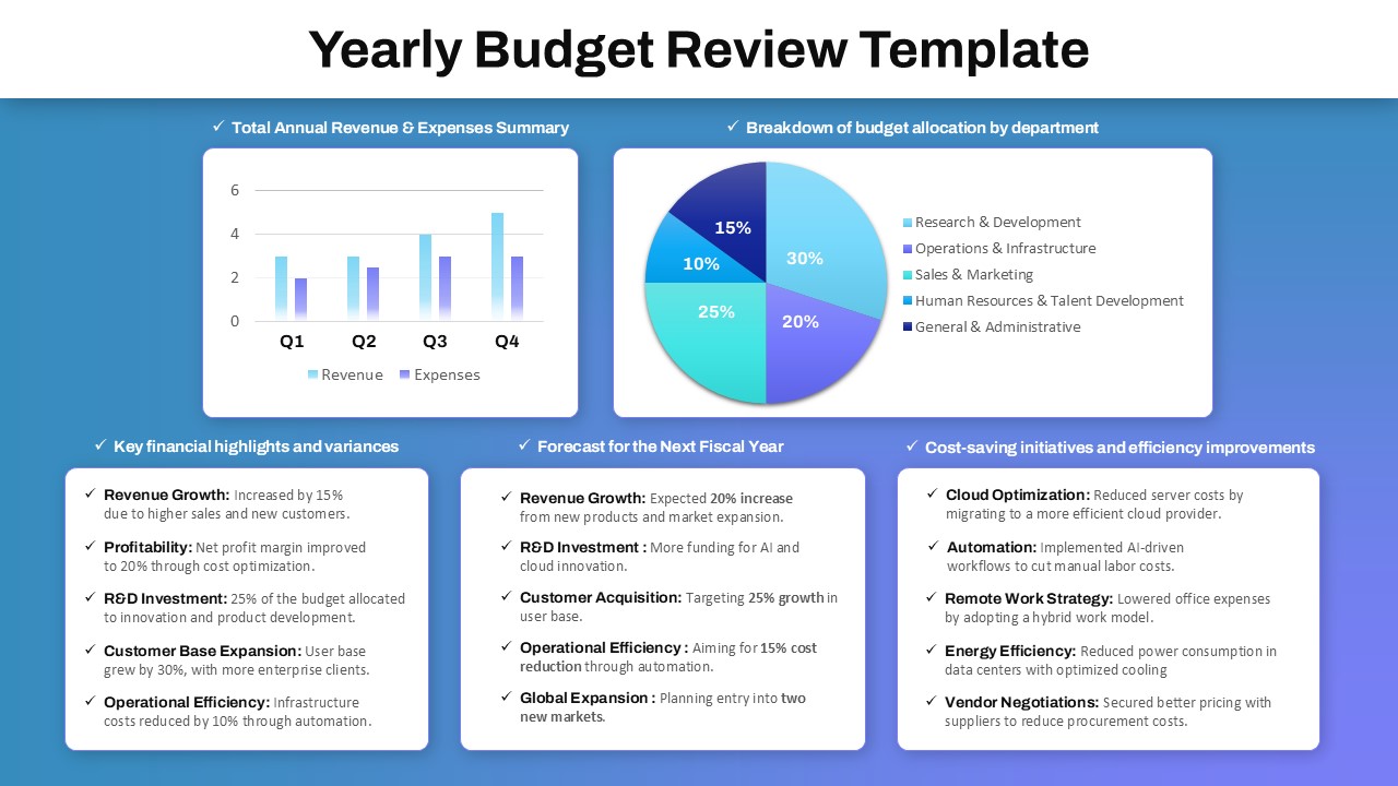
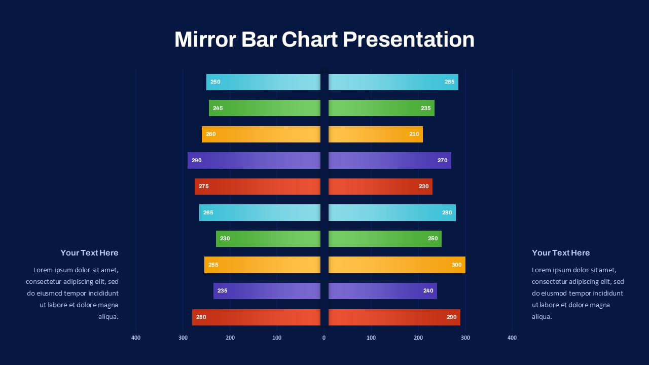
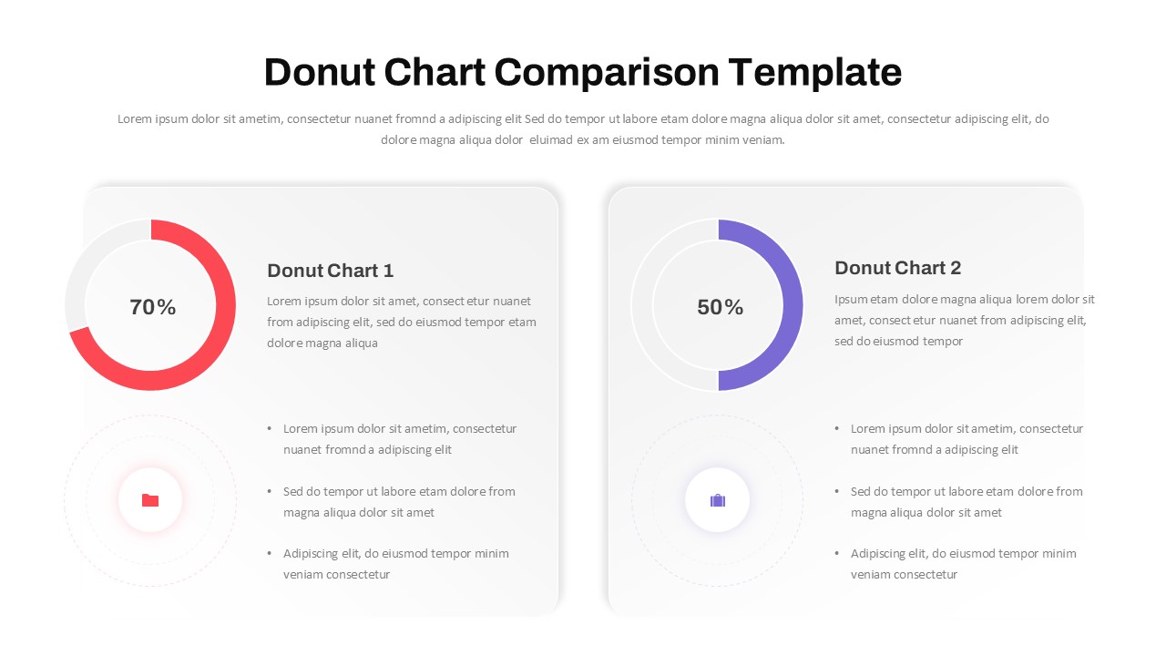
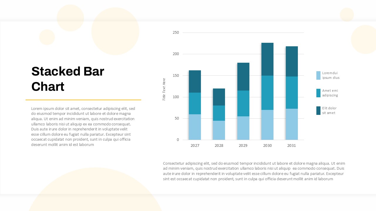
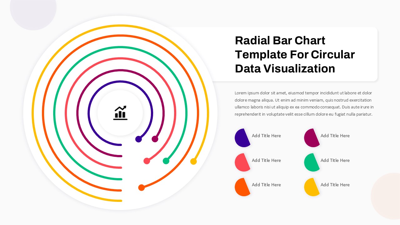
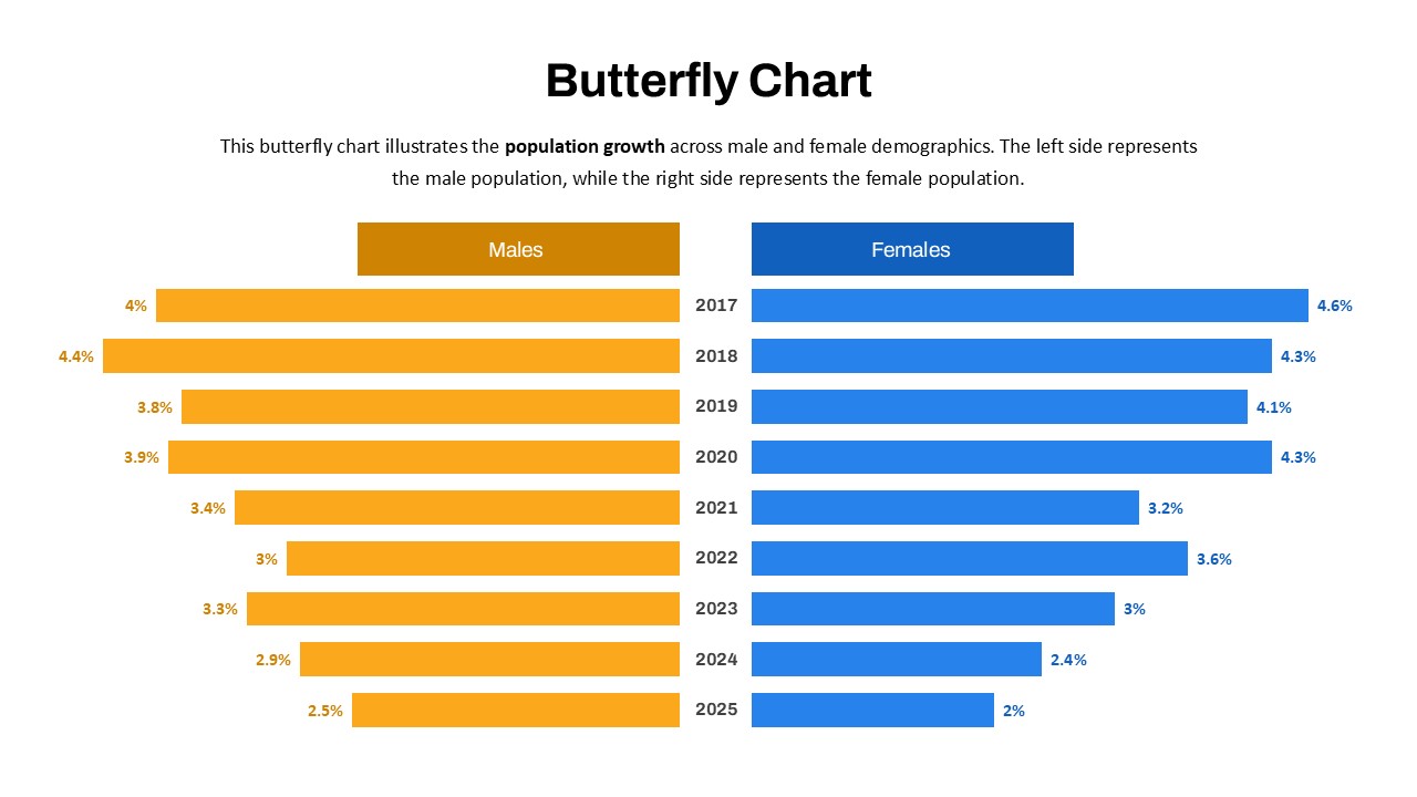
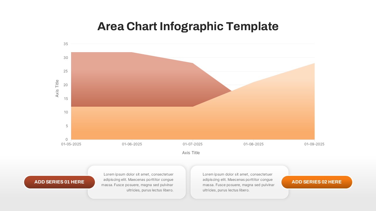
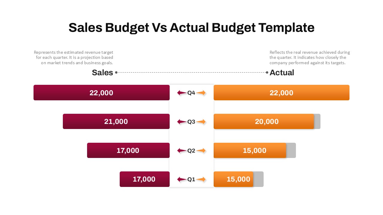
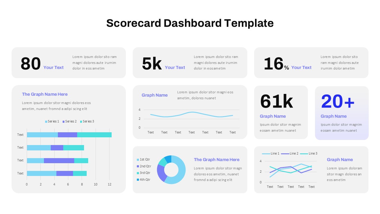
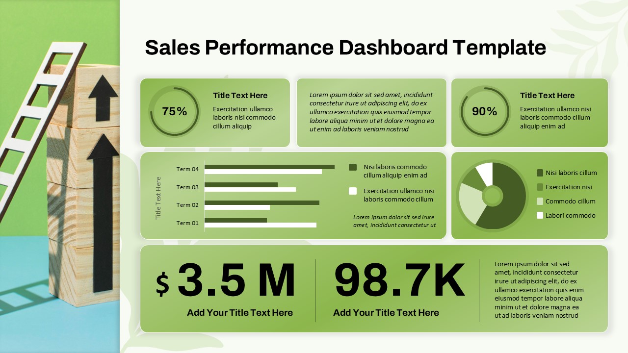
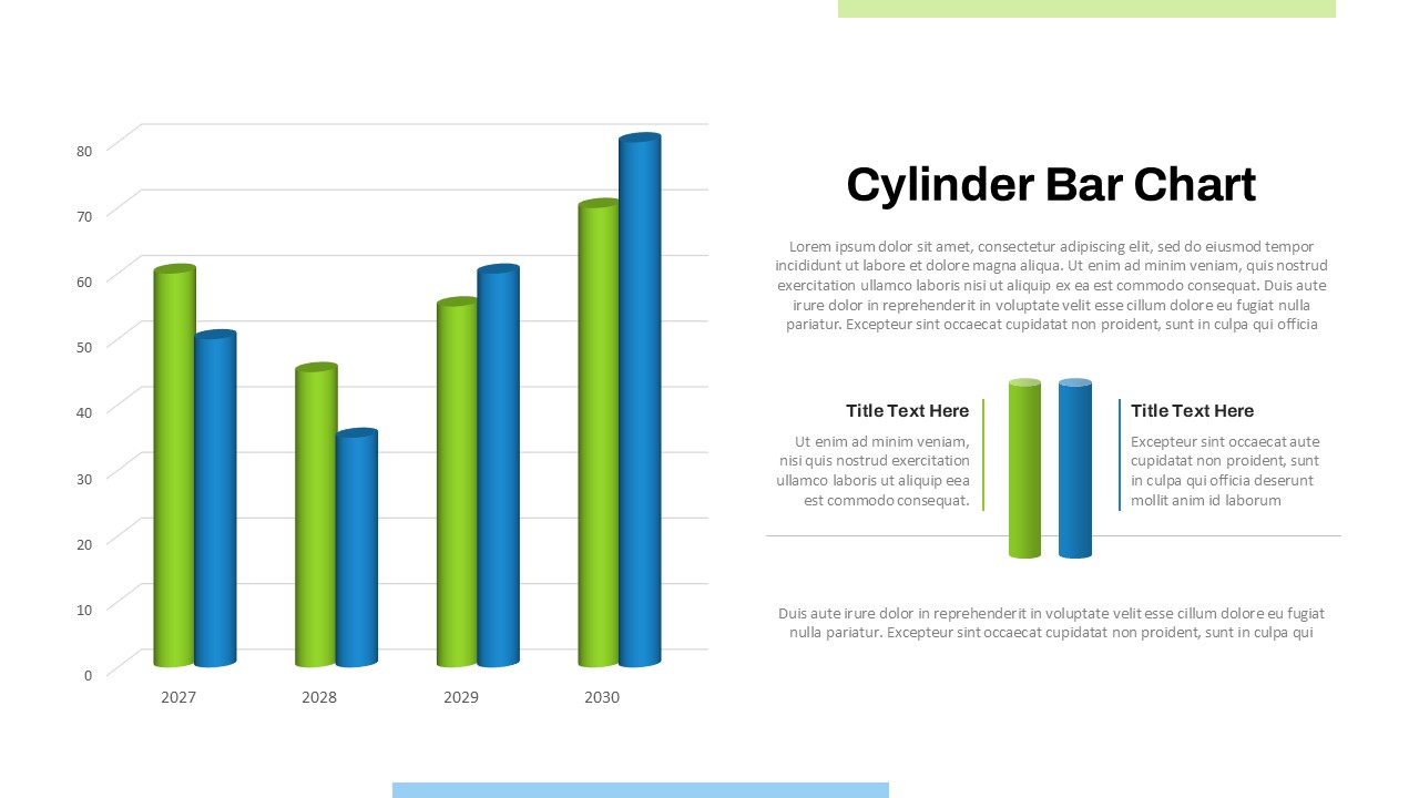
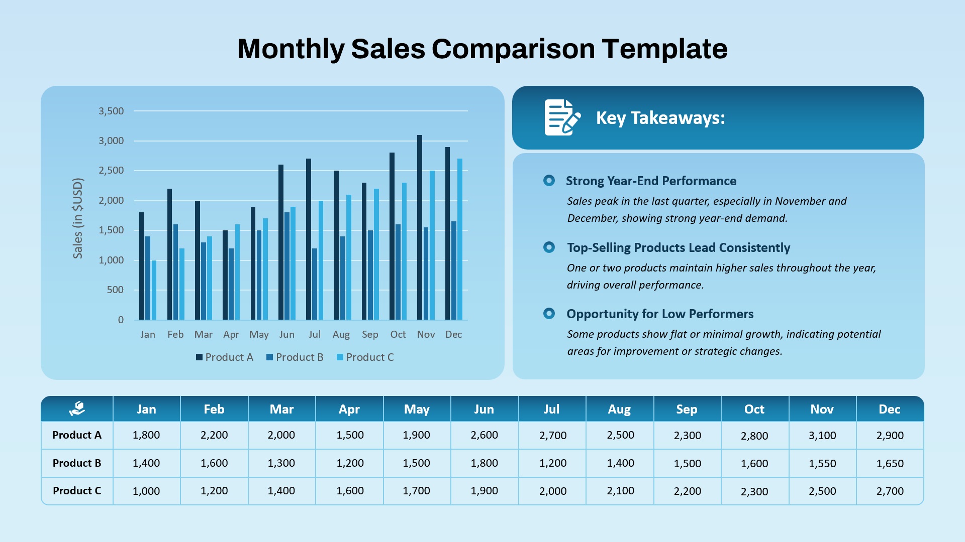
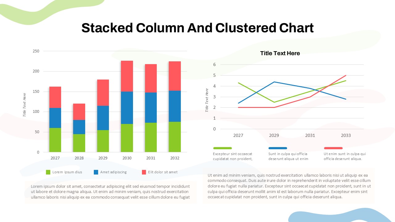
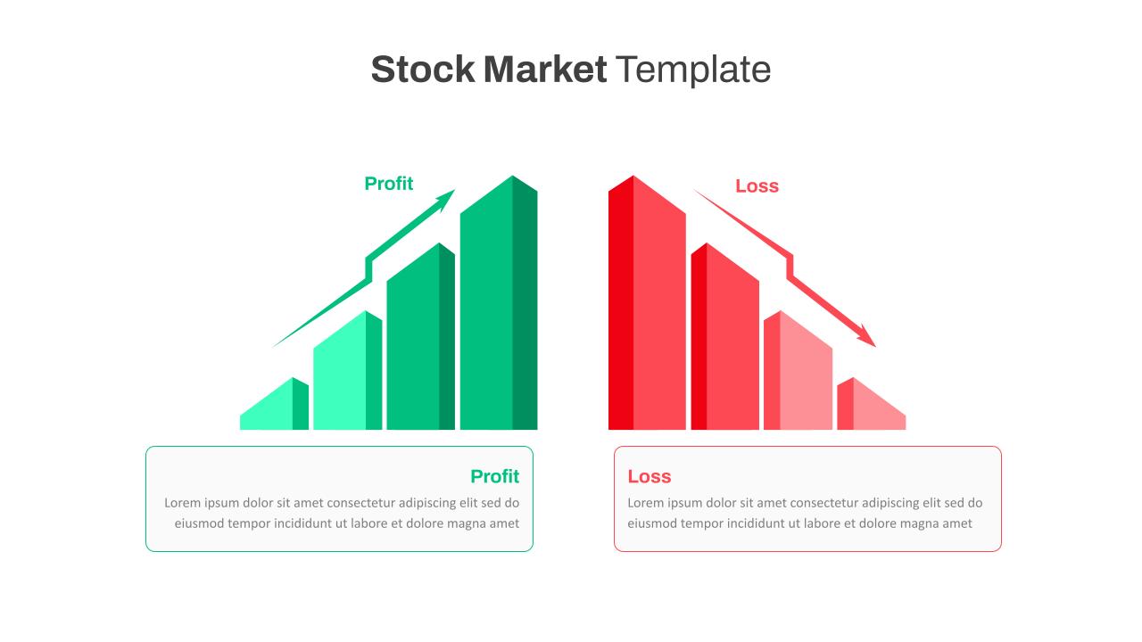
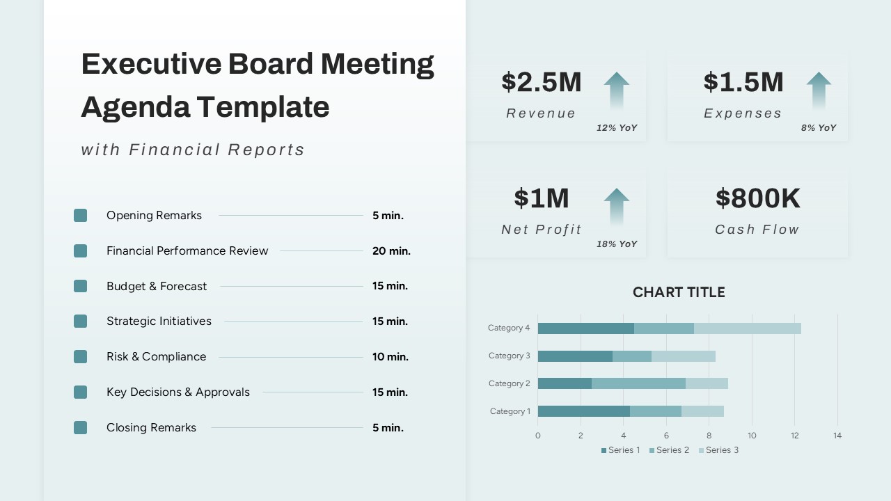
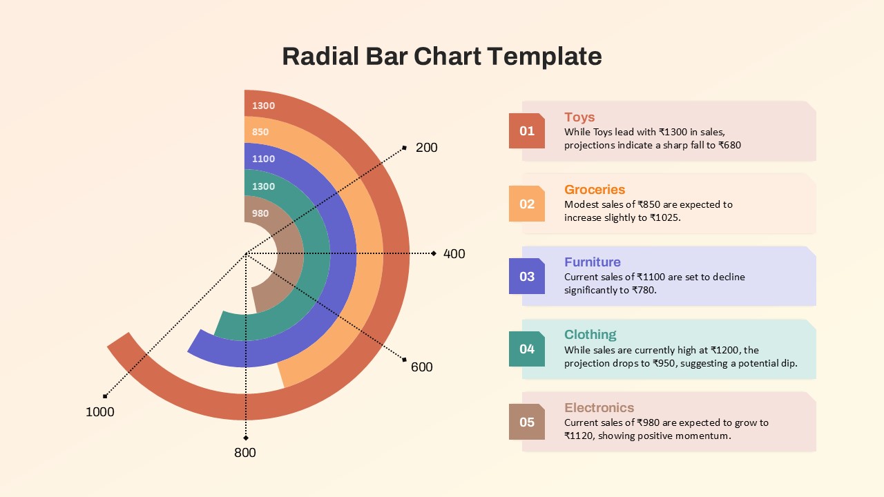
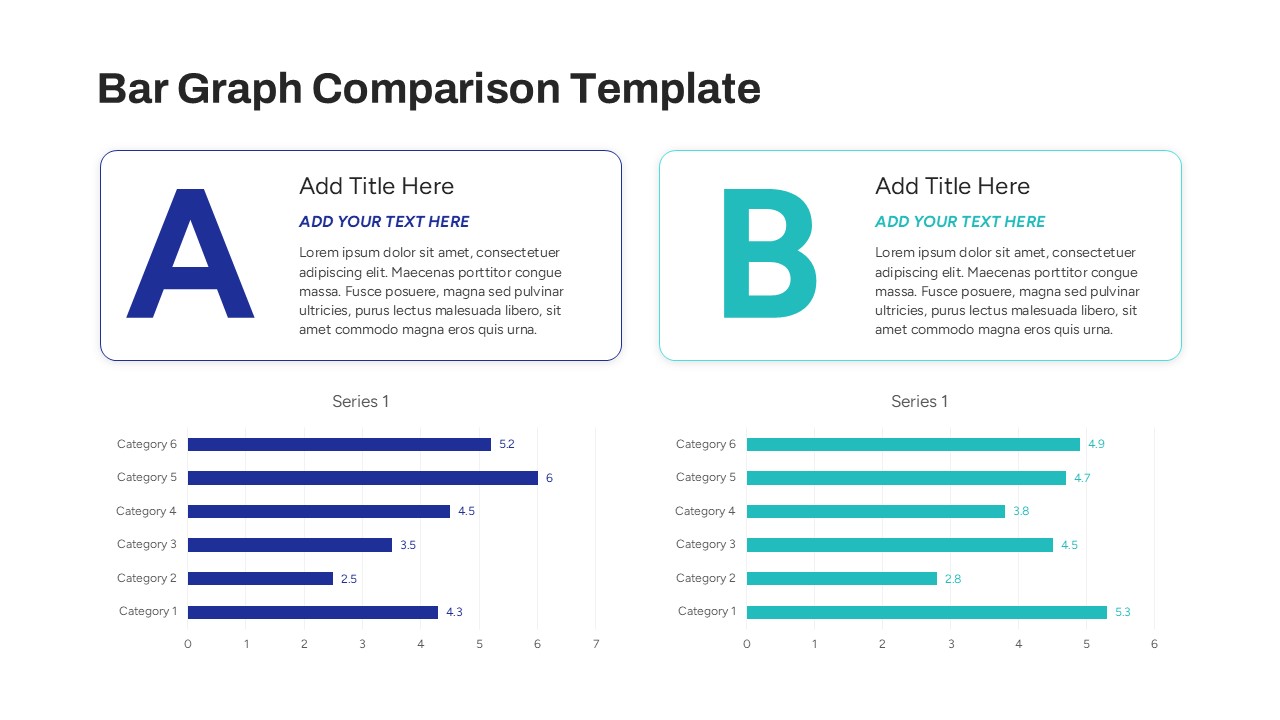
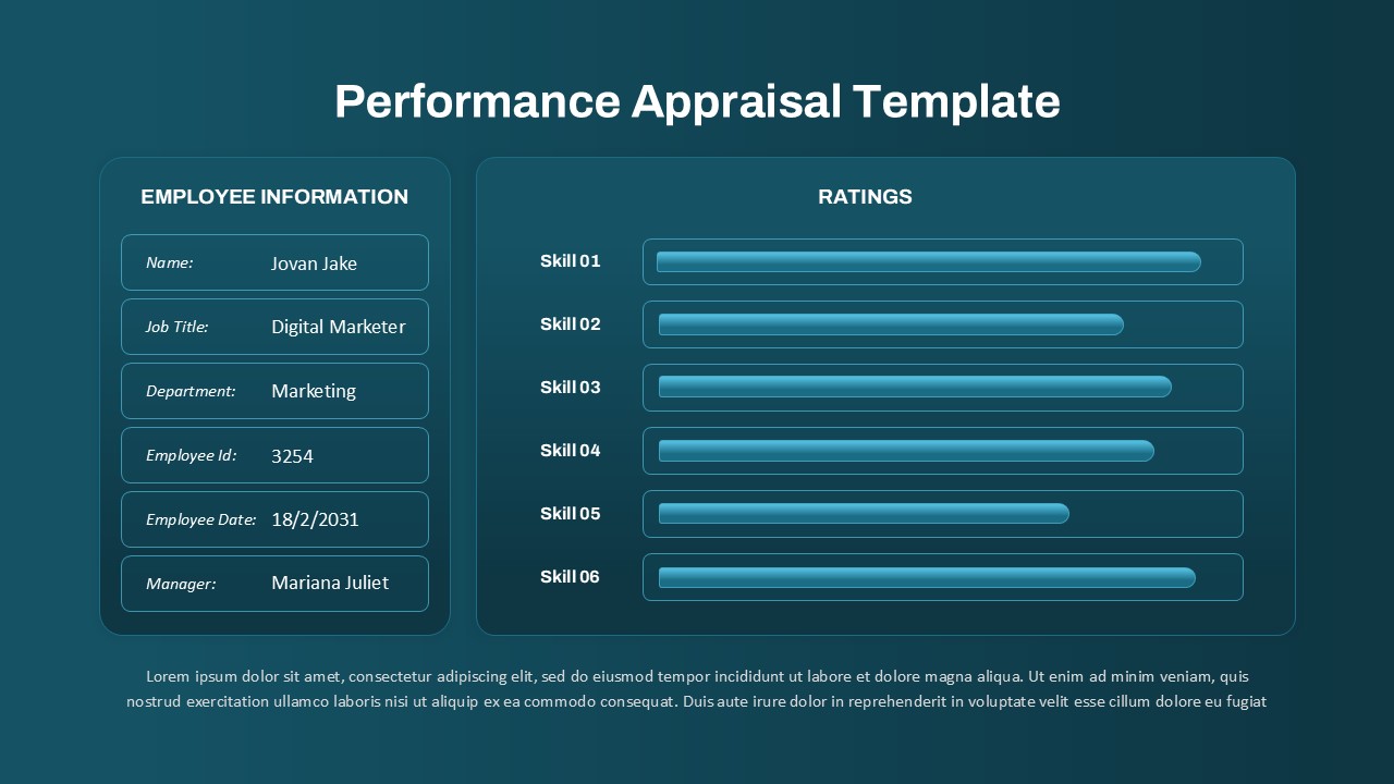
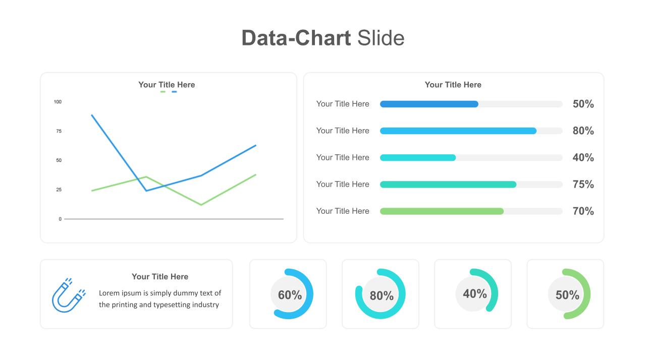
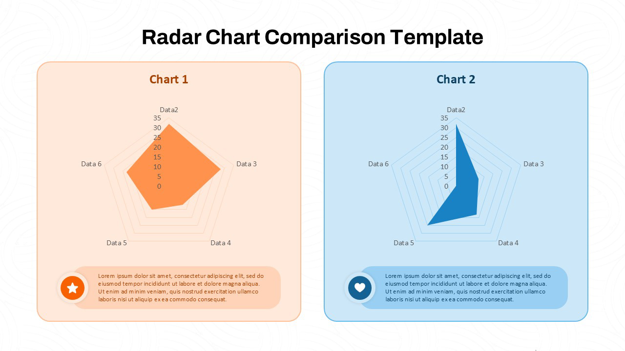
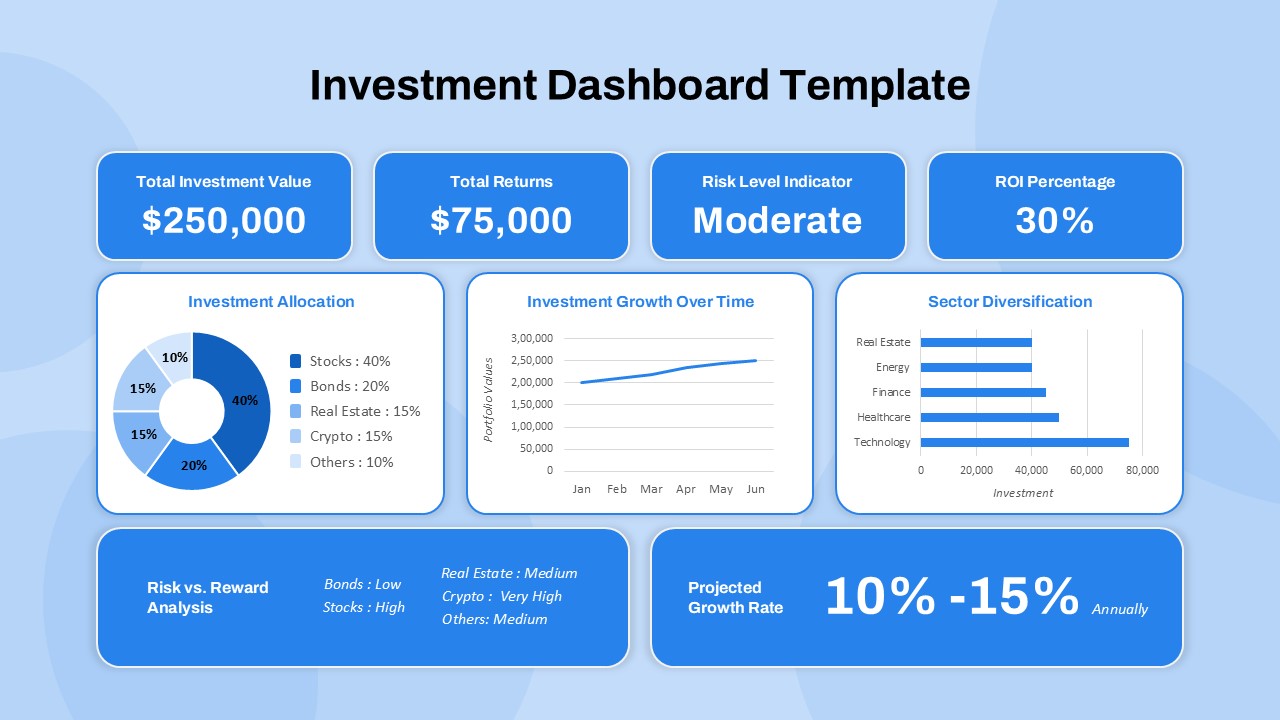
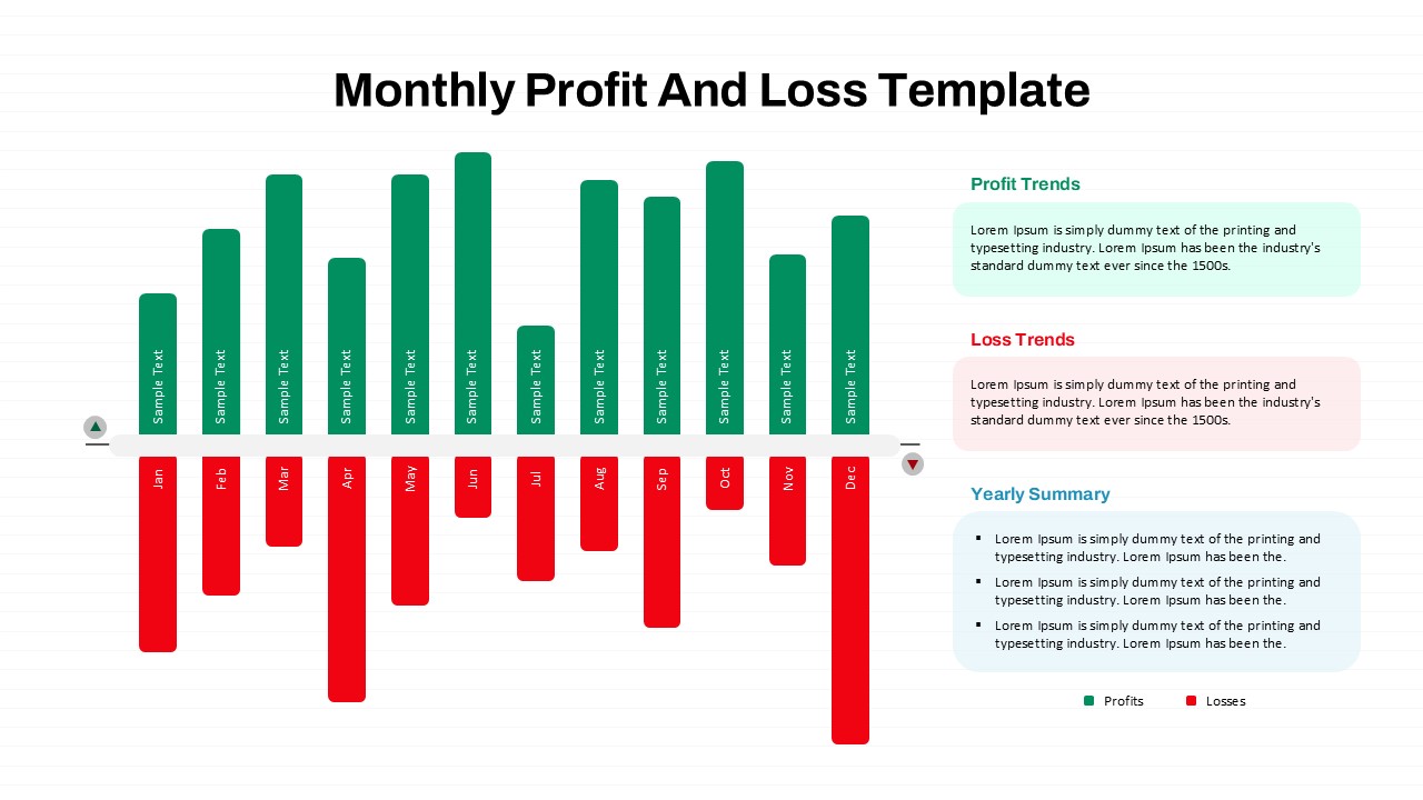
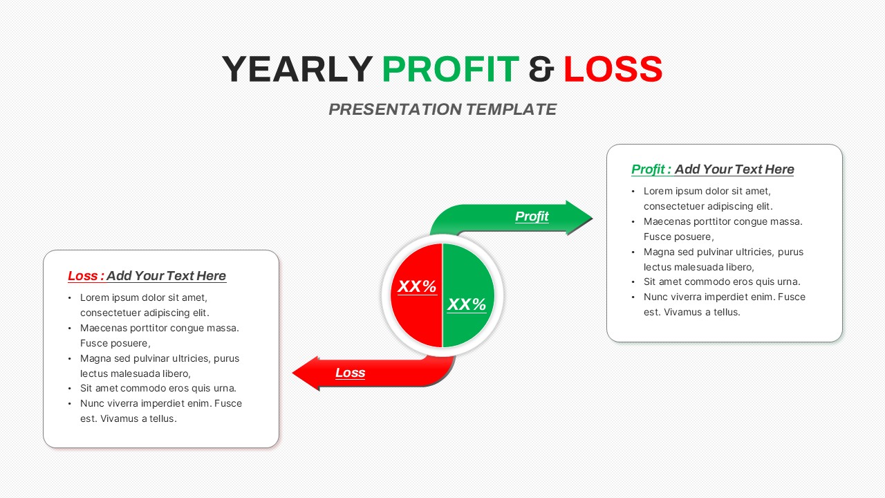
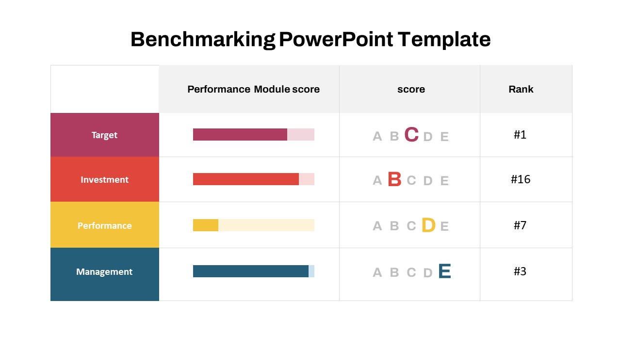
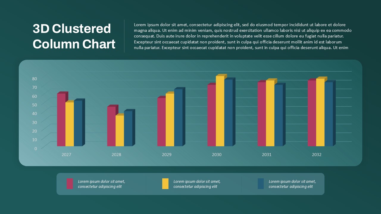
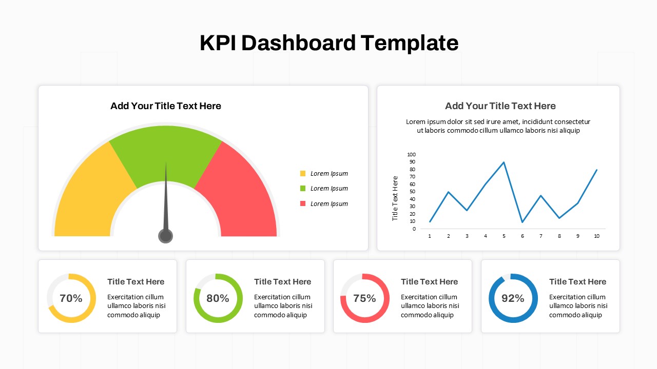
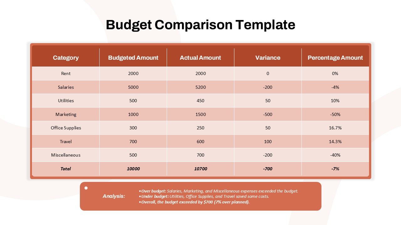
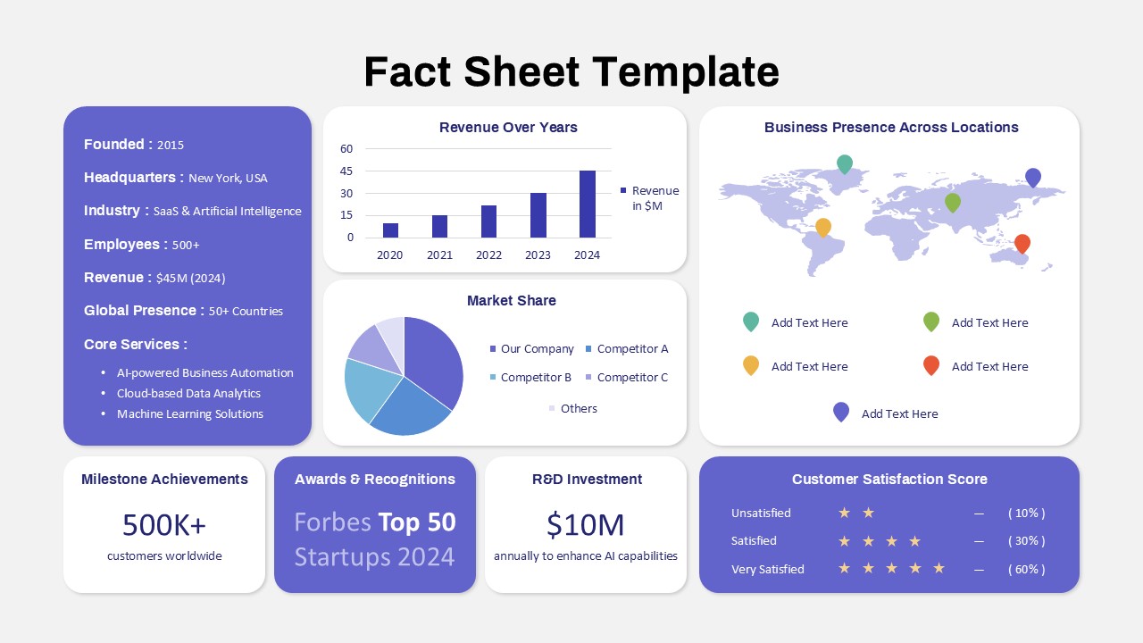
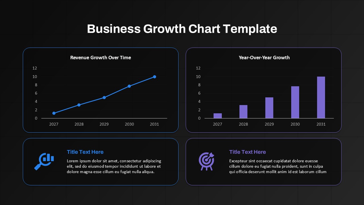
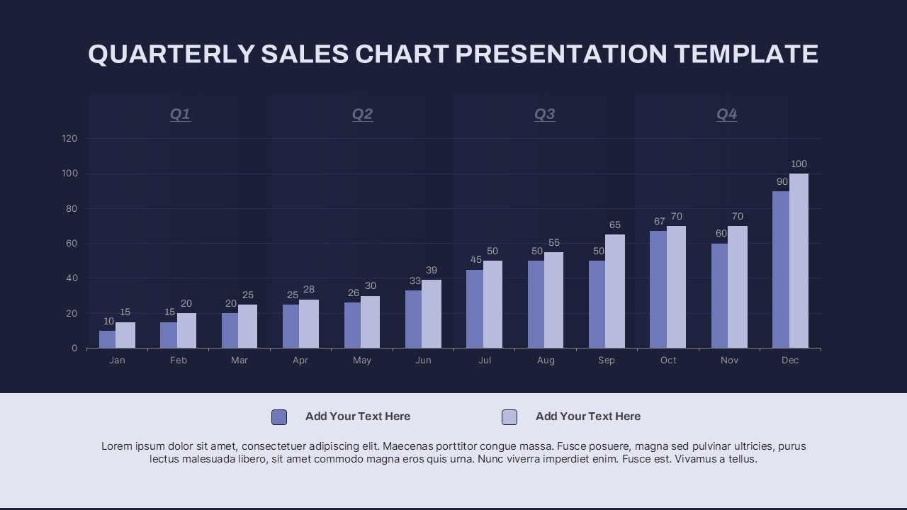
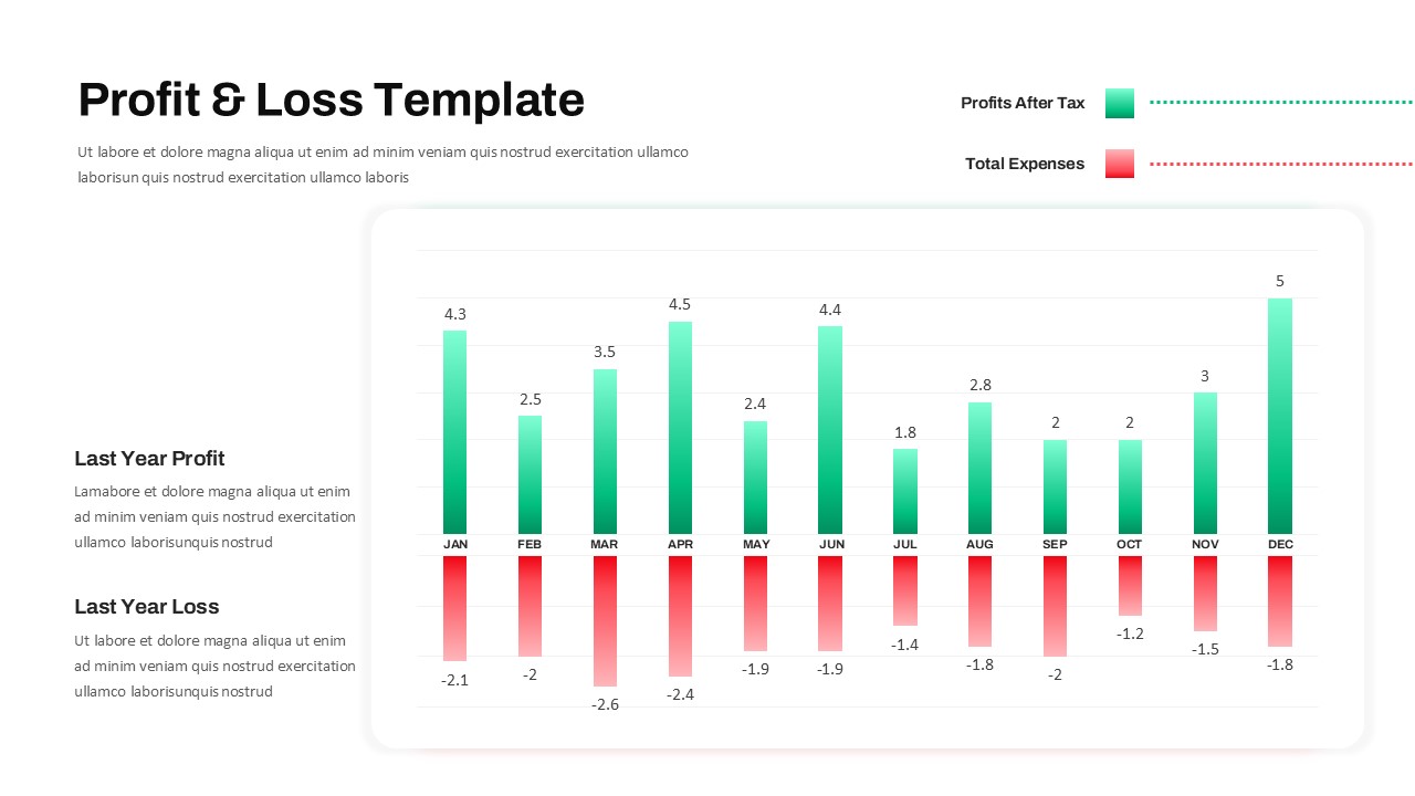
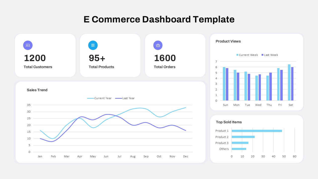
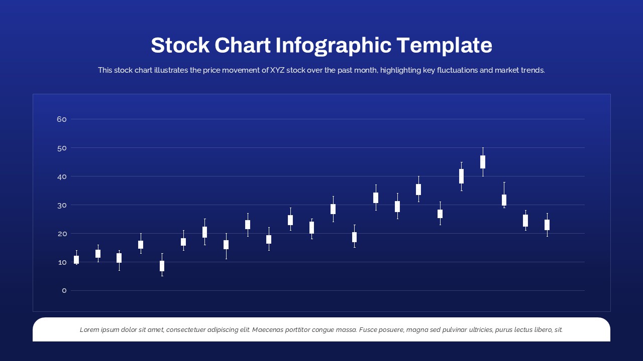
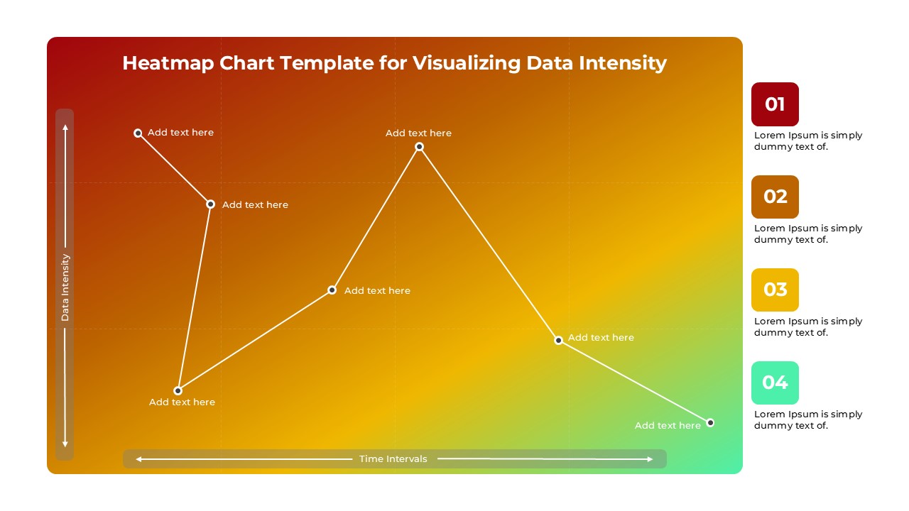
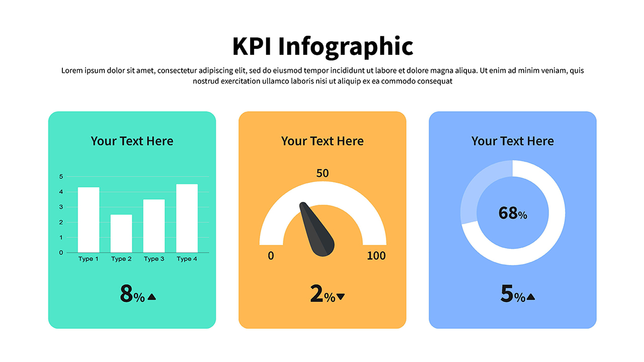
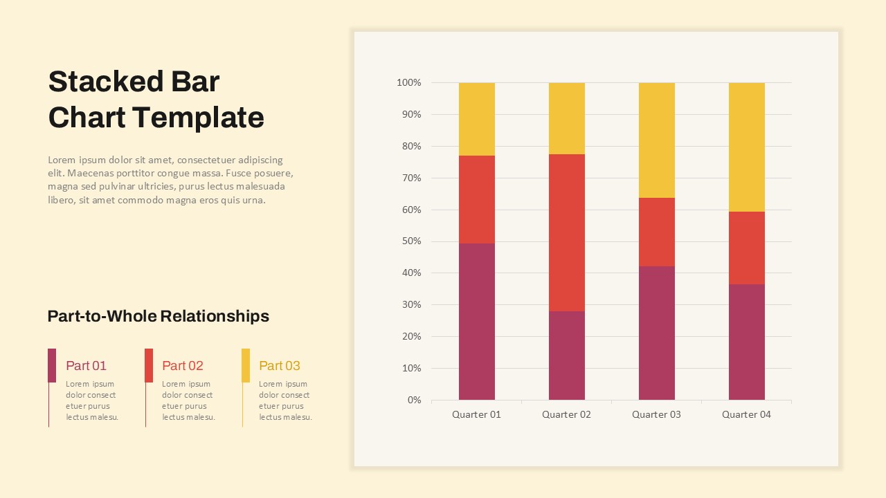
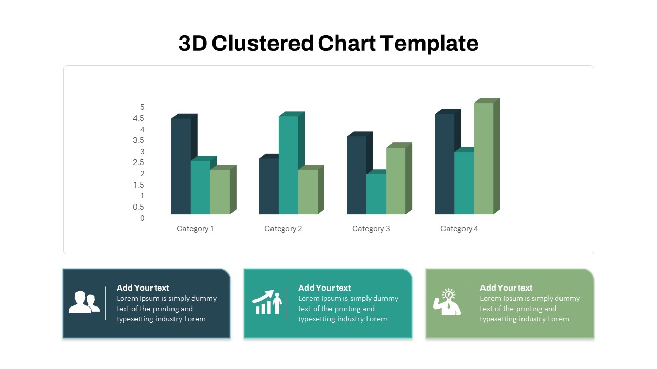
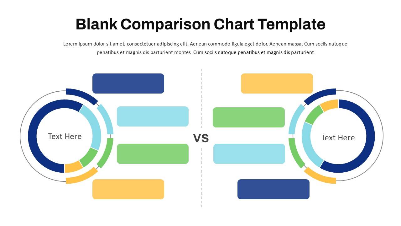
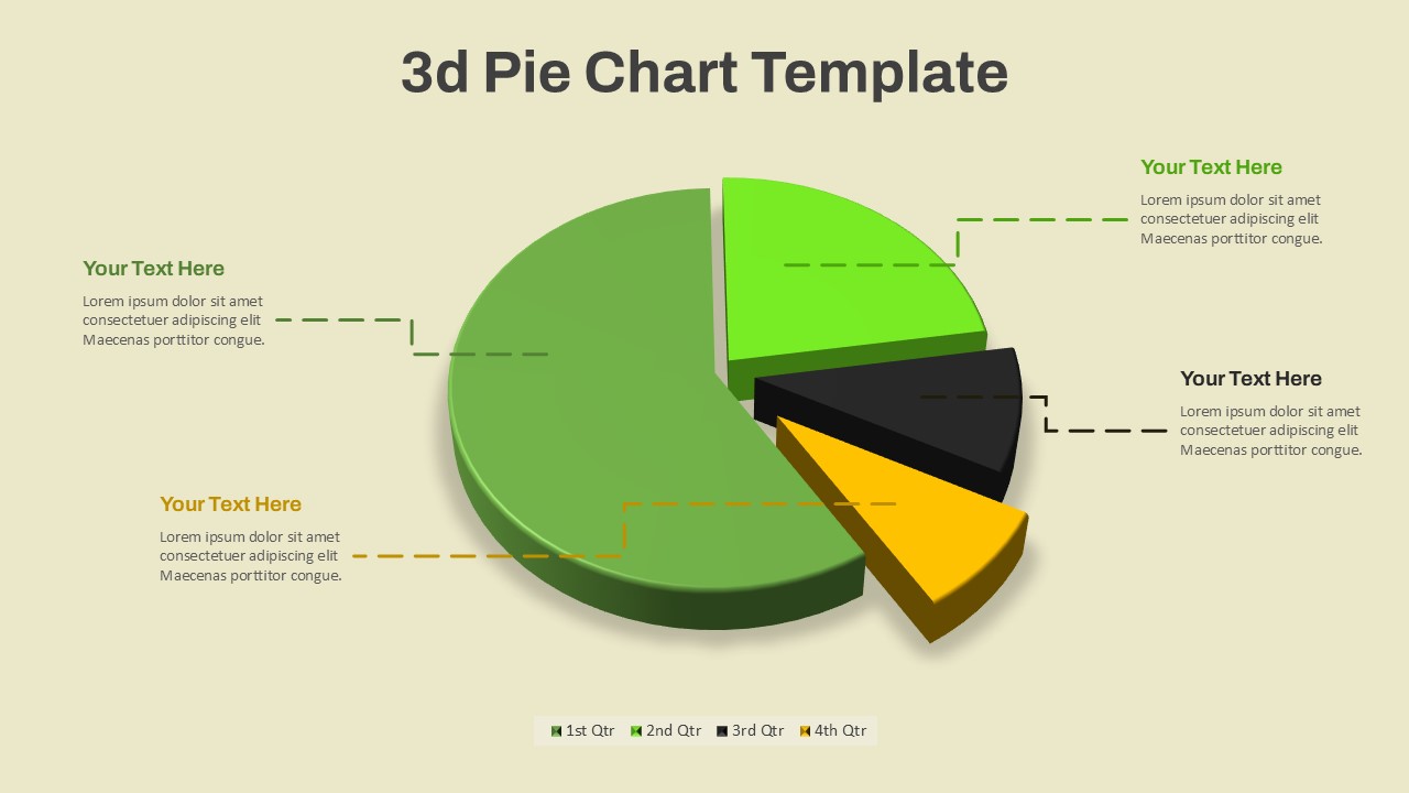
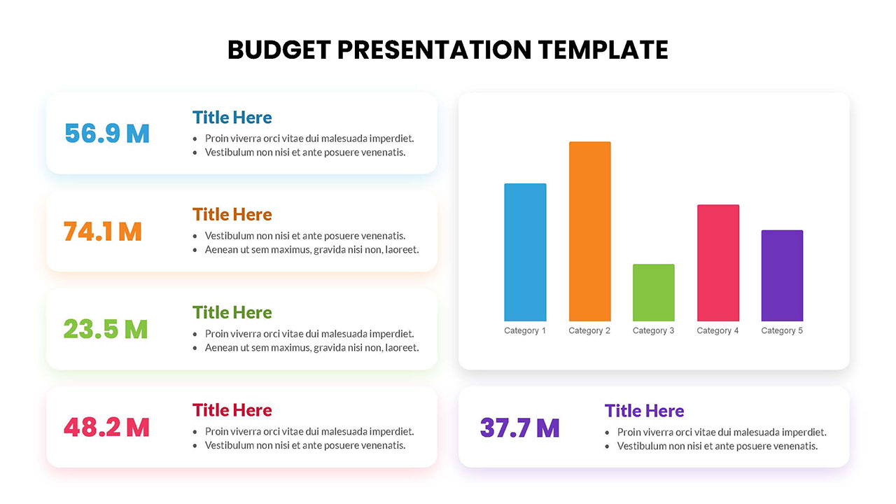
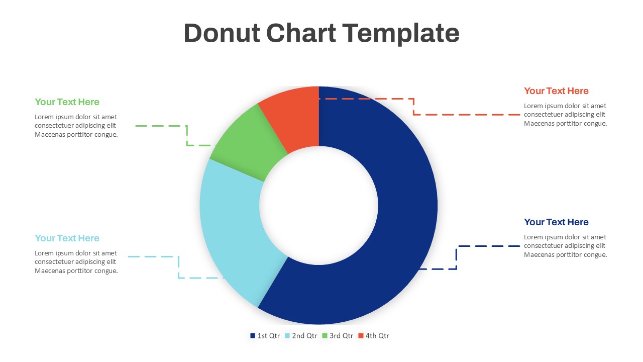
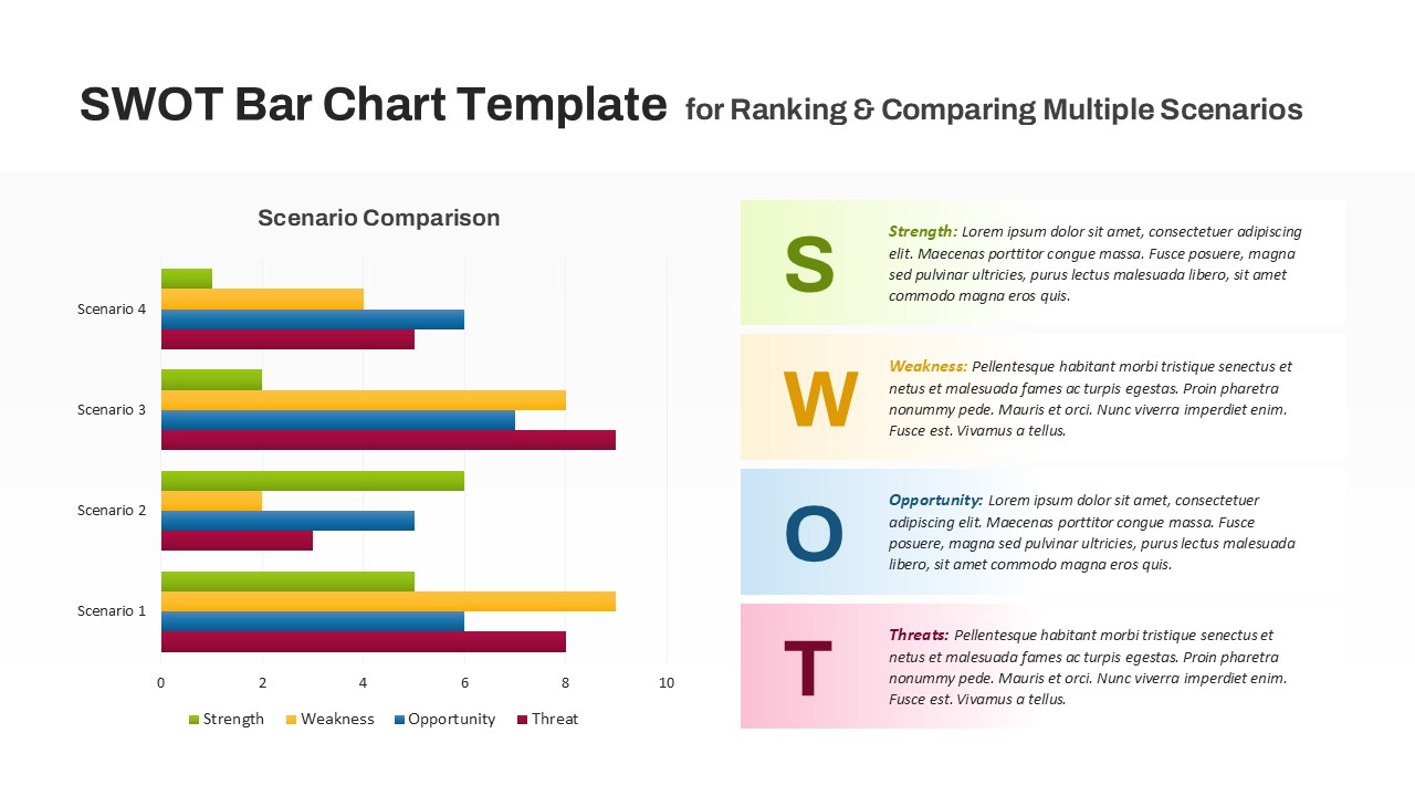
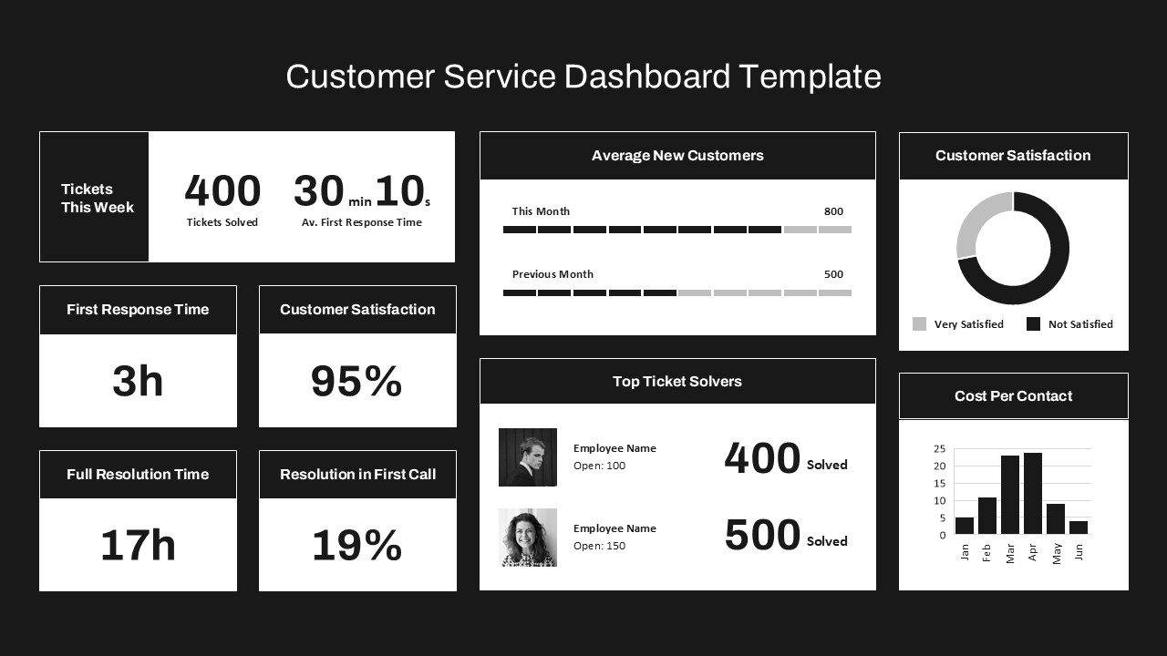
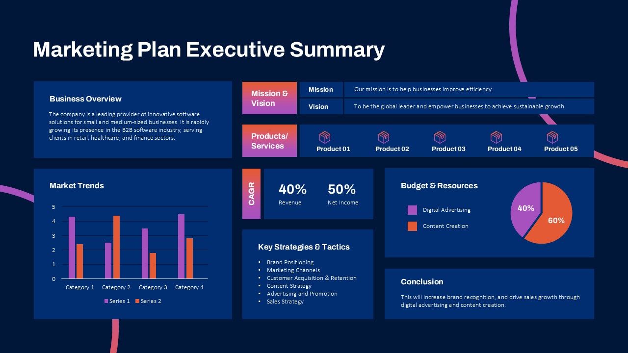
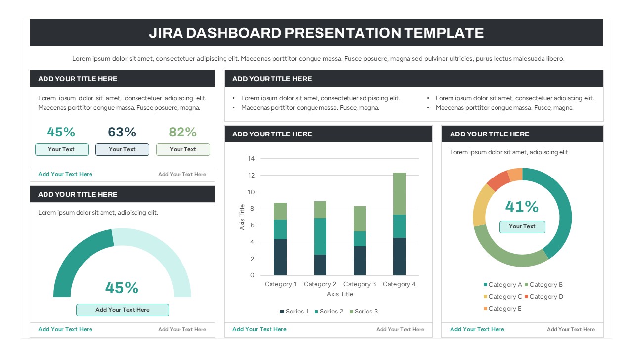
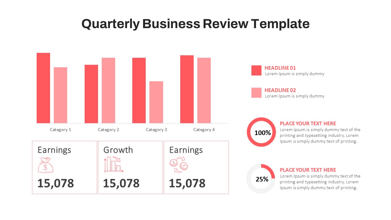
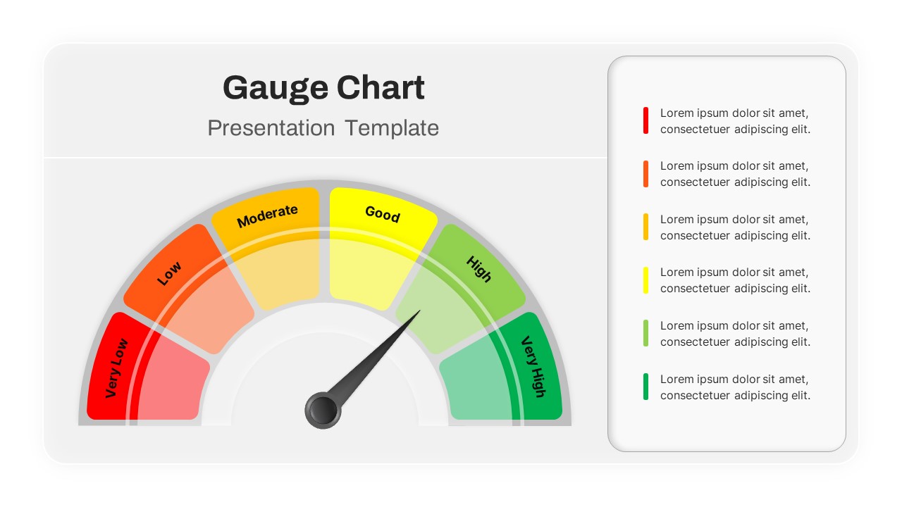
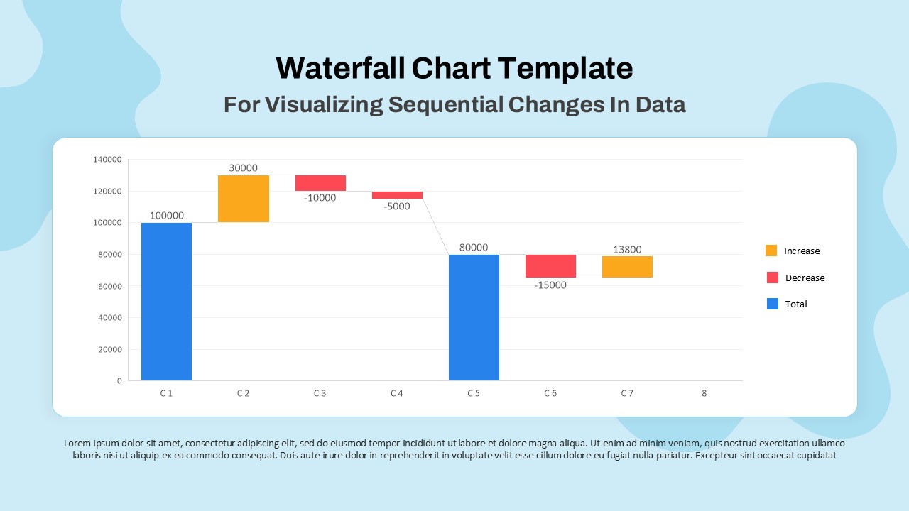
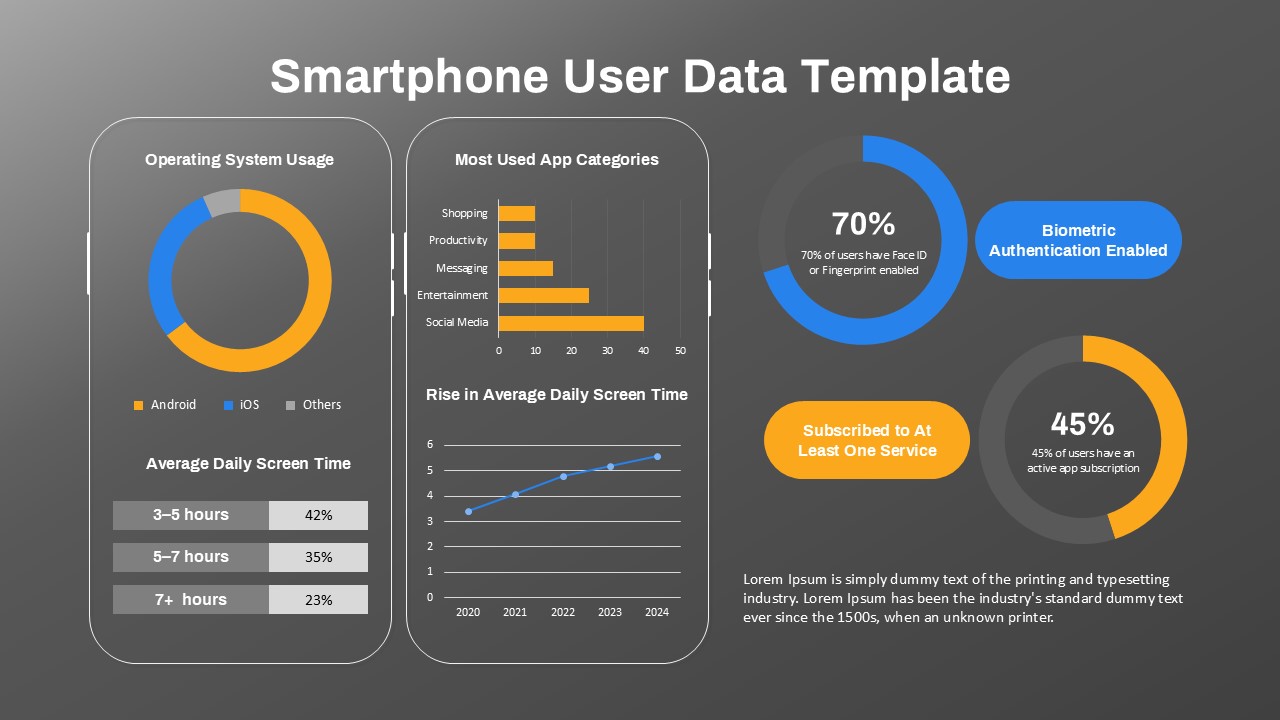
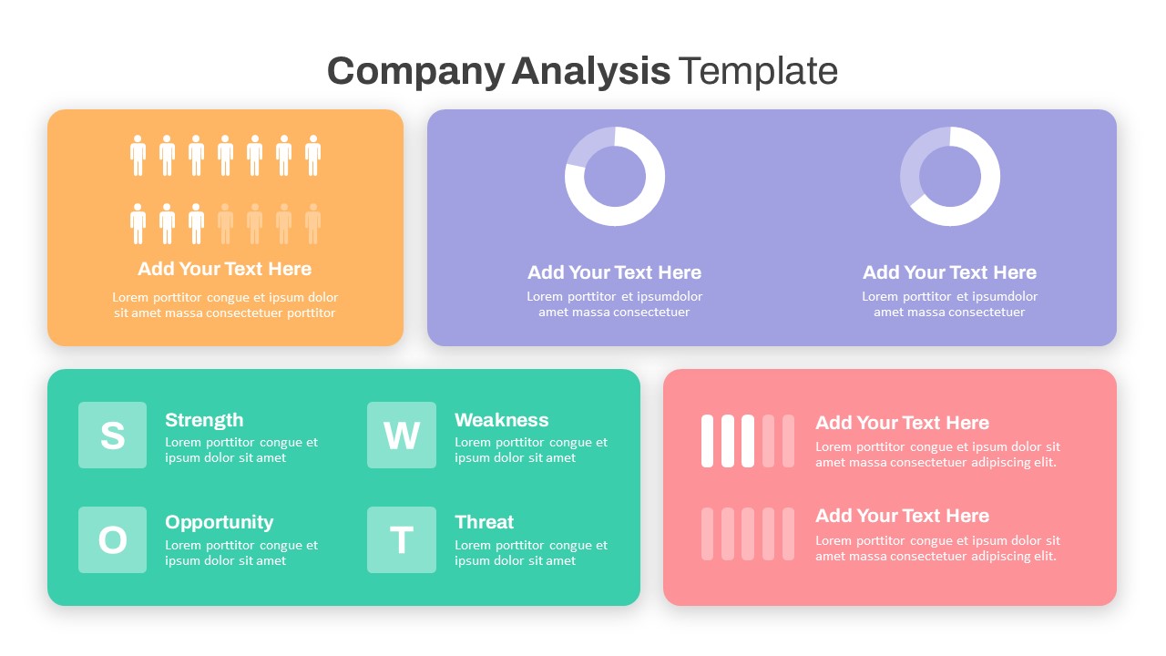
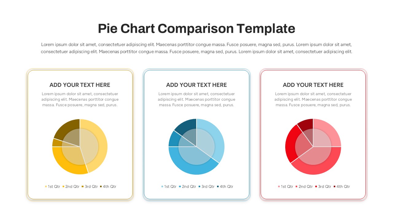
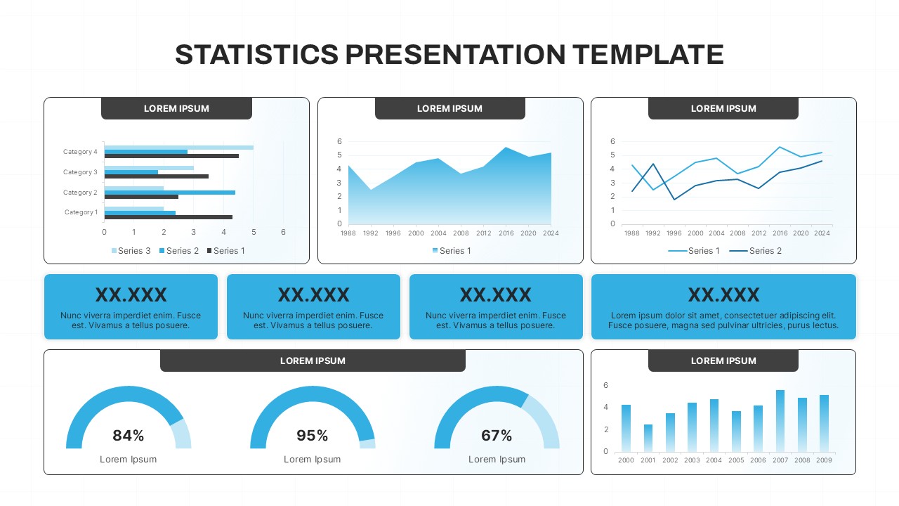
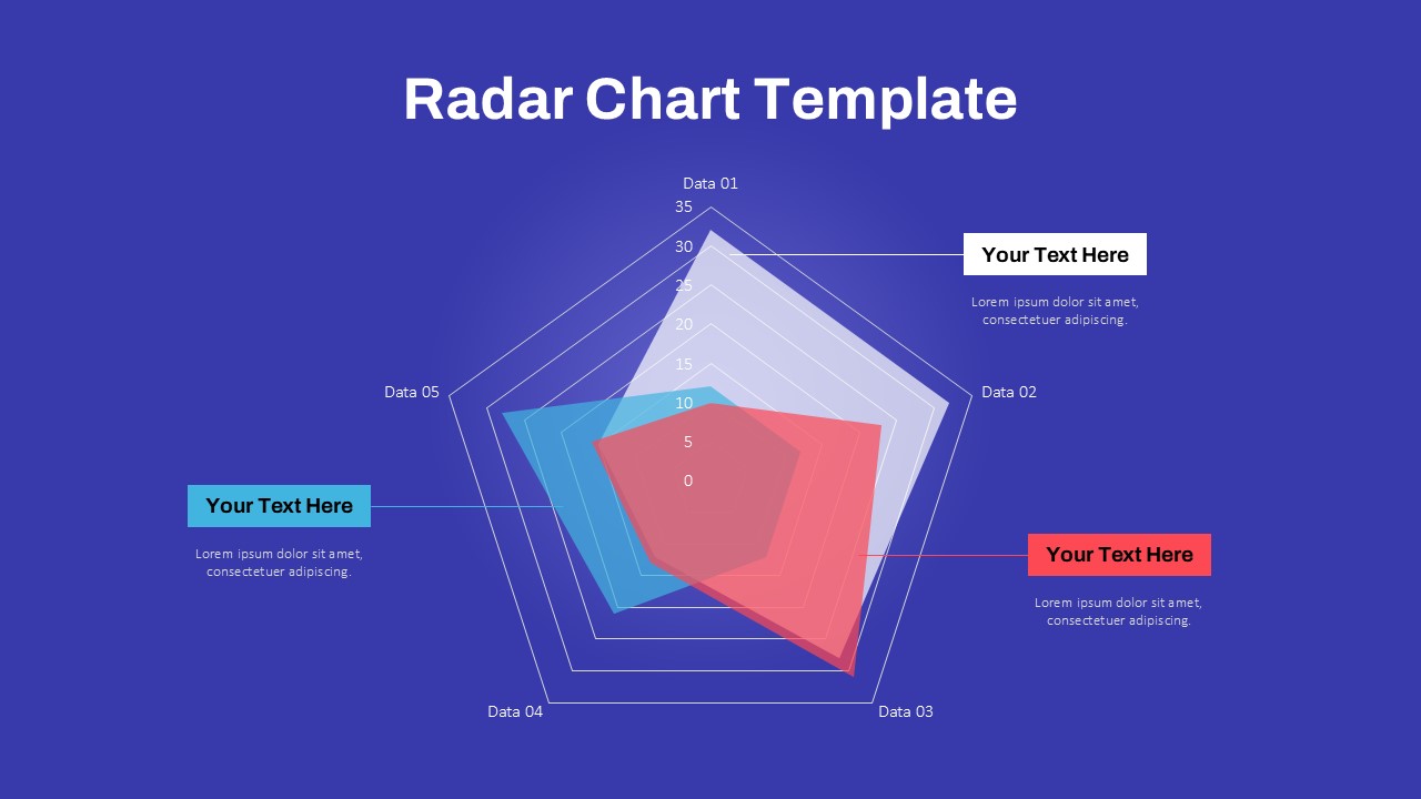
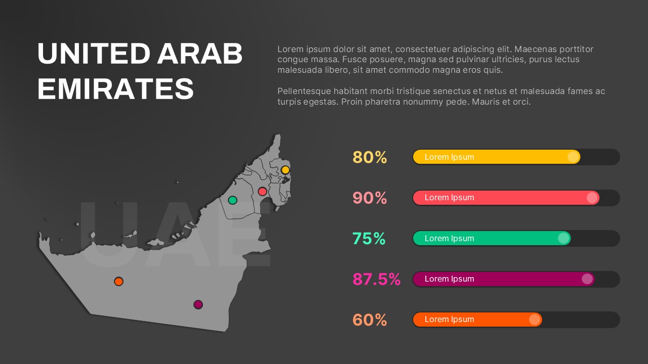
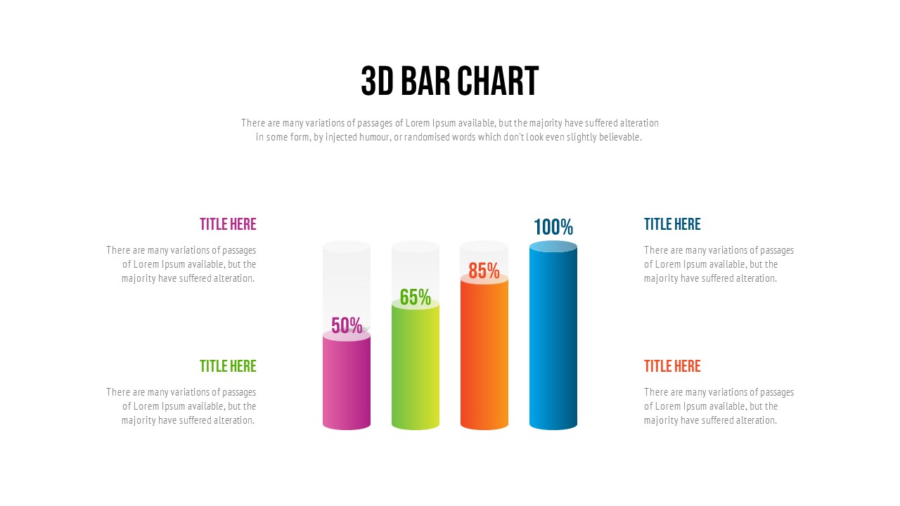
Featuring a clean design with a green monochrome palette, this charts on powerpoint template includes a variety of chart types—vertical bar charts, horizontal bar charts, area graphs, and donut charts. These visual tools help you effectively communicate revenue trends, cost analysis, budget allocations, or performance indicators across different time periods or departments. Each chart is paired with editable text boxes for data labels, explanations, or key takeaways, ensuring your message is both informative and easy to follow.
Designed for both PowerPoint and Google Slides, this template is fully customizable, allowing you to adapt colors, data inputs, labels, and legends to align with your organization’s branding or specific presentation goals. The organized grid layout makes it easy to compare different data sets side by side while keeping your slide content neat and structured.
Whether you’re a financial analyst, business consultant, CFO, or startup founder, this chart ppt template empowers you to present complex financial data in a format that is both engaging and decision-friendly.
See more

Aspect Ratio
16:9Item ID
SKT03834
Features of this template
Other User Cases of the Template:
financial performance reviews, investor pitch decks, board meeting presentations, budgeting and forecasting reports, quarterly earnings calls, revenue tracking, department-level financial dashboards, startup financial reporting, KPI and metric visualization, business analytics sessions
FAQs
You May Also Like These Presentation Templates


- Free


- Free
- Free

- Free
- Free
- Free
- Free
- Free
- Free