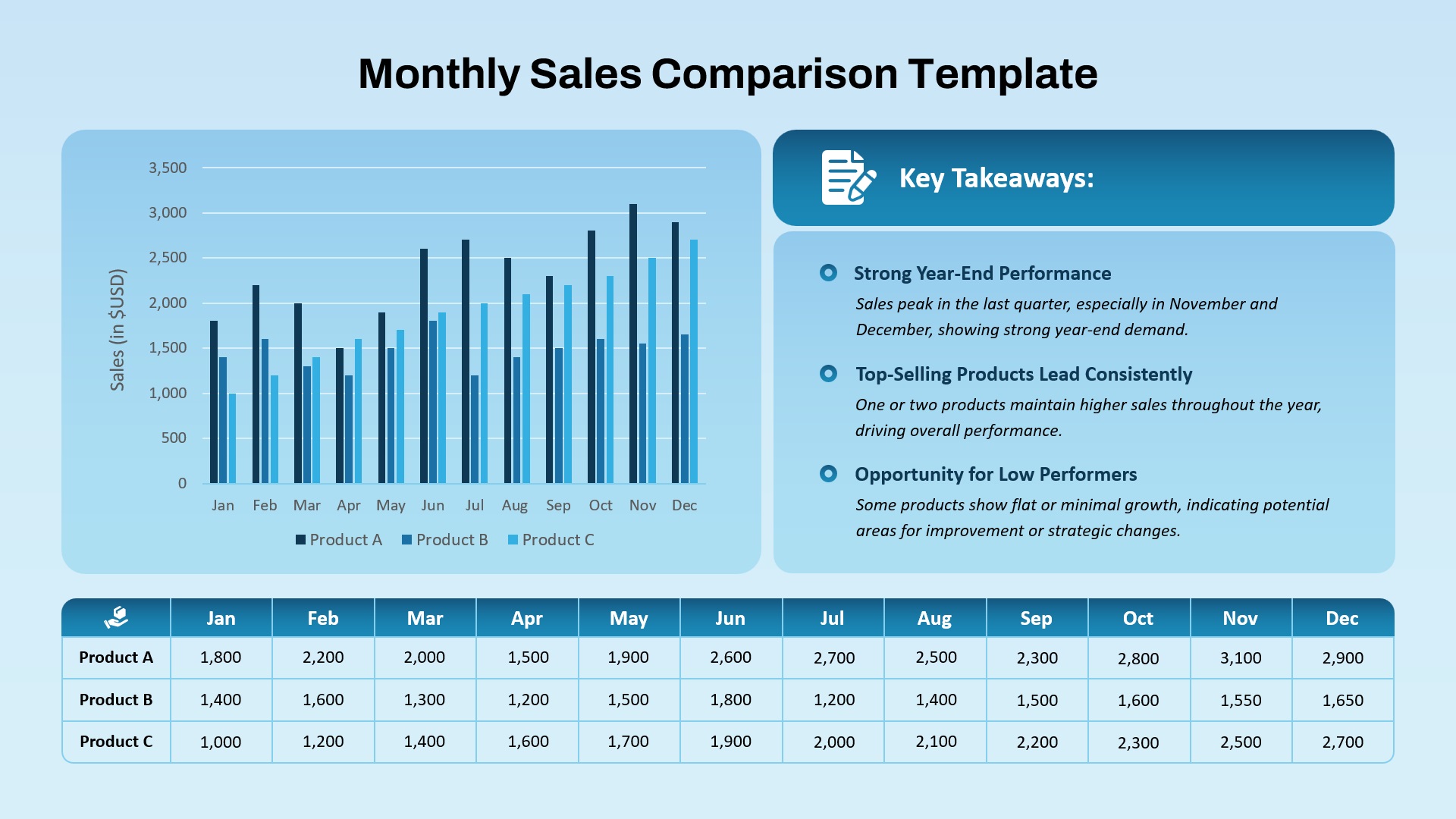
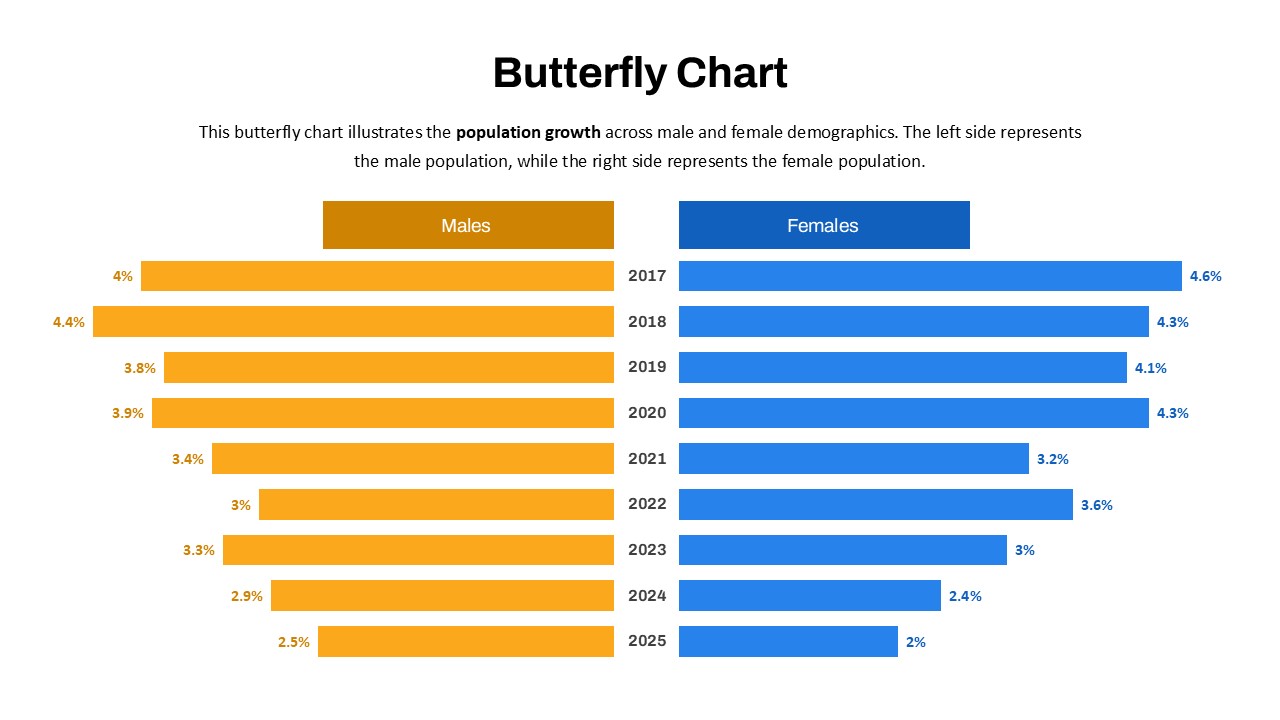
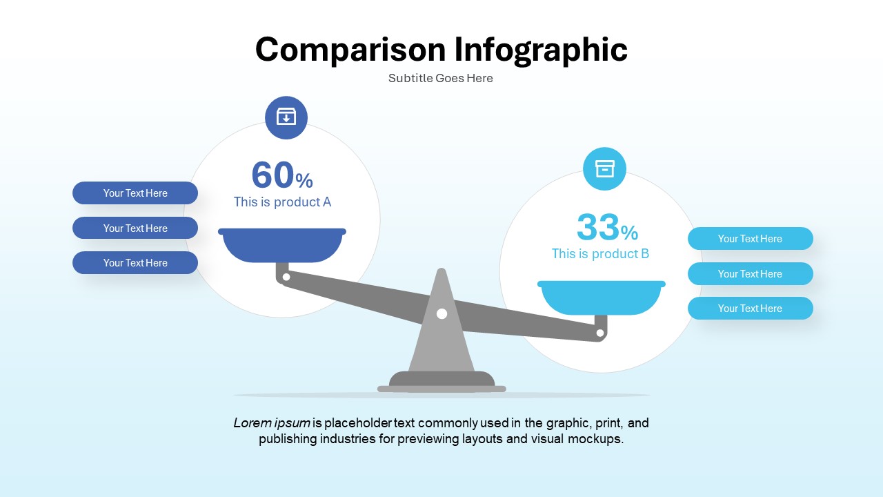
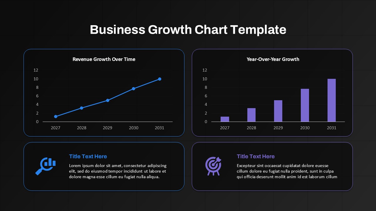
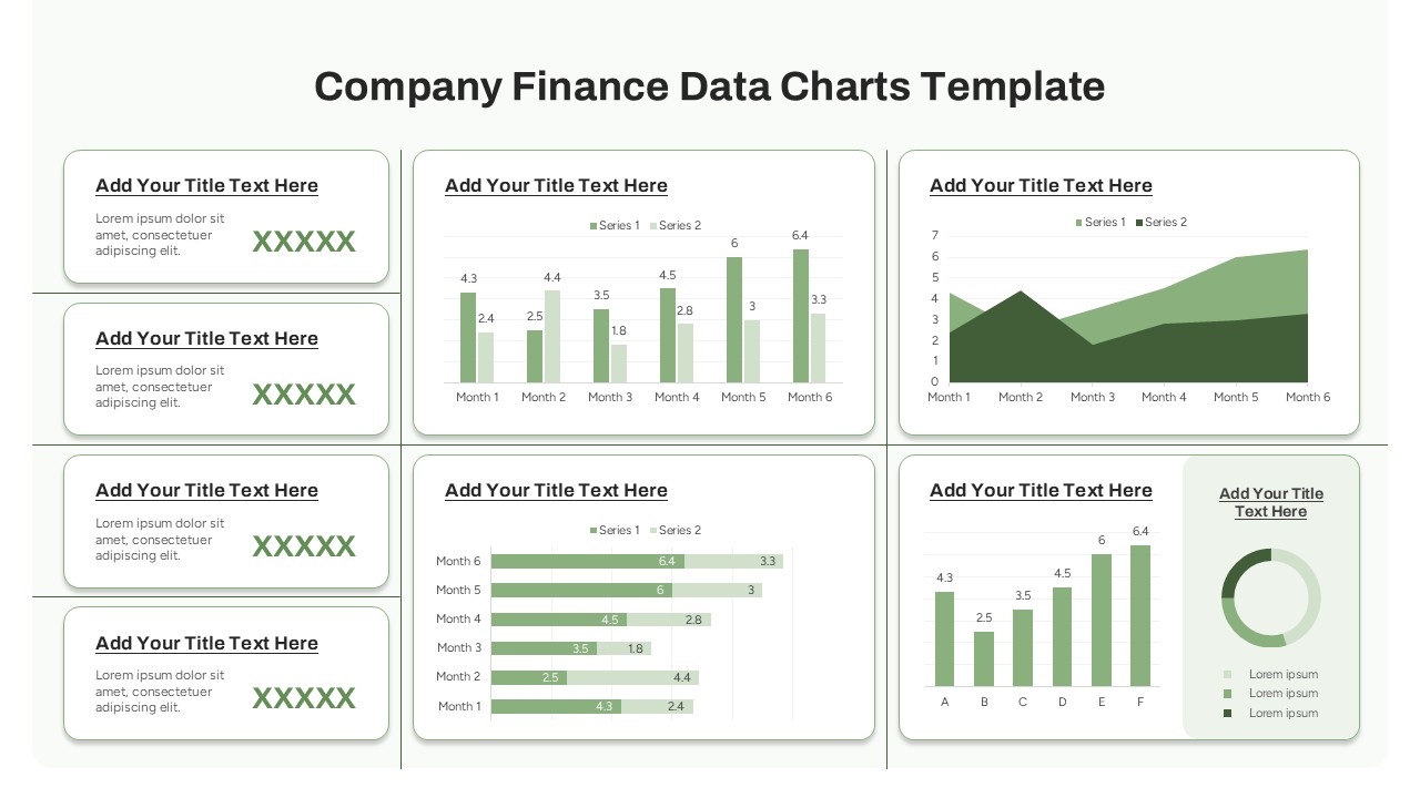
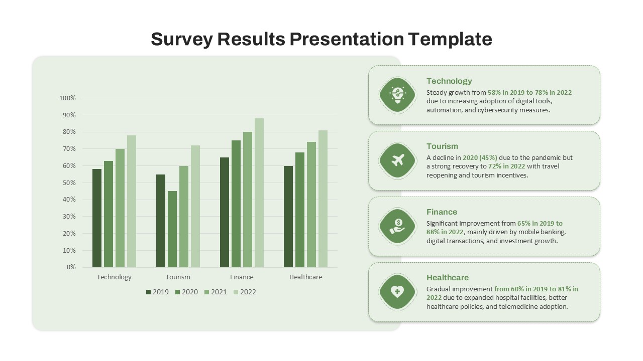
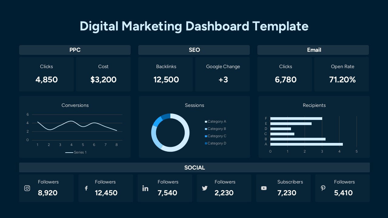
Year-over-Year Comparison PowerPoint Chart Template
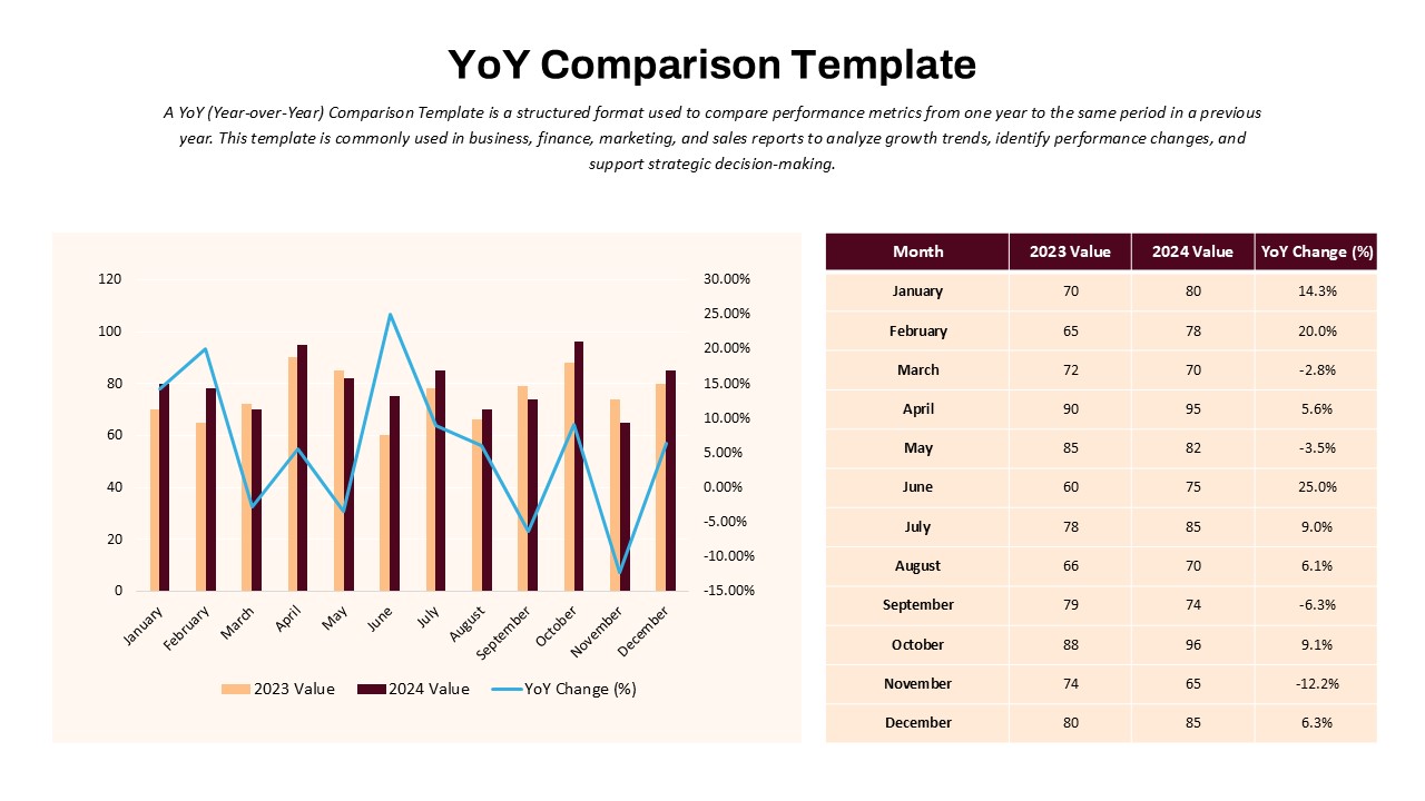
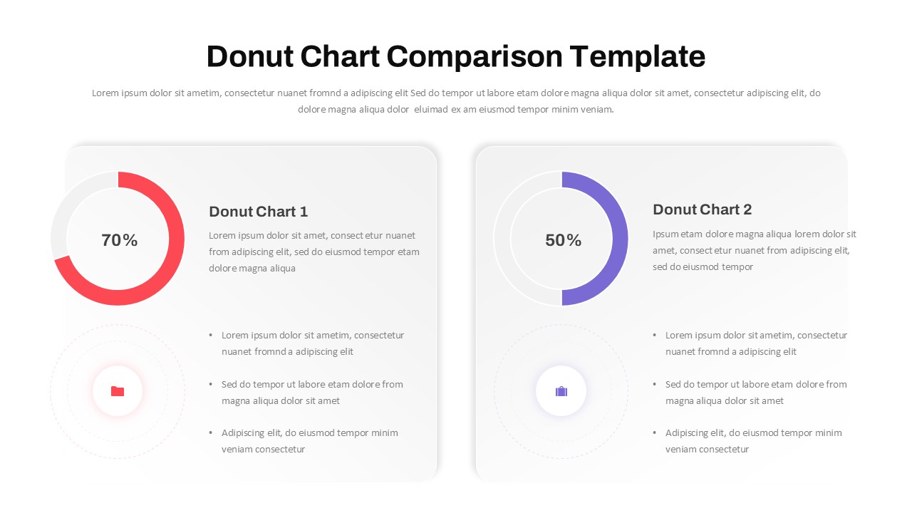
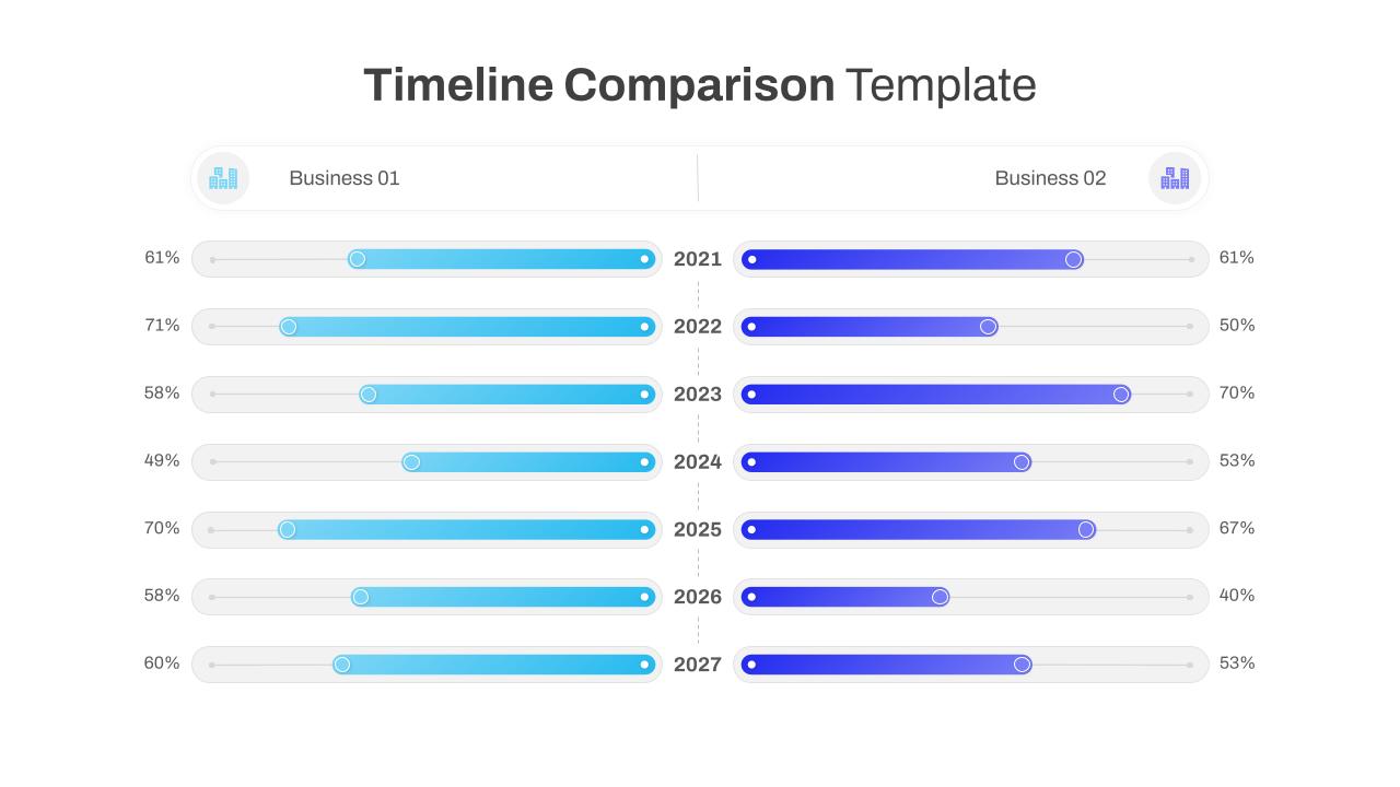
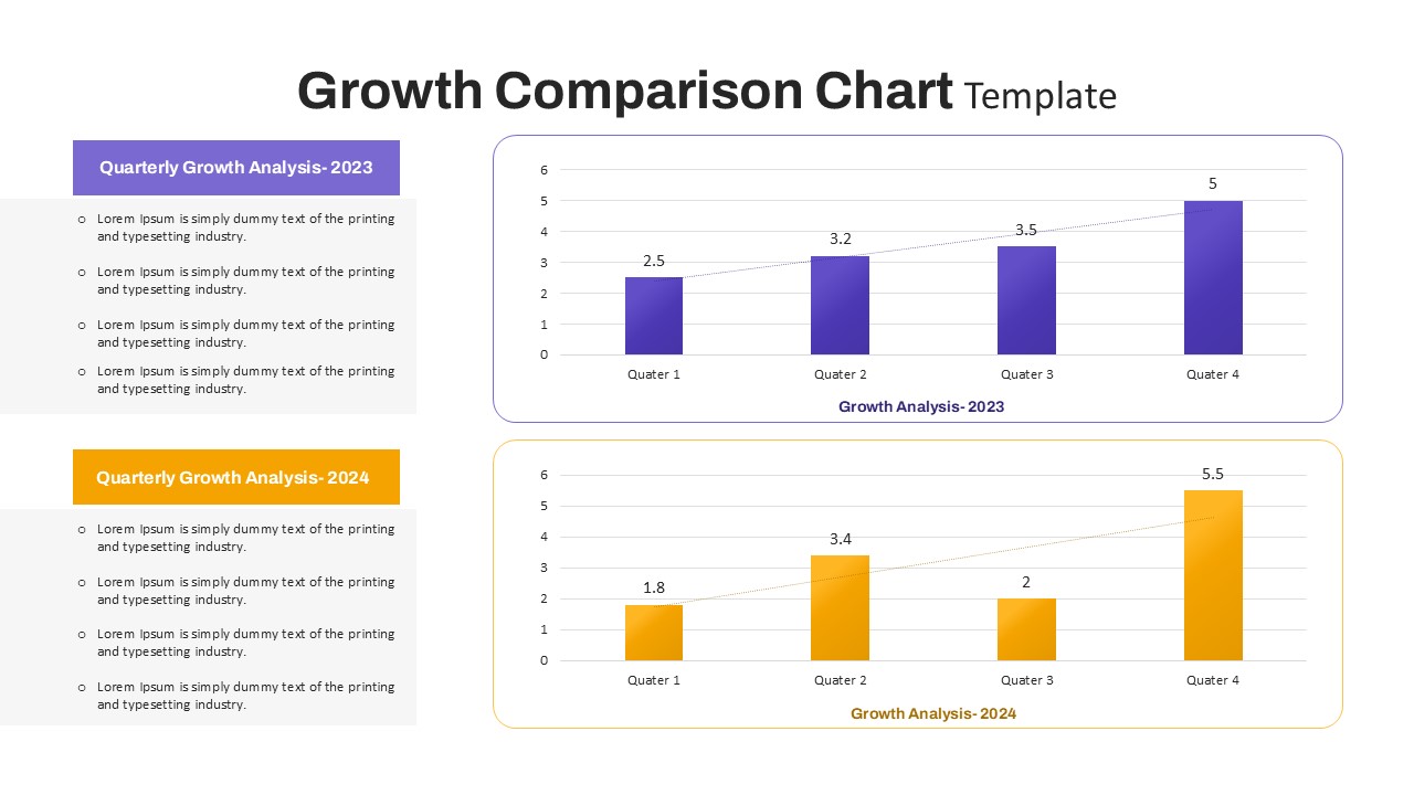
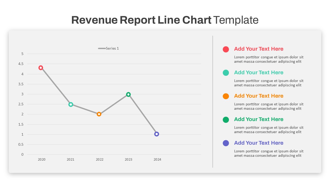
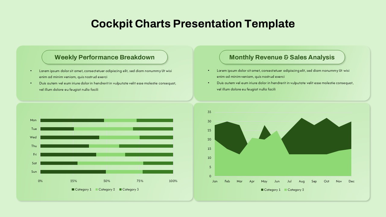
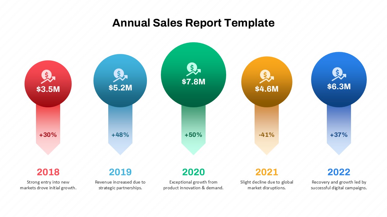
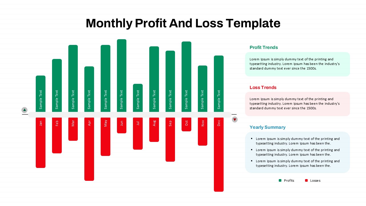
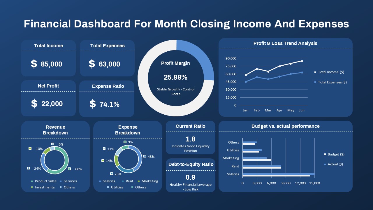
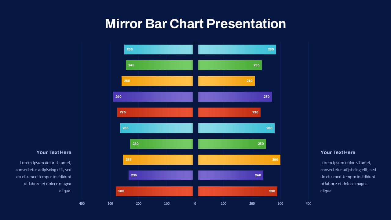
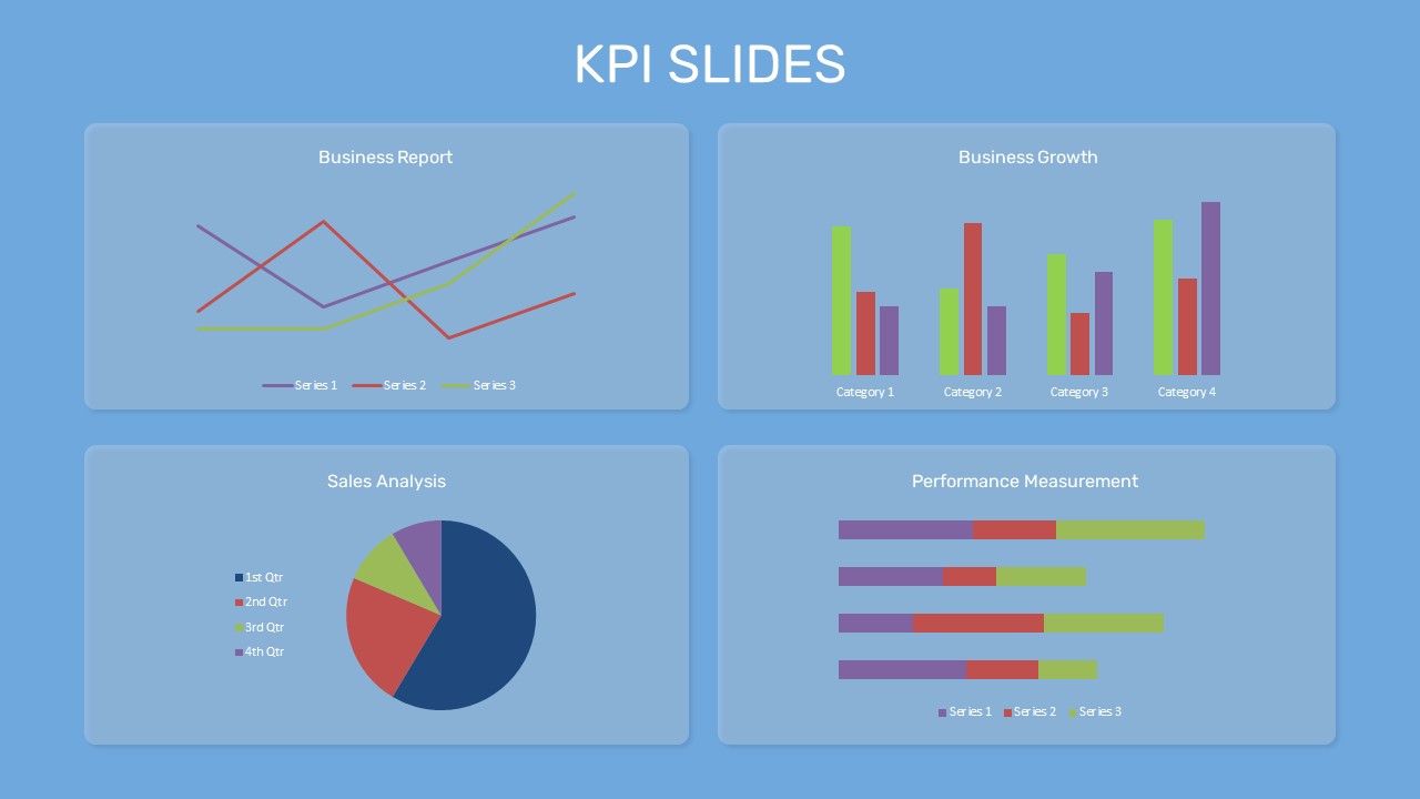
Present performance trends with precision using this Year-over-Year (YoY) Comparison Chart PowerPoint template, designed to help you analyze changes over time. This template displays monthly data for two consecutive years in a dual-axis format, combining vertical bars for actual values with a line graph for percentage changes—offering a comprehensive visual of year-on-year performance. The layout includes a clear legend, consistent color-coding, and a supporting data table, making it easy to interpret fluctuations and trends.
Ideal for business, finance, and sales presentations, this template supports strategic planning by simplifying comparative analysis across different time periods. Users can highlight growth opportunities, detect performance dips, or validate business decisions based on historical data. The clean, minimal background ensures the focus stays on your numbers and insights, while the built-in layout allows for easy customization of data sets, color schemes, and chart styles.
Fully compatible with PowerPoint , this template is both accessible and efficient for cross-platform use. Swap out values, update month labels, or translate figures into localized currencies without disrupting the structure—perfect for recurring monthly or quarterly reporting cycles. Its professional aesthetic and intuitive design make it a go-to resource for presenting metrics in stakeholder meetings, board reports, or client pitches.
See more

Aspect Ratio
16:9Item ID
SKT04031
Features of this template
Other Uses
Beyond standard reporting, this template can be repurposed for academic research, grant evaluations, product growth tracking, or HR performance reviews. It also suits dashboard builds and investor updates requiring time-based comparison visuals.
FAQs
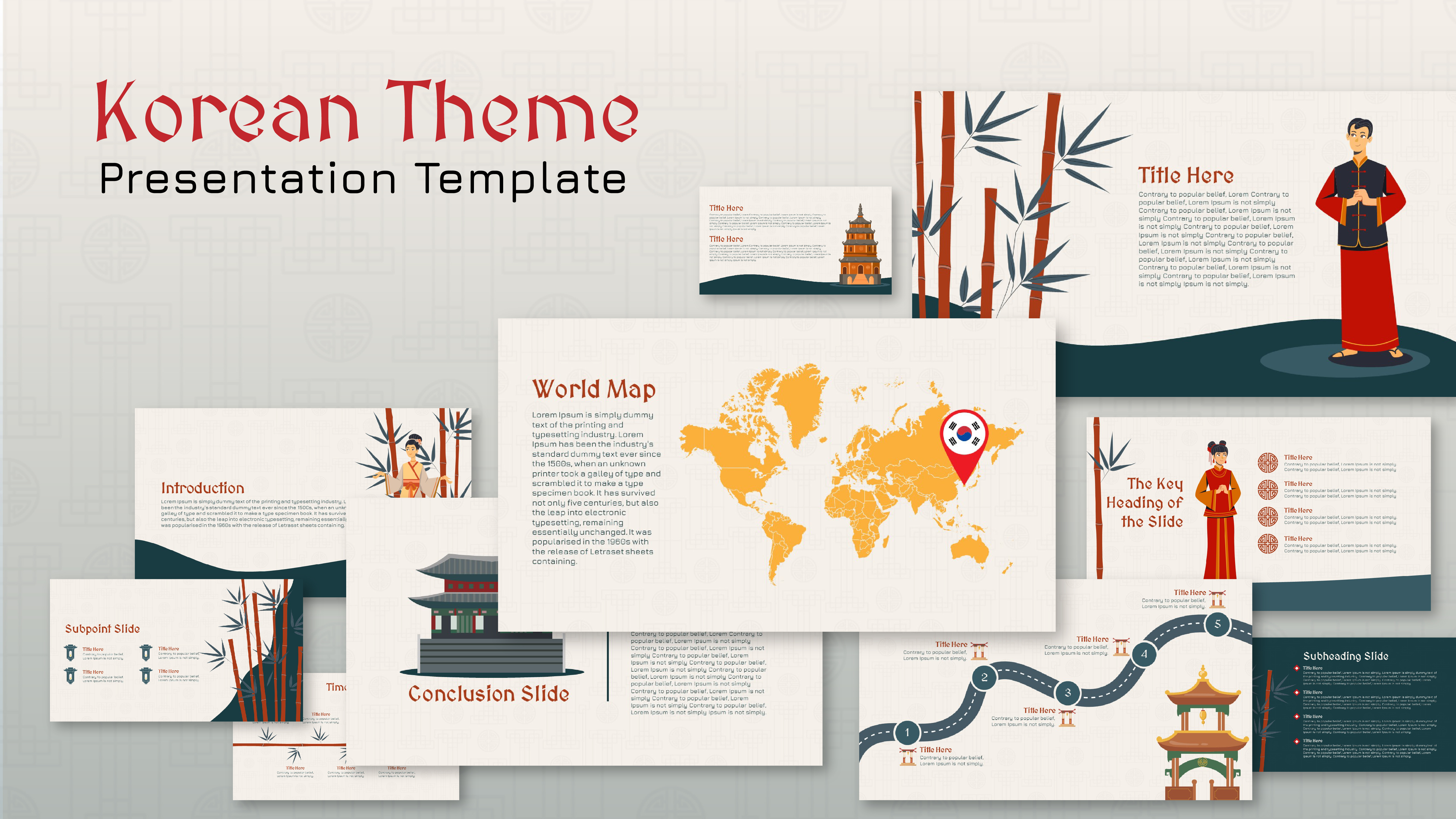
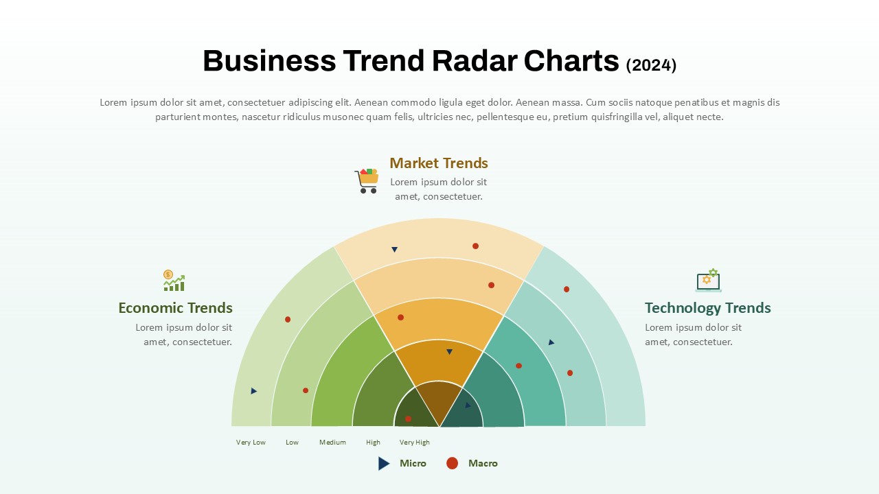
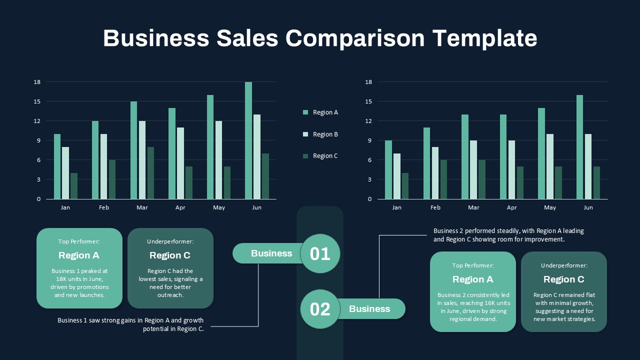
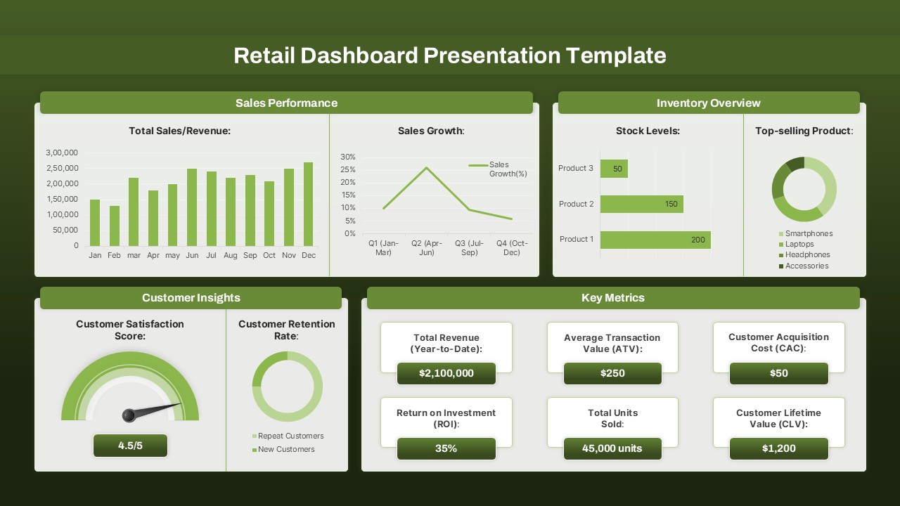
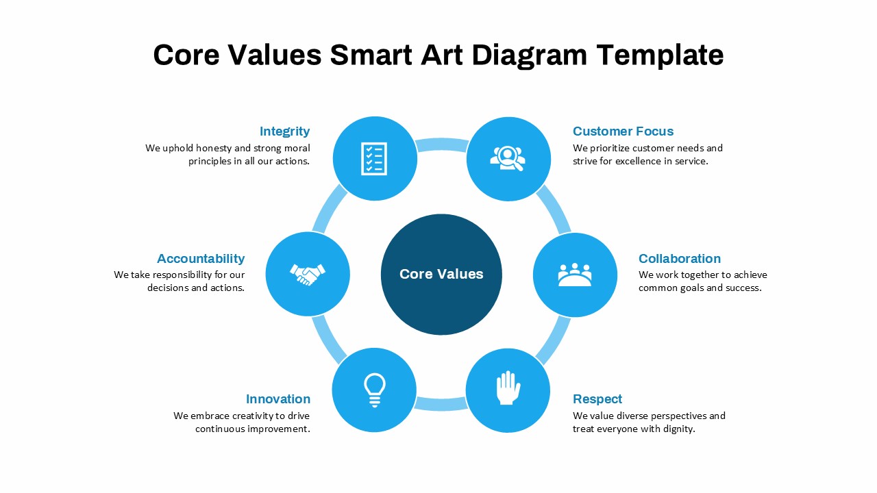
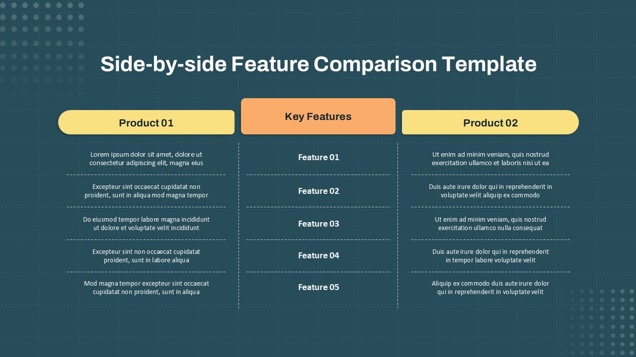
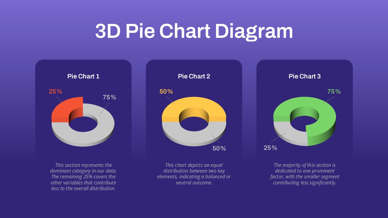
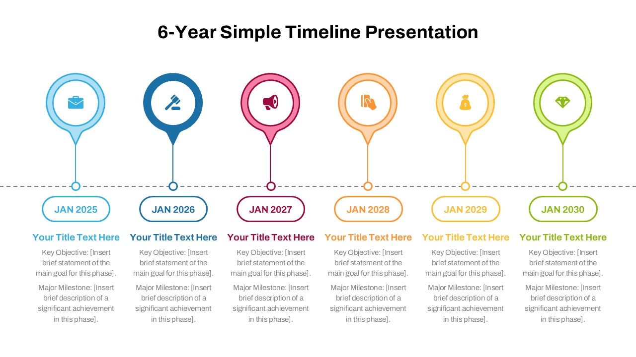
You May Also Like These Presentation Templates


- Free
- Free


- Free
- Free
- Free
- Free

- Free
- Free