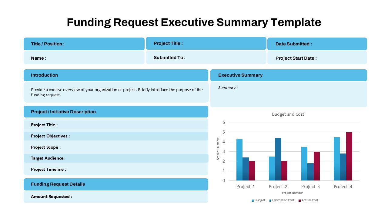
Laffer Curve PPT & Google Slides Template
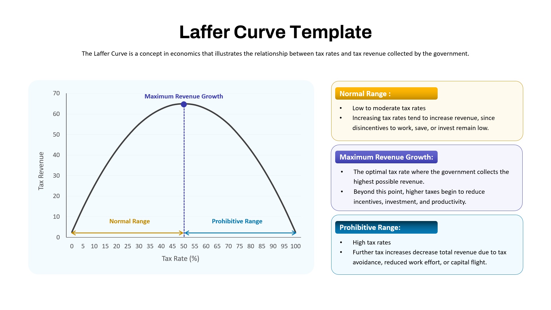
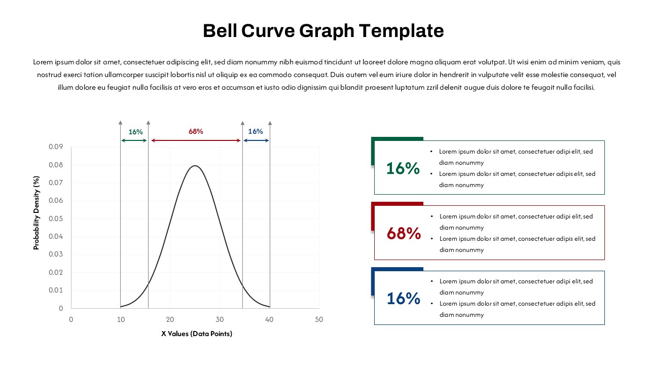
The Laffer Curve PPT Template is a clear and concise visual tool designed to explain the economic concept illustrating the relationship between tax rates and the tax revenue collected by governments. This template features a clean graph showing the iconic parabolic curve, highlighting key segments such as the Normal Range, Maximum Revenue Growth, and Prohibitive Range.
The Normal Range depicts low to moderate tax rates where increasing rates lead to higher revenue without significantly discouraging work or investment. The Maximum Revenue Growth point marks the optimal tax rate, where the government maximizes tax revenue. Beyond this, the Prohibitive Range illustrates how excessive tax rates reduce incentives, decrease productivity, and lead to tax avoidance.
Ideal for economics lectures, government policy presentations, and financial analysis, this template breaks down complex tax theories into easy-to-understand visuals supported by brief, informative descriptions. The professional layout is fully customizable in PowerPoint and Google Slides, making it suitable for educators, analysts, and policymakers aiming to communicate fiscal concepts effectively.
See more

Aspect Ratio
16:9Item ID
SKT03859
Features of this template
Other User Cases of the Template:
economic theory lectures, tax policy briefings, government budget presentations, financial analysis, public finance education, fiscal policy discussions, academic workshops, taxation seminars, investment strategy sessions, business economics classes
FAQs
You May Also Like These Presentation Templates


- Free
- Free
- Free
- Free
- Free