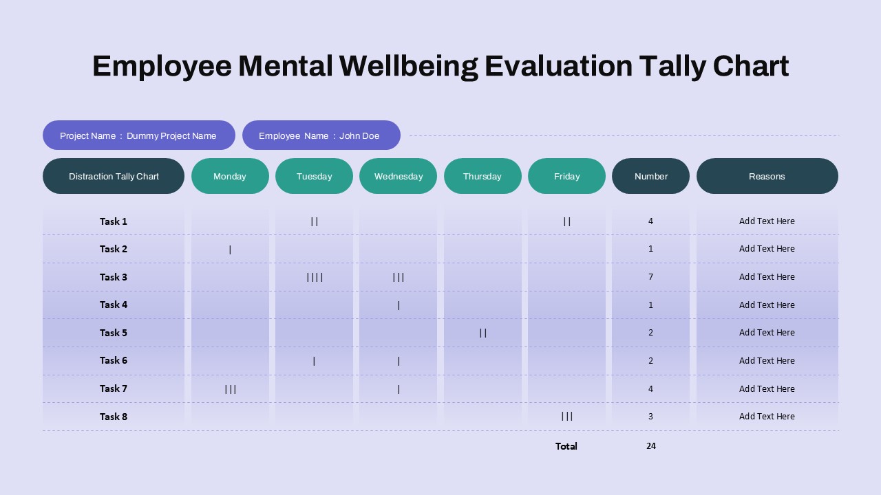
Cohort Analysis Chart Template for PowerPoint & Google Slides
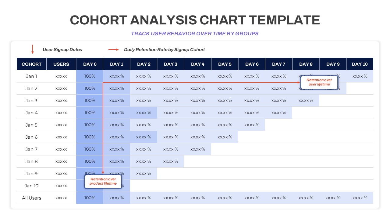
Cohort Analysis Chart Template for Retention Tracking
The Cohort Analysis Chart Template is a powerful visual tool designed to help you monitor user behavior and retention trends over time. Ideal for product managers, marketing analysts, startup founders, and UX researchers, this template enables clear, data-driven storytelling through structured cohort tracking. Compatible with both PowerPoint and Google Slides, it brings clarity and precision to performance analysis presentations.
This template presents a daily retention matrix where user cohorts, grouped by signup dates, are tracked across a 10-day window. Each row corresponds to a specific signup date, while columns measure user retention percentages from Day 0 through Day 10. This layout makes it simple to detect patterns, identify drop-off points, and assess long-term engagement—crucial insights for improving product stickiness and lifecycle marketing strategies.
Annotations like “Retention over product lifetime” and “Retention over user lifetime” help highlight key business metrics, guiding the viewer toward strategic insights without overwhelming them with raw data. With a clean color-coded design and clearly labeled columns, this chart ensures readability and quick comprehension—whether you’re presenting to internal stakeholders or external investors.
Fully editable, the template allows users to input custom data, adjust timeframes, or even expand the matrix for longer tracking periods. Its professional layout makes it a practical addition to dashboards, performance reviews, or investor updates aiming to spotlight customer loyalty and product success.
See more

Aspect Ratio
16:9Item ID
SKT03591
Features of this template
Other User Cases of the Template
Startup growth reports, user retention analysis, SaaS performance tracking, product usage evaluations, UX research presentations, marketing strategy briefs, investor pitch decks, lifecycle management reviews
FAQs
You May Also Like These Presentation Templates


- Free


- Free

- Free

- Free
- Free
- Free

- Free
- Free