Bell Curve Graph PowerPoint & Google Slides Template
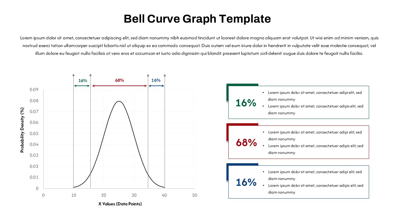
The PowerPoint bell curve template is a visually engaging tool for presenting statistical data in both PowerPoint and Google Slides formats. This bell curve graphic for PowerPoint is perfect for illustrating concepts like normal distribution, statistical analysis, and probability theory. The bell curve provides a clear visual representation of data, helping audiences better understand the distribution and frequency of data points.
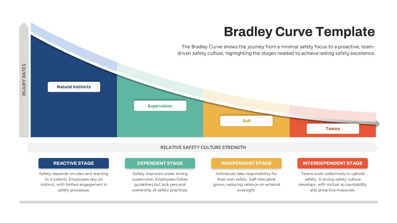
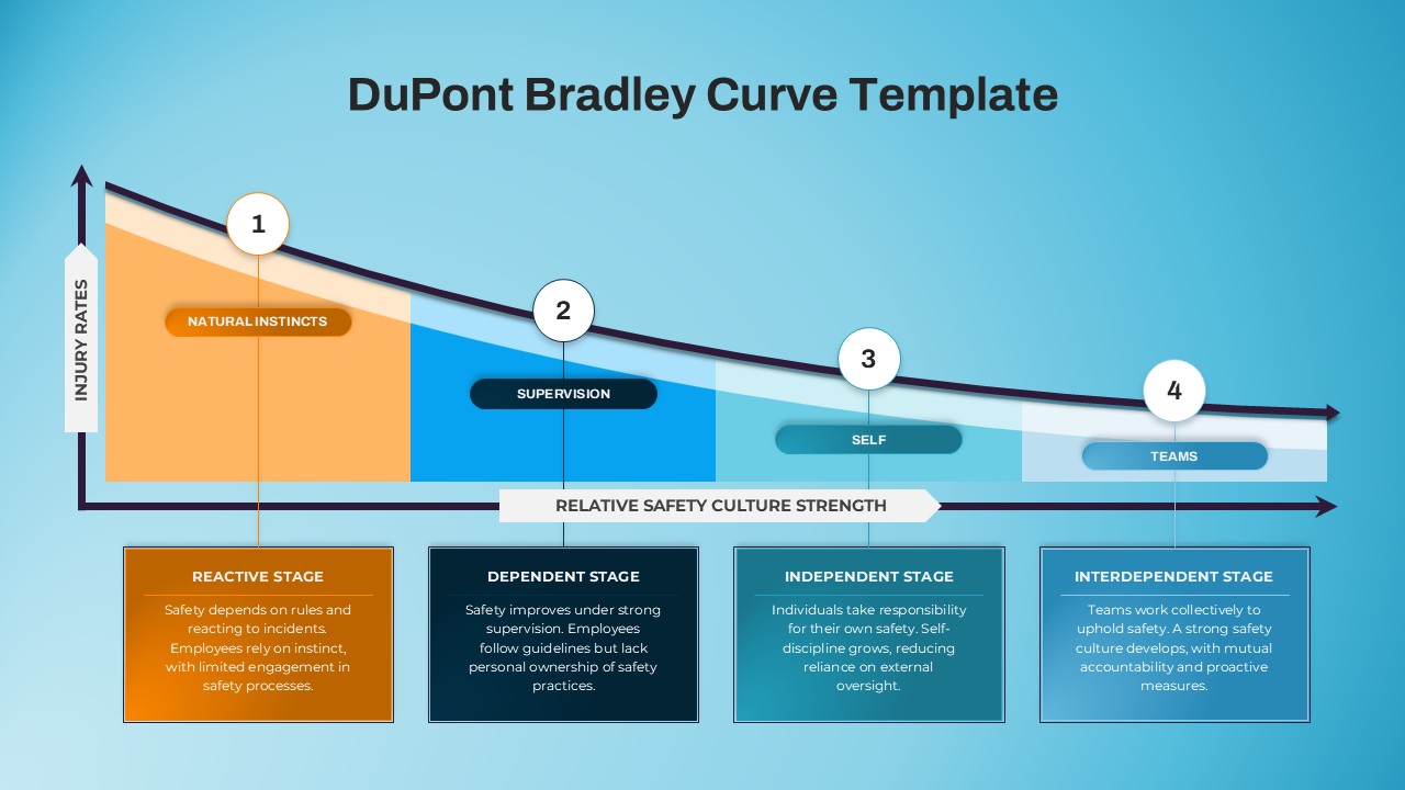
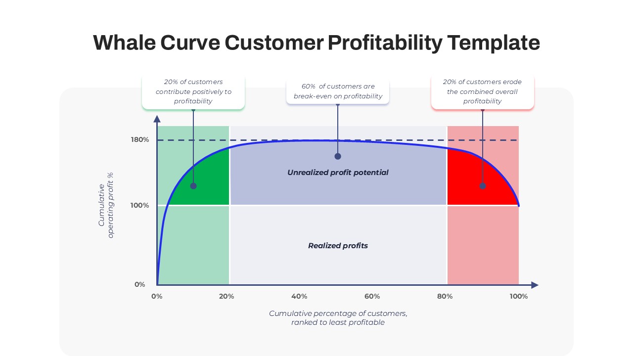
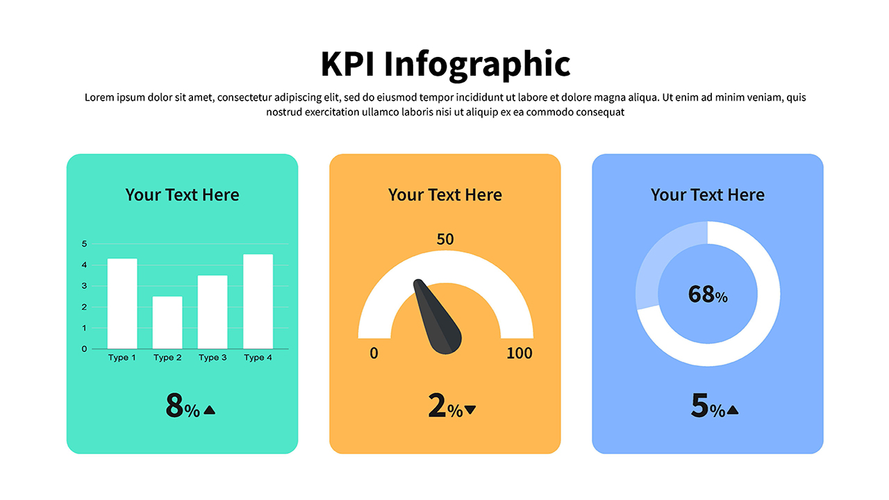
This editable bell curve chart in PowerPoint template includes a labeled bell curve graph, with percentage markers (16%, 68%, and 16%) highlighting key areas of the distribution. These markers can be customized to fit different data sets, making it ideal for presentations in data science, business analytics, educational environments, and research analysis. The adjacent text boxes offer additional space for explaining specific data points, making it easier for your audience to grasp complex concepts and key findings.
Whether you’re discussing statistical trends, performance metrics, or market research, this Bell Curve PowerPoint template helps convey your message with clarity and impact. Its clean, professional design ensures that the focus remains on your data, while the color-coded markers make the information easier to follow. Perfect for analysts, educators, and business professionals, this template is designed for both PowerPoint and Google Slides, an essential tool for presenting data-driven insights effectively.
See more

Aspect Ratio
16:9Item ID
SKT03558
Features of this template
Other User Cases of the Template
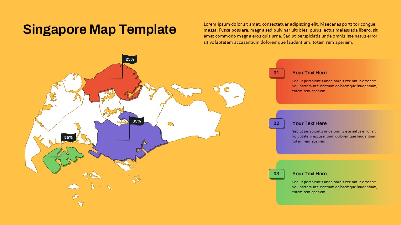
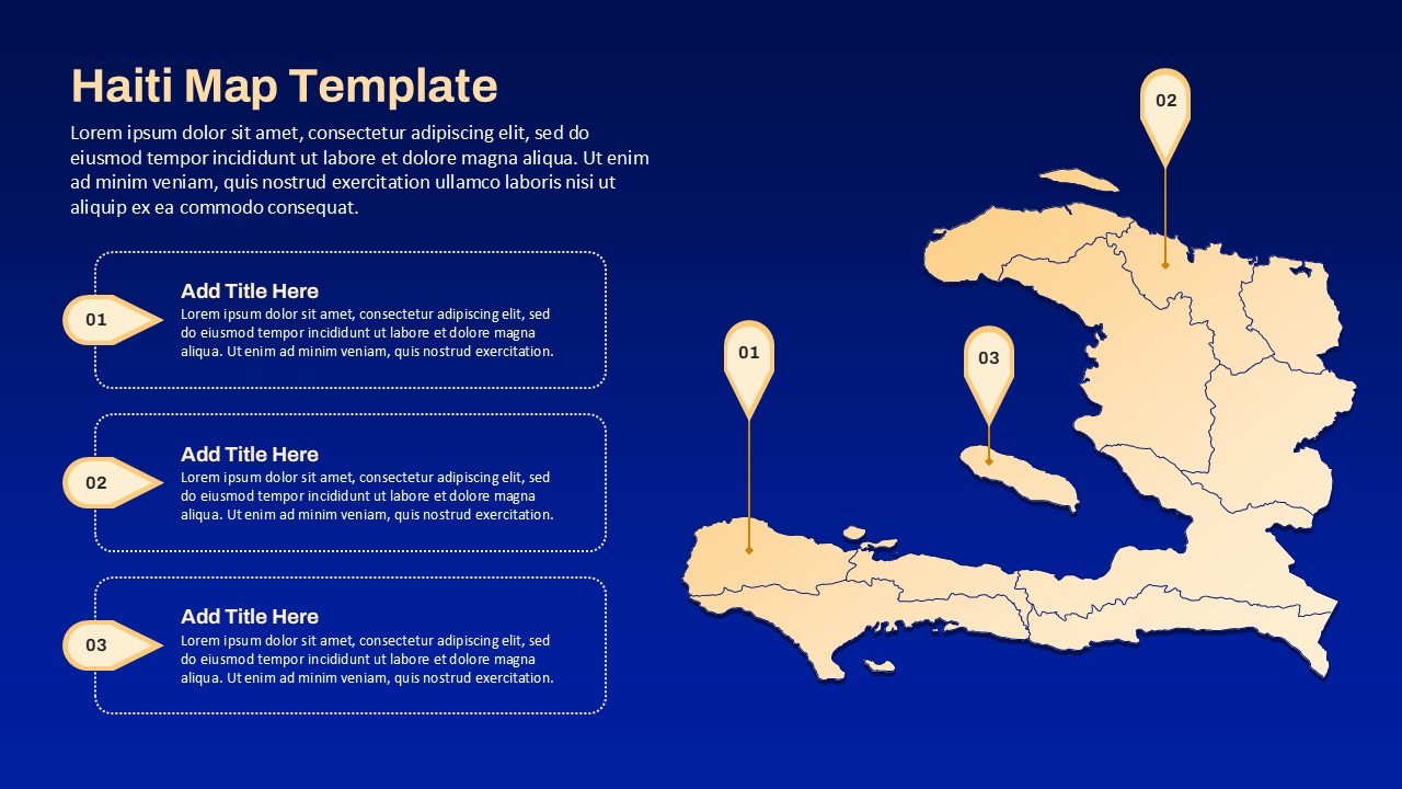
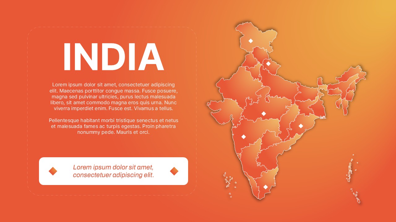
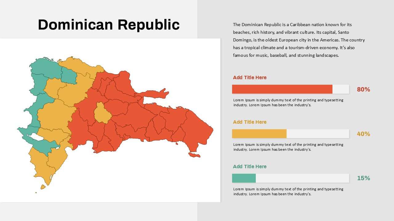
Statistical analysis, market research, performance metrics presentation, data science reports, business analytics, educational lectures, academic research, probability theory explanations, data distribution discussions, quantitative analysis
FAQs
You May Also Like These Presentation Templates


- Free

- Free

- Free

- Free

- Free