Onion Diagram vs Venn Diagram: Key Differences Explained
Both use circular shapes. Both appear in presentations. But they communicate completely different things — and using the wrong one sends the wrong message entirely. Here is how to tell them apart and choose the right one every time.
Why people confuse onion and Venn diagrams
At a glance, onion diagrams and Venn diagrams look similar both use circles, both appear regularly in business and educational presentations, and both are used to visualize relationships between concepts. This surface similarity leads many presenters to use them interchangeably, which almost always results in a diagram that communicates the wrong thing.
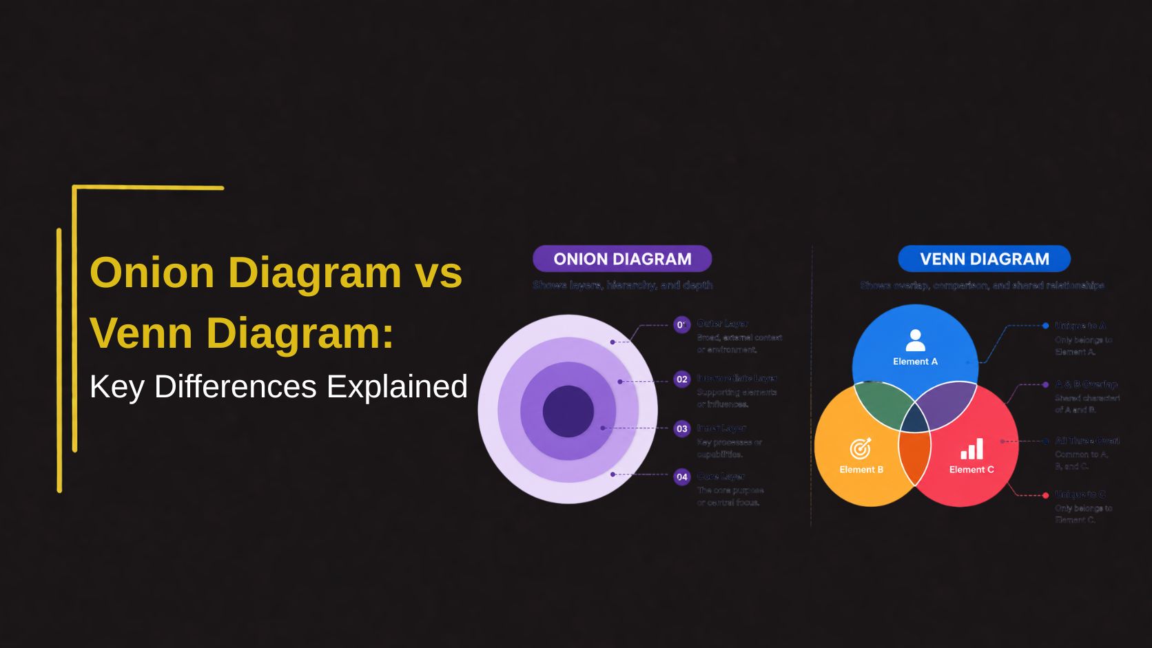
The confusion is understandable but the difference is fundamental. An onion diagram shows layers of concentric rings that represent hierarchy, depth, or levels of priority from the outside in. A Venn diagram shows overlapping intersecting circles that reveal shared characteristics between two or more distinct groups. Same shape family, completely different purpose.
Understanding this distinction is one of the most practical improvements any presenter can make to their diagram choices and it takes about five minutes to internalize permanently.
What is an onion diagram
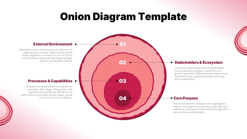
An onion diagram, sometimes called a layered diagram or concentric circle diagram is a visual structure built from rings nested inside each other like the layers of an onion. Each ring represents a different level, layer, or category, with the relationship between rings typically indicating depth, hierarchy, or proximity to a central concept.
The most important or foundational element sits at the center. Each successive ring moving outward represents either something less central, a broader category, or a higher level of abstraction. The visual logic is intuitive what is at the core matters most, and what surrounds it provides context, support, or broader framing.
👉Discover Editable Onion Diagram Slides on SlideKit
👉Discover Creative Venn Diagram Slides on SlideKit
What is a Venn Diagram
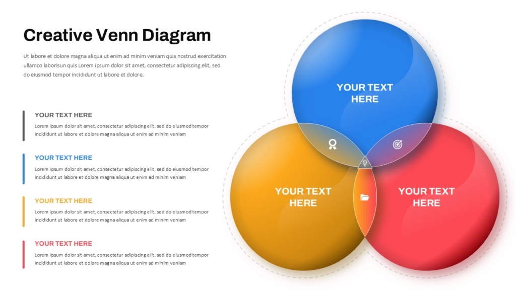
A Venn diagram uses two or more overlapping circles to show the relationship between different sets or groups. Each circle represents a distinct category, and the area where circles overlap represents characteristics, properties, or items that are shared between those categories.
The non-overlapping portions of each circle represent what is unique to that group alone. The overlap region sometimes called the intersection represents what they have in common. A three-circle Venn diagram can show pairwise overlaps between each pair of groups as well as a central area where all three groups share something.
Key differences at a glance
Onion Diagram :
- Concentric rings — no overlap between layers
- Shows hierarchy, depth, or layered structure
- Core element is the most central or important
- Rings move from specific to general outward
- Best for showing levels, tiers, or phases
- No intersection or shared zone between rings
Venn Diagram :
- Overlapping circles — intersection is the key feature
- Shows similarities, differences, and shared traits
- All circles are equally weighted by default
- Each circle represents a distinct and separate group
- Best for showing comparison and overlap
- Intersection zone contains shared elements
The simplest way to remember the difference — an onion diagram is about depth, a Venn diagram is about overlap. If your content has layers, use an onion. If your content has intersections, use a Venn.
When to use an onion diagram
Onion diagrams work best when your content has a natural layered or hierarchical structure where elements exist at different levels of depth, proximity to a core, or stages of development. The visual logic of concentric rings communicates these relationships without requiring explanation.
- Brand Architecture : Core brand values at the center, brand personality in the next ring, visual identity in the outer ring — shows how brand elements build from the inside out.
- Organizational layers : Leadership at the core, management in the middle ring, operational teams in the outer ring communicates structure and proximity to decision-making.
- Security and Trust Zones : Highly sensitive data at the core, internal systems in the middle, public-facing layers at the outside communicates levels of access and protection.
When to use a Venn diagram
Venn diagrams work best when your content involves two or more distinct groups and you want to show what they share and what makes each one unique. The intersection is the visual focus; it is where the most interesting insight typically lives.
- Product Positioning : Show where your product sits at the intersection of two customer needs that competitors serve separately as a powerful way to communicate unique market position.
- Competitive Analysis : Show what features or capabilities your product shares with competitors and what each does uniquely — a clear visual for differentiation conversations.
- Academic Comparison : Compare two theories, historical events, literary characters, or scientific concepts the classic educational use case that makes Venn diagrams universally recognized
Conclusion
Onion diagrams and Venn diagrams serve different purposes: onion diagrams show layers, hierarchy, and depth, while Venn diagrams illustrate overlap and shared relationships. Choosing the right one is simple: use onion diagrams for layered structures and Venn diagrams for comparisons to ensure your message remains clear and accurate.
If you are looking for professionally designed templates for both diagram types, SlideKit offers a curated library of fully editable onion diagrams and Venn diagram PowerPoint and Google Slides templates ready to customize with your content and brand colors in minutes. Stop building diagrams from scratch and start presenting with the visual clarity your ideas deserve.
Explore SlideKit diagram templates today and find the right visual structure for every presentation you build.

