How to Make Google Slides Look Good for Business Presentations

First impressions in business happen fast. Before you say a word in a client meeting or internal review, your slides communicate something about your standards, preparation, and professionalism. Clean, well-structured slides signal credibility. Cluttered, inconsistent ones quietly undermine it.
Google Slides has become a go-to presentation tool for business teams. It’s accessible, collaborative, and works across devices without compatibility headaches. But accessibility doesn’t automatically produce professional results. Many business presentations built in Google Slides look rushed, inconsistent, or visually distracting—not because the content is weak, but because basic design principles got skipped.
This guide explains practical ways to make Google Slides look good for business use, covering layout structure, typography, color, hierarchy, and common mistakes worth avoiding.
Why Design Quality Affects Business Credibility
Design quality isn’t just about aesthetics. In business contexts, how your slides look directly influences how your content gets received.
Poorly designed slides suggest rushed preparation. When text overflows margins, fonts change randomly between slides, or colors clash, audiences notice—even if they can’t articulate exactly what’s wrong. That subtle negative reaction affects how seriously they take your recommendations.
Well-designed slides do the opposite. They signal that you respect your audience’s time, that you’ve thought carefully about how to communicate, and that your work is thorough. This perception carries real weight in client pitches, stakeholder presentations, and leadership briefings where credibility influences decisions.
Design quality also affects comprehension. When slides are structured clearly, audiences follow your argument more easily. When they’re cluttered or inconsistent, audiences spend mental energy decoding the layout rather than absorbing your message.
The goal isn’t beautiful slides for their own sake. The goal is slides that communicate your content clearly while building rather than undermining professional credibility.
Starting With Clean Layout and Grid Structure
Layout is the foundation everything else builds on. Getting it right makes every other design decision easier.
Use Consistent Margins
Google Slides doesn’t enforce margins automatically. Content often drifts to slide edges, creating cramped presentations that look unprofessional.
Set consistent margins by using guide lines. Go to View > Guides > Edit Guides and add horizontal and vertical guides at consistent distances from slide edges—typically around 0.4 to 0.5 inches. Keep all text and content within these margins throughout your presentation.
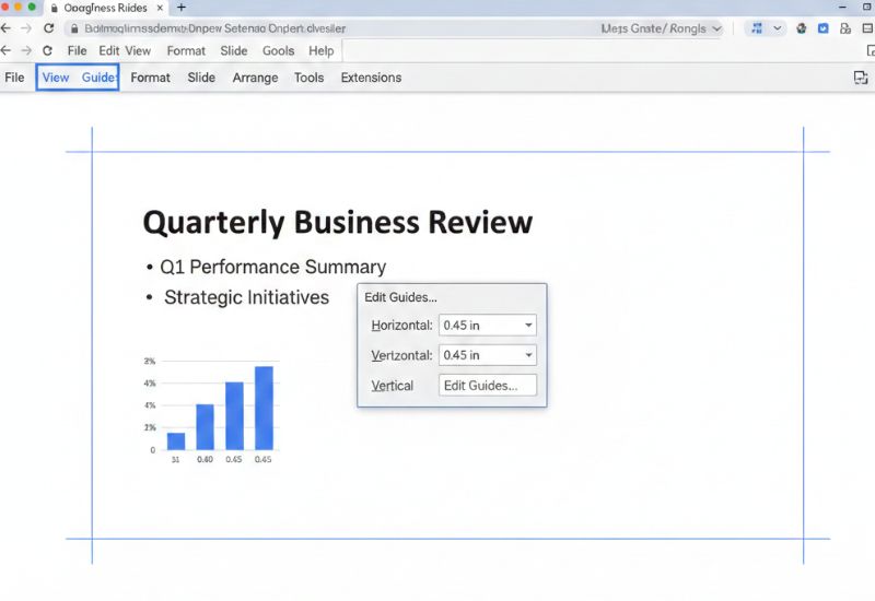
This single habit dramatically improves how professional slides look by creating visual breathing room and preventing the cramped appearance that undermines credibility.
Align Everything Deliberately
Random element positioning looks careless. Professional slides use alignment tools to ensure elements line up precisely.
Select multiple elements and use Arrange > Align to align them to each other or to the slide. Use Arrange > Distribute to space elements evenly. These tools create precision that eyeballing cannot.
Check alignment by looking for invisible grid lines running through your content. Text boxes, images, and shapes should align to each other in logical horizontal and vertical relationships.
Keep Layouts Simple
Business slides communicate most effectively with simple, focused layouts. Resist putting too many elements on a single slide.
One headline, one supporting visual or text block, and supporting detail where needed covers most business slide needs. When slides try to do more than this, audiences struggle to identify what matters.
Simple layouts also make slides easier to update as content changes—a practical benefit for business teams maintaining presentations over time.
Create Visual Breathing Room
White space—empty areas around and between elements—improves readability and directs attention to what matters. Slides that fill every available area feel overwhelming regardless of content quality.
Give text room to breathe. Leave space between sections. Don’t stretch images to fill slides just to avoid empty space. Intentional white space is a design tool, not wasted slide real estate.
Typography That Communicates Professionalism
Font choices and text formatting communicate tone before audiences read a single word. Professional typography requires deliberate decisions.
Limit Font Families
Use a maximum of two font families per presentation—one for headlines and one for body text. More fonts create visual inconsistency that looks unprofessional.
Good combinations pair a slightly bolder or more distinctive headline font with a highly readable body font. The contrast creates hierarchy without requiring dramatically different styles.
Google Slides includes access to Google Fonts, providing hundreds of options. For business presentations, lean toward clean sans-serif options like Lato, Montserrat, Open Sans, or Raleway. These remain readable at various sizes and project well.
Set Appropriate Text Sizes
Text hierarchy communicates importance through size. A clear size system might use 36 to 44 points for slide headlines, 20 to 24 points for key content, and 16 to 18 points for supporting details.
Never go below 16 points for any text audiences need to read. Text that looks acceptable on your laptop screen often becomes unreadable when projected or viewed on smaller devices.
Test every finished presentation in full-screen mode before presenting. If you need to squint, your text is too small.
Maintain Consistent Text Formatting
Formatting consistency signals professionalism. If headlines use title case, all headlines use title case. If bullet points use sentence case, all bullet points use sentence case. If a specific style appears bold, that same style should always be bold.
Inconsistent formatting—some headings bold, some not, some text centered, some left-aligned without clear reason—suggests carelessness that undermines confidence in your content.
Reduce Text Density
Business slides are not documents. The most common mistake in business Google Slides presentations is too much text on each slide.
Bullet points should be short phrases, not full sentences. Paragraphs of explanatory text belong in supporting documents, not slides. If you’re writing full paragraphs on slides, you’re creating a document that happens to be in slide format—not a presentation.
The rule to aim for: if someone can read your entire slide in under ten seconds, the text density is appropriate.
Color That Reinforces Brand and Clarity
Color choices affect both aesthetics and communication. For business presentations, color should serve specific purposes rather than just making slides look interesting.
Build From Your Brand Colors
Business presentations should use your organization’s brand colors consistently. This creates immediate visual connection to organizational identity and ensures presentations feel cohesive with other materials.
If brand guidelines exist, follow them precisely. Use exact color hex codes rather than approximations. Slightly different shades of the same brand color look like mistakes, not variations.
If no formal brand guidelines exist, choose a palette and document it. Three to four colors—a primary, a secondary, an accent, and a neutral—provide enough variety for most business presentation needs.
Use Color Functionally
Every color should mean something consistent throughout your presentation. One color might highlight key statistics. Another might indicate calls to action. A third might distinguish different data categories.
When color usage is consistent and purposeful, audiences quickly learn to read it. When colors are applied randomly or decoratively, they add visual noise without communication value.
Maintain Sufficient Contrast
Low contrast between text and backgrounds creates accessibility problems and reduces professional appearance. Dark text on light backgrounds or light text on dark backgrounds work reliably.
Avoid trendy but low-contrast combinations—light gray text on white backgrounds, pale text on light colored backgrounds, or busy patterned backgrounds beneath text.
Test contrast by stepping back from your screen and checking readability from a distance that simulates projection conditions.
Avoid Overusing Colors
Three to four colors covers most business presentations well. More colors create visual chaos that suggests poor design judgment.
Even with a four-color palette, most slides should use only two or three colors. Reserve accent colors for genuine emphasis rather than decorating every element.
Building Slide Hierarchy and Content Flow
Professional presentations guide audiences through information logically. Hierarchy and flow work together to make content easy to follow.
Create Clear Slide Headlines
Every slide needs a clear headline that states the slide’s main point. Not a vague topic label like “Sales” but a specific statement like “Sales grew 23% in Q3 driven by enterprise accounts.”
Good headlines let audiences understand your key message even if they only read headlines. This matters because audiences in meetings often scan ahead or get distracted—clear headlines ensure your key points land regardless.
Structure Information Consistently
Consistent slide structure helps audiences navigate presentations. When similar slides follow the same layout, audiences know where to look for different types of information.
A consistent structure might position slide headlines in the same place, supporting data in the same area, and source references in the same corner. This predictability reduces cognitive load and helps audiences focus on content rather than figuring out each slide’s layout.
Sequence Slides Logically
Each slide should connect clearly to the ones before and after it. Abrupt topic changes or random sequencing disrupts the logical flow that makes presentations persuasive.
Build presentations like well-structured arguments: establish context, present information, draw conclusions, make recommendations. Each section should lead naturally to the next.
Match Content Depth to Slide Count
Some topics need one slide. Others need five. Don’t artificially constrain complex topics to single slides or pad simple points across multiple slides.
When a slide feels too complex, split it. When slides feel redundant or thin, consider combining or removing. Match slide count to content complexity rather than hitting arbitrary numbers.
Practical Visual Improvements for Common Slide Types
Specific slide types appear frequently in business presentations. Each benefits from focused design attention.
Data Slides
Charts and graphs need clean, minimal formatting. Remove unnecessary gridlines, simplify axis labels, and eliminate chart borders that add no information.
Use color in charts functionally—highlighting the data series that matters most while keeping comparison data in neutral colors. Add data labels directly to chart elements rather than relying on legends that require eye movement to decode.
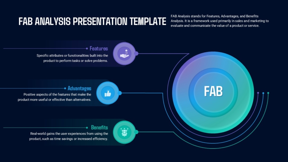
Business frameworks like the FAB analysis presentation template or double diamond model presentation template provide structured formats for analytical content that require clear visual organization.
Strategy and Framework Slides
Strategy presentations often cover frameworks, models, or structured approaches. These benefit from visual layouts that show relationships between components rather than bulleted lists of framework elements.
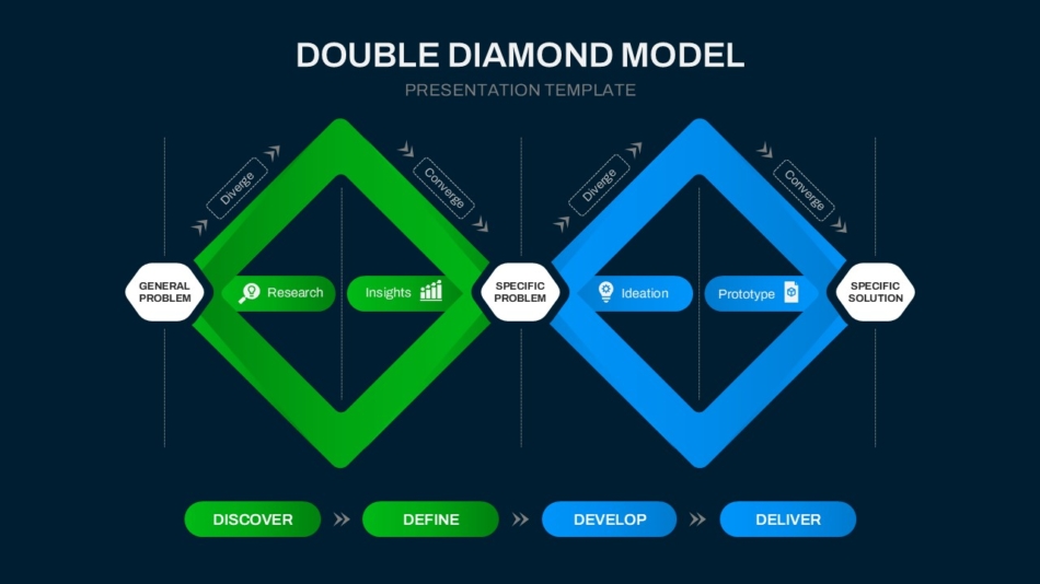
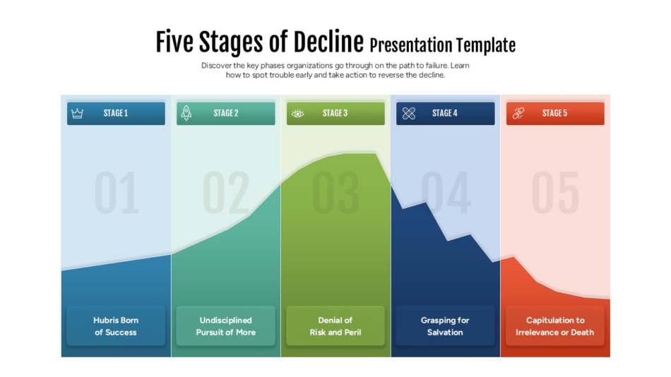
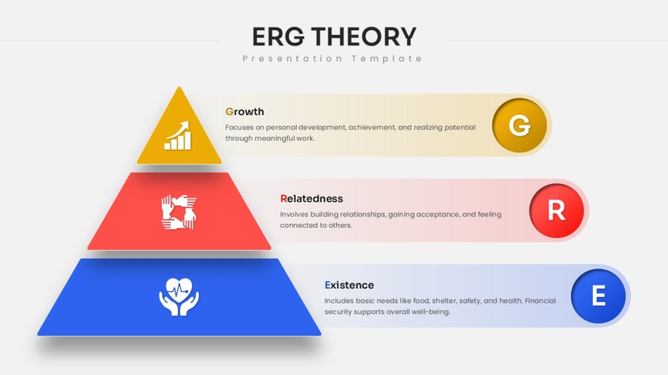
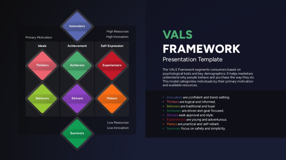
Templates like the VALS framework presentation template, ERG theory template, or five stages of decline presentation template visualize frameworks in ways that text descriptions can’t match.
Process and Workflow Slides
Business processes need visual representation that shows sequence and relationships. A SNAP sales process template or Poka-Yoke presentation template demonstrates how process content can be organized visually for better comprehension.
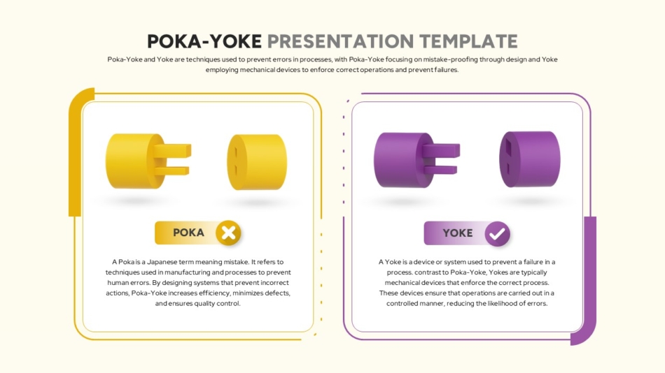
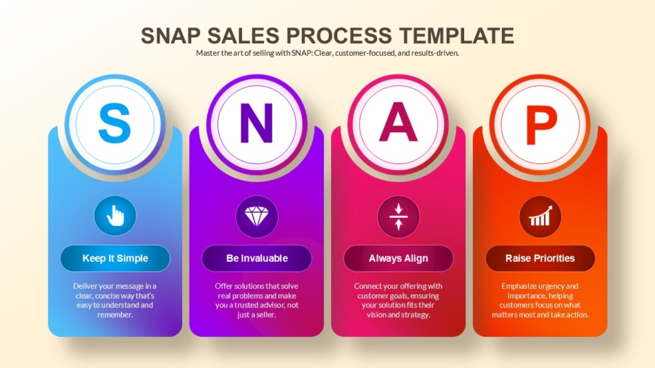
These formats show how steps connect and progress rather than simply listing them, helping audiences understand both sequence and relationships.
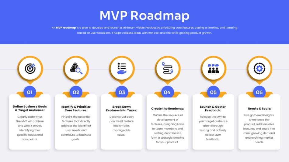
Planning and Roadmap Slides
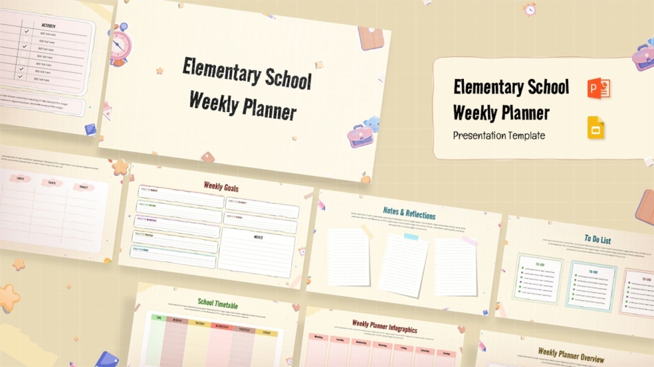
Forward-looking content benefits from roadmap-style layouts. An MVP roadmap template shows product development planning clearly, while educational planning content like an elementary school weekly planner template, demonstrates how planning content can be organized visually.
Common Design Mistakes to Fix
Recognizing frequent errors helps you improve presentation quality quickly.
Inconsistent slide layouts across a presentation make it look assembled rather than designed. Establish two or three standard layouts and use them consistently throughout.
Too many fonts and sizes create visual chaos. Limit yourself to two font families with clear, consistent size hierarchy.
Low contrast text reduces readability and looks unprofessional. Check every text element for sufficient contrast against its background.
Stretched or pixelated images signal lack of attention to detail. Only use high-resolution images and maintain aspect ratios when resizing.
Default color themes make presentations look generic. Customize colors to match organizational branding rather than using Google Slides defaults.
Overloaded slides with too much content force audiences to choose what to read rather than following your narrative. One main point per slide.
Missing visual hierarchy where everything looks equally important means nothing stands out. Use size, weight, and color to create clear emphasis.
Misaligned elements look careless. Use alignment tools rather than positioning by eye.
Inconsistent spacing between elements creates visual tension. Establish spacing standards and apply them throughout.
Animated transitions between slides that add no communication value distract from content. Use simple cuts or minimal fades rather than elaborate transition effects.
Google Slides vs PowerPoint for Business Presentations
Many business teams wonder whether to use Google Slides or PowerPoint. Both work well for professional presentations with some practical differences worth understanding.
Google Slides excels at real-time collaboration, browser-based access without software installation, and sharing convenience. Team members can work on the same deck simultaneously, comment on specific slides, and access presentations from any device.
PowerPoint offers more advanced design features, better offline reliability, and stronger compatibility with complex formatting. If your presentations need sophisticated animation, advanced chart formatting, or integration with other Microsoft Office tools, PowerPoint may serve better.
For most business presentation needs—client meetings, internal updates, strategy presentations, training materials—Google Slides handles the job well. The collaborative features often outweigh PowerPoint’s additional design capabilities for teams working together on presentations.
SlideKit templates work in both Google Slides and PowerPoint, giving teams flexibility to use whichever platform fits their workflow without sacrificing professional design quality.
How SlideKit Helps Create Professional Google Slides Faster
Building professionally designed Google Slides from scratch requires both design knowledge and significant time. Most business professionals have content expertise but limited design background, and even those with design skills often lack time for detailed slide formatting.
SlideKit provides professionally designed presentation templates that work in both Google Slides and PowerPoint. These templates come with established visual systems—consistent typography, strategic color use, proper alignment, and clear hierarchy—that produce professional results regardless of individual design skill.
The templates cover diverse business needs. Whether presenting business frameworks, strategic roadmaps, sales processes, planning content, or analytical models, SlideKit offers purpose-built formats appropriate for each context.
All templates are fully editable, allowing you to replace placeholder content with your information while maintaining professional design structure. You customize colors to match brand guidelines, adjust layouts for your specific content, and modify elements as needed—while the template’s visual system maintains professional consistency throughout.
For teams creating multiple presentations, consistent template use ensures all materials share similar professional standards. This matters for organizations where multiple people create presentations—templates prevent the quality variation that happens when individuals design slides differently.
Make Google Slides Work for Your Business, Not Against It
Making Google Slides look good for business presentations comes down to applying consistent design principles rather than adding decorative elements.
Start with clean layouts using consistent margins and alignment. Choose a maximum of two fonts and create clear size hierarchy for headlines, content, and supporting details. Build from brand colors used functionally rather than decoratively. Create clear slide headlines that communicate main points. Structure information consistently across slides and sequence content logically.
Avoid common mistakes: inconsistent layouts, too many fonts, low contrast text, stretched images, default color themes, overloaded slides, missing hierarchy, misaligned elements, inconsistent spacing, and unnecessary animations.
Professional Google Slides presentations don’t require design expertise—they require discipline in applying straightforward principles consistently. When design serves communication rather than decoration, slides support rather than undermine your business credibility.
SlideKit templates give business teams a practical starting point for professional presentations, handling design structure while allowing complete content customization. The result is presentation-ready slides that look polished without requiring hours of formatting work.

