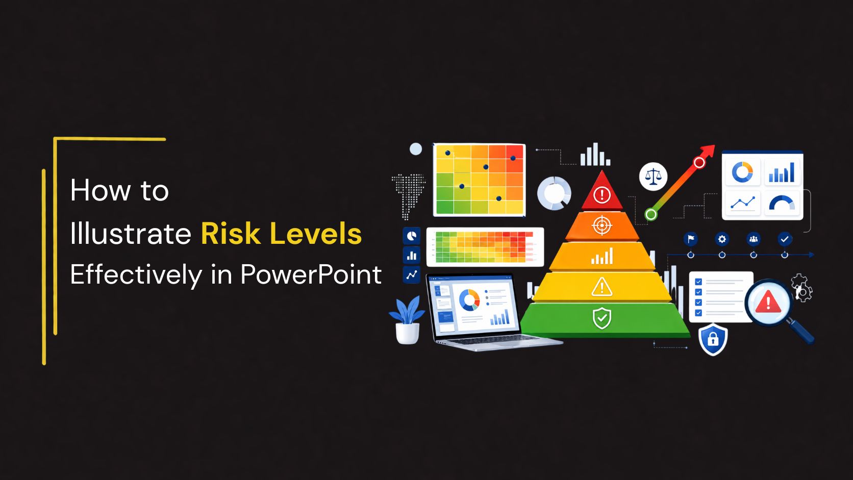
How to Illustrate Risk Levels Effectively in PowerPoint
Risk is an unavoidable part of every business decision. Whether you’re presenting an investment strategy, evaluating a project, planning cybersecurity initiatives, or assessing operational challenges, your audience needs to understand not only the potential risks but also their severity and impact.
Simply listing risks in bullet points often makes presentations difficult to follow. Instead, visualizing risk levels with diagrams such as pyramids, layered charts, matrices, and hierarchical graphics helps transform complex information into an easy-to-understand story.
In this guide, you’ll learn the best ways to illustrate risk levels in PowerPoint, discover practical examples across industries, and learn design tips that make your presentations more engaging and professional.
Why Visualizing Risk Matters
Decision-makers often have limited time. A well-designed risk infographic communicates key insights in seconds.
Instead of reading lengthy reports, stakeholders can immediately identify:
- High-risk areas requiring urgent attention
- Medium-risk items requiring monitoring
- Low-risk activities that need minimal intervention
- Potential rewards associated with higher-risk investments
- Relationships between risk, return, and business objectives
Risk visualizations also improve audience retention by simplifying complex financial, operational, and strategic concepts.
When Should You Use Risk Level Diagrams?
Risk level graphics work well in many business scenarios, including:
- Investment portfolio presentations
- Enterprise risk management
- Project management
- Corporate strategy meetings
- Manufacturing safety
- Financial forecasting
- ESG risk reporting
Instead of explaining risk through paragraphs, a simple visual hierarchy allows executives to grasp the message instantly.
Choosing the Right Risk Diagram
Different presentations require different visualization styles.
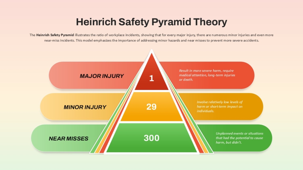
1. Risk Pyramid
The risk pyramid is one of the most popular ways to display risk because it naturally represents hierarchy.
The bottom layers represent stability and lower risk, while the upper layers represent increasing uncertainty and potentially higher returns.
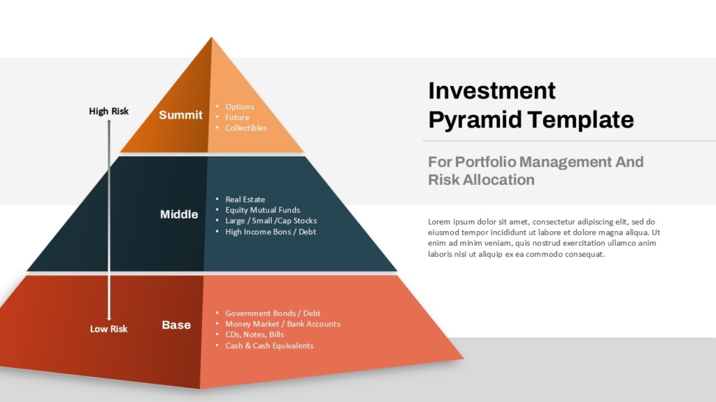
Base: Lowest Risk, Stable, Predictable Returns.
Middle: Moderate Risk, Balanced Growth, Medium Returns.
Top: Highest Risk, High Volatility, High Reward Potential.
This diagram ideal for :
- Investment portfolios
- Business expansion strategies
- Financial products
- Asset allocation
- Product maturity
2. Layered Risk Pyramid
Sometimes three levels aren’t enough.
A five- or six-layer pyramid provides more detailed categorization.
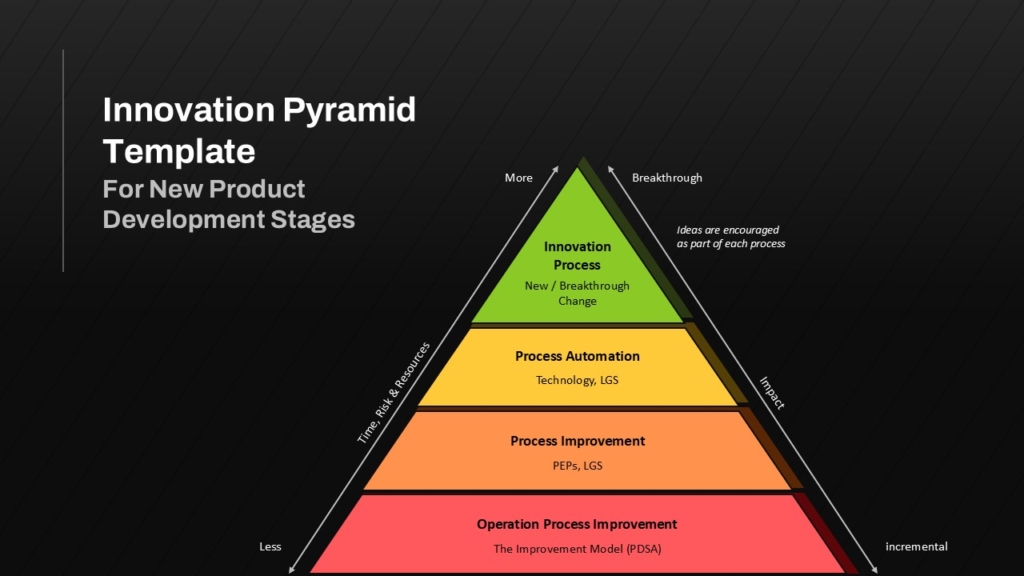
This structure gradually illustrates increasing risk alongside increasing return potential.
3. Risk vs Reward Pyramid
One of the most commonly used financial visuals combines both risk and expected returns.
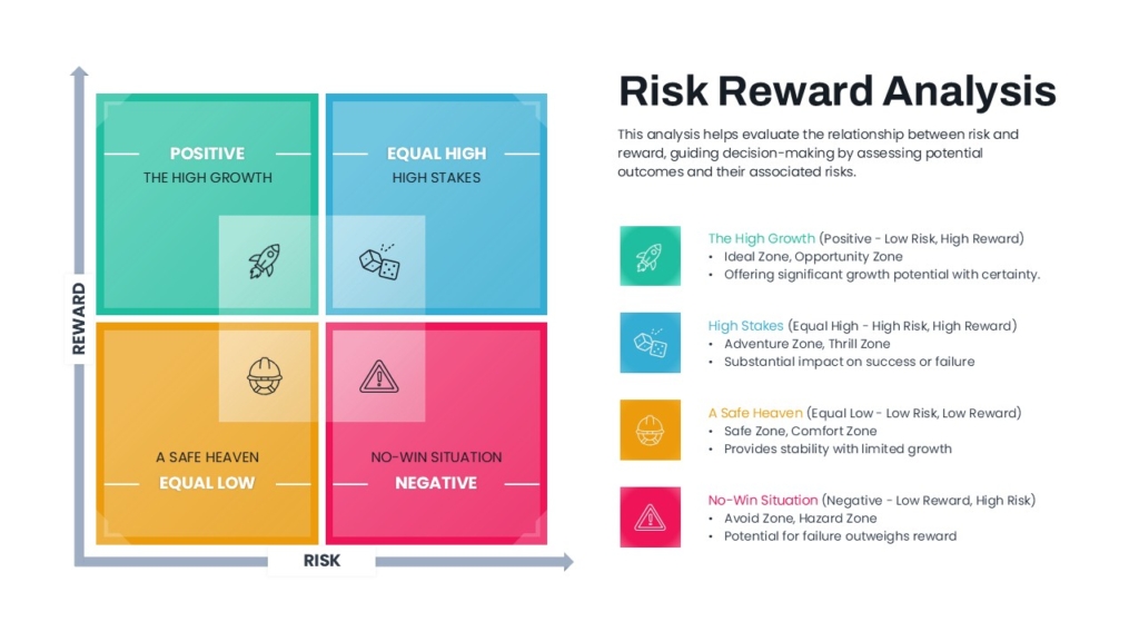
This instantly communicates the relationship between uncertainty and expected gains.
Illustrating Business Risk Factors
Not every risk presentation is financial.
Organizations often need to identify operational risks.
A layered business risk pyramid may include:
Using different colors for each category helps audiences understand which factors contribute most to organizational risk.
Showing Risk Escalation
Another effective visualization is a progressive risk hierarchy.
Each level can include:
- Probability
- Financial Impact
- Required Action
- Responsible Department
Color progression usually follows:
- Green
- Yellow
- Orange
- Red
- Dark Red
Presenting Enterprise Risk Management
Large organizations often classify risks into categories.
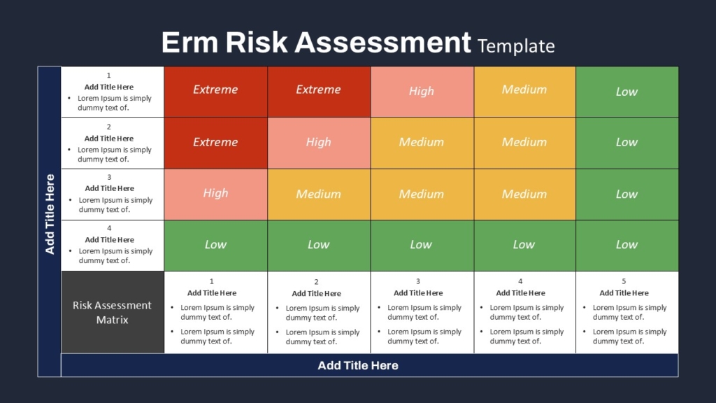
Instead of showing six separate slides, organize them into a multi-layer infographic.
This helps executives compare priorities quickly.
Visualizing Cybersecurity Risk
Cybersecurity presentations benefit from hierarchical risk graphics.
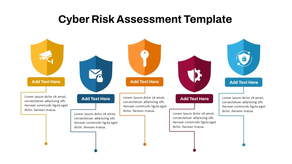
Combining icons with colors improves readability.
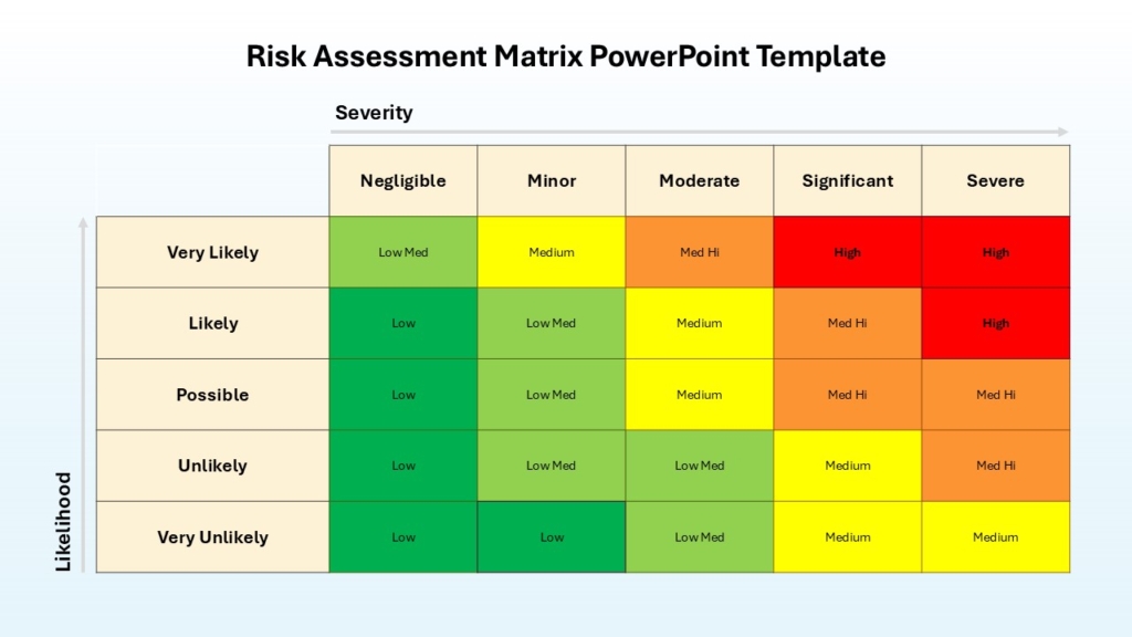
Color Psychology for Risk Presentations
Colors communicate urgency before the audience reads any text.
Recommended palette:
- Green : Safe
- Blue : Stable
- Yellow: Monitor
- Orange: Caution
- Red: High Risk
- Dark Red: Critical
Keep the palette consistent throughout the presentation.
Final Thoughts
Risk visualization transforms complicated data into a format that executives, investors, clients, and project teams can understand immediately. Whether you’re presenting investment strategies, business risks, safety procedures, or project assessments, using structured visuals such as pyramids, layered diagrams, and hierarchical charts makes your message clearer and more persuasive.
Instead of overwhelming your audience with spreadsheets and text-heavy reports, let your visuals tell the story. A professionally designed risk infographic not only improves understanding but also leaves a lasting impression, making your presentation both informative and memorable.
👉Explore the complete collection of Risk PowerPoint templates on SlideKit to make your next presentation more impactful and professional.

