Executive Summary Slide: What to Include and How to Design It
An executive summary slide has one job. It needs to communicate the most important information in a presentation before the audience gets to any of the detail. For executives who make decisions quickly, this slide determines whether they stay engaged with the rest of the deck or mentally check out before the second slide appears.
Most presentations get this wrong. They either skip the executive summary entirely and force decision-makers to extract the main points themselves, or they include one that is so dense with text and bullet points that it defeats the purpose of summarizing anything at all.
This guide covers what an executive summary slide actually needs to contain, how to design it so executives can process it in under 30 seconds, and the different formats that work across business planning, reporting, and strategic presentations.
What an Executive Summary Is (And What It Is Not)
An executive summary is not a table of contents. It is not an agenda. It is not a list of topics the presentation will cover. It is the conclusion delivered first.
A good executive summary tells the audience what they would know at the end of the presentation if they sat through the entire thing. The recommendation, the finding, the decision point, the key numbers. Everything else in the deck exists to support or explain what is stated in the summary.
This structure reflects how executives actually process information. They want the answer before the explanation. They evaluate the conclusion first and then decide whether the supporting evidence is worth their time. A presentation that withholds the main point until the end forces them to work backwards, which wastes time and creates frustration.
The executive summary slide is the antidote to that problem. It puts the conclusion at the front where it belongs.
What to Include on an Executive Summary Slide
The specific content of an executive summary depends on what the presentation is trying to accomplish, but the underlying structure stays consistent. The slide needs to answer a small set of critical questions in as few words as possible.
The core finding or recommendation
This is the single most important sentence on the slide. What is the conclusion? What should happen as a result of this presentation? This statement should be clear enough that someone reading only this slide would understand the main point.
The key supporting data points
Not all the data. Just the two or three numbers, facts, or metrics that justify the recommendation. Revenue growth of 18 percent year over year. Customer churn reduced by half. Three competitive proposals evaluated. These are the data points that make the recommendation credible.
The context or problem being addressed
Executives need to understand why this presentation exists before they can evaluate whether the conclusion makes sense. One or two sentences of context. The market shifted. The project missed its deadline. The regulation changed. This frames the rest of the content.
The next step or decision required
What happens after this presentation? Approval to proceed? A budget allocation? A strategic pivot? The executive summary should state what action the presentation is asking for.
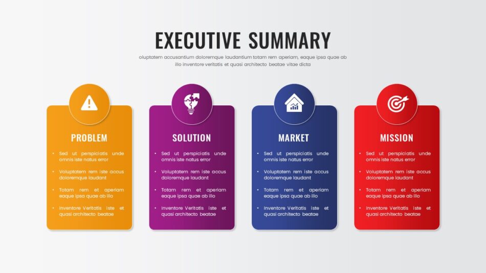
A well-designed executive summary slide contains all four of these elements and nothing else. No background. No methodology. No exhaustive lists. Just the essentials.
What Does an Executive Summary Look Like
The visual structure of an executive summary slide matters as much as the content. A block of text formatted as paragraphs is hard to scan quickly. A slide divided into clear sections with visual hierarchy is easy to process.
Example of executive summary layouts that work
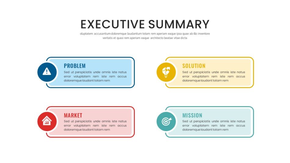
The most effective executive summary slides use a structured grid. Four distinct zones, each with a clear label. Recommendation in the top left. Key metrics in the top right. Context in the bottom left. Next steps in the bottom right. This layout gives the eye a predictable path and prevents information from blending together.
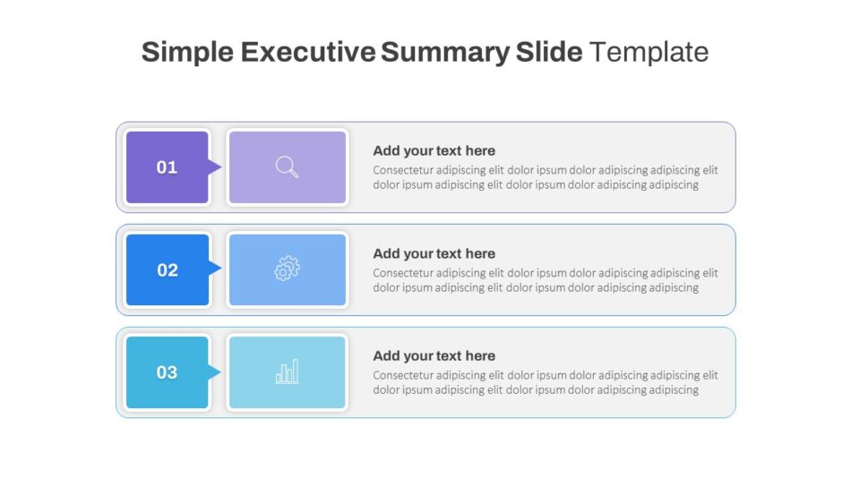
Another format that works well is a vertical stack. Recommendation at the top in larger, bolder text. Three supporting points below in consistent formatting. Action required at the bottom in a visually distinct callout. This structure works particularly well when the summary needs to emphasize a single decision or approval. SlideKit’s executive summary slide template and general executive summary slide template both use structured grid layouts designed to guide the reader through the content in a logical sequence without requiring them to hunt for information.
What an executive summary should not look like
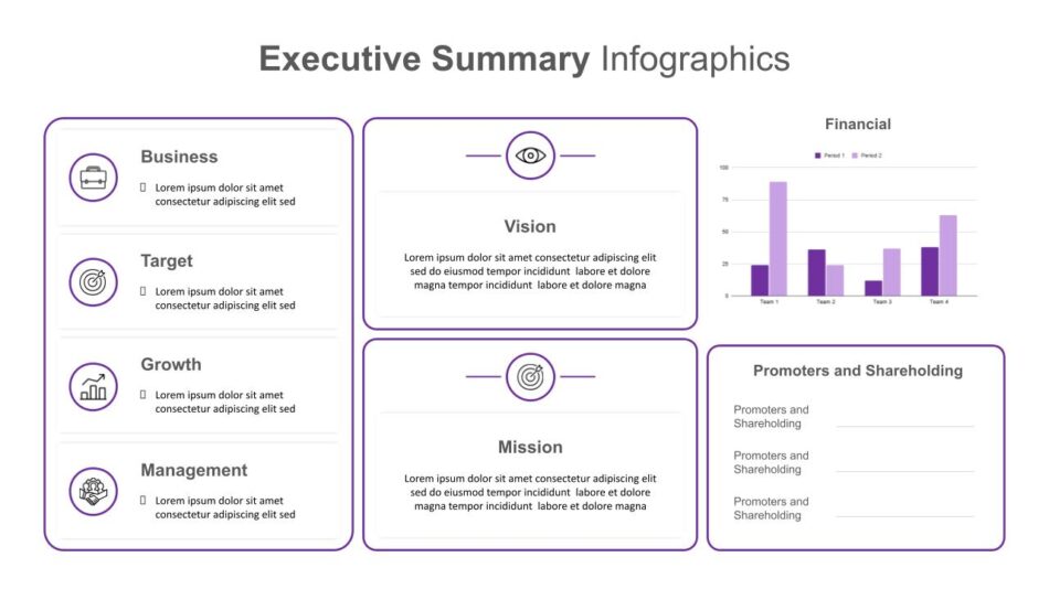
A common mistake is treating the executive summary as a miniature version of the full presentation. Bullet points under five different headings. Dense paragraphs of text. Charts and tables that require interpretation. All of this defeats the purpose. The executive summary is not a compressed version of the deck. It is the conclusion extracted and presented on its own.
Executive Summary Slide Design Principles
Design is not decoration on an executive summary slide. It is a communication tool. The right design choices make the slide faster to read and easier to remember. The wrong choices create friction.
Use hierarchy to guide attention
The most important piece of information on the slide should be the most visually prominent. Larger font size, bolder weight, or positioned at the top of the slide. This ensures that even a quick glance captures the main point.
Limit text density
Each section of the executive summary should contain no more than two or three short sentences. If a section requires a full paragraph to explain, the content is too detailed for a summary and belongs in the body of the presentation instead.
Apply consistent formatting
All section labels should use the same font size and style. All body text should be uniform. Visual consistency makes the slide feel organized and intentional rather than improvised.
Reserve color for emphasis
Use color sparingly. A green indicator next to a positive metric. A red callout for an urgent decision point. When everything on the slide is colorful, nothing stands out. Color should mean something specific.SlideKit’s simple executive summary slide and executive summary slide for PowerPoint demonstrate this principle well. Both templates use restrained color palettes and clear typographic hierarchy to keep the focus on content rather than design.

Executive Summary Slide Examples for Different Contexts
Not all presentations require the same type of executive summary. The format should match the context and the type of decision the presentation is supporting.
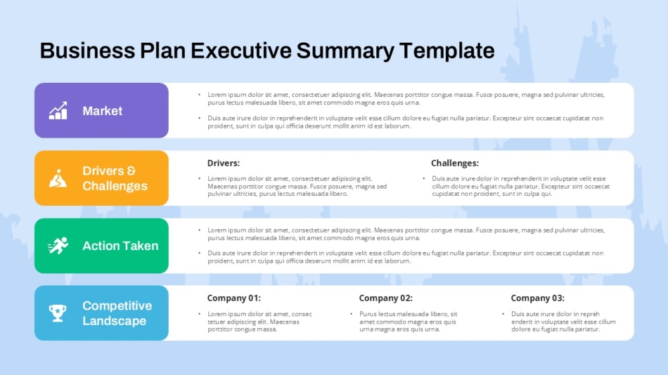
Business plan executive summary
A business plan presentation to investors or board members needs an executive summary that covers market opportunity, competitive positioning, financial projections, and funding request. The summary should communicate the investment thesis in under 100 words. The business plan executive summary slide sample template is structured specifically for this context. It includes sections for market size, revenue projection, competitive advantage, and capital requirement. This format gives investors the information they need to evaluate the opportunity before diving into the full business plan.
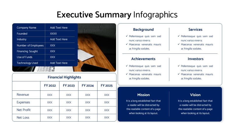
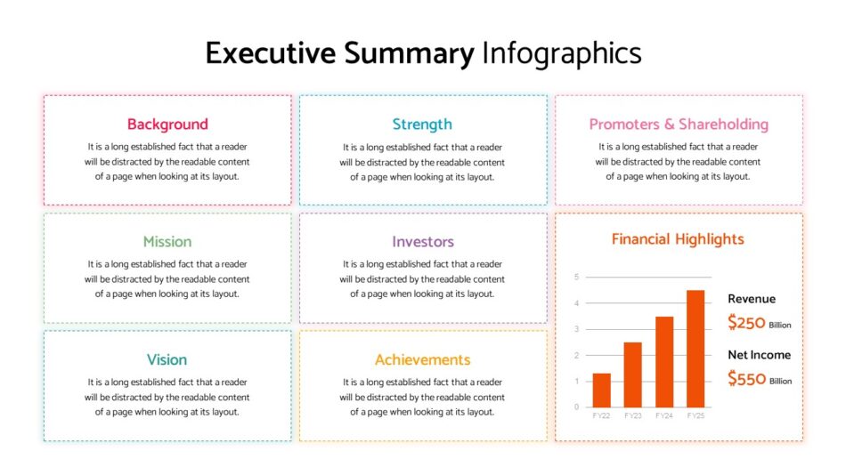
Corporate and metrics-focused executive summary
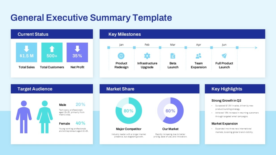
For quarterly business reviews, board reports, and operational updates, the executive summary needs to lead with key performance indicators. Revenue, margin, customer growth, operational efficiency. The numbers tell the story first, and the narrative follows. SlideKit’s corporate executive summary slide with metrics and services provides a layout built around KPI presentation. Metrics are visually prominent, comparison data is clearly labeled, and the recommendation flows naturally from the performance data.

Creative and strategic executive summary
Not all executive summaries are data-driven. Strategic presentations, creative briefs, and innovation proposals require a different approach. The summary needs to communicate the idea, the strategic rationale, and the expected impact without relying on historical metrics. The creative executive summary slide from SlideKit uses a more visually expressive layout appropriate for presentations where the content is forward-looking rather than retrospective.
Executive Summary Template Formats
Using a template for the executive summary slide ensures consistency across presentations and reduces the time spent on layout decisions. Different templates serve different organizational needs.
Standard executive summary templates
A general-purpose executive summary template works across multiple presentation types. It includes labeled sections for recommendation, supporting data, context, and next steps. This format is appropriate for internal strategy reviews, client proposals, and project updates where the content varies but the structure stays consistent. SlideKit’s executive summary template for presentation covers this category. It provides a clean, flexible structure that adapts to different content types without requiring redesign.
Presentation-specific executive summary templates
For organizations that present frequently to the same audience, a dedicated executive summary presentation template streamlines preparation. The template includes the executive summary slide plus supporting slide layouts that match the summary’s structure.The executive summary presentation template from SlideKit follows this model. The executive summary slide establishes the structure, and the subsequent slides provide detail in the same visual system.
Platform-specific templates
Executive summaries presented in PowerPoint benefit from templates designed specifically for that platform. Font rendering, layout behavior, and print compatibility all function as intended when the template is built natively for the software being used.SlideKit’s executive summary slide options are available in both PowerPoint and Google Slides formats, ensuring that the visual result is consistent regardless of which platform is used to build or present the deck.
Common Mistakes That Undermine Executive Summary Slides
Even with a good template, certain errors consistently weaken the effectiveness of executive summary slides. Recognizing these patterns makes them easier to avoid.
Treating the summary as an introduction
An introduction sets up what is coming. A summary delivers the conclusion. Confusing the two produces a slide that talks about what the presentation will cover rather than what it recommends. The executive summary should be able to stand alone as a complete communication, not a preview.
Including information that requires explanation
If a metric, term, or reference on the executive summary slide needs additional context to be understood, it does not belong on the summary. The slide should contain only information that is immediately clear to the intended audience.
Making the slide visually complex
Charts, diagrams, and multi-colored graphics compete with the text for attention. The executive summary slide should be one of the simplest slides in the deck from a visual standpoint. Complexity belongs in the supporting slides, not the summary.
Failing to state a clear recommendation
The most common and most damaging mistake is creating an executive summary that presents information without concluding anything. Executives are decision-makers. They need to know what the presenter recommends, not just what the data shows. A summary without a recommendation is not a summary.
How to Test Whether Your Executive Summary Works
Before finalizing an executive summary slide, it helps to apply a simple test. Show the slide to someone unfamiliar with the presentation and ask them two questions. What is the main point? What happens next?
If they can answer both questions correctly after reading the slide once, the summary works. If they need to reread it, ask for clarification, or express confusion about what the presentation is recommending, the summary needs revision.
This test works because it simulates how executives actually engage with presentations. They do not have time to decode information. The summary either communicates clearly on first read, or it fails.
Integrating the Executive Summary Into the Full Presentation
The executive summary slide typically appears second in the presentation deck. The title slide comes first, the executive summary comes next, and the detailed content follows. This sequence gives the audience immediate orientation before any granular information appears.
Some presentations place a table of contents after the title slide and before the executive summary. This is rarely necessary and often counterproductive. Executives do not need to know what is coming. They need to know what the conclusion is. The table of contents can be omitted entirely in most executive-facing presentations.
After the executive summary, the rest of the deck should support and expand on what was stated in the summary. Each subsequent slide answers a question or provides evidence for a claim made in the summary. This structure keeps the entire presentation aligned with the conclusion rather than wandering into unrelated detail.
Final Thought
An executive summary slide is not optional in any presentation delivered to decision-makers. It is the most important slide in the deck. It determines whether the audience engages with the content or mentally moves on before the presentation has a chance to make its case.
The summary works when it delivers the conclusion first, supports it with the minimum necessary data, and states clearly what action is required. It fails when it tries to introduce, preview, or compress the full presentation into a single overcrowded slide.
The templates and examples covered in this guide provide a starting point for building executive summary slides that actually function the way they are supposed to. Choosing the right format depends on the presentation context, the type of data being presented, and the decision the summary needs to support. Getting that choice right makes every presentation that follows more effective.

