Heatmap Chart PowerPoint Template for Data Visualization Presentation

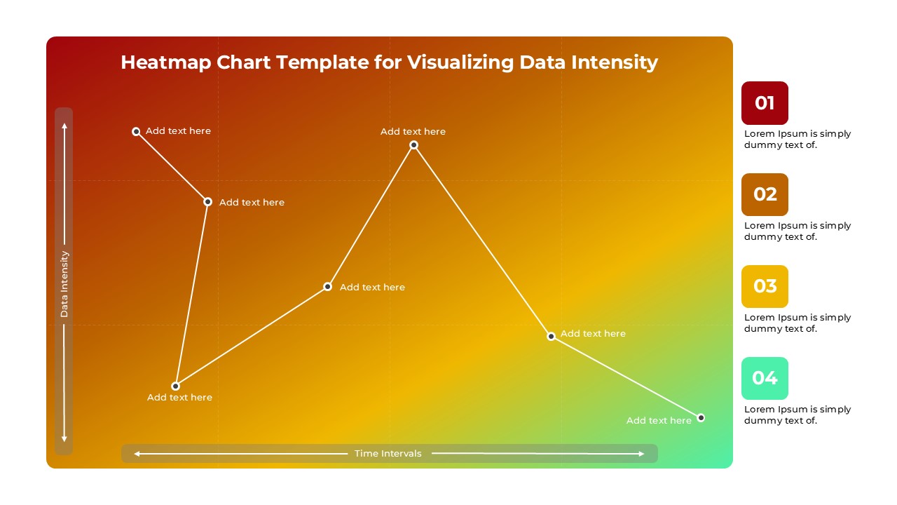
Bring your data to life with this Heatmap Chart PowerPoint Template, designed specifically for visualizing data intensity over time or across variables. Featuring a gradient background that transitions from warm reds to cool greens, this template effectively highlights data points by intensity, making it easy to spot trends, peak values, and areas of low activity. Ideal for analysts, marketers, educators, and project managers, this template provides a clear visual representation of data fluctuations, helping audiences quickly grasp complex information.
Each slide is structured to include a heatmap area chart with space for customizable labels, text descriptions, and data points. The color gradient visually represents data intensity, while the accompanying numbered list on the right provides additional context, making this template perfect for presentations on performance analysis, trend tracking, and data comparison. It’s suitable for various applications, from marketing analytics and sales data to website traffic monitoring and operational efficiency assessments.
Compatible with both PowerPoint and Google Slides, this heatmap chart template is user-friendly and fully customizable. You can easily edit the colors, text, and data points to match your specific presentation needs, making it an essential tool for delivering data-driven insights in a visually engaging and professional format.
See more


