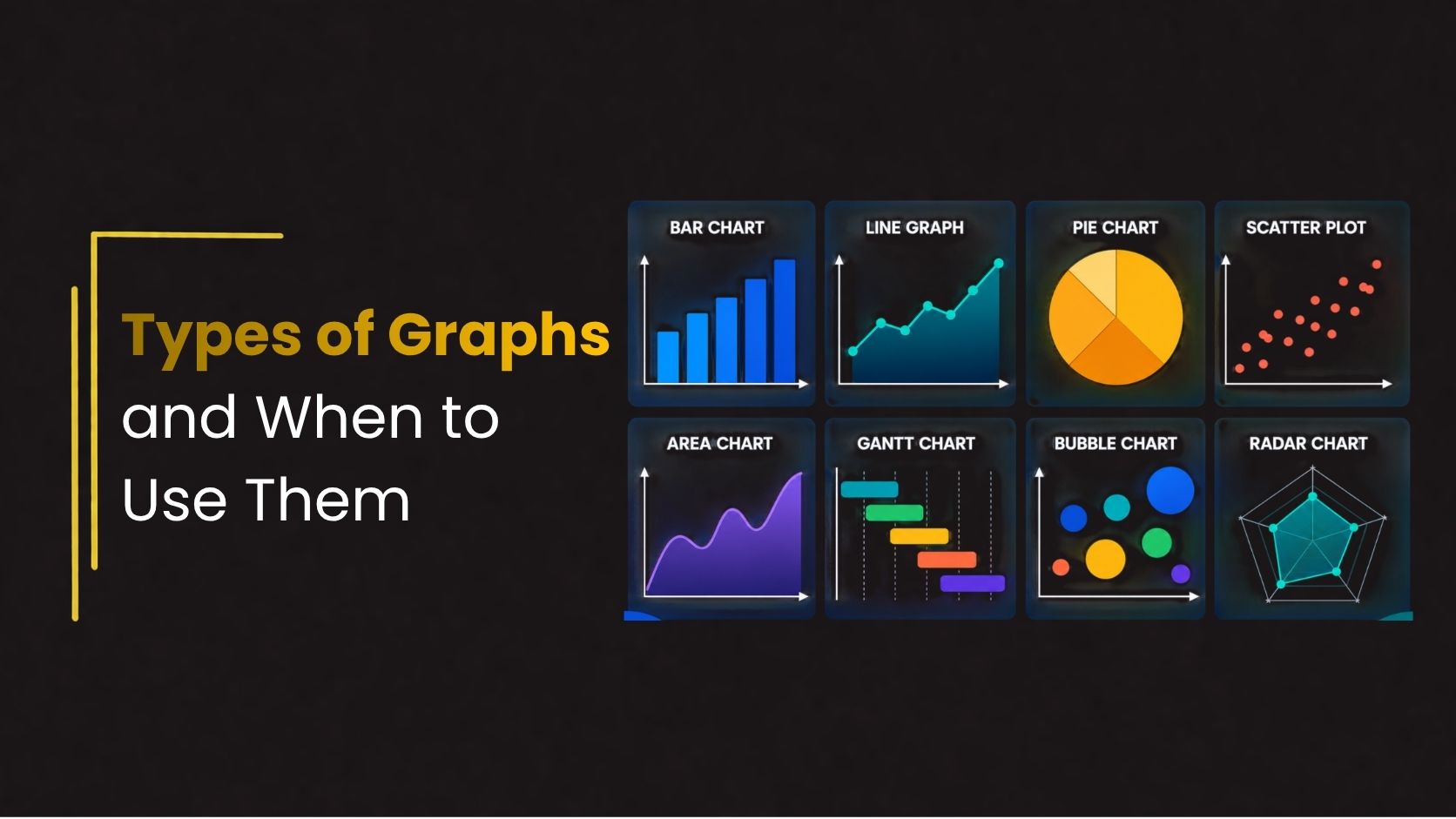
Types of Graphs and When to Use Them
Data visualization plays an important role in modern presentations, reports, dashboards, and business communication. Instead of presenting audiences with large blocks of numbers, graphs simplify complex information and make trends easier to understand.
Choosing the right type of graph improves readability, highlights key insights, and helps audiences make faster decisions. Whether you are preparing business reports, educational presentations, research papers, or marketing dashboards, understanding different types of graphs helps create more effective presentations.
This guide explores 8 essential types of graphs, when to use them, and best practices for designing professional chart presentations.
Why Graphs Matter in Presentations
Graphs improve communication by transforming raw data into visual information that is easier to understand and analyze. Instead of reading lengthy tables or complicated spreadsheets, audiences can quickly identify patterns, trends, comparisons, and relationships through clear visual elements. This makes presentations more engaging and helps viewers retain information more effectively.
Using graphs in presentations also supports faster decision-making by simplifying complex data into accessible insights. Well-designed charts improve presentation clarity, strengthen storytelling, and create a more professional visual experience. Whether used in business reports, educational presentations, or marketing dashboards, professional data visualization charts help presenters communicate ideas with greater impact and confidence.
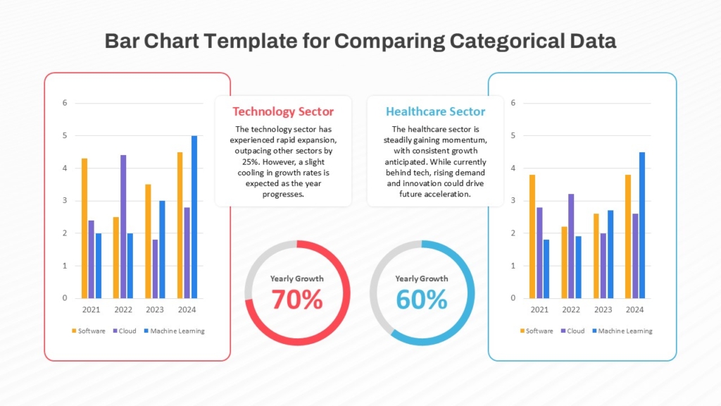
1. Bar Graph
A bar graph uses rectangular bars to compare values across categories. It is one of the most commonly used graph types in business and educational presentations.
Best for: Comparing categories, Sales performance reports, Survey results, Product comparisons,Revenue analysis.
Design Tips : Keep labels short, Use consistent spacing, Highlight important bars with accent colors.
Why Use it : Bar graphs make comparisons easy to understand at a glance. They are ideal when categories have distinct differences in values.
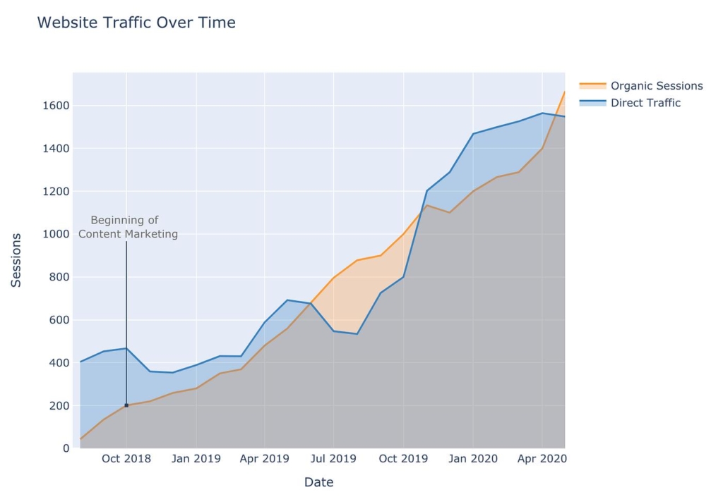
2. Line Graph
A line graph displays data points connected by lines to show trends over time.
Best for : Sales growth tracking, Website traffic analysis,Stock market trends,Performance monitoring,Time-series data.
Design Tips : Avoid too many lines, Use contrasting colors, Label important milestones clearly.
Why Use it : Line graph presentation examples are effective for identifying upward or downward trends over continuous periods.
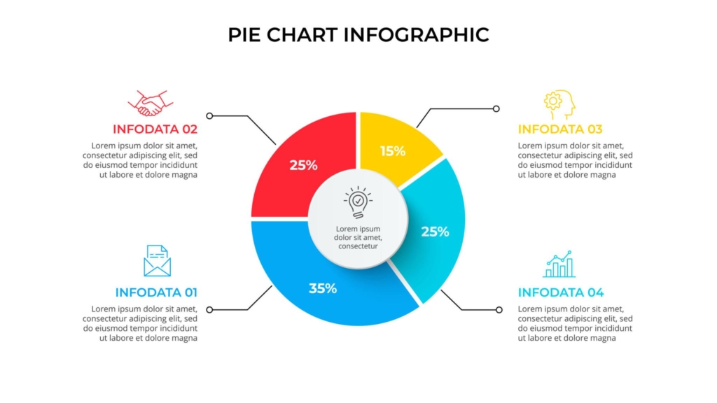
3. Pie Chart
Pie charts display proportions of a whole using slices of a circle.
Best for: Market share analysis, Budget allocation, Survey percentages, Demographic breakdowns.
Design Tips : Limit slices to 5–6 categories, Highlight key segments, User clear labels.
Why Use it : The pie chart usage guide is simple: use pie charts when you want to show percentage distribution clearly.
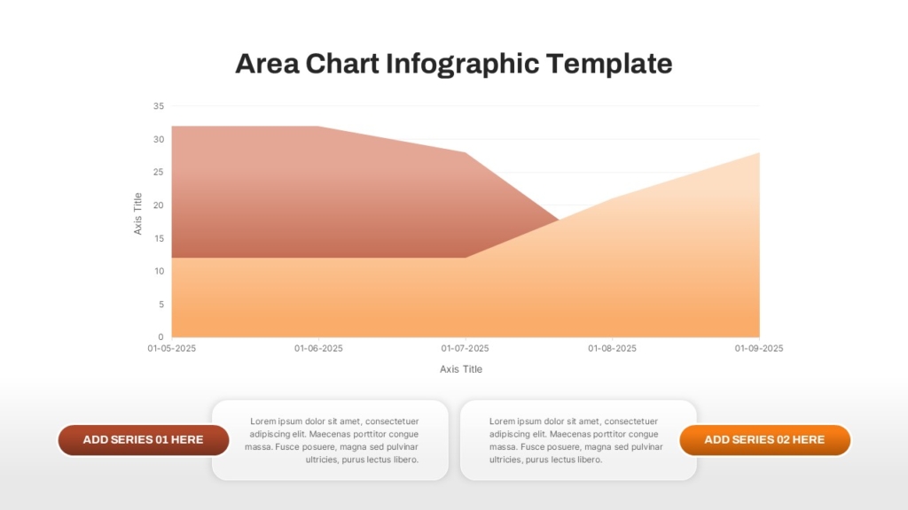
4. Area Chart
Area charts are similar to line graphs but use filled areas beneath the lines to emphasize volume or magnitude.
Best for : Revenue growth, Traffic analysis, Population growth, Financial forecasting.
Design Tips : Use transparency carefully, Avoid overlapping too many datasets.
Why Use it : Area charts emphasize volume and cumulative changes over time.
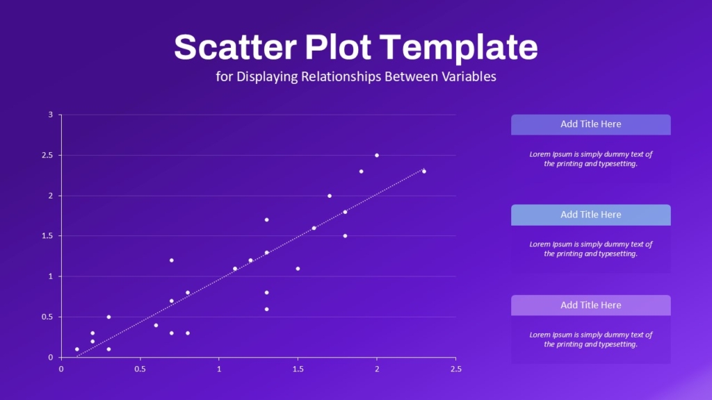
5. Scatter Plot
Scatter plots display relationships between two variables using dots.
Best for : Correlation analysis, Scientific research, Statistical presentations.
Design Tips : Keep axis labels clear, Use color coding for categories.
Why Use it : Scatter plots help identify patterns, clusters, and relationships in datasets.
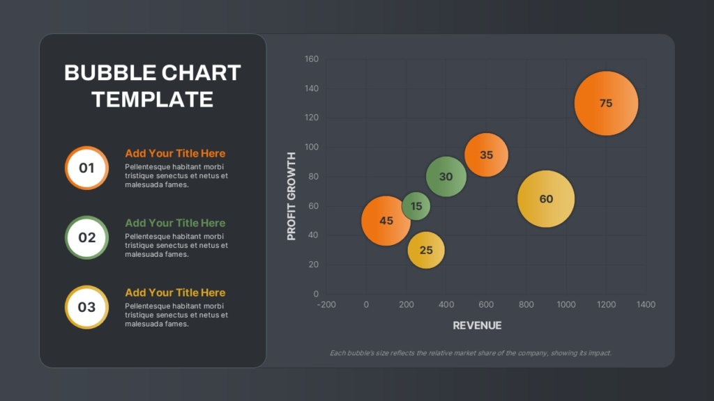
6. Bubble Chart
Bubble charts extend scatter plots by adding bubble sizes to represent additional data dimensions.
Best for : Market Analysis, Product Comparisons, Business Performance Analysis.
Design Tips : Avoid excessive bubble overlap, Use consistent scaling.
Why Use it : Bubble charts provide more detailed visual comparisons than standard scatter plots.
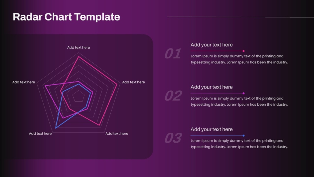
7. Radar Chart
Radar charts compare multiple variables using a circular graph layout.
Best for : Skill comparisons, Performance reviews, Competitive Analysis
Design Tips : Limit categories, Use contrasting colors carefully.
Why Use it : Radar charts help compare multiple variables in a compact visual format.
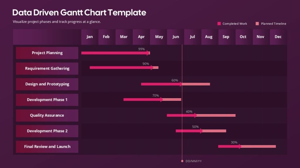
8. Gantt Chart
Gantt charts visualize project schedules and timelines.
Best for : Project Management, Task Scheduling, Timeline Tracking, Workflow Planning.
Design Tips : Use color-coded phases, Keep timelines readable, Highlight milestones clearly.
Why Use it : Teams can easily plan workflows and assign responsibilities.
👉 Explore more professional chart presentation templates on SlideKit
Common Graph Mistakes to Avoid
- Using the wrong graph type
- Overcrowding charts
- Excessive colors
- Poor labeling
- Misleading scales
- Overusing animations
- Low contrast between elements
Conclusion
Understanding the different types of graphs and when to use them helps create clearer and more engaging presentations. From bar graphs and line charts to heat maps and Gantt charts, each graph type serves a specific purpose in data communication.
Using clean layouts, balanced colors, and professional data visualization charts improves audience understanding while making presentations more visually appealing. Whether you are preparing business reports, educational presentations, marketing dashboards, or research slides, selecting the right chart type is essential for effective storytelling.
For professionally designed infographic presentation slides, chart layouts, and PowerPoint graph templates, explore SlideKit and discover modern presentation templates for PowerPoint and Google Slides.

