
Pyramid Chart vs Funnel Chart: What’s the Difference?
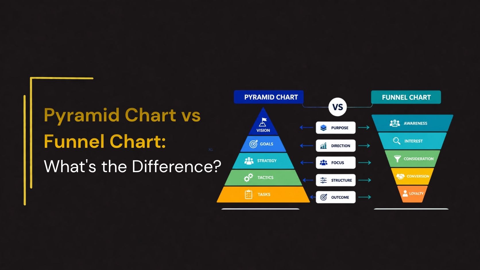
When presenting business data, choosing the right visualization can make your message clearer and more impactful. Two popular diagrams often used in presentations are the Pyramid Chart and the Funnel Chart. While they may look similar at first glance, they serve very different purposes and communicate different types of information.
A Pyramid Chart is ideal for displaying hierarchical structures, proportional relationships, or levels of importance, whereas a Funnel Chart is designed to illustrate progressive stages where values decrease from one step to the next, such as a sales or recruitment process.
In this guide, we’ll compare Pyramid Charts and Funnel Charts, explain their key differences, advantages, and best use cases, and help you determine which one best fits your presentation.
What Is a Pyramid Chart?
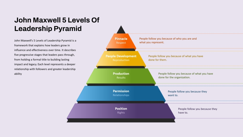
A Pyramid Chart is a hierarchical diagram that represents information in stacked layers, with the broadest section at the bottom narrowing toward the top. Each layer represents a category, level, or stage, and the arrangement often reflects importance, priority, or structure rather than data loss.
Pyramid charts are commonly used to explain concepts where each level supports the one above it.
Common Uses
- Organizational hierarchies
- Maslow’s Hierarchy of Needs
- Business strategy frameworks
- Product categories
- Educational concepts
The emphasis is on relationships between layers rather than the movement of values.
What Is a Funnel Chart?
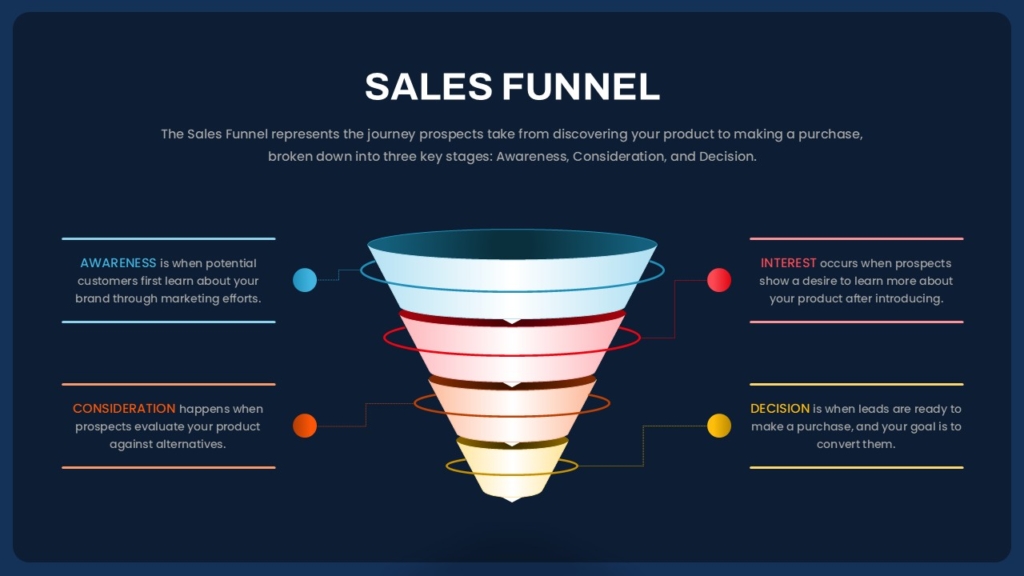
A Funnel Chart visualizes a process where quantities decrease through sequential stages. The widest section at the top represents the largest group, while each lower section becomes progressively smaller, showing how items move through a process.
Funnel charts are particularly useful for highlighting conversion rates, drop-offs, and process efficiency.
Common Uses
- Sales funnels
- Recruitment pipelines
- Marketing campaigns
- Lead generation
- Customer journey analysis
Unlike pyramid charts, funnel charts focus on how values change over time or across stages.
When to Use a Pyramid Chart
Choose a Pyramid Chart when your goal is to present layered information or hierarchical relationships.
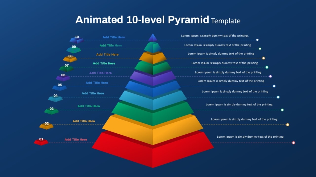
Ideal for :
- Business Strategy : Illustrate strategic priorities, organizational goals, or business frameworks.
- Organizational Structure : Display management levels or reporting hierarchies.
- Education : Explain theories, learning models, or structured concepts.
- Project Planning : Present priority levels or implementation phases.
Pyramid charts work best when every layer has equal importance within an overall structure.
When to Use a Funnel Chart
Use a Funnel Chart when your presentation focuses on progression through multiple stages.
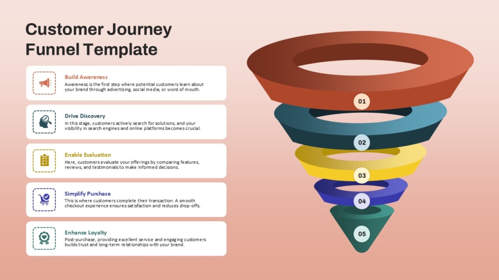
Ideal for :
- Sales Process : Show how leads convert into paying customers.
- Marketing Campaigns : Track prospects from awareness to conversion.
- Recruitment : Visualize applicants moving through interview stages.
- Customer Journey : Monitor user progression from initial interest to purchase.
Best Practices for Designing Pyramid and Funnel Charts
Regardless of which chart you choose, follow these design principles:
- Keep labels concise and readable.
- Use consistent colors for related sections.
- Highlight important stages with accent colors.
- Limit the number of levels to maintain clarity.
- Include icons or illustrations to improve visual appeal.
- Add supporting data where appropriate.
- Maintain consistent typography and spacing.
A clean and organized layout makes both chart types more effective and easier to interpret.
Final Thoughts
Although Pyramid Charts and Funnel Charts share a similar stacked appearance, they serve different communication goals. Pyramid Charts are ideal for presenting hierarchical structures, strategic frameworks, and priority levels, while Funnel Charts excel at visualizing processes, conversion rates, and stage-by-stage progression. Understanding these differences allows you to choose the right diagram for your presentation and communicate information more effectively. Whether you’re explaining an organizational model or analyzing a sales pipeline, selecting the appropriate chart enhances clarity, supports better decision-making, and keeps your audience engaged.
👉Explore SlideKit’s Pyramid and Funnel Chart Templates to create impactful presentations in minutes.