How to Create Infographics in PowerPoint: Step-by-Step Tips for Better Slides

Dense spreadsheets and text-heavy slides often fail to convey key messages effectively. Infographic PowerPoint slides transform complex information into clear, engaging visual stories that audiences actually remember.
Creating effective infographics requires strategic planning, thoughtful design choices, and understanding which visual format best serves the message. This guide covers the complete process—from initial concept to polished presentation.
What Is an Infographic and Why It Works in Presentations
An infographic is a visual representation of information designed to present complex ideas quickly and clearly. Unlike traditional slides filled with bullet points, infographics combine text, graphics, icons, and data visualizations to tell a cohesive story at a glance.
The key difference between an infographic poster and infographic slides lies in their purpose. Infographic posters are standalone pieces designed for print or digital sharing, while infographic slides are presentation components optimized for screen display and speaker narration. PowerPoint infographic slides serve as visual anchors during presentations, helping audiences follow along and retain key information.
Why do infographic PowerPoint slides improve engagement? Research shows people process visuals 60,000 times faster than text. When presenters use infographic key points presentation formats, audiences can grasp relationships, trends, and hierarchies almost instantly.
Infographics work particularly well when:
- Presenting statistical data or research findings
- Explaining multi-step processes or workflows
- Comparing options or showing relationships between concepts
- Communicating timelines or historical progressions
- Simplifying complex systems or organizational structures
Infographic slides allow presenters to focus verbal explanations on context and implications rather than forcing audiences to read and interpret text while listening.
Planning Your Infographic Before Opening PowerPoint
Most professionals make the mistake of opening PowerPoint first and designing as they go. This approach often results in cluttered, unfocused visuals. Effective infographic creation starts with strategic planning.
Identify the main message: Every infographic should communicate one primary idea. What should the audience remember after seeing this slide? This clarity drives every design decision.
Define 3–7 key points: The human brain comfortably processes 5–7 pieces of information at once. Break down the main message into supporting points that build the complete story.
Choose supporting data: Select specific numbers or facts that reinforce each key point. The goal is clarity, not comprehensiveness.
Decide visual hierarchy: Determine which information deserves the most emphasis. Primary information should be largest and most prominent, guiding the audience’s eye through the infographic in the intended sequence.
Sketch layout before building: Spend five minutes sketching a rough layout. This low-investment step often reveals structural issues that would take hours to fix later in PowerPoint.
Business infographic planning involves considering the presentation context. Will this slide be projected, shared in a PDF, or posted online? Delivery method influences size, color choices, and detail level.
Using a blank infographic template during planning helps visualize the final result without committing to specific design elements.
Choosing the Right Infographic Type for Your Content
Not all information fits the same visual structure. Selecting the appropriate infographic format is crucial for clear communication. Each type serves specific content needs and tells different kinds of stories.
Process Infographic
Process infographics excel at showing sequential steps, workflows, or procedures. They answer “how to” questions and guide audiences through ordered actions or stages.
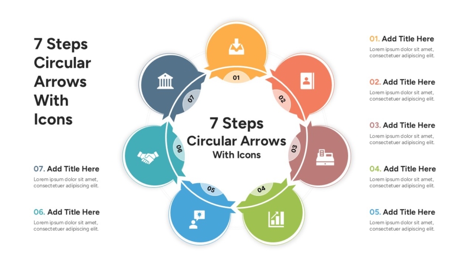
These infographics typically flow left to right or top to bottom, using numbered steps or directional arrows to indicate progression. A 7 Steps Circular Arrows Infographic template works well for cyclical processes or continuous improvement frameworks where the final step connects back to the first.
Process infographics are ideal for:
- Standard operating procedures
- Customer journey maps
- Product development cycles
- Onboarding workflows
Timeline Infographic
Timeline infographics organize information chronologically, making them perfect for project planning, historical context, or future roadmaps. They help audiences understand sequence, duration, and key milestones.
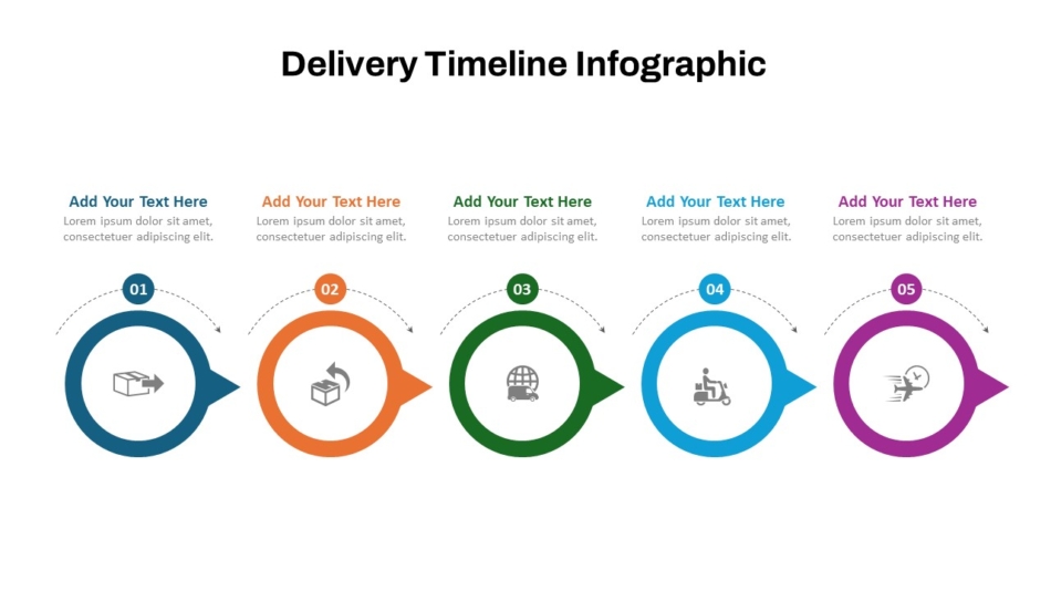
The Best Delivery Timeline Infographic Template provides a structured format for showing project phases, delivery schedules, or implementation plans. Timeline infographic templates typically feature a horizontal or vertical axis with marked intervals and associated events or milestones.
These work best for:
- Project timelines and Gantt charts
- Company history or evolution
- Product launch schedules
- Strategic planning horizons
Funnel Infographic
Funnel infographics visualize processes where volume decreases at each stage, such as sales pipelines, recruitment processes, or conversion paths. The narrowing shape immediately communicates filtering or progressive reduction.
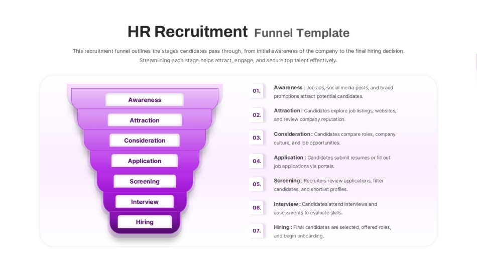
For talent acquisition teams, an HR Recruitment Funnel template illustrates candidate flow from initial application through final offer. Each funnel level shows decreasing numbers while highlighting conversion rates between stages.
Funnel infographics suit:
- Sales conversion processes
- Application or approval workflows
- Customer retention analysis
- Quality control stages
Comparison and Data Infographic
Comparison infographics present multiple options, approaches, or data sets side by side, making differences and similarities immediately visible. They support decision-making by organizing comparative information clearly.
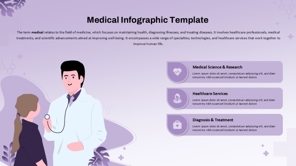
Healthcare presentations often require specialized comparison formats. A Medical Infographic template can compare treatment options, health statistics, or patient outcomes with appropriate clinical formatting and color schemes.
Comparison formats work for:
- Competitive analysis
- Before/after scenarios
- Product feature matrices
- Statistical comparisons
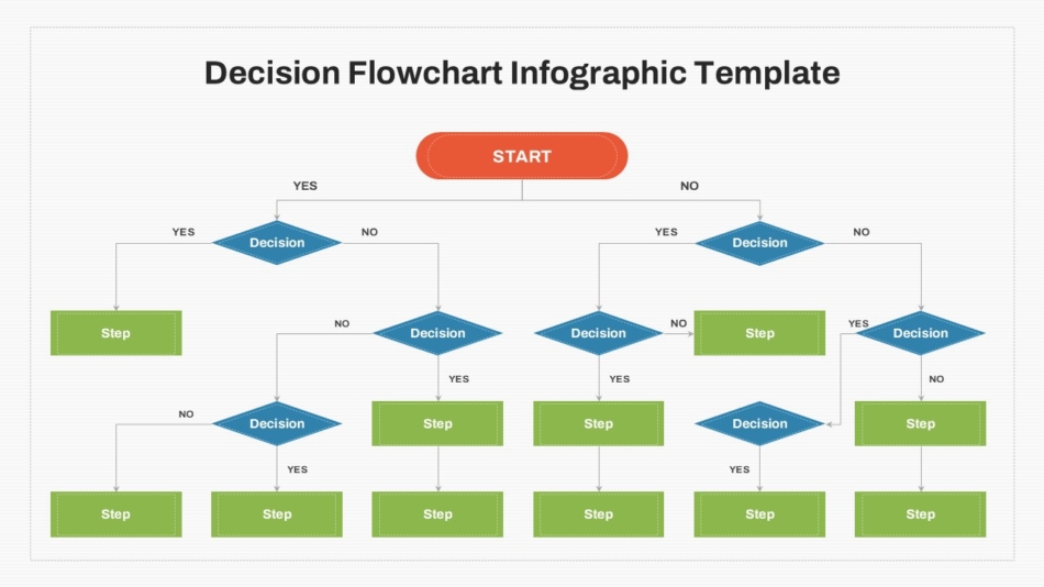
Flowchart and Decision Infographic
Flowchart infographics map decision trees, conditional processes, or system diagrams. They use branching logic to show different paths based on specific conditions or choices.
A Decision Flow Chart template helps audiences navigate complex decision criteria or troubleshooting procedures. The visual branching structure makes logical relationships clear without extensive explanation.
These infographics excel at:
- Troubleshooting guides
- Decision frameworks
- System architecture
- Logic flow documentation
Choosing among infographic templates requires matching content structure to visual form. The wrong template forces information into an awkward format that obscures rather than illuminates meaning.
How to Create Infographic Slides in PowerPoint
Once planning is complete and the infographic type is selected, the construction in PowerPoint becomes straightforward.
Using shapes and icons: PowerPoint’s Insert menu provides access to shapes, icons, and illustrations. The icon library contains thousands of vector graphics suitable for professional business infographics. Icons should share a consistent style—all outlined, all filled, or all flat design.
SmartArt versus custom layout: PowerPoint’s SmartArt offers pre-built diagrams for hierarchies and processes. While convenient, SmartArt often looks generic. For unique, branded infographics, building custom layouts with individual shapes provides greater control.
Aligning elements: PowerPoint’s alignment tools ensure elements line up precisely. Use the ruler, gridlines, and smart guides to maintain consistent spacing.
Applying brand colors: Consistency with organizational brand guidelines maintains professional appearance. Limit color palette to 3–4 colors plus neutral backgrounds.
Converting text into visual blocks: Instead of full sentences, convert information into concise labels or data points. Each text element should be scannable in 2–3 seconds.
When creating infographic PowerPoint content, less is almost always more. White space enhances comprehension by giving the eye places to rest and helping key information stand out.
Design Principles That Make Infographics Clear (Not Cluttered)
Understanding fundamental design principles separates clear infographics from confusing ones.
One message per section: Each distinct area should communicate a single idea. Trying to pack multiple concepts into one visual region creates confusion.
Consistent icon style: Mixing different icon styles—outlined icons alongside filled icons, or realistic illustrations next to flat graphics—creates visual discord. Select one style and use it throughout.
Strong visual hierarchy: Size, color, and position establish importance. The most important information should be largest and most prominent.
Use white space intentionally: Strategic white space groups related elements, separates different concepts, and creates visual breathing room. Professional designers often say white space is as important as the content itself.
Avoid too much text: Infographic key points presentation formats should minimize text. Each label should be the minimum words necessary.
For infographic poster designs viewed without a presenter, slightly more explanatory text may be necessary. Infographic slides for live presentation should rely heavily on visuals while the presenter provides verbal context.
Common Infographic Mistakes in PowerPoint
Even experienced professionals fall into predictable traps when creating infographics.
Too many colors: Using every color makes infographics look amateur and makes it harder to understand which elements relate to each other. Stick to a limited palette of 3–4 colors.
Overcrowded layout: Trying to fit too much information on one slide defeats the purpose. If everything is emphasized, nothing stands out. Split complex topics across multiple slides.
Poor alignment: Elements that almost line up but don’t quite create visual tension. PowerPoint provides alignment and distribution tools—use them.
Random icon styles: Downloading icons from multiple sources results in visual inconsistency. Either use PowerPoint’s built-in icon library exclusively or select icons from a single source.
No logical flow: Information should guide the eye in a natural sequence—typically top to bottom or left to right. Random placement forces audiences to hunt for where to look next.
Real Presentation Scenarios Where Infographics Work Best
Different presentation contexts benefit from specific infographic approaches.
Business infographic for quarterly reports: Financial presentations often drown in spreadsheets. Converting key metrics into visual comparisons—year-over-year growth shown as vertical bars, market share illustrated as pie segments—makes data accessible to non-financial audiences.
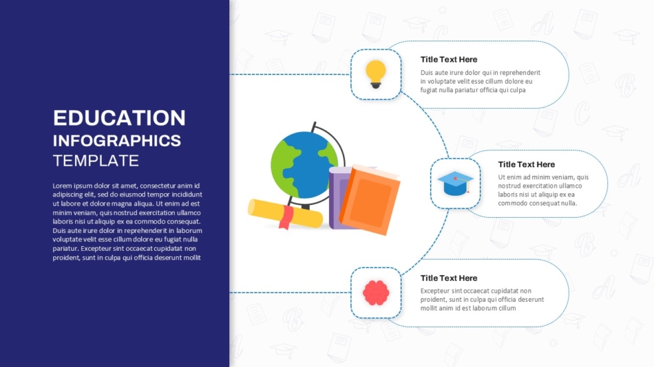
Education infographic slides: Teachers and trainers use infographics to break down complex concepts. The Education Infographics PowerPoint Template helps present lesson structures, learning frameworks, or curriculum progressions in formats that improve student retention.
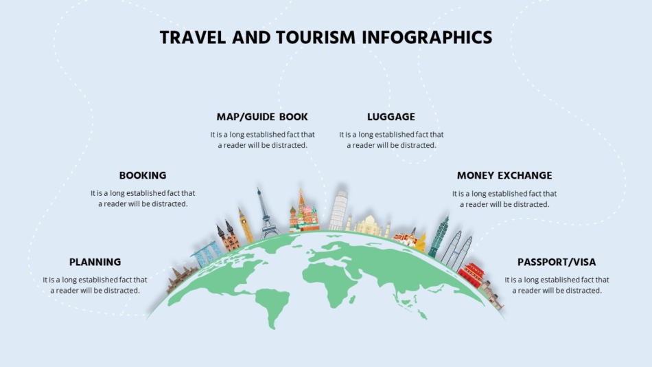
Travel and tourism infographics: Destination marketing and itinerary planning benefit from visual storytelling. A Travel & Tourism Infographic Template can showcase travel packages, highlight destination features, or present visitor data in engaging formats.
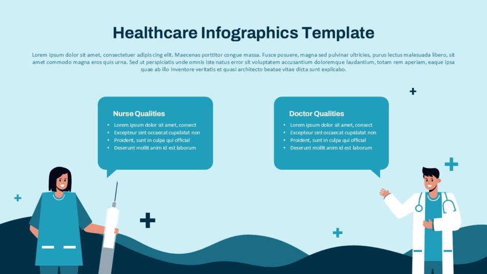
Healthcare data presentation: Medical information requires particular clarity and precision. The Healthcare Infographics Template provides formats appropriate for patient education, clinical process documentation, or health outcome reporting.
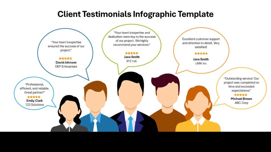
Client testimonials infographic: Customer feedback gains credibility when presented professionally. A Client Testimonials Infographic Template organizes quotes, ratings, and success metrics in trust-building formats.
When to Use a Ready-Made Infographic Template
Building custom infographics from scratch offers maximum flexibility but demands significant time and design skill. Ready-made templates provide an alternative that balances professional quality with efficiency.
Saves time: Starting with a structured template reduces creation time from hours to minutes. The layout, color scheme, and basic design decisions are already made.
Ensures alignment: Templates are pre-built with proper alignment, spacing, and proportions, eliminating tedious manual adjustment work.
Professional structure: Quality templates incorporate design principles that casual PowerPoint users might overlook—proper visual hierarchy, balanced layouts, and appropriate typography.
Easy customization: Despite being pre-designed, professional templates remain fully editable. Every element can be recolored, resized, or repositioned while maintaining overall design coherence.
Free infographic templates provide starting points for learning. However, infographic templates free download options often lack the design refinement or customization flexibility of premium alternatives. For professional presentations, investing in quality templates demonstrates commitment to communication excellence.
Blank infographic template options offer another approach—providing structure without prescriptive styling for teams with strong design capabilities.
Conclusion: Build Better Infographic PowerPoint Slides with SlideKit
Creating effective infographic PowerPoint presentations requires strategic thinking about message clarity, thoughtful selection of visual formats, and disciplined application of design principles.
The process begins before opening PowerPoint—with identifying core messages, defining key points, and selecting the infographic type that best serves the content. Whether using timeline infographics for project schedules, funnel infographics for process flows, or comparison formats for decision support, matching content to form determines success.
Professional infographic slides balance visual appeal with functional clarity. They guide audience attention, simplify complex information, and create memorable presentations. By avoiding common pitfalls—overcrowding, color chaos, poor alignment, inconsistent styling—presenters elevate their communication effectiveness.
For teams seeking faster creation without sacrificing quality, SlideKit’s collection of infographic templates provides structured, customizable starting points across multiple formats. Better presentations start with better structure. Clearer infographics lead to clearer thinking, stronger alignment, and more confident decision-making.

