How Do I Make My Own Timeline for a Presentation?
reating a timeline for a presentation sounds straightforward until you actually sit down to build one. Questions pile up quickly. Where do you start? How many milestones should you include? How do you space events proportionally? What happens when your content doesn’t fit neatly into a fixed template design?
These questions come up because timelines require two things working together—clear content organization and sound visual structure. Get both right and your timeline communicates project phases, strategic plans, or historical sequences instantly. Get either wrong and audiences struggle to follow what should be simple information.
This guide explains how to create your own timeline for presentations, from deciding what structure fits your content to building professional slides in PowerPoint and Google Slides without spending hours on formatting.
What Is a Blank Timeline and When Should You Use One
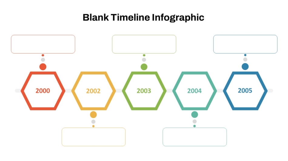
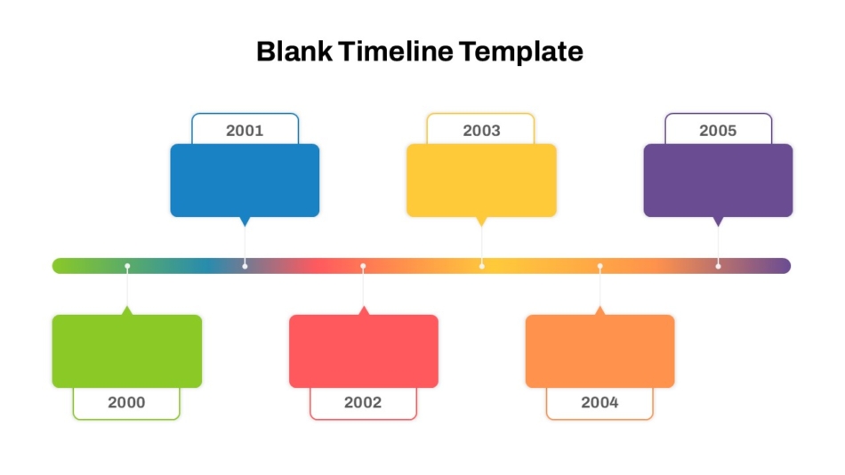
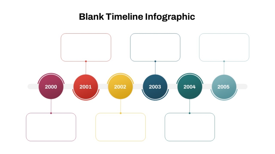
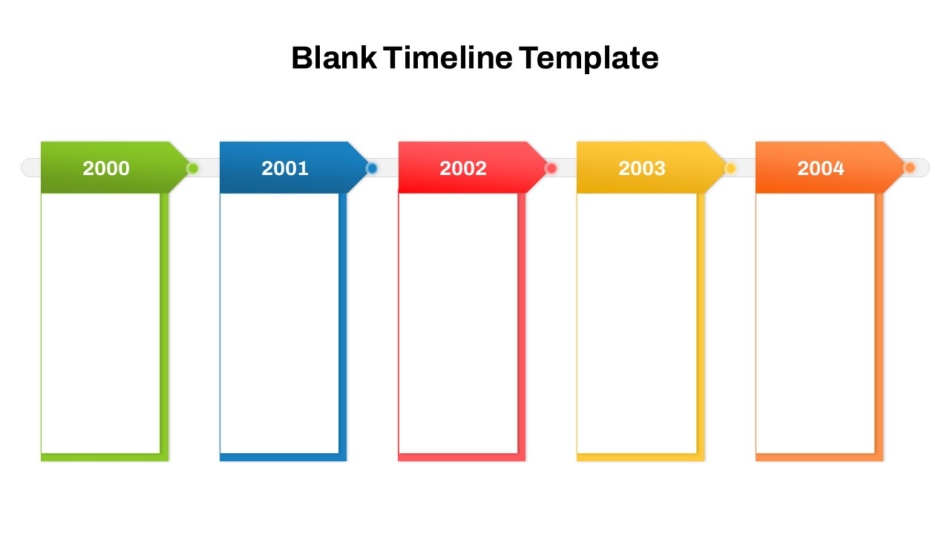
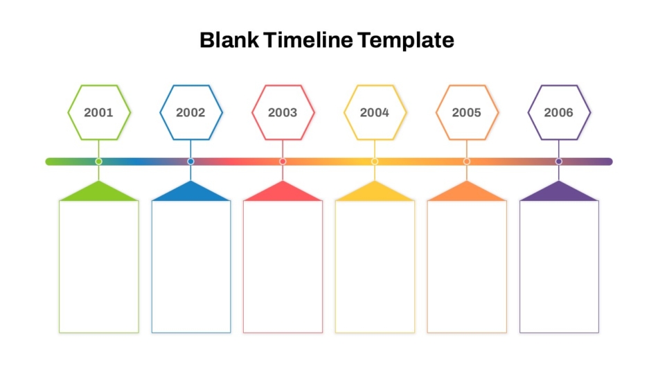
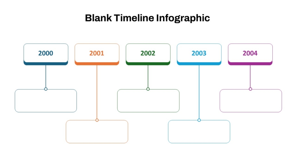
A blank timeline is a pre-structured layout with a timeline framework but no predetermined content. It gives you the visual foundation—axis, spacing guides, milestone positions, and formatting—while leaving every content decision to you.
This differs from fixed infographic timelines that come with set milestone counts, predetermined labels, or locked design elements. Fixed templates work well when your content happens to match their structure. When it doesn’t, you end up forcing information into formats that don’t fit.
Blank timelines make more sense when your project has a specific number of milestones that don’t match standard templates, your timeline spans an unusual period, your content structure is unique to your industry or context, or you need full control over visual style and branding.
They also work better for recurring presentations where you update the same timeline structure regularly. Starting from a blank framework means updates are straightforward rather than requiring you to work around predetermined design elements.
A blank timeline template provides professional visual structure while keeping content decisions entirely in your hands. This combination saves design time while maintaining the flexibility that makes timelines actually useful.
Defining the Purpose and Milestones Before You Build
The most important timeline work happens before you open PowerPoint or Google Slides. Rushing into design without planning content leads to cluttered, confusing timelines that require rebuilding.
Clarify What Your Timeline Needs to Show
Start with one clear question: what should audiences understand from this timeline? The answer shapes every subsequent decision.
A project timeline communicates what happens and when. A strategic roadmap shows organizational direction over time. A historical timeline provides context for how something evolved. A planning timeline helps teams coordinate activities.
Each purpose leads to different content choices, different detail levels, and different visual approaches. A project timeline might need weekly granularity. A strategic roadmap might show only quarterly milestones. A historical timeline might span decades.
Get this clarity before designing and your timeline will be focused. Skip it and you’ll likely include too much or too little.
Determine Your Time Span
Know your timeline’s time frame before choosing structure. This decision determines appropriate granularity and visual scale.
Timelines spanning weeks or months can show specific dates with meaningful detail. Timelines spanning years need quarterly or annual markers rather than monthly detail. Timelines spanning decades need year-level markers with space for brief descriptions rather than precise dates.
Match your time markers to the scale that makes sense for your content. Too much granularity on a long timeline creates clutter. Too little on a short timeline leaves audiences guessing about specific timing.
Choosing the Right Timeline Structure
Different timeline formats suit different content types. Choosing appropriate structure before building saves significant time and produces clearer results.
Horizontal Timelines
Horizontal timelines progress left to right across the slide, matching natural reading direction for most audiences. They work well for projects, plans, or sequences where audiences need to understand progression from start to finish.
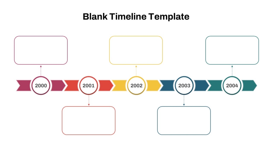
These formats suit quarterly or annual timelines where showing progression clearly matters more than fitting many items. A horizontal blank timeline template or horizontal arrow blank timeline template provides appropriate structure, with the arrow format particularly useful when emphasizing forward momentum or directional progress.
Horizontal timelines work best in landscape presentation formats and accommodate visual labels above and below the axis without feeling crowded.
Vertical Timelines
Vertical timelines flow top to bottom, working well for process explanations, historical progressions, or when showing how events build upon each other over time.
These formats suit printed materials better than projected presentations since vertical space is more limited on standard slides. However, they work effectively in digital presentations when content benefits from top-to-bottom flow or when showing how stages stack sequentially.
Multi-Year and Strategic Timelines
Long-term strategic plans need timeline structures accommodating multiple years without cramping information. A multi-year blank timeline template provides scale for showing organizational direction over extended periods.
These templates use year-level granularity rather than monthly detail, keeping strategic timelines focused on major milestones rather than operational activities. The year-by-year blank timeline template breaks each year down while maintaining multi-year perspective.
Annual and Yearly Timelines
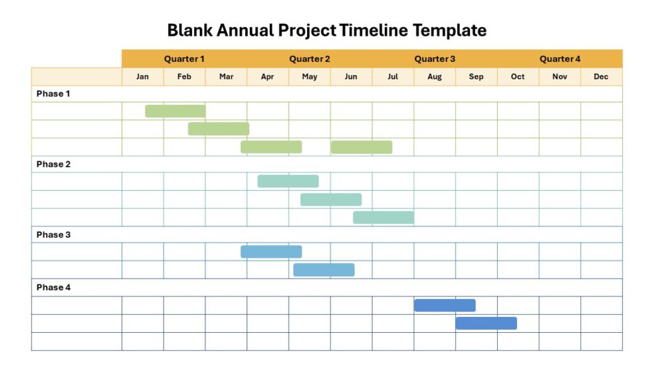
Projects or initiatives spanning a single year benefit from monthly or quarterly breakdowns. A blank annual project timeline template structures twelve months clearly for marketing calendars, product development cycles, or any annual initiative.
For visual variety, a colorful yearly blank timeline template adds color distinction between periods while maintaining clear yearly structure.
How to Create a Timeline in PowerPoint Step by Step
With content planned and structure chosen, building the timeline follows logically.
Setting Up Your Slide Foundation
Start with a blank timeline for PowerPoint and Google Slides that matches your chosen structure. Open the template and save a copy specifically for your project, keeping the original intact.
Review existing elements in the template—axis, milestone markers, text positions, spacing. Understanding the built-in structure helps you customize effectively without accidentally breaking design logic.
Set your slide dimensions before adding content. Standard presentations use 16:9 widescreen format. Changing dimensions after building content can distort elements.
Adding Milestone Markers
Create your first milestone marker using a circle, diamond, or other shape positioned on the timeline axis. Size it appropriately—large enough to see clearly, small enough not to dominate the slide.
Once you have one perfect milestone marker, duplicate it using Ctrl+D for all subsequent milestones rather than creating new shapes each time. Duplicating maintains identical sizing and formatting, which is essential for visual consistency.
Position duplicated markers along the axis according to proportional timing. If your timeline spans twelve months and one milestone occurs at month three, that marker should sit roughly one quarter along the axis.
Adding Labels and Dates
Label each milestone with date or time period and a brief description. Place labels consistently—all above the axis, all below, or alternating if space is tight. Mixing label positions randomly looks unorganized.
Keep labels concise. “Q2 Product Launch” works better than “Complete the product development process and launch to market in Q2.” Brief phrases serve timeline purposes; detailed explanations belong in speaker notes.
Use consistent date formatting throughout. Decide whether you’re using “January 2026,” “Jan 2026,” or “Q1 2026” and stick with that format for every milestone.
Formatting for Readability
Ensure text is large enough to read comfortably at presentation size. Timeline labels often become too small during editing then prove unreadable when projected.
Test your PowerPoint timeline slide in presentation mode before finalizing. Walk away from your screen and check readability from a few feet away, simulating projection distance.
How to Make a Timeline on Google Slides
Creating timelines in Google Slides follows similar principles to PowerPoint with some platform-specific considerations.
Working With Shapes and Lines
Google Slides uses shapes and lines as your primary building tools. Insert a horizontal line for your timeline axis, then add shapes for milestone markers.
Hold Shift while drawing shapes to maintain perfect proportions. Use Ctrl+D to duplicate elements just like PowerPoint, maintaining consistency across markers.
Using Alignment Guides
Google Slides shows alignment guides automatically when dragging elements near other objects. These guides help you align milestone markers to the axis without manual measurement.
For more control, use Format > Align and Distribute functions to position multiple elements precisely. This ensures professional results that eyeballing can’t achieve.
Saving Time with Google Slides Timeline Templates
Building Google Slides timelines from scratch takes longer than working from templates designed for the platform. A Google Slides timeline template or the blank timeline charts PowerPoint & Google Slides template provides ready-made structure that functions properly on both platforms.
This cross-platform compatibility matters for team collaboration when members use different tools. Templates that work in both applications prevent formatting problems when files move between platforms.
Customizing Colors and Theme
Google Slides lets you customize theme colors under Slide > Edit Theme. Setting brand colors at the theme level applies them consistently throughout, preventing accidental color inconsistencies.
This theme-level customization produces more reliable results than manually changing individual element colors, particularly when templates include multiple slides.
Design Best Practices for Professional Timeline Slides
Good design decisions make timelines easier to understand and more credible.
Maintain Visual Hierarchy
Not all timeline elements carry equal importance. Major milestones deserve more visual prominence than minor checkpoints. Key phases can be larger, bolder, or more colorful than supporting details.
Hierarchy guides audiences to what matters most without requiring them to read every element equally. When everything looks the same, nothing stands out.
Use Color Purposefully
Color should communicate meaning, not just decorate. One color might indicate completed phases, another shows current work, a third marks future plans. The modern color-coded layout blank timeline template demonstrates how strategic color use clarifies timeline information at a glance.
Limit your palette to three or four colors maximum. More colors create visual noise that confuses rather than clarifies.
Keep Text Minimal
Timelines communicate through visual structure. Heavy text defeats this purpose. Labels should identify milestones briefly, not explain them fully.
Detailed explanations belong in speaker notes or supporting slides. Your timeline slide shows structure and timing; you provide depth verbally.
Common Mistakes to Avoid
Learning from common errors improves timeline quality.
Including too many milestones overwhelms audiences. Keep timelines focused on major events only.
Inconsistent date formats look careless and create confusion. Choose one format and apply it throughout.
Ignoring proportional spacing makes timelines inaccurate. Equal time periods need equal visual space.
Using too many colors creates visual chaos. Functional color use communicates meaning; random color use just distracts.
Forgetting to update timelines undermines credibility. Presenting outdated information suggests poor preparation.
Poor contrast between text and backgrounds makes content hard to read. Check readability carefully.
Misaligned elements signal lack of attention to detail. Use alignment tools, not eyeballing.
Real Use Cases Where Blank Timelines Work Best
Blank timelines suit numerous presentation contexts where predetermined templates don’t fit specific needs.
Project updates use timelines to show phase progress, upcoming milestones, and delivery schedules to stakeholders who need status without operational detail.
Strategic roadmaps communicate organizational direction over one to three years, showing major initiatives and expected timing without locking into operational specifics.
Marketing planning presentations coordinate campaign launches, content schedules, and channel activities across quarters or full years.
Product development timelines show feature development phases, release schedules, and launch timing to align cross-functional teams.
Academic and research presentations use timelines to show study phases, data collection periods, or historical context relevant to research topics.
Onboarding and training programs map learning phases, skill development stages, or program progression for new employees or students.
Each context needs different timeline structure, time scale, and milestone focus—exactly why blank timelines work better than fixed predetermined designs.
How SlideKit Makes Timeline Creation Faster
SlideKit provides a collection of blank timeline templates built specifically for professional presentation contexts. These templates work in both PowerPoint and Google Slides, giving teams flexibility across platforms without formatting problems.
Each template comes with established spacing systems, visual hierarchy, and professional design foundations. You add your milestones, dates, and labels while the template handles the visual structure that takes most time to create manually.
The templates are fully editable—you can adjust colors to match brand guidelines, modify time scales, add or remove milestone markers, and change layouts without breaking the design. An empty timeline template gives maximum flexibility, while more structured options suit specific content types.
For teams creating timeline presentations regularly, SlideKit templates ensure consistent quality across different presenters and projects. New team members can create professional timelines without design expertise, and existing team members save hours previously spent on formatting.
Whether you need a simple horizontal layout for a project update, a multi-year format for strategic planning, or a color-coded annual timeline for marketing planning, SlideKit provides blank starting points that produce professional results with less effort.
Practical Takeaways
Making your own timeline for a presentation starts with clear planning—knowing your purpose, selecting key milestones, determining your time span, and choosing appropriate structure before designing anything.
Different formats suit different needs. Horizontal timelines work for sequential projects. Multi-year formats handle strategic planning. Annual timelines organize yearly initiatives. Phased formats work when sequence matters more than specific dates.
Build timelines using consistent elements, proportional spacing, clear labels, and purposeful color. Avoid overcrowding, inconsistent formatting, poor alignment, and text that competes with visual structure.
Blank timeline templates from SlideKit provide professional foundations for any of these contexts, saving design time while maintaining complete control over content and structure. The result is timeline slides that communicate clearly rather than just looking busy—which is exactly what professional presentations need.

