Gap Analysis PowerPoint Diagram Template
This template is part of a deck featuring multiple slides. To check out all slides, click on See All.
See All

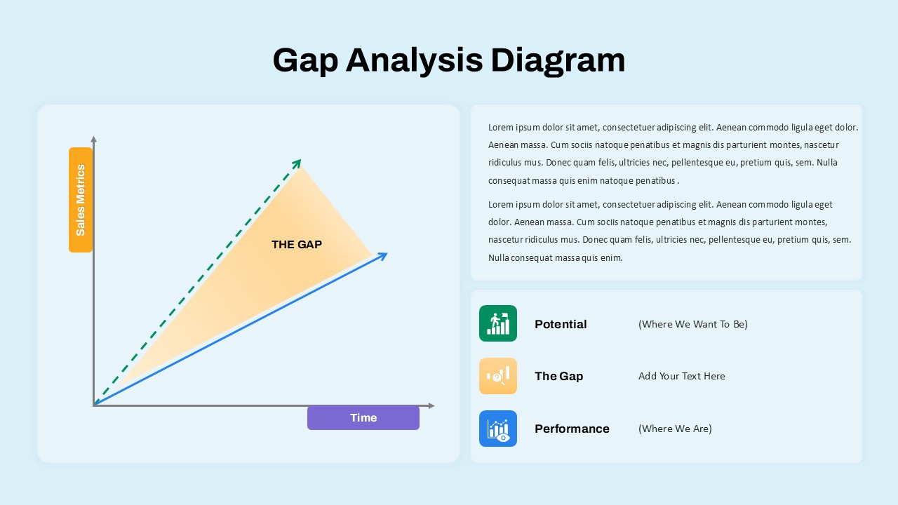
Gap Analysis Diagram PowerPoint visually represents performance versus potential over time using a simple line chart. On the left, the vertical axis is labeled “Sales Metrics” with an orange tag, and the horizontal axis is labeled “Time” with a purple tag.

