Editable Donut Chart PowerPoint Template and Google Slides
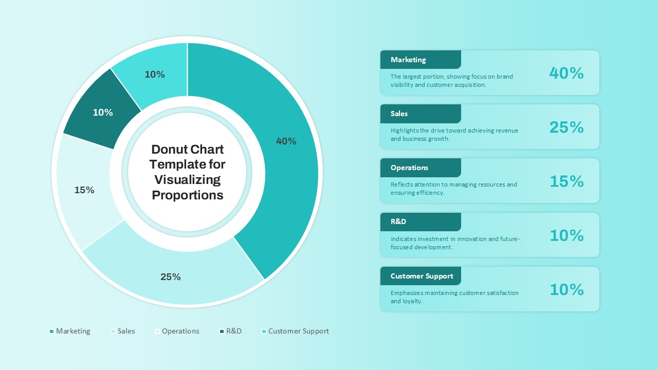
The Donut Chart Template for Visualizing Proportions is a sleek and professional design crafted to showcase data insights effectively. This donut chart PowerPoint template features a visually appealing donut chart that breaks down proportions into five segments: Marketing, Sales, Operations, R&D, and Customer Support, each color-coded for clarity and paired with detailed explanations and percentages. The layout emphasizes simplicity and readability, making complex data easy to interpret for your audience.
Perfect for business professionals, educators, and analysts, this template is an excellent choice for presenting revenue distribution, resource allocation, departmental focus, or performance metrics. Fully customizable in both PowerPoint and Google Slides, you can adjust the colors, text, and data points to align with your specific presentation goals.
Ideal for business reports, project updates, or data analysis presentations, this template ensures a visually compelling way to present proportional data. Its clean aesthetic and modern design make it suitable for corporate settings or educational environments alike.
See more

