Cohort Analysis Chart Template for PowerPoint & Google Slides
This template is part of a deck featuring multiple slides. To check out all slides, click on See All.
See All

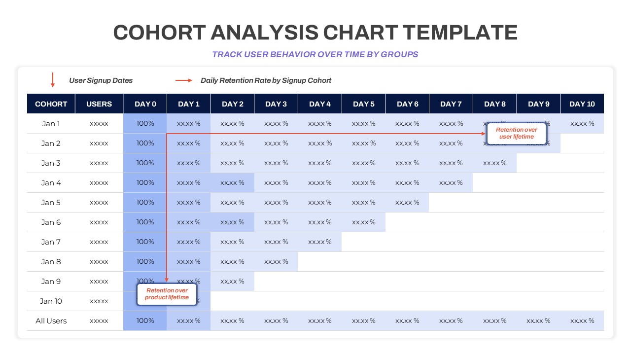
Template for cohort analysis showing user signup cohorts from Jan 1 to Jan 10, with daily retention rates across 10 days. Highlights user behavior trends and lifetime retention using a heatmap-style grid for performance tracking.

