
Business Sales Comparison PowerPoint and Google Slides Template
This template is part of a deck featuring multiple slides. To check out all slides, click on See All.
See All


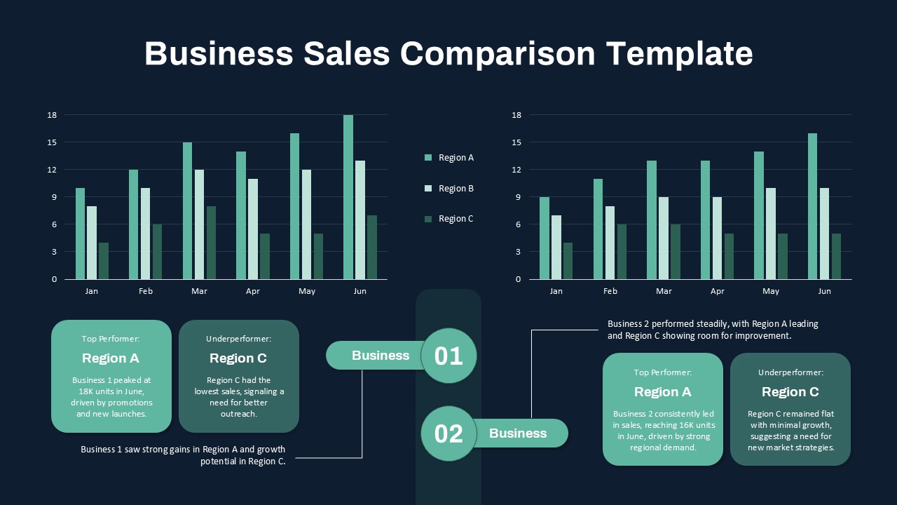
This PowerPoint template is a business sales comparison chart that shows the sales performance of three regions (A, B, and C) from January to June. The bar graphs on the left compare sales data for Business 1, highlighting Region A as the top performer and Region C as the underperformer. The right side compares sales for Business 2, with Region A leading and Region C showing minimal growth