Thank You Slide Templates: How to End Any Presentation Perfectly

The last slide of a presentation stays on screen longer than any other. It sits there during the entire Q&A session, through the discussion that follows, and while people are packing up and leaving the room. Despite that, most presenters treat it as an afterthought. A blank screen, a generic “Thank You” in default font, or worse, leaving the final content slide visible with too much information still competing for attention.
A well-designed thank you slide template solves this problem cleanly. It gives the presentation a composed ending, provides a professional backdrop for discussion, and leaves the audience with a final impression that matches the quality of everything that came before it.
This guide covers how to end a presentation effectively, what makes a good closing slide, and the different types of thank you slide templates that work across business, educational, and creative contexts.
Why the End of a Presentation Matters More Than You Think
Most people focus their preparation time on the opening and the main content. The closing slide gets whatever time is left, which is usually not much. This is backwards for a simple reason. The end of the presentation is what the audience remembers most clearly.
There is actual psychology behind this. Recency effect means people remember the last thing they heard or saw more vividly than information from the middle. A strong close reinforces the main message. A weak or absent close leaves the audience with nothing memorable to take away.
Beyond memory, there is a practical consideration. After the presentation ends, the last slide becomes the visual environment for the rest of the meeting. If that slide is cluttered, blank, or visually inconsistent with the rest of the deck, it creates a subtle but noticeable drop in professionalism right when credibility matters most.
A good thank you slide for presentation contexts handles both the psychological and the practical side. It closes the narrative cleanly and provides a composed backdrop that supports rather than distracts from the discussion that follows.
What Most People Get Wrong About Closing Slides
The most common mistake is treating the thank you slide as purely functional text. The presenter adds a slide at the end, types “Thank You” in the center, and calls it done. This is not technically wrong, but it misses the opportunity entirely.
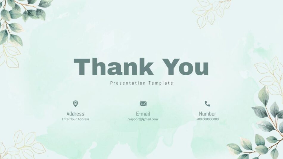
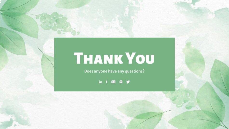
A closing slide can do several useful things at once. It can display contact information so people know how to follow up. It can restate the core message or recommendation. It can reinforce the brand or visual identity established in the rest of the deck. It can provide a visually calm space that makes Q&A easier to manage.
The other common mistake is leaving the final content slide visible. This happens when the presenter does not create a dedicated closing slide at all. The last piece of actual content (usually a data slide, a bullet list, or a detailed chart) stays on screen while people are asking questions. This works against the discussion because the audience is still reading the slide instead of engaging with the conversation. SlideKit’s end thank you slide templates are built specifically to avoid both problems. They provide a clean, professional close without being visually empty, and they are designed to function as a backdrop rather than a distraction during the post-presentation discussion.
Different Types of Thank You Slides and When to Use Each
Not all thank you slides serve the same purpose, and not all contexts call for the same visual tone. Matching the closing slide to the presentation type and audience produces a better result than using a single generic format for everything.
Professional and minimal thank you slides
For business presentations, client meetings, board reports, and formal contexts, the closing slide should match the tone of the rest of the deck. Clean typography, restrained color use, and enough white space to feel composed without being empty.
A professional thank you slide works well when the presentation has been data-heavy, formal, or delivered to a senior audience. The visual simplicity reinforces the seriousness of the content rather than undercutting it with decorative elements.
SlideKit’s professional thank you slide falls into this category. It is designed for business contexts where the closing slide needs to look intentional without drawing attention to itself.

Creative and expressive thank you slides
For pitch decks, creative presentations, marketing briefings, and contexts where personality is part of the message, a more visually expressive thank you slide is often the better choice. Bold colors, distinctive typography, or a design element that reflects the brand or subject matter can make the close feel like a natural conclusion rather than a generic add-on.
The creative thank you presentation slide from SlideKit is built for this purpose. It has a visual treatment that works in contexts where the presentation itself has energy and the closing slide should reflect that rather than neutralize it.

Cool and modern thank you slides
Some presentations fall between formal and expressive. They need to look polished but not corporate, distinctive but not overly decorative. A modern thank you slide with clean lines, contemporary typography, and subtle visual interest handles this middle ground well.
The cool thank you presentation slide is designed for this range. It works for presentations that need to look professional enough for client-facing work but visually engaging enough to feel intentional.

Attractive and visually distinctive slides
For presentations where visual design is part of the content itself (design portfolios, creative showcases, brand presentations), the thank you slide can be more visually ambitious. It should still function as a closing frame, but it can carry more design personality.
SlideKit’s attractive thank you slide provides a template in this category, with a stronger visual identity that works when the rest of the presentation has already established a bold aesthetic direction.
Free and accessible options
Not every presentation has a budget for premium templates, and not every context requires one. For internal updates, classroom presentations, or informal settings, a well-designed free thank you slide template can be entirely sufficient.
The free thank you slide template from SlideKit provides a clean, functional option without cost. It is useful for students, educators, and teams working with limited resources. For presentations that use a dark theme throughout, the free dark theme thank you slide maintains visual consistency without requiring a paid template.


How to End a Presentation Beyond Just the Slide
A good closing slide is part of a strong ending, not the entire thing. The way a presentation concludes matters as much as what is on screen. This includes what the presenter says, how the final message is framed, and what happens immediately after.
Invite discussion with a specific prompt
Rather than ending with a generic “Any questions?”, a more effective approach is to invite discussion with a specific framing. Something like “I would like to hear your thoughts on the timeline we discussed” or “What concerns do you have about this approach?” gives people a clearer entry point into the conversation.
Keep the closing slide visible during Q&A
Once the thank you slide is on screen, it should stay there. Flipping back to earlier slides during Q&A is fine if someone asks for specific data, but the default state should be the closing slide. This keeps the visual environment calm and prevents the audience from re-reading content slides instead of engaging with the discussion.
Backgrounds That Work for Thank You Slides
The background of a thank you slide sets the tone as much as the text itself. A blank white background feels unfinished. A busy or overly decorative background competes with the message. The right background provides visual interest without distraction.
Aesthetic and vintage backgrounds
For presentations with a specific thematic or historical context, an aesthetic powerpoint background vintage in style can reinforce the subject matter. A history presentation, a literature review, or a brand retrospective can benefit from a background that visually reflects the content. The design element is doing communication work rather than just decoration.
Thanksgiving and seasonal backgrounds
For presentations delivered during specific times of year, a seasonally appropriate background makes the closing slide feel contextually relevant. A Thanksgiving background works well for November company updates, client reviews, or team presentations where the seasonal timing is already part of the context. The background acknowledges the timing without becoming the main focus.
Cute and approachable backgrounds
For educational contexts, student presentations, community events, or any setting where warmth and approachability matter more than formal authority, a cute background for Google Slides or PowerPoint creates a friendly visual tone. This works particularly well in classroom settings, nonprofit presentations, or internal team meetings where a lighter visual register is appropriate.
Google Slides background images
For teams working primarily in Google Slides, using a google slides background image designed specifically for that platform avoids the rendering and spacing issues that often occur when PowerPoint backgrounds are imported. A natively designed background maintains its proportions and visual quality across different devices and screen sizes.
SlideKit’s background templates are available in both PowerPoint and Google Slides formats, so the visual result is consistent regardless of which platform is used to present.
Thank You Slides in PowerPoint vs Google Slides
The platform makes a difference in how a thank you slide renders and behaves. A template designed for PowerPoint may not import cleanly into Google Slides, and vice versa. Font substitution, spacing shifts, and background scaling issues are all common when files are moved between platforms.
Thank you slide in PPT
A thank you slide for ppt contexts benefits from PowerPoint’s more advanced design tools. These include precise spacing controls, embedded fonts, and support for more complex visual elements. For presentations that will be delivered from a local machine in a controlled environment, a PowerPoint thank you powerpoint slide is the more reliable choice.
Thank you slide for Google Slides
For distributed teams, collaborative presentations, or contexts where the deck will be shared via link rather than file attachment, a thank you slide designed natively for Google Slides avoids platform conversion issues entirely. The layout is calibrated for Google’s rendering engine, so what the presenter sees during editing is what the audience sees during presentation.
SlideKit’s thank you presentation slide template and thank you slide presentation template are both available in PowerPoint and Google Slides formats, making it straightforward to maintain visual consistency across both platforms.


What to Include on a Thank You Slide
Beyond the thank you message itself, a well-designed closing slide can include several other useful elements without becoming cluttered.
Contact information
Email address, LinkedIn profile, or website URL give the audience a clear way to follow up. This is particularly useful in networking contexts, conference presentations, or any setting where the goal is to create ongoing connections rather than end the conversation at the presentation itself.
A short reminder of the key message
A single sentence restating the core recommendation, finding, or takeaway reinforces the main point without requiring the audience to remember everything from earlier slides. This is especially effective in persuasive or decision-making presentations where a specific action or conclusion is being proposed.
Brand or organizational identity
A logo, tagline, or visual element that connects the closing slide to the organization helps reinforce brand consistency. This is standard practice in client-facing presentations and should feel like a natural part of the slide rather than an afterthought.
QR code for additional resources
For presentations that include supplementary materials, a QR code on the thank you slide gives people immediate access to documents, websites, or follow-up content without requiring them to write down a URL or wait for an email.
The key is keeping the slide functional without overloading it. Three to four elements maximum is the practical limit before the slide starts to feel busy.
Common Mistakes to Avoid
Even with a good template, a few common errors can undermine the effectiveness of a closing slide.
Using too many fonts or colors
If the thank you slide suddenly introduces new fonts or colors that were not used anywhere else in the deck, it reads as disconnected rather than intentional. The closing slide should feel like part of the same presentation, not a borrowed element from a different file.
Making the text too small
Contact information or secondary messages on the thank you slide are often set in font sizes that are too small to read at projection scale. If the information is important enough to include, it should be large enough to actually see.
Leaving the slide blank
A completely blank screen after the presentation ends feels like the deck stopped rather than concluded. Even a simple “Thank You” with clean typography is better than nothing.
Overcomplicating the design
The opposite problem is a thank you slide with too many design elements, animations, or decorative features. The closing slide should provide visual calm, not compete for attention.
A well-designed thank you slide template avoids all of these by default. The fonts, colors, and layout are already calibrated to work within a professional presentation context, so the presenter is starting from a functional foundation rather than building from scratch.
Final Thought
The end of a presentation is not an ending. It is the transition into the next phase. This could be discussion, decision-making, follow-up, or simply the audience leaving with a clear impression. A good thank you slide template supports that transition by providing a professional, composed close that matches the quality of everything that came before it.
Whether the context is a formal business presentation, a creative pitch, a classroom lecture, or an internal team update, the closing slide is not decoration. It is the last communication decision the presenter makes before the conversation shifts to the audience. Making that decision intentionally rather than defaulting to a blank screen or a generic text slide is a small change that produces a measurable improvement in how the presentation is received.
The templates covered in this guide provide a range of options across professional, creative, modern, and accessible categories. Knowing which one fits the context is all it takes to end any presentation with clarity and confidence.

