Simplify Your Message with PowerPoint Diagram Templates

The most complex ideas become clear the moment you visualize them. PowerPoint diagram templates give you the structure to communicate faster, more precisely, and more memorably than words alone ever could.
Why diagrams communicate better than words alone
There is a reason experienced presenters reach for diagrams when they need their audience to truly understand something. Words describe. Diagrams reveal. When you place a process flow, a hierarchy chart, or a comparison matrix on a slide, you give your audience a spatial map of the idea and spatial understanding sticks in a way that sequential text rarely does. The challenge is that building a diagram from scratch inside PowerPoint can take far longer than the value it delivers.
You wrestle with shapes, alignment, connectors, and spacing and by the time the diagram looks right, you have spent an hour on a single slide. PowerPoint diagram templates solve this problem entirely. They give you a professionally designed, fully editable visual structure that you simply fill with your own content.
In this guide we walk through the most useful types of PowerPoint presentation diagrams, when to use each one, how to customize templates for maximum impact, and where to find the best designs available in 2026.
The most useful PowerPoint diagram types and when to use them
Not every diagram type suits every message. Understanding which diagram belongs with which kind of content is the first and most important decision you will make before opening any template.
1. Process Flow Diagram
If you could only use one type of PowerPoint diagram template across your entire presentation career, the process flow would be the most useful choice. Almost every business concept — onboarding, approval workflows, product development cycles, customer journeys — has a sequential logic that a flow diagram communicates instantly and clearly.
Best for : Operations, HR, Project management
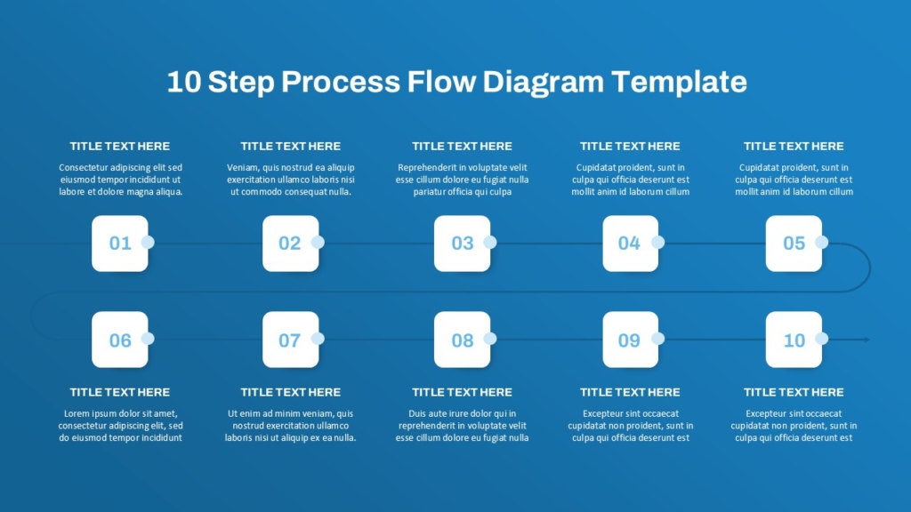
The most effective process flow diagrams keep each step label short ideally one or two words and use color to highlight the current step, a decision point, or a milestone the audience needs to pay particular attention to. Pre-designed templates handle the alignment and spacing automatically, so your only job is replacing the placeholder labels with your actual process steps.
2. Comparison diagrams
One of the most common needs in a business presentation is helping an audience understand the difference between two or more options. A comparison diagram template does this work far more effectively than a bullet point list ever could — it places the options side by side in a visual structure that makes differences immediately visible without requiring the audience to hold information in working memory.
Best for : Product comparison, Strategy options, Vendor selection
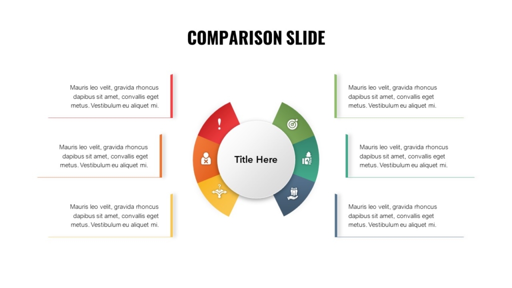
A well-designed comparison diagram does not just show data it makes the right answer feel obvious before anyone has read a single row.
3. Pyramid Diagrams
Pyramid diagrams are particularly powerful when you need to communicate that some elements are more foundational, more important, or more urgent than others. The visual weight of a triangle naturally communicates hierarchy — what sits at the base supports everything above it, and what sits at the peak represents the pinnacle of whatever model you are presenting.
Best for : Strategy frameworks, priority models, need analysis
Strategy frameworks, Maslow-style models, organizational maturity scales, and priority matrices all translate naturally into pyramid diagram templates. The key is keeping each level label short and ensuring the color or shading reinforces the hierarchy rather than working against it.
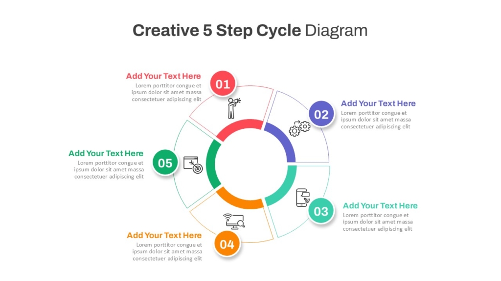
4. Cycle Diagram
Represents repeating processes, feedback loops, or continuous improvement cycles with no defined start or end.
Best for: product cycles, feedback loops, seasonal planning
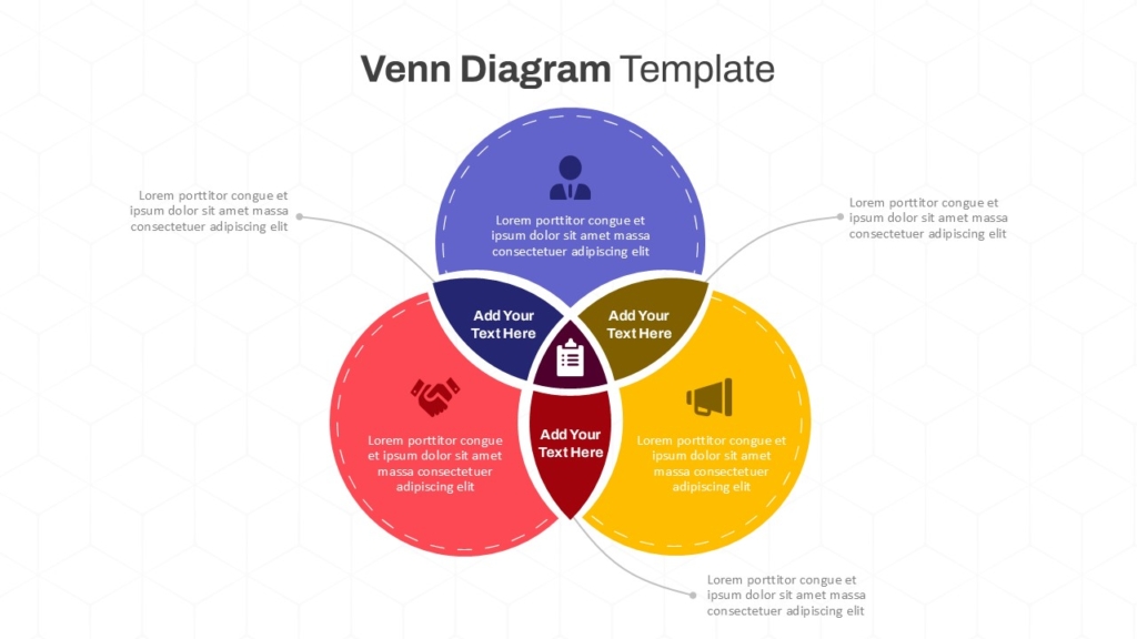
5. Venn Diagram
Shows overlapping relationships and shared characteristics between two or more groups or concepts.
Best for : Positioning, Audience overlap, Shared values
How to choose the right diagram template for your content
The most common mistake presenters make with diagram templates is choosing the one that looks most impressive rather than the one that best suits the content. A visually complex diagram applied to a simple idea creates confusion, not clarity. The right diagram type is always the simplest one that accurately communicates the relationship you are trying to show.
- Sequential Content : If your content has a clear start, middle, and end — use a process flow or timeline diagram.
- Hierarchical Content : If some elements are above, below, or more important than others — use a hierarchy chart or pyramid diagram.
- Comparative Content : If you are showing differences or similarities — use a comparison diagram or Venn diagram.
How to customize a PowerPoint diagram template effectively
A diagram template is a starting structure, not a finished product. The value comes from how well you adapt it to your specific content and brand. These are the customization steps that make the biggest difference.
- Replace every placeholder label with your actual content never leave template text in a final presentation
- Apply your brand colors to the diagram elements so it feels like part of your presentation rather than a generic insert
- Remove any diagram elements you do not need a five-step template used for a three-step process creates unnecessary visual noise
- Keep labels short ideally one to three words per element and move detailed explanations to your speaker notes or body text
- Use color intentionally highlight the most important element, the recommended option, or the current stage rather than applying color randomly
- Check alignment and spacing after any edits even small changes to label text can shift element positions in ways that break the visual balance.
Conclusion
The best PowerPoint diagram templates do not just make your slides look better they make your ideas land faster, your logic feel clearer, and your audience’s job of understanding significantly easier. Whether you are mapping a five-step process, comparing two strategic options, or visualizing an organizational hierarchy, the right diagram template gives you a proven visual structure that you can adapt in minutes rather than build from scratch in hours.
Start with the right template, customize it to your content and brand, and let the visual structure carry your message where words alone cannot reach.
If you are ready to simplify your message and elevate your presentations, SlideKit offers a curated library of professionally designed PowerPoint diagram templates process flows, comparison layouts, pyramids, timelines, cycle diagrams, and more built to be fully editable, brand-ready, and immediately usable. Stop building diagrams from scratch and start presenting with the clarity your ideas deserve.

