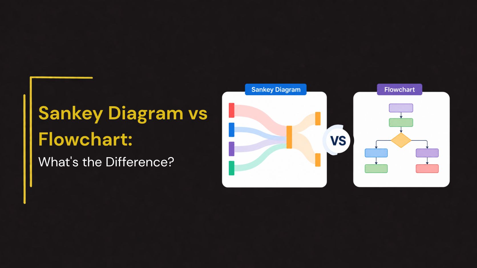
Sankey Diagram vs Flowchart: What’s the Difference?
Visual diagrams are powerful tools for simplifying complex processes, systems, and data. Among the many visualization methods available, Sankey Diagrams and Flowcharts are two popular options used across business, engineering, project management, education, and data analysis.
Although both diagrams use connected elements to represent movement or progression, they serve very different purposes. Understanding the differences between a Sankey Diagram and a Flowchart can help you choose the right visualization for your presentation, report, or analysis.
In this guide, we’ll explore what each diagram is, their key differences, advantages, use cases, and when to use one over the other.
What Is a Sankey Diagram?
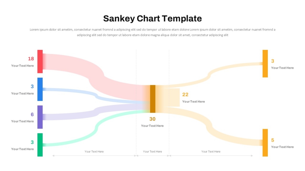
A Sankey Diagram is a flow visualization used to show the movement of resources, energy, money, materials, users, or data between stages of a process.
The defining feature of a Sankey Diagram is that the width of each flow line is proportional to the quantity being represented.
Key Characteristics
- Visualizes quantities moving between stages
- Flow width represents volume or magnitude
- Highlights losses, gains, and distributions
- Ideal for tracking resource allocation
- Focuses on data relationships and proportions
For example, a company can use a Sankey Diagram to show how marketing leads move through different sales funnel stages and how many convert into customers.
What Is a Flowchart?
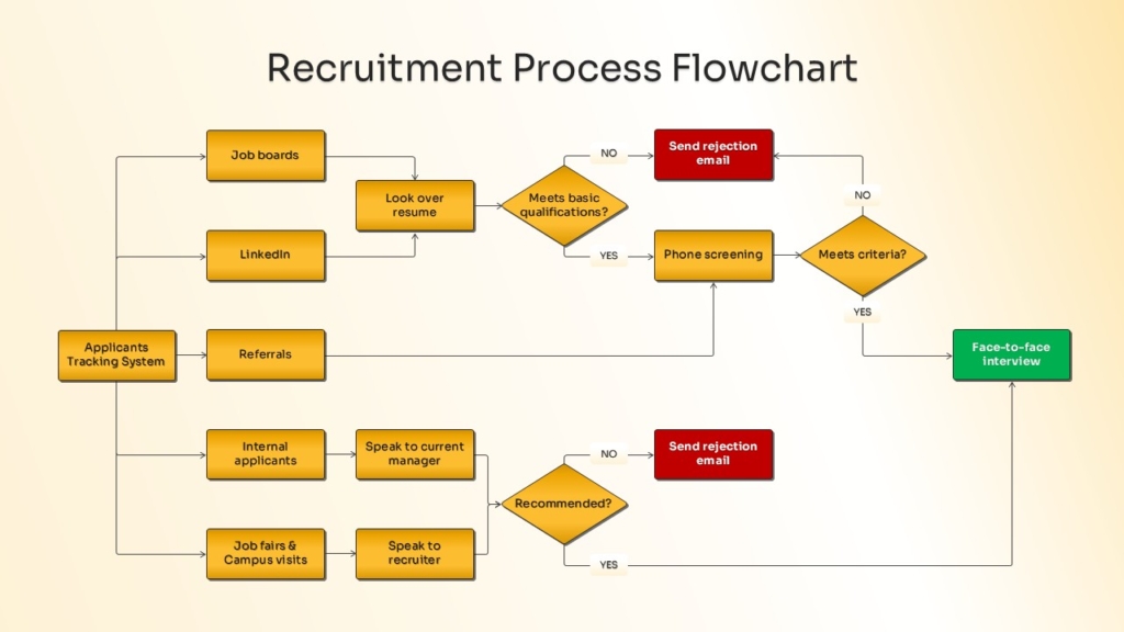
A Flowchart is a process visualization that illustrates the sequence of steps, decisions, and actions required to complete a task or workflow.
Flowcharts focus on process logic rather than quantities.
Key Characteristics
- Shows process flow step-by-step
- Uses standardized symbols
- Includes decisions and branching paths
- Focuses on workflow structure
- Easy to understand and create
For example, a customer service team may use a flowchart to map how support tickets move through various resolution stages.
When to Use a Sankey Diagram
A Sankey Diagram is the better choice when you need to visualize how something moves through a system.
Ideal for :
- Resource Allocation : Show how budgets, funds, or investments are distributed across departments.
- Energy Flow Analysis : Track energy production, usage, and losses.
- Sales Funnel Visualization : Display how prospects move through different stages and where drop-offs occur.
- Website User Journeys : Analyze traffic flow between pages and conversion paths.
- Supply Chain Reporting : Visualize product movement across suppliers, warehouses, and customers.
Because flow widths represent values, Sankey Diagrams quickly reveal where the largest movements occur.
When to Use a Flowchart
Flowcharts are ideal when the goal is to explain a process, procedure, or decision path.
Ideal for :
- Business Workflows : Document operational procedures and approval processes.
- Project Management : Map project phases and task dependencies.
- Employee Training : Explain standard operating procedures.
- Software Development : Visualize system logic and user interactions.
- Customer Support Processes : Outline troubleshooting and escalation paths.
Advantages of Sankey Diagrams
- Visualize Large Data Flows
- Highlight Bottlenecks
- Improve Decision-Making
- Support Data Storytelling
Advantages of Flowcharts
- Easy to Understand
- Standardized Structure
- Excellent for Process Documentation
- Support Training and Communication
Which Diagram Should You Choose?
Choose a Sankey Diagram when:
- You need to show quantities moving through a system
- Data visualization is the priority
- You want to identify bottlenecks or losses
- Resource allocation is important
Choose a Flowchart when:
- You need to explain a process
- Workflow documentation is required
- Decision-making paths must be shown
- Process optimization is the goal
The right choice depends on whether you’re explaining how something works or how much moves through it.
Conclusion
While Sankey Diagrams and Flowcharts both use connected elements to represent movement, they serve distinct purposes. Sankey Diagrams focus on visualizing quantities and relationships between stages, making them ideal for data analysis, resource allocation, and performance reporting. Flowcharts, on the other hand, focus on process logic and step-by-step workflows, making them invaluable for documentation, training, and operational planning.
Understanding these differences helps organizations select the most effective visual tool for communicating information. In many cases, using both diagrams together provides the clearest picture of both process structure and performance outcomes.
Create Professional Sankey Diagrams and Flowcharts with SlideKit
Need visually engaging Sankey Diagrams or Flowchart Templates for your next presentation?
SlideKit offers professionally designed PowerPoint Templates and Google Slides Themes for process mapping, workflow visualization, business analysis, project planning, sales funnels, and data storytelling. With fully editable layouts and modern infographic designs, SlideKit helps you present complex information clearly and professionally.
Explore SlideKit Sankey Diagram and Flowchart Templates to create impactful presentations with ease.

