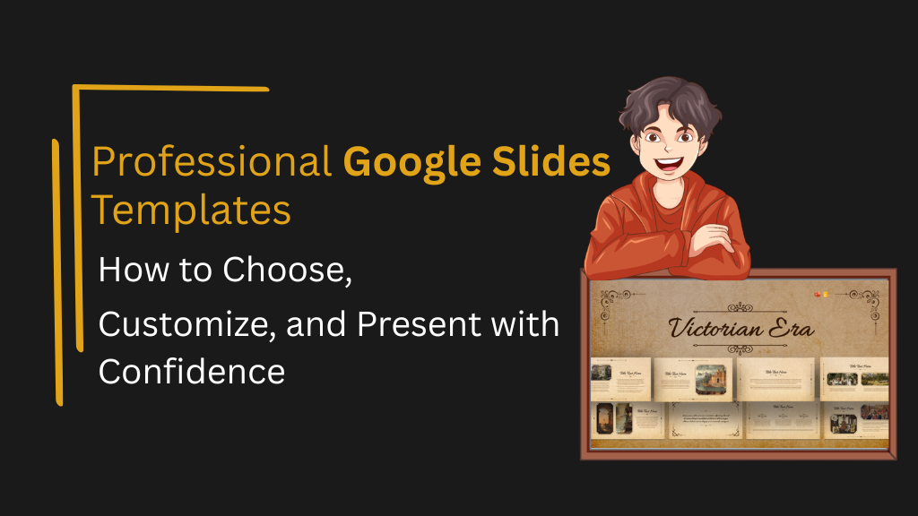
Professional Google Slides Templates: How to Choose, Customize, and Present with Confidence
Google Slides has evolved well beyond a free alternative to PowerPoint. For distributed teams, educators, marketers, and executives, it has become the default platform for real-time collaboration and shareable presentations. But the platform’s default themes rarely meet the standards of a professional audience. Professional Google Slides templates bridge that gap — providing structured layouts, polished design, and consistent visual systems that allow presenters to focus on content instead of formatting decisions.
This guide covers how to evaluate and use professional templates effectively, from aesthetic choices to structural formats across a wide range of presentation contexts.
What Defines a Professional Google Slides Template
A professional template is not simply one that looks polished — it is one that is structurally sound, visually consistent, and built to support communication across different slide types without requiring manual redesign.
The defining characteristics of a professional Google Slides template are:
- Slide Master integration — Fonts, colors, and spacing are controlled from the master layout so that changes propagate uniformly rather than requiring slide-by-slide edits
- Layout variety — A complete template includes title slides, section breaks, full-content slides, comparison layouts, data slides, and a closing frame
- Typography hierarchy — Heading, subheading, and body text sizes are pre-set at proportions that remain legible in both projection and screen-sharing contexts
- Background coherence — Whether minimal or decorative, the background system is consistent and does not compete with text content
- Export reliability — Well-built templates retain their design integrity when downloaded as PDF or converted to PowerPoint format
Templates that are missing any of these properties force presenters to make compensatory design decisions mid-production — a reliable source of visual inconsistency.
SlideKit’s professional Google Slides templates are built to meet all five criteria. Each template is designed for Google Slides — not converted from another format — which means the layout behavior, font rendering, and Slide Master structure all function as intended from the moment the file is opened.
How to Use Google Slides Templates Effectively
Using a Google Slides template well goes beyond inserting content into pre-existing placeholders. The process involves a small number of deliberate steps that preserve the template’s design integrity.
Step 1: Import or open the template correctly
For templates downloaded as .pptx files, open Google Slides and use File → Import Slides to bring in the layouts while preserving the original design. For .gslides files, open directly from Google Drive. SlideKit templates are available in both formats, making the import process straightforward regardless of how a team stores and shares files.
Step 2: Access the Slide Master before editing content
Before adding any text or images, go to View → Theme Builder (Slide Master) and review the master slide and layout hierarchy. Understanding which layouts are available prevents the common mistake of building all slides from a single generic layout.
Step 3: Use layout slides — not blank slides
Every placeholder in a layout slide has a defined font, size, and position. When presenters insert text directly onto blank slides, they bypass this system entirely, breaking the template’s visual consistency. SlideKit templates include a range of pre-built layout slides — from title and content slides to comparison, data, and closing frames — so there is a correct layout available for nearly every slide type.
Step 4: Apply the theme globally before customizing
If a brand color or font change is needed, make it in the Slide Master first. This ensures the change applies to all slides rather than requiring manual updates across the deck. Because SlideKit templates use a structured theme system, color and font changes made at the master level cascade correctly without breaking individual slide layouts.
Step 5: Replace placeholder images using “Replace Image”
Right-clicking an existing image placeholder and selecting “Replace Image” preserves the frame size and position. Dragging a new image directly onto the slide does not — it creates a floating element that sits outside the layout grid.
Following these steps consistently produces presentations that look intentional and coherent, rather than assembled.
How to Make Your Google Slides Look Cool and Consistent
Making a presentation visually distinctive does not require advanced design skills — it requires a few deliberate structural decisions applied consistently across the deck.
Use a background system, not just a color
A background that includes a subtle texture, gradient, or geometric element adds visual depth without distracting from content. SlideKit’s aesthetic slide background and simple Google Slide background illustrate the range between expressive and restrained — both professional, but serving different tonal contexts. Having a designed background built into the template eliminates the need to create or source one independently.


Limit typefaces to two
A heading font and a body font are sufficient for the vast majority of presentations. Adding a third typeface introduces visual noise without adding communication value. SlideKit templates handle this automatically — each one ships with a pre-defined font pairing that has been tested for readability at projection scale.
Use color with intent, not decoration
Reserve accent colors for data callouts, key statistics, and calls to action. Sections and content slides should remain visually calm so that emphasized elements carry genuine weight.
Apply seasonal or contextual themes where appropriate
For classroom presentations, community communications, or seasonal marketing content, themed templates add personality and relevance. SlideKit’s winter Google Slides theme template demonstrates how a purposeful thematic design can be applied with professional restraint — visually distinctive without overwhelming the content it is meant to support.

Google Slides Templates Aesthetic: Choosing a Visual Direction
The aesthetic category of a template should align with the audience’s expectations and the presentation’s purpose. “Aesthetic” in the context of Google Slides refers to templates with a distinctive visual identity — often used in educational, creative, and brand-forward contexts.
The following framework helps narrow the choice:
| Visual Direction | Best Suited For | Characteristics |
| Minimalist | Executive, corporate, consulting | White space, clean type, low contrast |
| Dark / High-contrast | Tech, product, investor pitches | Dark backgrounds, bold type, accent lighting |
| Soft / Pastel | Education, wellness, lifestyle brands | Muted tones, rounded shapes, open layouts |
| Bold / Graphic | Marketing, brand launches, events | Strong color blocks, oversized type |
| Vintage / Historical | Education, cultural, archival | Textured backgrounds, serif fonts, period-accurate styling |
| Thematic | Entertainment, seasonal, cultural events | Branded visual motifs |
Cute Google Slides designs typically fall in the soft and pastel category — common in educational and student presentations, online courses, and community-facing content where warmth and approachability matter more than formal authority.
Google Slides Timeline Templates: Structure and Use Cases
Timelines are among the most structurally demanding slide types to build from scratch. They require precise horizontal or vertical spacing, consistent label placement, and visual markers that remain readable as more data points are added.
A dedicated Google Slides timeline template removes this problem by pre-building the structure — leaving only the dates, events, and labels to be populated.
When timeline slides are most useful:
- Project planning — Milestones, delivery phases, and dependency visualization
- Historical education — Chronological narrative for academic or archival subjects
- Product roadmaps — Feature release schedules communicated to stakeholders
- Onboarding sequences — Process timelines for new employees or clients
- Case study narratives — Showing how a situation developed over time
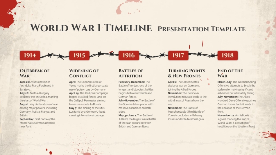
For history-focused presentations, World War 1 timeline template for PowerPoint and Google Slides provides a historically structured layout designed for both classroom teaching and academic presentations. The event marker system is pre-built and can be adapted to other historical periods with minimal editing, making it a reusable resource rather than a single-use slide.
Product and Business Presentation Templates in Google Slides
Product presentations require a different structural approach than general business decks. The goal is to communicate what a product does, who it is for, and why it is relevant — typically with more visual content and less text-heavy narration.
Key slide types for product presentations include:
- Hero slide — Product name, tagline, and primary visual
- Problem/need slide — The context that makes the product relevant
- Feature highlight slides — One feature per slide with supporting visuals or icons
- Use case scenarios — Real-world applications for the target audience
- Comparison table — Positioning relative to alternative approaches
- Social proof — Customer quotes, adoption data, or case study references
- Pricing or next steps — Clear engagement pathway
SlideKit’s product showcase PowerPoint and Google Slides template provides a structured framework for this format — with pre-built layouts for feature highlights, comparison views, and visual product callouts. Because the template is available for both PowerPoint and Google Slides, teams can build in whichever platform they prefer and share across both without layout degradation.
Thematic and Creative Templates for Specialized Contexts
Not all presentations serve a corporate function. Educators, students, event organizers, and creative professionals regularly need templates that communicate through visual personality rather than formal structure alone.
Educational and historical presentations
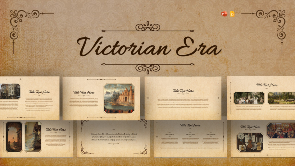
When the subject matter has a distinct historical or cultural identity, a template that visually reflects that context helps establish credibility and engagement before the first word is spoken. Victorian era presentation template demonstrates how design can reinforce thematic content rather than simply containing it — a meaningful advantage in history, literature, and cultural studies presentations.
Brand analysis and marketing case studies
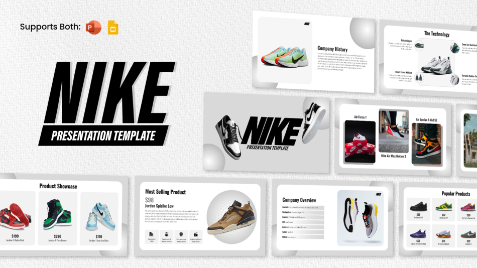
Brand-specific templates are commonly used in marketing coursework, competitive analysis, and creative strategy presentations. They function as visual case study frames that orient the audience immediately. Spotify PowerPoint template and Nike presentation template serve this purpose effectively — providing an aesthetically accurate visual environment that frames the analysis before a single word of content is read.

Entertainment and fan presentations
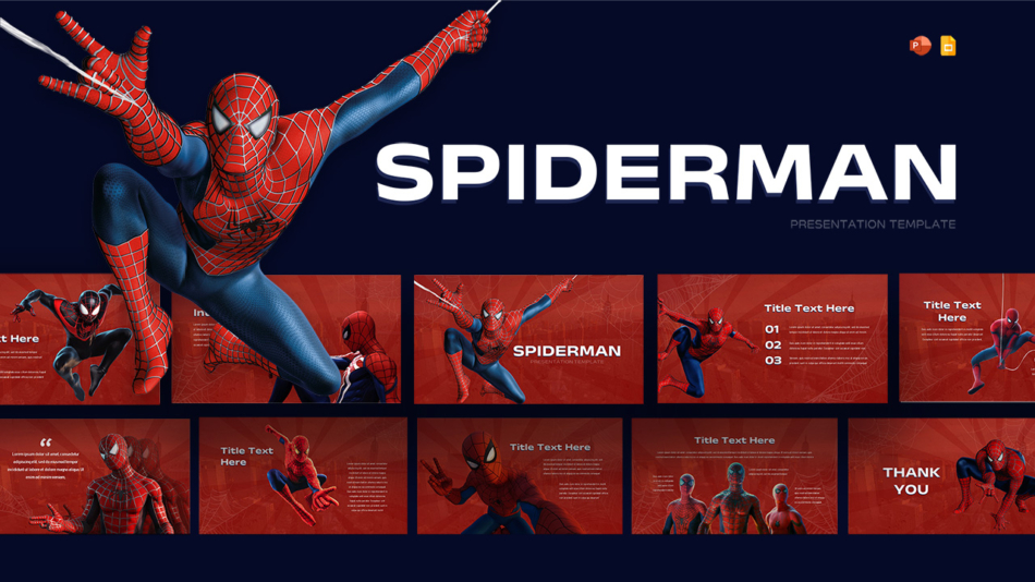
For school projects, fan communities, or creative showcase presentations, themed templates bring immediate visual energy that generic templates cannot replicate. SlideKit’s Spider-Man PowerPoint and Google Slides template is a practical example — available for both platforms, visually distinctive, and structured enough to carry real content without becoming purely decorative.
Strategic Slide Types Every Professional Deck Needs
Beyond layout and aesthetics, certain slide types appear in professional presentations across nearly every industry. Having pre-built versions of these slide types in a template eliminates common production bottlenecks.
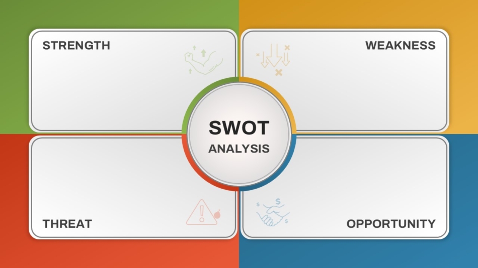
SWOT Analysis
The SWOT framework — Strengths, Weaknesses, Opportunities, Threats — is one of the most widely used strategic analysis tools in business presentations. A structured four-quadrant layout is far more readable than the same information in bullet list format. SlideKit’s empty SWOT analysis template provides a clean, editable version ready for any strategic context — with a layout that maintains visual balance even when the four quadrants contain uneven amounts of content.
Thank You / Closing Slides
The closing slide is often the last thing an audience sees before discussion begins — yet it receives less design attention than any other slide in the deck. A well-designed closing slide reinforces brand credibility and gives the presenter a composed visual backdrop during Q&A.
SlideKit offers two distinct approaches: the stylish thank you PowerPoint slide for formal, restrained contexts and the creative thank you presentation slide for presentations where a more expressive closing better fits the tone. Having both options available means the closing slide can match the visual character of the deck rather than defaulting to a blank screen or a generic text frame.


Background Slides
Section dividers and transitional slides with intentional background design help audiences track progression through a multi-part presentation. A consistent background system across all non-content slides maintains visual rhythm without requiring decorative elements on data or text slides. SlideKit’s background options are designed to integrate seamlessly with the rest of the template structure — not to stand alone as isolated design elements.
Conclusion: Build Better Presentations from the Start
Professional Google Slides templates do more than improve how a presentation looks — they reduce production time, enforce visual consistency, and ensure that structural decisions serve the communication goal rather than compete with it.
Whether the context is an executive briefing, a product launch, a historical education presentation, or a strategic planning session, choosing the right professional Google Slides template is the first and most consequential design decision a presenter makes. The template sets the visual tone, defines the available layouts, and determines how much time will be spent on structure versus content.
SlideKit’s template library is designed with this in mind — offering professionally structured options across business, education, creative, and thematic contexts, all built for compatibility with both Google Slides and PowerPoint. For teams and individuals who want presentations that communicate clearly without investing hours in design, starting with a high-quality template is the most reliable path to a finished deck that holds up under professional scrutiny.

