
Organizational Chart Best Practices: Tips for Creating Clear Team Structures
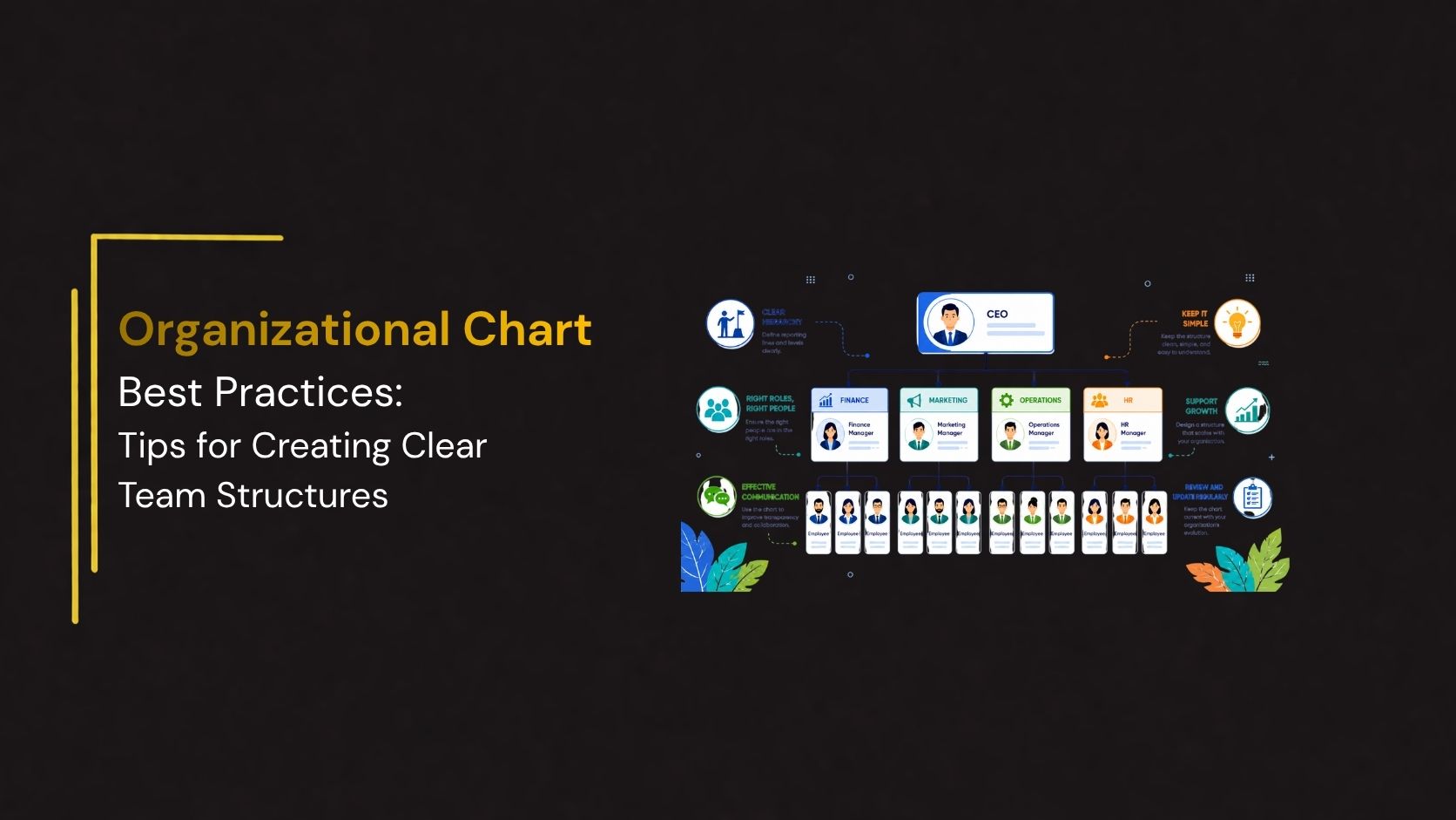
An organizational chart is more than a simple diagram showing reporting relationships; it is a visual representation of your company’s structure, roles, and lines of communication. A well-designed organizational chart helps employees understand who reports to whom, clarifies responsibilities, and supports better collaboration across departments.
Whether you’re a startup building your first team structure or a large enterprise managing multiple departments, following organizational chart best practices ensures your chart remains accurate, easy to understand, and useful for employees, managers, and stakeholders.
In this guide, we’ll explore the best practices for creating effective organizational charts, common mistakes to avoid, and tips for designing charts that improve communication and organizational efficiency.
What Is an Organizational Chart?
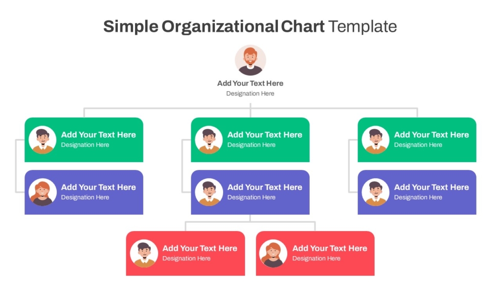
An organizational chart (org chart) is a visual diagram that illustrates the hierarchy within an organization. It displays reporting relationships, departments, job titles, and team structures, making it easier to understand how different roles connect.
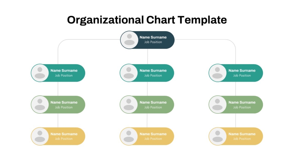
Modern organizational charts are often created using PowerPoint or Google Slides, making them easy to edit and present during meetings.
Organizational Chart Best Practices
Following these best practices will help you create an organizational chart that is accurate, easy to navigate, and visually appealing.
1. Choose the Right Organizational Structure
Select a structure that reflects how your business operates.
Common organizational structures include:
- Functional Organizational Chart
- Divisional Organizational Chart
- Matrix Organizational Chart
Choosing the right format ensures the chart accurately represents your organization’s workflow and reporting relationships.
2. Keep the Layout Simple
Avoid overcrowding your organizational chart with excessive details.
A clean layout should:
- Display clear reporting lines
- Maintain consistent spacing
- Use readable fonts
Simple charts are easier to understand and present.
3. Use Consistent Formatting
Consistency improves readability.
Ensure that:
- Job titles follow the same format
- Shapes are equally sized
- Fonts remain consistent
- Colors represent departments logically
A standardized design creates a more professional appearance.
4. Include Only Relevant Information
Focus on essential details.
Typically include:
- Employee names
- Job titles
- Departments
Avoid adding excessive personal information that may clutter the chart.
5. Use Color Strategically
Colors should enhance understanding—not distract from it.
For example:
- Blue for Management
- Green for Operations
- Orange for Sales
- Purple for HR
- Teal for IT
Maintain consistent color usage throughout the chart.
6. Clearly Show Reporting Relationships
One of the primary purposes of an organizational chart is to define reporting lines.
Use connectors that clearly indicate:
- Direct reporting
- Department relationships
- Cross-functional teams (when applicable)
Avoid overlapping or confusing connections.
7. Group Employees by Department
Organizing employees into departments makes the chart easier to understand.
Examples include:
- Human Resources
- Finance
- Marketing
- Sales
- Operations
- IT
- Customer Support
Color coding departments can further improve readability.
8. Keep the Chart Updated
Organizational structures change frequently.
Update your chart whenever:
- Employees join or leave
- Departments are reorganized
- New management roles are created
- Reporting relationships change
An outdated chart can cause confusion and miscommunication.
9. Design for Your Audience
Consider who will use the organizational chart.
For example:
- Executives may need a high-level overview.
- HR teams may require detailed employee information.
- New employees benefit from simplified charts during onboarding.
Tailor the level of detail accordingly.
10. Use Editable Templates
Rather than creating charts from scratch, use editable templates that can be easily updated as your organization evolves.
PowerPoint and Google Slides templates allow you to:
- Add new employees
- Rearrange reporting lines
- Customize colors
- Include company branding
This saves time and ensures consistency.
Common Mistakes to Avoid
Even well-designed organizational charts can become ineffective if common mistakes are overlooked.
Avoid:
- Overcrowding the chart with too many details
- Using inconsistent formatting
- Failing to update employee changes
- Creating unclear reporting lines
- Ignoring departmental grouping
A clean and organized chart is far more effective than one overloaded with information.
Conclusion
An effective organizational chart is an essential communication tool that brings clarity to your company’s structure, reporting relationships, and departmental responsibilities. By following best practices such as choosing the right layout, maintaining consistent formatting, keeping the chart updated, and focusing on simplicity, you can create a visual resource that supports onboarding, collaboration, and strategic decision-making. Whether you’re managing a growing startup or a large enterprise, a well-designed organizational chart improves transparency and helps teams work more efficiently.
👉Explore SlideKit’s Organizational Chart Templates today and create clear, professional organizational charts in just minutes.