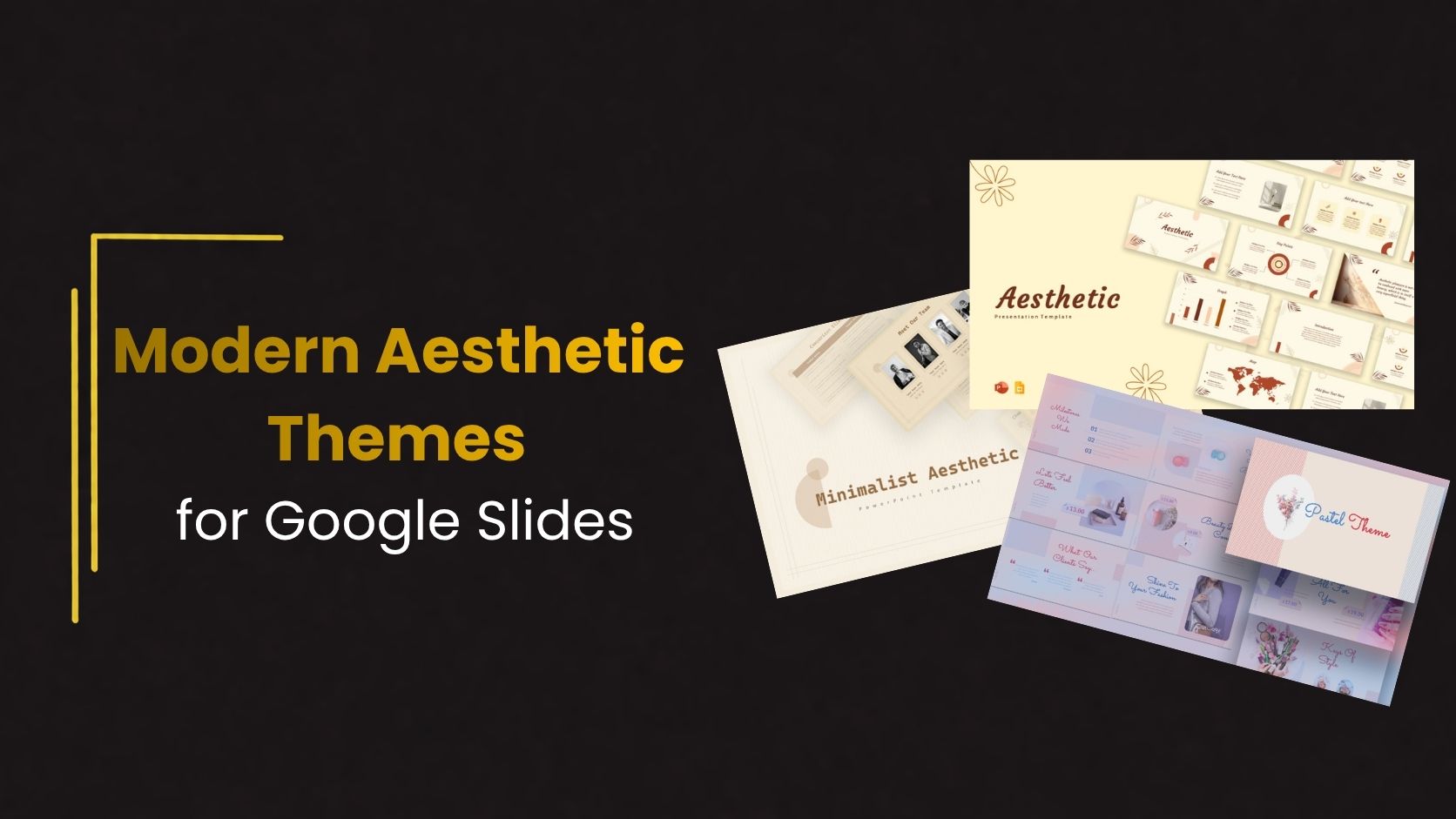
Modern Aesthetic Themes for Google Slides
Modern presentations are becoming simpler, cleaner, and more visually organized. Instead of overloaded slides with too much text and distracting graphics, many presenters now prefer minimal layouts that improve readability and communication. This shift is why modern aesthetic themes for Google Slides are becoming increasingly popular across business, education, creative, and marketing presentations.
Aesthetic presentation themes focus on balance, typography, spacing, and visual consistency. They help presentations feel more professional while making content easier to understand.
The Rise of Modern Presentation Design
Presentation trends have changed significantly in recent years. Earlier presentations often focused heavily on animations, gradients, and decorative elements. Modern slide design now focuses more on clarity and simplicity.
Audiences today prefer presentations that:
- Look visually organized
- Use minimal distractions
- Communicate ideas quickly
- Feel modern and professional
This is exactly where aesthetic themes perform well. Their clean structure creates a better viewing experience without overwhelming the audience.
What Defines an Aesthetic Google Slides Theme?
An aesthetic theme is not simply about making slides look attractive. It is about creating visual harmony throughout the presentation.
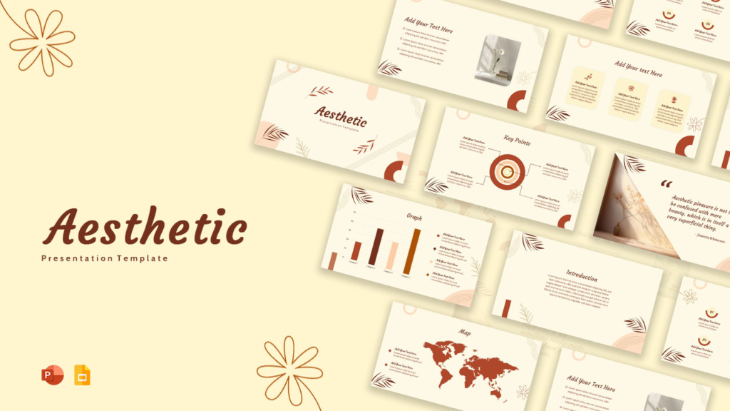
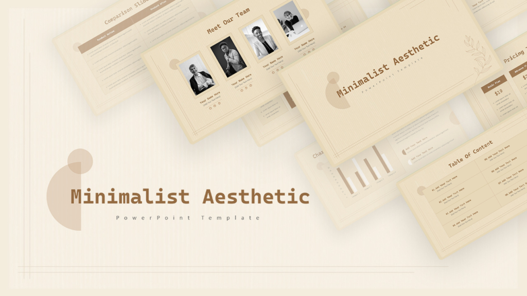
Most modern aesthetic themes include:
- Neutral or soft color palettes
- Clean typography
- Spacious layouts
- Consistent visual hierarchy
- Minimal graphic clutter
Instead of using excessive visual effects, these themes prioritize readability and structure.
Why Minimal Slides Often Work Better
Minimal design helps presentations communicate more effectively. Slides filled with too much information often reduce engagement because audiences struggle to focus on the key message.
Modern aesthetic themes improve presentations by:
- Reducing unnecessary distractions
- Creating stronger visual hierarchy
- Improving readability
- Helping audiences process information faster
Simple presentations are usually more memorable because the audience can focus on the message itself rather than navigating visual clutter.
Best Presentation Types for Aesthetic Themes
Aesthetic Google Slides themes work well across many presentation categories because of their flexibility and clean structure.
They are especially effective for:
- Startup pitch decks
- Creative portfolios
- Marketing reports
- Educational presentations
- Brand presentations
- Company profiles
Minimal layouts adapt easily to different industries while maintaining a professional appearance.
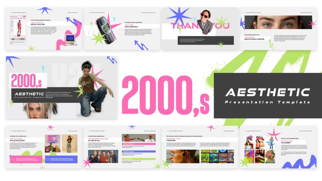
👉Get Free 2000s aesthetic template from SlideKit
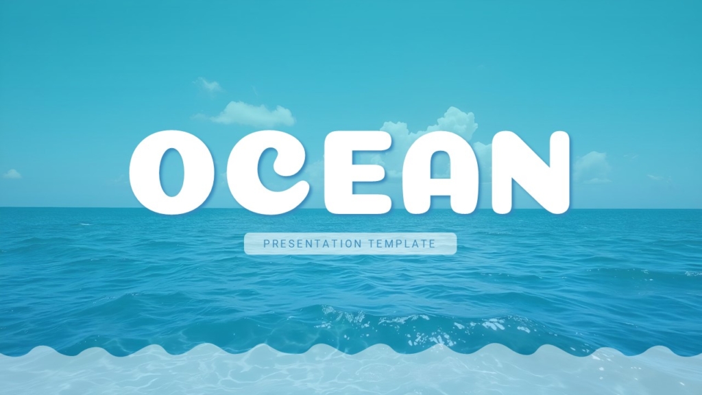
👉 Explore Free Aesthetic Ocean themed template from Slidekit
Typography Plays a Bigger Role Than Most People Think
Typography is one of the most important elements in modern presentation design. Aesthetic themes usually rely on clean sans-serif fonts combined with strong hierarchy.
Good typography improves presentation readability by making content easier to understand and follow. It also enhances slide flow, creates visual consistency across the deck, and gives presentations a more polished and professional appearance. Consistent font styles, proper spacing, and clear text hierarchy help audiences stay focused on the message without distractions.
Color Consistency Creates Better Visual Balance
Modern presentation themes usually use limited color palettes. Instead of using many bright colors, they rely on a few balanced tones that create consistency throughout the deck.
Soft neutrals, muted colors, dark monochrome layouts, and subtle gradients are common in aesthetic presentation design.
This consistency helps presentations feel more polished and organized.
Why Ready-Made Themes Save Time
Designing presentations from scratch can become time-consuming, especially for people without design experience. Ready-made Google Slides presentation templates simplify this process significantly.
Using templates helps:
- Maintain visual consistency
- Speed up workflow
- Improve presentation quality
- Reduce design effort
Instead of building layouts manually, presenters can focus more on storytelling and communication.
Common Design Mistakes to Avoid
Even clean themes can lose effectiveness when presentations become overloaded. One common mistake is adding too many fonts, colors, or visual elements that break consistency.
Other mistakes include:
- Overcrowded slides
- Excessive animations
- Poor spacing
- Inconsistent typography
- Too much decorative styling
The strongest aesthetic presentations maintain simplicity from beginning to end.
Conclusion
Modern aesthetic themes for Google Slides are popular because they improve communication through clean and organized design. Instead of distracting audiences with unnecessary visual effects, these themes focus on clarity, balance, and readability.
In many cases, the simplest presentations are the most effective. Minimal layouts, consistent typography, and thoughtful spacing create presentations that feel more professional and engaging.
If you want professionally designed aesthetic presentation themes without spending hours designing slides yourself, SlideKit offers ready-to-use Google Slides and PowerPoint templates built for modern presentations.
👉 Explore SlideKit templates and create clean, stylish, and impactful presentations faster.

