How To Create Harvey Balls Chart in PowerPoint?
A Harvey ball can easily visualize the data in simple steps and gives the overall information within a single frame. The data visualization is made quickly by the usage of a Harvey ball, and hence the users can easily grab the content. Harvey balls are mainly used in comparison tables, project management, lean manufacturing like CNC Machining ,HR management, and in different industries, including health and automotive. The main advantage of a Harvey ball diagram is that it tells stories packed with data. In this article, we will go through the pros and cons and use cases of Harvey balls as well as the steps to insert Harvey balls in PowerPoint.
What is a Harvey Ball?
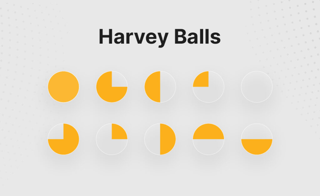
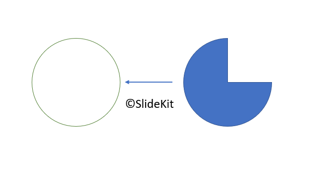
The circular ideograms that are used to convey qualitative information visually and quickly are known as Harvey balls. A Harvey best block diagram programs ball diagram consists of multiple circular shapes, with each colored quadrant representing a certain set of data. The colored segment usually represents the data or criterion that has been achieved or completed. And the non-colored or blank segment represents the data or criterion to be achieved. They are commonly used in comparisons, project status updates, and to depict the overall status of anything.
Advantages & Disadvantages of Harvey Balls
The round ideograms are also known as Booz balls. They are first used in the 1970s by Harvey L. Poppel, an IT investor, to highlight and compare various sets of data. The usage of Harvey balls is increasing day by day and has its own pros and cons. The following are the pros of using a Harvey ball diagram.
Advantages
1. Shows a large set of data in a single frame.
The Harvey balls diagram can be used to show different types of data in a single slide or page itself. The data from large tables or sheets can be easily shown using a Harvey ball analysis, and the users will have a better understanding of them. For example, the sales percentage comparison of your company, along with your competitor, can be plotted easily on a Harvey ball. Moreover, the user doesn’t need to look at each column of the comparison matrix. All the necessary information is available on the Harvey ball diagram itself. And it will be easier for them to analyze the data while ensuring data integrity.
2. Assists in showcasing qualitative data.
Harvey balls are a good assessment tool for depicting qualitative data in a visually appealing manner. Users will be able to get the data easily. The usage of graphs instead of numbers will help the audience to analyze the data quickly. Furthermore, including a lot of numbers in your presentations make them confused.
3. A common element in reports.
Harvey balls are most commonly used as comparison charts. Besides this, they can be used in project management, project status updates, and reports. Managers and other professionals use Harvey balls in their reports to save space and understand the data better.
Disadvantages
1. Does not fit in all situations.
There are many situations where a Harvey ball diagram couldn’t clearly convey the message or data. For example, if we take the comparison rating of two products, then it will be better to use a star rating better than showing them in a Harvey ball diagram. So, anyone can simply understand that a product with a 5-star rating is far better than that with a 3-star rating.
2. Not widely used.
Harvey balls are not common in all types of presentations. Unlike the commonly used symbols like emojis or bitmojis, Harvey balls don’t have much wider popularity. And therefore, they are not universally used and might be less popular. Many often find Harvey balls alternatives like Pie charts and data bars better in presenting their data.
3. Not everyone finds it powerful.
We have already discussed that Harvey balls are a powerful tool for visualizing different types of data. But everyone doesn’t find it easy to grasp the information contained in a Harvey ball slide. The different colors used in visualizing and depicting the data might make someone feels confused and finds it difficult to distinguish between each set of data. A Harvey ball chart with a lot of data is not good in situations where a simple pie chart can tell the same data.
Use cases of Harvey ball diagrams
Harvey balls have many applications in different situations. The following are the different use cases of Harvey balls.
1. Project Management
Harvey balls are an efficient tool for project managers to showcase the status of their project and its updates. They can use Harvey balls icons to represent the status of the various phases (project research, initiation, resource allocation, delivery, etc.) of the project. Also, a Harvey ball chart with the status of the assigned tasks to different employees and their current status helps the project manager to make his next decisions. It helps the managers to understand whether more time should be allocated or whether any other support like manpower or resources is needed.
2. Lean Manufacturing
Harvey balls help in value-stream mapping in lean manufacturing presentations. The value stream map shows all important stages in a particular process and quickly calculates the amount of time and material needed at each step. This reduces the time and effort in the overall production system.
3. Compare Products & Features
The features between your products and that of your competitors can be easily visualized with the help of a Harvey ball chart diagram. This helps in understanding the comparison easier, and you can check the current status of your product. This will help answer questions like whether any updates are needed with the product. How are your products performing compared to competitors? What type of updates will increase your sales? And much more.
How to create Harvey balls in PowerPoint?
The following steps will guide you through the simple process of creating Harvey ball images in PowerPoint.
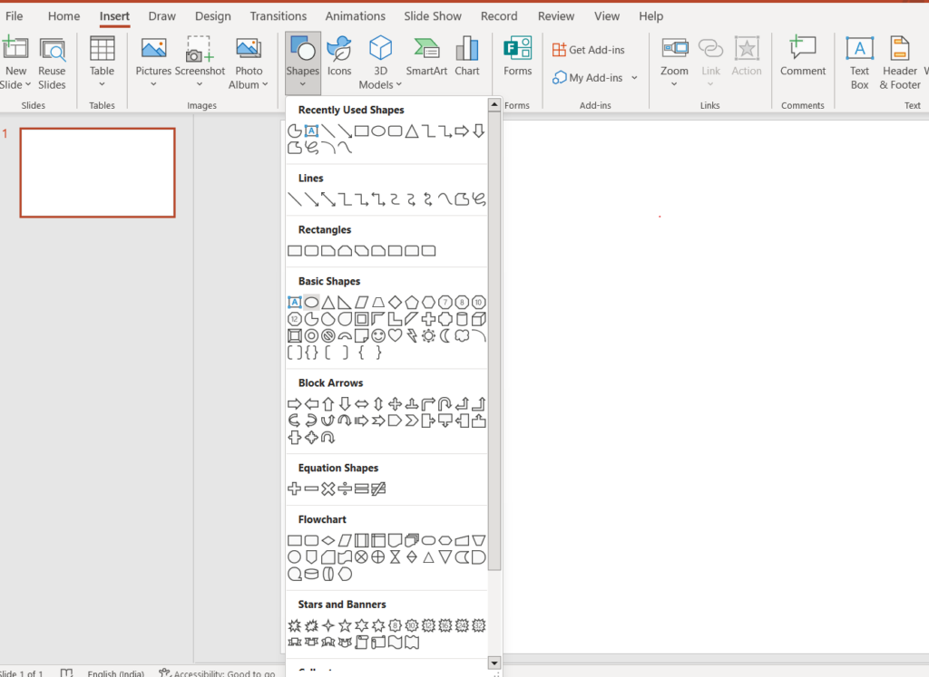
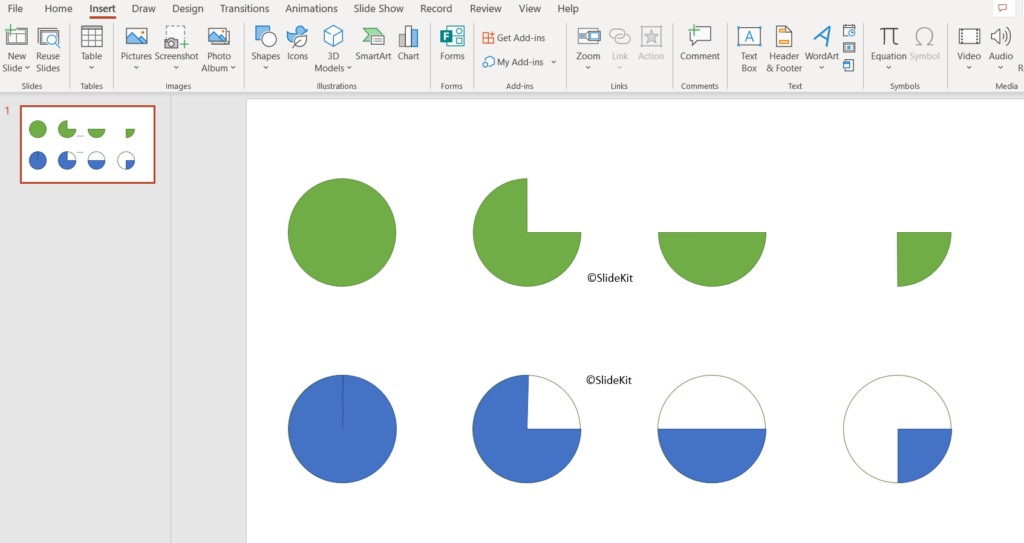
1. Insert the shapes
Click on the Insert button and go to Shapes. Choose the oval shape under the basic shapes(2nd one) from the pop-up menu. Then draw the oval shape with the required size.
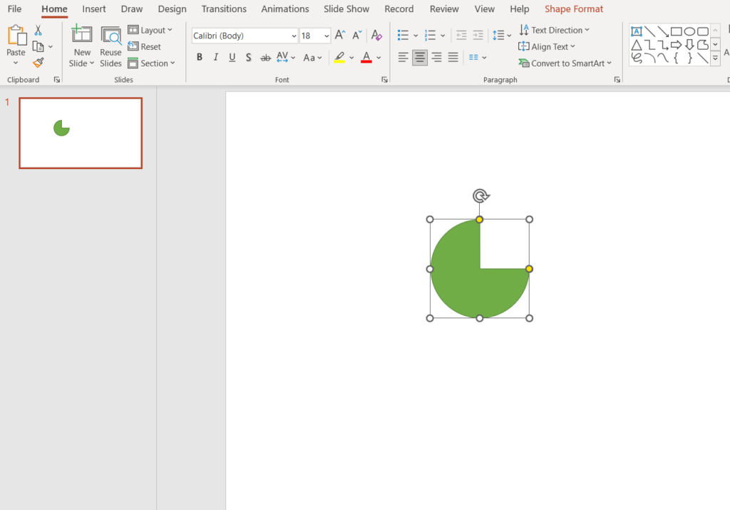
2. Edit the shape
Format the shape with the help of the Shape Format tab on the top menu bar. Here, you can change the color of the ellipse. The next step is to edit the shape into a Harvey ball model. For that, you need to click on the ellipse and go to the Edit shape on the top menu bar. Then click on Change shape and choose Partial circle under the basic shapes.
3. Adjusting the Harvey balls
You can change the shape of the Harvey balls once the Pie chart shape is ready with you. For this, you can move any of the two yellow handles and adjust the angle of the circle. This will create different Harvey ball diagrams.
Furthermore, you can customize the Harvey ball by left-clicking on them. Creating copies of the same and editing them will save you time. The following method helps to create a more attractive Harvey ball diagram. First of all, insert an ellipse and remove the Fill color of the ellipse by left-clicking on it and choosing the No fill from the Shape Fill menu. Then insert a partial circle by using the above method and align it with the exact shape of the ellipse.
Then left-click and drag the cursor over the two to select both of them. After this, left-click and group them by clicking on the Group button. Then create copies of the same and edit the shapes by adjusting the angles with the help of the yellow indicator. This will create the required Harvey balls with a circular outline.
Further, if you don’t have the time to create a Harvey ball google slides and PPT from scratch, you can browse our catalog of Harvey ball PowerPoint templates and alternatively best block diagram programs to create any set of that.
Final Words
The Harvey balls are an ideal visual tool when it comes to qualitative data representation. One of the most important applications of Harvey balls is in comparing similar sets of data. Especially when comparing competitor products or features and studying the market data. The data representation using a Harvey ball diagram has its own pros and cons but is greatly helpful when analyzing certain types of data.

