
5 Best Ways to Visualize Survey Results

Survey results help businesses understand customer preferences, employee experiences, market trends, and audience opinions. However, presenting survey data in a spreadsheet or a long list of percentages can make important findings difficult to understand.
The right visualisation turns raw responses into clear insights. Charts, graphs, infographics, and presentation slides help audiences recognise patterns, compare answers, and make informed decisions.
Whether you are presenting customer feedback, employee engagement, academic research, or market research findings, choosing the right visual format makes a difference.
In this guide, we explore 5 effective ways to visualise survey results, explain when to use each method, and share practical tips for presenting survey data clearly with PowerPoint and Google Slides.
Why Is Visualizing Survey Results Important?
Visualising survey results makes information easier to interpret and communicate. Instead of asking your audience to read rows of numbers, you can use visuals to highlight the most important findings.
Here are some key benefits:
- Simplifies complex data: Converts large sets of responses into understandable visuals.
- Highlights patterns: Makes trends, preferences, and differences easier to identify.
- Improves engagement: Keeps presentations focused and visually appealing.
- Supports decision-making: Helps teams connect findings with practical actions.
1. Bar Charts for Comparing Responses
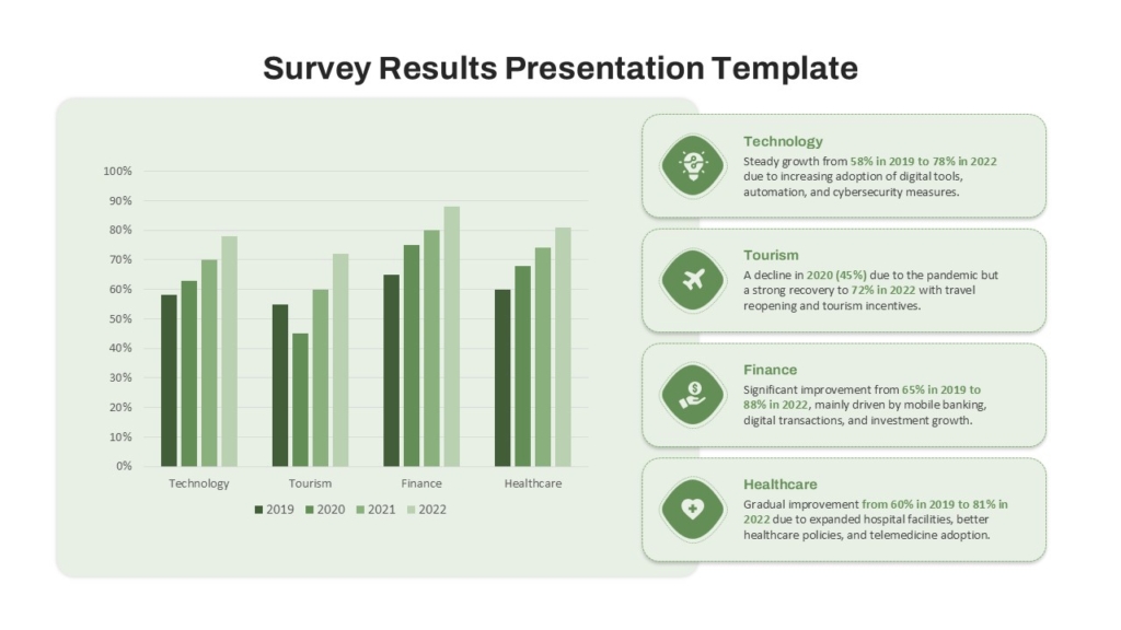
Bar charts are one of the most useful ways to visualise survey results. They make it easy to compare the number or percentage of respondents who selected different answers.
2. Pie Charts for Showing Proportions
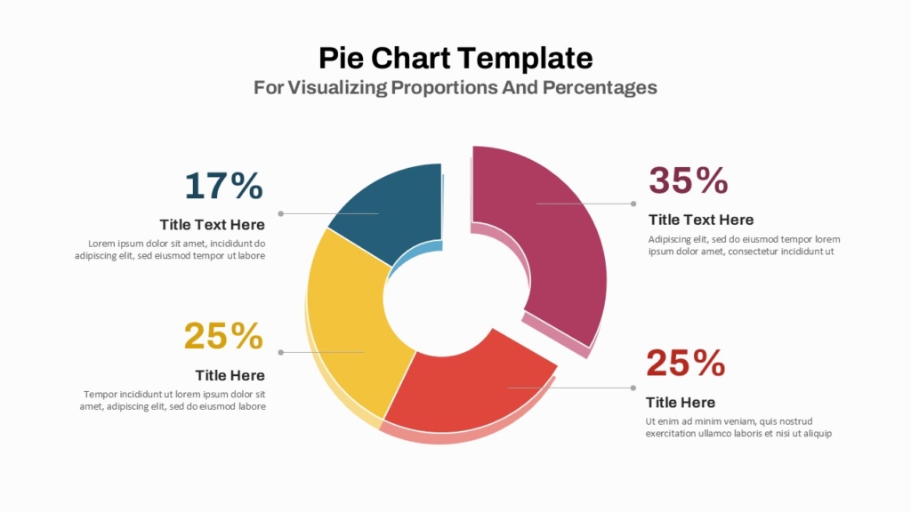
Pie charts show how a total is divided into categories. They work well when survey responses represent mutually exclusive options and the proportions add up to 100%.
3. Donut Charts for Highlighting Key Percentages
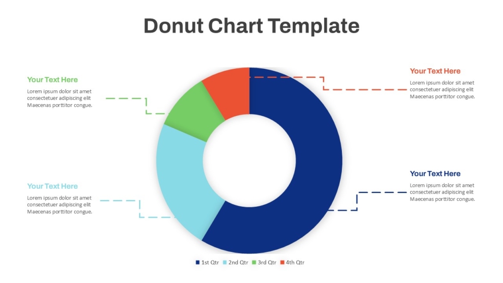
Donut charts are similar to pie charts but leave space in the centre for a headline metric. This makes them useful when you want to highlight one important survey result.
4. Stacked Bar Charts for Rating Scales
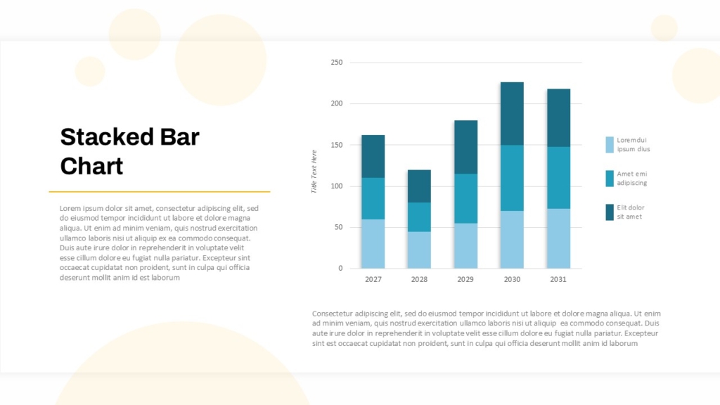
Stacked bar charts show how responses are distributed across multiple categories. They are particularly helpful for surveys that use rating scales, such as satisfaction or agreement questions.
5. Infographics for Summarizing Key Findings
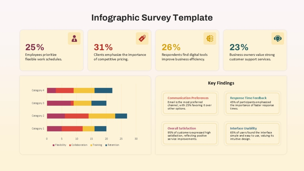
Infographics combine statistics, icons, short explanations, and visual elements to tell a concise story. They work particularly well when you need to communicate survey findings to a broad audience.
Best Practices for Visualising Survey Data
Even a well-chosen chart can become confusing if it is poorly designed. Follow these practices to make your survey results clearer and more trustworthy.
1. Start With a Clear Research Question
Before creating a chart, decide what you want the audience to learn. Are you comparing customer preferences, measuring satisfaction, or tracking changes in employee engagement?
2. Show the Sample Size
Include the number of respondents alongside percentages. A result from 20 participants should not appear equivalent to a result from 2,000 participants.
3. Use Accurate Labels
Clearly identify categories, percentages, time periods, and units. Include a note when respondents could select multiple answers, because the percentages may add up to more than 100%.
5. Keep the Design Consistent
Use consistent colours, fonts, spacing, and labels throughout the report. Ensure that the visuals remain readable when presented on a screen or exported to PDF.
Conclusion
The best way to visualise survey results depends on the type of data and the message you want to communicate. Bar charts make comparisons clear, donut charts highlight proportions, line charts reveal trends, heatmaps expose patterns, and infographics summarise important findings. Dashboards and presentation slides help bring multiple insights together.
Start with the question you want to answer, choose a visual that represents the data accurately, and focus on the findings that matter most to your audience. Then use a clear presentation structure to connect the evidence with practical recommendations. With the right visualisation and a well-designed slide deck, survey results can become a useful tool for better communication and informed decision-making.
Create Better Survey Results Presentations With SlideKit
Turning survey data into a polished presentation takes more than selecting a chart. You also need clear layouts, consistent visual elements, readable typography, and a logical flow between findings.
SlideKit helps you create professional presentations with ready-made PowerPoint and Google Slides templates. Use editable layouts to organise survey findings, highlight key statistics, compare responses, and communicate recommendations.
Whether you are preparing a customer feedback report, employee engagement review, academic research presentation, or market research deck, choose a suitable template and customize it with your own data.